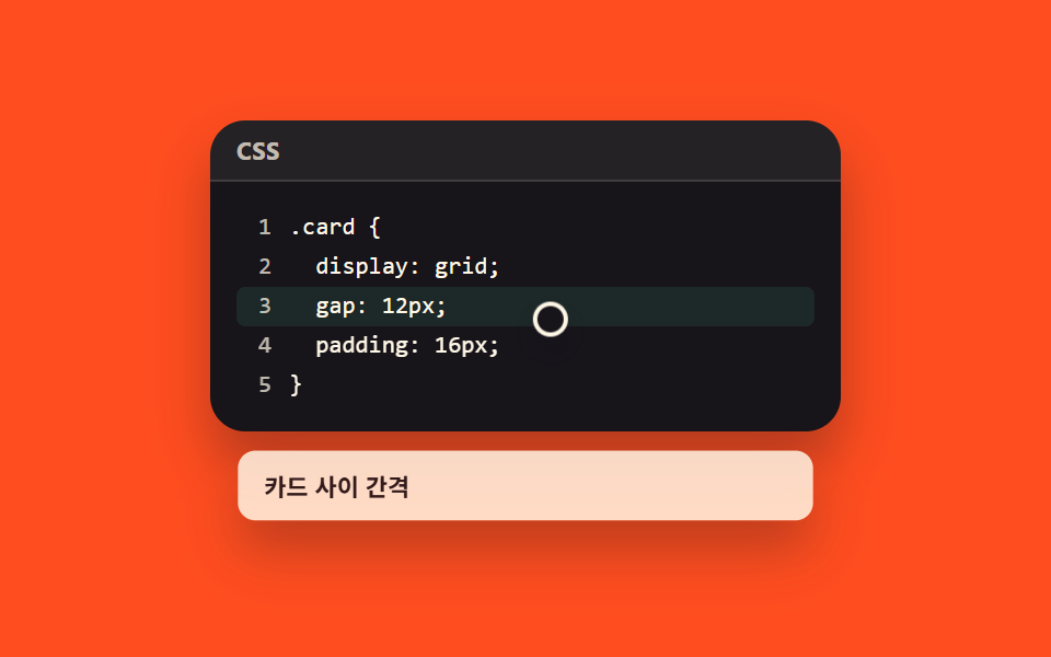
03行番号と指し示す行
行番号は文字ではなく counter-increment で数えて ::before に出すため、コピーしても付いてきません。指し示した行は背景色が違い、その行にポインタを乗せると理由を書いた付箋が出ます。
使いどころ長いコードの一行だけを説明するチュートリアル
counter-increment::beforeuser-select
<main class="stage">
  <div class="lnh is-demo" id="root">
    <div class="pane">
      <div class="pane__head">
        <span class="pane__lang">CSS</span>
      </div>
      <div class="pane__body">
        <pre id="codeText"><code class="lines"><span class="ln">.card {</span><span class="ln">  display: grid;</span><span class="ln is-called" id="calledLine" tabindex="0" aria-describedby="tip">  gap: 12px;</span><span class="ln">  padding: 16px;</span><span class="ln">}</span></code></pre>
      </div>
    </div>
    <div class="tooltip" id="tip" role="tooltip">カード間の余白</div>
    <span class="lnh__cursor" id="cursor" aria-hidden="true"></span>
  </div>
</main>
@use "../../../../site/static/demo-tokens" as *;
$duration: $dur-base;
$easing: $ease-spring;
$color: $subject-mint;
$syn-key: $stage-orange;
$syn-str: $stage-yellow;
$syn-num: $subject-sky;
$syn-dim: rgba($subject-cream, .72);
$syn-txt: $subject-cream;
@include stage($stage-orange);
.lnh {
position: relative;
box-sizing: border-box;
padding-bottom: 48px;
}
.pane {
box-sizing: border-box;
width: 288px;
border-radius: $r-card;
overflow: hidden;
box-shadow: $shadow-raised;
background: $stage-ink;
color: $subject-cream;
}
.pane__head {
box-sizing: border-box;
display: flex;
align-items: center;
gap: $sp-2;
height: 28px;
padding: 0 $sp-3;
background: rgba(255, 247, 230, .06);
border-bottom: 1px solid rgba(255, 247, 230, .12);
}
.pane__lang {
font-family: -apple-system, "Segoe UI", "Noto Sans KR", sans-serif;
font-size: 11px;
font-weight: 700;
letter-spacing: .02em;
color: $syn-dim;
text-transform: uppercase;
}
.pane__body {
position: relative;
box-sizing: border-box;
padding: $sp-3;
font-family: ui-monospace, "SFMono-Regular", Menlo, Consolas, monospace;
font-size: 11px;
line-height: 18px;
}
.pane__body pre, .pane__body code { margin: 0; font: inherit; }
.lines { counter-reset: ln; display: block; }
.ln {
position: relative;
display: block;
box-sizing: border-box;
padding-left: 24px;
color: $syn-txt;
white-space: pre;
border-radius: $r-xs;
}
.ln::before {
counter-increment: ln;
content: counter(ln);
position: absolute;
left: 0;
top: 0;
width: 16px;
text-align: right;
color: $syn-dim;
user-select: none;
}
.ln.is-called {
cursor: pointer;
background: rgba($color, .10);
}
.ln.is-called:focus-visible { outline: 2px solid $color; outline-offset: 1px; }
.ln.is-called::after {
content: "";
position: absolute;
left: 0;
top: 0;
bottom: 0;
width: 3px;
border-radius: $r-xs;
background: $color;
transform-origin: top center; // 규칙8: 하이라이트 막대 위에서
transform: scaleY(0);
}
.lnh.is-open .ln.is-called {
background: rgba($color, .22);
transition: background $duration $easing;
}
.lnh.is-open .ln.is-called::after {
transform: scaleY(1);
transition: transform $duration $easing;
}
.tooltip {
// .pane 은 헤더 28px + 본문(패딩 $sp-3×2 + 5줄×18px) = 142px 로 고정 계산 가능 —
// top:100% 는 .lnh 의 padding-bottom(예약분) 까지 포함해 계산되어 버리므로(Trap #7),
// 반드시 .pane 실측 높이를 px 로 고정해 그 아래에 배치한다
position: absolute;
left: $sp-3;
right: $sp-3;
top: 142px;
margin-top: $sp-2;
box-sizing: border-box;
padding: $sp-2 $sp-3;
border-radius: $r-sm;
background: rgba(255, 247, 230, .96);
color: $stage-ink;
font-family: -apple-system, "Segoe UI", "Noto Sans KR", sans-serif;
font-size: 11px;
font-weight: 700;
box-shadow: $shadow-raised;
opacity: 0;
transform-origin: top center; // 규칙8: 패널 아래변에서 펼침
transform: translateY(6px) scale(.96);
pointer-events: none;
}
.lnh.is-open .tooltip {
opacity: 1;
transform: translateY(0) scale(1);
transition: opacity $duration $easing, transform $duration $easing;
}
.lnh__cursor {
position: absolute;
left: 0;
top: 0;
z-index: 3;
width: 12px;
height: 12px;
border: 2px solid $subject-cream;
border-radius: 50%;
background: $stage-ink;
box-shadow: $shadow-press;
pointer-events: none;
opacity: 0;
transform: translate(16px, 20px);
}
.lnh.is-demo .lnh__cursor { opacity: 1; }
// ── 자동 루프 (2s) ────────────────────────────────────
// 등장(≈9~19%, 0.2s)은 짧은 구간에 몰아 급격하게, 퇴장(≈78~94%)은 넓은 구간에 걸쳐 서서히
// — poster 가 「닫히는 순간」이 아니라 「짚어서 뜨는 순간」이 되도록 한다
.lnh.is-demo .tooltip {
animation-name: lnh-tooltip;
animation-duration: $dur-loop;
animation-timing-function: $easing;
animation-iteration-count: infinite;
}
.lnh.is-demo .ln.is-called {
animation-name: lnh-bg;
animation-duration: $dur-loop;
animation-timing-function: $easing;
animation-iteration-count: infinite;
}
.lnh.is-demo .ln.is-called::after {
animation-name: lnh-bar;
animation-duration: $dur-loop;
animation-timing-function: $easing;
animation-iteration-count: infinite;
}
.lnh.is-demo .lnh__cursor {
animation-name: lnh-cursor;
animation-duration: $dur-loop;
animation-timing-function: $easing;
animation-iteration-count: infinite;
}
@keyframes lnh-tooltip {
0%, 9% { opacity: 0; transform: translateY(6px) scale(.96); }
19% { opacity: 1; transform: translateY(0) scale(1); }
78% { opacity: 1; transform: translateY(0) scale(1); }
94% { opacity: 0; transform: translateY(6px) scale(.96); }
100% { opacity: 0; transform: translateY(6px) scale(.96); }
}
@keyframes lnh-bg {
0%, 18% { background: rgba($color, .10); }
20% { background: rgba($color, .24); }
74% { background: rgba($color, .24); }
92% { background: rgba($color, .10); }
100% { background: rgba($color, .10); }
}
@keyframes lnh-bar {
0%, 20% { transform: scaleY(0); }
34% { transform: scaleY(1); }
78% { transform: scaleY(1); }
94% { transform: scaleY(0); }
100% { transform: scaleY(0); }
}
@keyframes lnh-cursor {
// 3번 줄 글자(" gap: 12px;")는 절대좌표 x 36~115 에 찍힌다 — 커서는 그 오른쪽 빈칸(x≥130)에서만 훑는다
0%, 2% { transform: translate(16px, 20px); }
18% { transform: translate(150px, 84px); }
34% { transform: translate(180px, 84px); }
52% { transform: translate(140px, 84px); }
72% { transform: translate(170px, 84px); }
86%, 100% { transform: translate(16px, 20px); }
}
@media (max-width: 340px) {
// 좁은 폭에서 .pane 높이 = 헤더 28px + 본문(패딩 $sp-2×2 + 5줄×16px) = 124px
.lnh { padding-bottom: 32px; }
.pane { width: 100%; }
.pane__body { font-size: 10px; line-height: 16px; padding: $sp-2; }
.ln { padding-left: 20px; }
.tooltip {
top: 124px;
margin-top: $sp-1;
left: $sp-2;
right: $sp-2;
padding: $sp-1 $sp-2;
}
}
@media (prefers-reduced-motion: reduce) {
.lnh.is-demo .tooltip,
.lnh.is-demo .ln.is-called,
.lnh.is-demo .ln.is-called::after,
.lnh.is-demo .lnh__cursor { animation: none !important; }
.lnh.is-demo .lnh__cursor { opacity: 0; }
.lnh.is-demo .tooltip { opacity: 0; }
}html, body {
margin: 0;
overflow: hidden;
}
.stage {
box-sizing: border-box;
min-height: 100vh;
display: grid;
place-items: center;
margin: 0;
background: #ff4d1f;
font-family: -apple-system, "Segoe UI", "Noto Sans KR", sans-serif;
padding: clamp(8px, 4vw, 24px);
}
.lnh {
position: relative;
box-sizing: border-box;
padding-bottom: 48px;
}
.pane {
box-sizing: border-box;
width: 288px;
border-radius: 16px;
overflow: hidden;
box-shadow: 0 14px 24px rgba(23, 20, 26, 0.32);
background: #17141a;
color: #fff7e6;
}
.pane__head {
box-sizing: border-box;
display: flex;
align-items: center;
gap: 8px;
height: 28px;
padding: 0 12px;
background: rgba(255, 247, 230, 0.06);
border-bottom: 1px solid rgba(255, 247, 230, 0.12);
}
.pane__lang {
font-family: -apple-system, "Segoe UI", "Noto Sans KR", sans-serif;
font-size: 11px;
font-weight: 700;
letter-spacing: 0.02em;
color: rgba(255, 247, 230, 0.72);
text-transform: uppercase;
}
.pane__body {
position: relative;
box-sizing: border-box;
padding: 12px;
font-family: ui-monospace, "SFMono-Regular", Menlo, Consolas, monospace;
font-size: 11px;
line-height: 18px;
}
.pane__body pre, .pane__body code {
margin: 0;
font: inherit;
}
.lines {
counter-reset: ln;
display: block;
}
.ln {
position: relative;
display: block;
box-sizing: border-box;
padding-left: 24px;
color: #fff7e6;
white-space: pre;
border-radius: 4px;
}
.ln::before {
counter-increment: ln;
content: counter(ln);
position: absolute;
left: 0;
top: 0;
width: 16px;
text-align: right;
color: rgba(255, 247, 230, 0.72);
user-select: none;
}
.ln.is-called {
cursor: pointer;
background: rgba(76, 212, 166, 0.1);
}
.ln.is-called:focus-visible {
outline: 2px solid #4cd4a6;
outline-offset: 1px;
}
.ln.is-called::after {
content: "";
position: absolute;
left: 0;
top: 0;
bottom: 0;
width: 3px;
border-radius: 4px;
background: #4cd4a6;
transform-origin: top center;
transform: scaleY(0);
}
.lnh.is-open .ln.is-called {
background: rgba(76, 212, 166, 0.22);
transition: background 300ms cubic-bezier(0.2, 0.8, 0.2, 1);
}
.lnh.is-open .ln.is-called::after {
transform: scaleY(1);
transition: transform 300ms cubic-bezier(0.2, 0.8, 0.2, 1);
}
.tooltip {
position: absolute;
left: 12px;
right: 12px;
top: 142px;
margin-top: 8px;
box-sizing: border-box;
padding: 8px 12px;
border-radius: 8px;
background: rgba(255, 247, 230, 0.96);
color: #17141a;
font-family: -apple-system, "Segoe UI", "Noto Sans KR", sans-serif;
font-size: 11px;
font-weight: 700;
box-shadow: 0 14px 24px rgba(23, 20, 26, 0.32);
opacity: 0;
transform-origin: top center;
transform: translateY(6px) scale(0.96);
pointer-events: none;
}
.lnh.is-open .tooltip {
opacity: 1;
transform: translateY(0) scale(1);
transition: opacity 300ms cubic-bezier(0.2, 0.8, 0.2, 1), transform 300ms cubic-bezier(0.2, 0.8, 0.2, 1);
}
.lnh__cursor {
position: absolute;
left: 0;
top: 0;
z-index: 3;
width: 12px;
height: 12px;
border: 2px solid #fff7e6;
border-radius: 50%;
background: #17141a;
box-shadow: 0 6px 12px rgba(23, 20, 26, 0.32);
pointer-events: none;
opacity: 0;
transform: translate(16px, 20px);
}
.lnh.is-demo .lnh__cursor {
opacity: 1;
}
.lnh.is-demo .tooltip {
animation-name: lnh-tooltip;
animation-duration: 2s;
animation-timing-function: cubic-bezier(0.2, 0.8, 0.2, 1);
animation-iteration-count: infinite;
}
.lnh.is-demo .ln.is-called {
animation-name: lnh-bg;
animation-duration: 2s;
animation-timing-function: cubic-bezier(0.2, 0.8, 0.2, 1);
animation-iteration-count: infinite;
}
.lnh.is-demo .ln.is-called::after {
animation-name: lnh-bar;
animation-duration: 2s;
animation-timing-function: cubic-bezier(0.2, 0.8, 0.2, 1);
animation-iteration-count: infinite;
}
.lnh.is-demo .lnh__cursor {
animation-name: lnh-cursor;
animation-duration: 2s;
animation-timing-function: cubic-bezier(0.2, 0.8, 0.2, 1);
animation-iteration-count: infinite;
}
@keyframes lnh-tooltip {
0%, 9% {
opacity: 0;
transform: translateY(6px) scale(0.96);
}
19% {
opacity: 1;
transform: translateY(0) scale(1);
}
78% {
opacity: 1;
transform: translateY(0) scale(1);
}
94% {
opacity: 0;
transform: translateY(6px) scale(0.96);
}
100% {
opacity: 0;
transform: translateY(6px) scale(0.96);
}
}
@keyframes lnh-bg {
0%, 18% {
background: rgba(76, 212, 166, 0.1);
}
20% {
background: rgba(76, 212, 166, 0.24);
}
74% {
background: rgba(76, 212, 166, 0.24);
}
92% {
background: rgba(76, 212, 166, 0.1);
}
100% {
background: rgba(76, 212, 166, 0.1);
}
}
@keyframes lnh-bar {
0%, 20% {
transform: scaleY(0);
}
34% {
transform: scaleY(1);
}
78% {
transform: scaleY(1);
}
94% {
transform: scaleY(0);
}
100% {
transform: scaleY(0);
}
}
@keyframes lnh-cursor {
0%, 2% {
transform: translate(16px, 20px);
}
18% {
transform: translate(150px, 84px);
}
34% {
transform: translate(180px, 84px);
}
52% {
transform: translate(140px, 84px);
}
72% {
transform: translate(170px, 84px);
}
86%, 100% {
transform: translate(16px, 20px);
}
}
@media (max-width: 340px) {
.lnh {
padding-bottom: 32px;
}
.pane {
width: 100%;
}
.pane__body {
font-size: 10px;
line-height: 16px;
padding: 8px;
}
.ln {
padding-left: 20px;
}
.tooltip {
top: 124px;
margin-top: 4px;
left: 8px;
right: 8px;
padding: 4px 8px;
}
}
@media (prefers-reduced-motion: reduce) {
.lnh.is-demo .tooltip,
.lnh.is-demo .ln.is-called,
.lnh.is-demo .ln.is-called::after,
.lnh.is-demo .lnh__cursor {
animation: none !important;
}
.lnh.is-demo .lnh__cursor {
opacity: 0;
}
.lnh.is-demo .tooltip {
opacity: 0;
}
}var root = document.getElementById('root');
var line = document.getElementById('calledLine');
function open() {
root.classList.remove('is-demo');
root.classList.add('is-open');
}
function close() {
root.classList.remove('is-open');
}
line.addEventListener('mouseenter', open);
line.addEventListener('mouseleave', close);
line.addEventListener('focus', open);
line.addEventListener('blur', close);import { useState } from "react";
import type { CSSProperties } from "react";
import styles from "./LineNumberHighlight.module.scss";
export type LineNumberHighlightProps = {
langLabel?: string;
tooltipText?: string;
/** Auto-play loop (for gallery). Turns off on real interaction */
demo?: boolean;
duration?: number;
easing?: string;
color?: string;
};
type Vars = CSSProperties & { "--duration"?: string; "--easing"?: string; "--color"?: string };
const LINES = [".card {", " display: grid;", " gap: 12px;", " padding: 16px;", "}"];
const CALLED_INDEX = 2;
export default function LineNumberHighlight({
langLabel = "CSS",
tooltipText = "Gap between cards",
demo = true,
duration = 300,
easing = "cubic-bezier(.2,.8,.2,1)",
color = "#4cd4a6",
}: LineNumberHighlightProps) {
const [live, setLive] = useState(demo);
const [open, setOpen] = useState(false);
const [tipId] = useState(() => "lnh-tip-" + Math.random().toString(36).slice(2));
function show() {
setLive(false);
setOpen(true);
}
function hide() {
setOpen(false);
}
const vars: Vars = { "--duration": `${duration}ms`, "--easing": easing, "--color": color };
return (
<div className={[styles.lnh, live ? styles.isDemo : "", open ? styles.isOpen : ""].join(" ")} style={vars}>
<div className={styles.pane}>
<div className={styles.paneHead}>
<span className={styles.paneLang}>{langLabel}</span>
</div>
<div className={styles.paneBody}>
<pre>
<code className={styles.lines}>
{LINES.map((text, i) =>
i === CALLED_INDEX ? (
<span
key={i}
className={[styles.ln, styles.isCalled].join(" ")}
tabIndex={0}
aria-describedby={tipId}
onMouseEnter={show}
onMouseLeave={hide}
onFocus={show}
onBlur={hide}
>
{text}
</span>
) : (
<span key={i} className={styles.ln}>
{text}
</span>
)
)}
</code>
</pre>
</div>
</div>
<div className={styles.tooltip} id={tipId} role="tooltip">
{tooltipText}
</div>
<span className={styles.lnhCursor} aria-hidden="true" />
</div>
);
}03 行番号と指し示す行 — 計測 累積面積 14.751% · 動いたフレーム 22/23GODRICH オリジナル · SCSS と React は zip に同梱 · コードブロック UI 9選 — ハイライターなしで作るコード窓
このデモが属する記事
 コードブロック UI 9選 — ハイライターなしで作るコード窓コードブロックとは、記事やドキュメントに載せるプログラムのコードを読みやすく整える、角の丸い窓のことです。窓がただ飾るだけでなく、コピーできて、大事な行を指せて、長いときは畳める形になっていると、読む人は貼り付けまで一息に進めます。ここでは この記事のデモをすべて見る