03下に跳ねる
下向きの矢印が上下にぴょんぴょん跳ねて、スクロールして続きを見るよう優しく促します。
使いどころヒーローセクションのスクロール誘導、LP下部の案内
translateYkeyframesauto
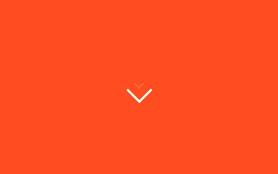
<main class="stage">
  <span class="bd-wrap" aria-hidden="true">
    <span class="bd-chevron"></span>
    <span class="bd-trail"></span>
  </span>
</main>
@use "../../../../site/static/demo-tokens" as *;
// ── 변수 3개 ──────────────────────────────────────────
$duration: 1.4s;
$easing: $ease-pop;
$color: $subject-cream;
@include stage($stage-orange);
.bd-wrap {
position: relative;
display: inline-block;
width: 28px;
height: 40px;
}
.bd-chevron {
position: absolute;
top: 8px;
left: 0;
display: block;
width: 28px;
height: 28px;
border-bottom: 4px solid $color;
border-right: 4px solid $color;
transform: rotate(45deg) translateY(0);
}
// 자동 재생: 아래를 가리키는 화살표가 42%에서 오버슛했다 50%에서 정착하며 튄다(고무줄 신장). translateY 만 움직인다
@keyframes bd-bounce {
0%, 100% { transform: rotate(45deg) translateY(0); }
42% { transform: rotate(45deg) translateY(15px); }
50% { transform: rotate(45deg) translateY(12px); }
}
.bd-chevron { animation: bd-bounce $duration $easing infinite; }
// 트레일 파티클 — 화살표 위로 작은 잔상이 살짝 늦게 따라 내려온다
.bd-trail {
position: absolute;
top: 4px;
left: 7px;
display: block;
width: 14px;
height: 14px;
border-bottom: 3px solid $color;
border-right: 3px solid $color;
opacity: 0;
}
@keyframes bd-trail {
0%, 100% { opacity: 0; transform: rotate(45deg) translateY(-4px) scale(.6); }
50% { opacity: .3; transform: rotate(45deg) translateY(6px) scale(.8); }
}
.bd-trail { animation: bd-trail $duration $easing 90ms infinite; }
@media (prefers-reduced-motion: reduce) {
.bd-chevron { animation: none !important; transform: rotate(45deg) translateY(0) !important; }
.bd-trail { animation: none !important; opacity: 0 !important; }
}html, body {
margin: 0;
overflow: hidden;
}
.stage {
box-sizing: border-box;
min-height: 100vh;
display: grid;
place-items: center;
margin: 0;
background: #ff4d1f;
font-family: -apple-system, "Segoe UI", "Noto Sans KR", sans-serif;
padding: clamp(8px, 4vw, 24px);
}
.bd-wrap {
position: relative;
display: inline-block;
width: 28px;
height: 40px;
}
.bd-chevron {
position: absolute;
top: 8px;
left: 0;
display: block;
width: 28px;
height: 28px;
border-bottom: 4px solid #fff7e6;
border-right: 4px solid #fff7e6;
transform: rotate(45deg) translateY(0);
}
@keyframes bd-bounce {
0%, 100% {
transform: rotate(45deg) translateY(0);
}
42% {
transform: rotate(45deg) translateY(15px);
}
50% {
transform: rotate(45deg) translateY(12px);
}
}
.bd-chevron {
animation: bd-bounce 1.4s cubic-bezier(0.2, 1.4, 0.4, 1) infinite;
}
.bd-trail {
position: absolute;
top: 4px;
left: 7px;
display: block;
width: 14px;
height: 14px;
border-bottom: 3px solid #fff7e6;
border-right: 3px solid #fff7e6;
opacity: 0;
}
@keyframes bd-trail {
0%, 100% {
opacity: 0;
transform: rotate(45deg) translateY(-4px) scale(0.6);
}
50% {
opacity: 0.3;
transform: rotate(45deg) translateY(6px) scale(0.8);
}
}
.bd-trail {
animation: bd-trail 1.4s cubic-bezier(0.2, 1.4, 0.4, 1) 90ms infinite;
}
@media (prefers-reduced-motion: reduce) {
.bd-chevron {
animation: none !important;
transform: rotate(45deg) translateY(0) !important;
}
.bd-trail {
animation: none !important;
opacity: 0 !important;
}
}import { CSSProperties } from "react";
import styles from "./BounceDownward.module.scss";
export interface BounceDownwardProps {
duration?: string;
easing?: string;
color?: string;
}
export default function BounceDownward({
duration = "1.4s",
easing = "cubic-bezier(.2, 1.4, .4, 1)",
color = "#fff7e6",
}: BounceDownwardProps) {
const style = { "--duration": duration, "--easing": easing, "--color": color } as CSSProperties;
return (
<span className={styles.wrap} style={style} aria-hidden="true">
<span className={styles.chevron} />
<span className={styles.trail} />
</span>
);
}03 下に跳ねる — 計測 累積面積 0.637% · 動いたフレーム 22/23GODRICH オリジナル · SCSS と React は zip に同梱 · 矢印 CSS アニメーション9選【コピペOK】
このデモが属する記事
 矢印 CSS アニメーション9選【コピペOK】リンクの矢印にマウスを乗せた瞬間にすっと伸びたり、ボタンの矢印が絶えずゆっくり跳ねたりする動きを見たことはありませんか。この記事はそうした矢印 css アニメーションを、一行でコピペOKなコード9個にまとめたものです。 この記事のデモをすべて見る