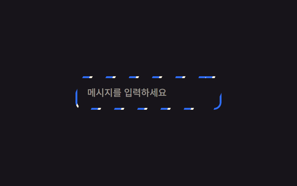
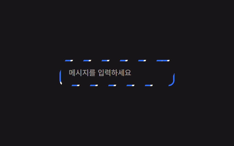
01斜めハイライトスイープ枠
枠の形だけに切り抜いた薄いリングに斜めの縞グラデーションを敷き、background-position を流し続けることで枠全体が一斉に光って流れているように見える。
使いどころAI生成中の入力欄の枠、プレミアムカードの枠
mask-compositebackground-position2초
<main class="stage">
  <div class="frame is-demo">
    <input class="frame__input" type="text" placeholder="メッセージを入力" readonly>
  </div>
</main>
@use "../../../../site/static/demo-tokens" as *;
$duration: $dur-loop; // 줄무늬가 한 바퀴 흐르는 시간
$easing: linear; // 흐름은 일정 속도로
$color: $subject-blue; // 줄무늬 색
@include stage($stage-ink);
.stage { padding: clamp(6px, 2.4vw, 16px); }
.frame {
position: relative;
width: min(230px, 74vw);
border-radius: $r-control;
padding: 3px;
isolation: isolate;
}
// 테두리 자리에만 보이게 잘라낸 링 위에 대각선 줄무늬를 흘려보낸다
.frame::before {
content: "";
position: absolute;
inset: 0;
border-radius: $r-control;
padding: 3px;
background: repeating-linear-gradient(115deg, $color 0 10px, $subject-cream 10px 14px, transparent 14px 34px);
-webkit-mask: linear-gradient(#000 0 0) content-box, linear-gradient(#000 0 0);
-webkit-mask-composite: xor; // 옛 사파리
mask-composite: exclude; // 표준 (mask 무접두사 지원표: blog-topic 편브리프)
}
.frame.is-demo::before,
.frame:focus-within::before { animation: sweep $duration $easing infinite; }
.frame__input {
position: relative;
display: block;
box-sizing: border-box;
width: 100%;
border: 0;
border-radius: $r-control - 3px;
padding: 14px 16px;
font-weight: 500; font-size: clamp(13px, 3.6vw, 15px); line-height: 1.3; font-family: inherit;
color: $subject-cream;
background: $stage-ink;
}
.frame__input::placeholder { color: rgba($subject-cream, .55); }
@keyframes sweep { to { background-position: 220px 0; } }
@media (prefers-reduced-motion: reduce) {
.frame.is-demo::before, .frame:focus-within::before { animation: none; }
}html, body {
margin: 0;
overflow: hidden;
}
.stage {
box-sizing: border-box;
min-height: 100vh;
display: grid;
place-items: center;
margin: 0;
background: #17141a;
font-family: -apple-system, "Segoe UI", "Noto Sans KR", sans-serif;
padding: clamp(8px, 4vw, 24px);
}
.stage {
padding: clamp(6px, 2.4vw, 16px);
}
.frame {
position: relative;
width: min(230px, 74vw);
border-radius: 12px;
padding: 3px;
isolation: isolate;
}
.frame::before {
content: "";
position: absolute;
inset: 0;
border-radius: 12px;
padding: 3px;
background: repeating-linear-gradient(115deg, #2f6df6 0 10px, #fff7e6 10px 14px, transparent 14px 34px);
-webkit-mask: linear-gradient(#000 0 0) content-box, linear-gradient(#000 0 0);
-webkit-mask-composite: xor;
mask-composite: exclude;
}
.frame.is-demo::before,
.frame:focus-within::before {
animation: sweep 2s linear infinite;
}
.frame__input {
position: relative;
display: block;
box-sizing: border-box;
width: 100%;
border: 0;
border-radius: 9px;
padding: 14px 16px;
font-weight: 500;
font-size: clamp(13px, 3.6vw, 15px);
line-height: 1.3;
font-family: inherit;
color: #fff7e6;
background: #17141a;
}
.frame__input::placeholder {
color: rgba(255, 247, 230, 0.55);
}
@keyframes sweep {
to {
background-position: 220px 0;
}
}
@media (prefers-reduced-motion: reduce) {
.frame.is-demo::before, .frame:focus-within::before {
animation: none;
}
}import type { CSSProperties } from "react";
import styles from "./SweepBorderInput.module.scss";
export type SweepBorderInputProps = {
placeholder: string;
/** 줄무늬가 한 바퀴 흐르는 시간 (기본 2000ms) */
duration?: number;
easing?: string;
/** 줄무늬 색 */
color?: string;
};
type Vars = CSSProperties & { "--duration"?: string; "--easing"?: string; "--color"?: string };
export default function SweepBorderInput({
placeholder,
duration = 2000,
easing = "linear",
color = "#2f6df6",
}: SweepBorderInputProps) {
const vars: Vars = { "--duration": `${duration}ms`, "--easing": easing, "--color": color };
return (
<div className={styles.frame} style={vars}>
<input className={styles.input} type="text" placeholder={placeholder} readOnly />
</div>
);
}01 斜めハイライトスイープ枠 — 計測 累積面積 1.167% · 動いたフレーム 23/23GODRICH オリジナル · SCSS と React は zip に同梱 · 【一行でコピペOK】CSS 枠線 アニメーション 9選
このデモが属する記事
 【一行でコピペOK】CSS 枠線 アニメーション 9選css 枠線 アニメーションは、カードや入力欄の外側の線だけを動かして「今なにが起きているか」を伝える技法です。今回は9種類を選び、光の縞を流すもの、SVGで線を描くもの、色相だけを回すものまで、マスク・SVG・アウトライン・@proper この記事のデモをすべて見る