04ベルが揺れる
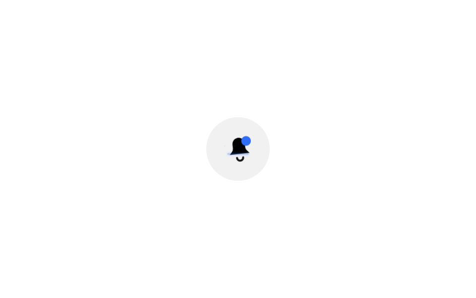
ベルアイコンが上端を軸に左右に揺れ、上のバッジの点も一緒に膨らんだり縮んだりする。
使いどころヘッダーの新着通知アイコンボタン
transform-box: fill-box진폭 8deg배지 pulse
<main class="stage">
  <button class="iconbtn is-demo" type="button" aria-label="通知3件">
    <svg viewBox="0 0 24 24" width="30" height="30" aria-hidden="true">
      <g class="bell">
        <path d="M12 3a5 5 0 0 0-5 5v3.2c0 1-.4 2-1.1 2.7L4 16h16l-1.9-2.1c-.7-.7-1.1-1.7-1.1-2.7V8a5 5 0 0 0-5-5z"/>
        <path class="bell__clap" d="M9.5 19a2.5 2.5 0 0 0 5 0" fill="none" stroke="currentColor" stroke-width="1.6" stroke-linecap="round"/>
      </g>
      <circle class="badge-dot" cx="18.5" cy="5.5" r="3"/>
      <g class="ring">
        <path class="ring__orbit" pathLength="100" fill="none" d="M4 16h16"/>
        <circle class="ring__spark" r=".9" cx="4" cy="16"/>
        <circle class="ring__bit" r=".4" cx="4" cy="16" style="--dx:0px;--dy:-2.2px"/>
        <circle class="ring__bit" r=".35" cx="4" cy="16" style="--dx:2px;--dy:0px"/>
        <circle class="ring__bit" r=".35" cx="4" cy="16" style="--dx:-2px;--dy:0px"/>
      </g>
    </svg>
  </button>
</main>
@use "../../../../site/static/demo-tokens" as *;
// ── 변수 3개 ──────────────────────────────
$duration: $dur-base; // 300ms — 흔들리는 시간
$easing: $ease-out;
$color: $subject-blue;
// ── 데모 무대 ───────────────────────────────
@include stage($stage-paper);
.iconbtn {
border: 0; border-radius: $r-pill; cursor: pointer;
width: clamp(52px, 14vw, 64px); height: clamp(52px, 14vw, 64px);
display: grid; place-items: center;
background: rgba(23, 20, 26, .06); color: $subject-ink;
-webkit-tap-highlight-color: transparent;
}
.iconbtn:focus-visible { outline: 2px solid $subject-ink; outline-offset: 3px; }
// transform-box: fill-box 가 없으면 회전축이 SVG 뷰포트(0,0)~(24,24) 기준이라
// 종 모양이 왼쪽 위로 쏠려 돈다. fill-box 로 종 자신의 경계 상자를 축으로 쓴다
.bell {
transform-box: fill-box;
transform-origin: 50% 0%; // 종의 꼭지점(위쪽 중앙)
}
.badge-dot {
fill: $color;
transform-box: fill-box;
transform-origin: 50% 50%;
}
// ── 데모 루프: 새 알림처럼 주기적으로 흔들리고 배지가 맥동한다 ──────
.iconbtn.is-demo .bell { animation: shake $dur-loop $easing infinite; }
.iconbtn.is-demo .badge-dot { animation: pulse $dur-loop $easing infinite; }
@keyframes shake {
0%, 30%, 100% { transform: rotate(0); }
4% { transform: rotate(8deg); }
8% { transform: rotate(-8deg); }
12% { transform: rotate(6deg); }
16% { transform: rotate(-6deg); }
20% { transform: rotate(3deg); }
24% { transform: rotate(-3deg); }
}
@keyframes pulse {
0%, 30%, 100% { transform: scale(1); }
10% { transform: scale(1.3); }
20% { transform: scale(1.1); }
}
// ── 한 겹: 종 밑단을 내닫는 스파크 + 미광 잔상 ──────────────────────
// 종이 부딪힐 때마다 받침 라인을 따라 에너지가 좌우로 흐른다 — JS 가 종의 실제
// 회전각을 읽어 스파크를 옮긴다. 잔상(orbit)은 JS 가 흔들림 구간에만 인라인으로 켠다.
.ring { pointer-events: none; }
.ring__orbit {
stroke: $color; stroke-width: 1.2; stroke-linecap: round;
stroke-dasharray: 100; // pathLength="100"
opacity: 0;
transition: opacity 240ms $easing; // JS 토글이 부드럽게
filter: drop-shadow(0 0 1px $color); // 미광
}
.ring__spark {
fill: $color;
opacity: 0;
transform: scale(1.5); transform-origin: center; transform-box: fill-box;
filter: drop-shadow(0 0 1px $color);
}
.ring__bit {
fill: $color;
opacity: 0;
animation: bit-fly 420ms $ease-out forwards;
}
@keyframes bit-fly {
0% { opacity: .9; transform: translate(0, 0) scale(1); }
100% { opacity: 0; transform: translate(var(--dx), var(--dy)) scale(.3); }
}
@media (prefers-reduced-motion: reduce) {
.iconbtn.is-demo .bell, .iconbtn.is-demo .badge-dot { animation: none; }
.ring { display: none; }
}html, body {
margin: 0;
overflow: hidden;
}
.stage {
box-sizing: border-box;
min-height: 100vh;
display: grid;
place-items: center;
margin: 0;
background: #ffffff;
font-family: -apple-system, "Segoe UI", "Noto Sans KR", sans-serif;
padding: clamp(8px, 4vw, 24px);
}
.iconbtn {
border: 0;
border-radius: 999px;
cursor: pointer;
width: clamp(52px, 14vw, 64px);
height: clamp(52px, 14vw, 64px);
display: grid;
place-items: center;
background: rgba(23, 20, 26, 0.06);
color: #17141a;
-webkit-tap-highlight-color: transparent;
}
.iconbtn:focus-visible {
outline: 2px solid #17141a;
outline-offset: 3px;
}
.bell {
transform-box: fill-box;
transform-origin: 50% 0%;
}
.badge-dot {
fill: #2f6df6;
transform-box: fill-box;
transform-origin: 50% 50%;
}
.iconbtn.is-demo .bell {
animation: shake 2s ease-out infinite;
}
.iconbtn.is-demo .badge-dot {
animation: pulse 2s ease-out infinite;
}
@keyframes shake {
0%, 30%, 100% {
transform: rotate(0);
}
4% {
transform: rotate(8deg);
}
8% {
transform: rotate(-8deg);
}
12% {
transform: rotate(6deg);
}
16% {
transform: rotate(-6deg);
}
20% {
transform: rotate(3deg);
}
24% {
transform: rotate(-3deg);
}
}
@keyframes pulse {
0%, 30%, 100% {
transform: scale(1);
}
10% {
transform: scale(1.3);
}
20% {
transform: scale(1.1);
}
}
.ring {
pointer-events: none;
}
.ring__orbit {
stroke: #2f6df6;
stroke-width: 1.2;
stroke-linecap: round;
stroke-dasharray: 100;
opacity: 0;
transition: opacity 240ms ease-out;
filter: drop-shadow(0 0 1px #2f6df6);
}
.ring__spark {
fill: #2f6df6;
opacity: 0;
transform: scale(1.5);
transform-origin: center;
transform-box: fill-box;
filter: drop-shadow(0 0 1px #2f6df6);
}
.ring__bit {
fill: #2f6df6;
opacity: 0;
animation: bit-fly 420ms ease-out forwards;
}
@keyframes bit-fly {
0% {
opacity: 0.9;
transform: translate(0, 0) scale(1);
}
100% {
opacity: 0;
transform: translate(var(--dx), var(--dy)) scale(0.3);
}
}
@media (prefers-reduced-motion: reduce) {
.iconbtn.is-demo .bell, .iconbtn.is-demo .badge-dot {
animation: none;
}
.ring {
display: none;
}
}// 벨 흔들림 한 겹 — 종이 흔들리는 동안 밑단(받침 라인)을 따라 스파크가 좌우로 내닫는다.
// 01 과 같은 원리(getPointAtLength 좌표 계산)지만 타이밍은 하드코딩하지 않는다:
// 종의 실제 회전각(getComputedStyle transform 행렬)을 매 프레임 읽어
// 회전각 ±8° 를 받침 라인 0..1 진행도로 사상한다 — CSS 애니메이션과 물리적으로 동기.
(function () {
var btn = document.querySelector('.iconbtn');
if (!btn) return;
var bell = btn.querySelector('.bell');
var orbit = btn.querySelector('.ring__orbit');
var spark = btn.querySelector('.ring__spark');
var bits = [].slice.call(btn.querySelectorAll('.ring__bit'));
var reduce = window.matchMedia('(prefers-reduced-motion: reduce)').matches;
if (reduce || !bell || !orbit || !spark || !orbit.getTotalLength) return;
var L = orbit.getTotalLength();
var prevA = null, prevP = null, lastEmit = 0, emitIdx = 0;
function angle() { // 종의 현재 회전각(도) — transform 이 none 이면 0
var tr = getComputedStyle(bell).transform;
if (!tr || tr === 'none') return 0;
var m = tr.match(/matrix\(([^)]+)\)/);
if (!m) return 0;
var v = m[1].split(',').map(parseFloat);
return Math.atan2(v[1], v[0]) * 180 / Math.PI;
}
function frame(t) {
var a = angle();
if (prevA !== null) {
if (Math.abs(a - prevA) > .05) { // 종이 움직이는 동안만
orbit.style.opacity = '.4'; // 잔상 켬 (transition 이 부드럽게)
var u = Math.max(0, Math.min(1, .5 + a / 16)); // ±8° → 0..1
var p = orbit.getPointAtLength(u * L);
spark.setAttribute('cx', p.x);
spark.setAttribute('cy', p.y);
spark.style.opacity = 1;
if (prevP && (Math.abs(p.x - prevP.x) + Math.abs(p.y - prevP.y)) > .01 && t - lastEmit > 55) {
lastEmit = t;
var ang = Math.atan2(p.y - prevP.y, p.x - prevP.x) + Math.PI; // 진행 반대 = 잔상 쪽
var sp = .35 + Math.random() * .45;
var b = bits[emitIdx++ % bits.length];
b.setAttribute('cx', p.x);
b.setAttribute('cy', p.y);
b.style.setProperty('--dx', (Math.cos(ang) * sp * 5).toFixed(2) + 'px');
b.style.setProperty('--dy', (Math.sin(ang) * sp * 5).toFixed(2) + 'px');
b.style.animation = 'none';
void b.getBoundingClientRect();
b.style.animation = '';
b.style.animationName = 'bit-fly';
}
prevP = p;
} else { // 멈춤 — 스파크·잔상 끔
spark.style.opacity = 0;
orbit.style.opacity = '';
prevP = null;
}
}
prevA = a;
requestAnimationFrame(frame);
}
requestAnimationFrame(frame);
})();import { useEffect, useRef } from "react";
import type { CSSProperties } from "react";
import styles from "./BellShake.module.scss";
export type BellShakeProps = {
count?: number;
/** 흔들리는 시간, ms */
duration?: number;
easing?: string;
color?: string;
onClick?: () => void;
};
type Vars = CSSProperties & { "--duration"?: string; "--easing"?: string; "--color"?: string };
type Box<T> = { current: T };
const BIT_DIRS: Array<[number, number]> = [
[0, -2.2],
[2, 0],
[-2, 0],
];
export default function BellShake({
count = 3,
duration = 300,
easing = "ease-out",
color = "#2f6df6",
onClick,
}: BellShakeProps) {
const orbitRef = useRef<SVGPathElement>(null);
const sparkRef = useRef<SVGCircleElement>(null);
const bitRefs = useRef<Array<SVGCircleElement | null>>([]) as unknown as Box<Array<SVGCircleElement | null>>;
const bellRef = useRef<SVGGElement>(null);
// 한 겹: 종 밑단을 내닫는 스파크 — 종의 실제 회전각(getComputedStyle transform 행렬)을
// 매 프레임 읽어 ±8° 를 받침 라인 0..1 진행도로 사상한다 (vanilla 데모와 동일 계산).
// CSS 애니메이션과 물리적으로 동기라 트리거 방식(data-shaking·데모 루프)과 무관하다.
useEffect(() => {
const bell = bellRef.current, orbit = orbitRef.current, spark = sparkRef.current;
if (!bell || !orbit || !spark || !orbit.getTotalLength) return;
if (window.matchMedia("(prefers-reduced-motion: reduce)").matches) return;
const L = orbit.getTotalLength();
const bits = bitRefs.current.filter(Boolean) as SVGCircleElement[];
let prevA: number | null = null, prevP: DOMPoint | null = null, lastEmit = 0, emitIdx = 0, raf = 0;
const angle = () => { // 종의 현재 회전각(도) — transform 이 none 이면 0
const tr = getComputedStyle(bell).transform;
if (!tr || tr === "none") return 0;
const m = tr.match(/matrix\(([^)]+)\)/);
if (!m) return 0;
const v = m[1].split(",").map(parseFloat);
return Math.atan2(v[1], v[0]) * 180 / Math.PI;
};
const frame = (t: number) => {
const a = angle();
if (prevA !== null) {
if (Math.abs(a - prevA) > 0.05) { // 종이 움직이는 동안만
orbit.style.opacity = "0.4"; // 잔상 켬 (transition 이 부드럽게)
const u = Math.max(0, Math.min(1, 0.5 + a / 16)); // ±8° → 0..1
const p = orbit.getPointAtLength(u * L);
spark.setAttribute("cx", String(p.x));
spark.setAttribute("cy", String(p.y));
spark.style.opacity = "1";
if (prevP && Math.abs(p.x - prevP.x) + Math.abs(p.y - prevP.y) > 0.01 && t - lastEmit > 55 && bits.length) {
lastEmit = t;
const ang = Math.atan2(p.y - prevP.y, p.x - prevP.x) + Math.PI; // 진행 반대 = 잔상 쪽
const sp = 0.35 + Math.random() * 0.45;
const b = bits[emitIdx++ % bits.length];
b.setAttribute("cx", String(p.x));
b.setAttribute("cy", String(p.y));
b.style.setProperty("--dx", (Math.cos(ang) * sp * 5).toFixed(2) + "px");
b.style.setProperty("--dy", (Math.sin(ang) * sp * 5).toFixed(2) + "px");
b.style.animation = "none";
void b.getBoundingClientRect();
b.style.animation = "";
}
prevP = p;
} else { // 멈춤 — 스파크·잔상 끔
spark.style.opacity = "0";
orbit.style.opacity = "";
prevP = null;
}
}
prevA = a;
raf = requestAnimationFrame(frame);
};
raf = requestAnimationFrame(frame);
return () => cancelAnimationFrame(raf);
}, []);
const vars: Vars = { "--duration": `${duration}ms`, "--easing": easing, "--color": color };
return (
<button type="button" className={styles.iconbtn} style={vars} aria-label={`알림 ${count}개`} onClick={onClick}>
<svg viewBox="0 0 24 24" width="30" height="30" aria-hidden="true">
<g ref={bellRef} className={styles.bell}>
<path d="M12 3a5 5 0 0 0-5 5v3.2c0 1-.4 2-1.1 2.7L4 16h16l-1.9-2.1c-.7-.7-1.1-1.7-1.1-2.7V8a5 5 0 0 0-5-5z" />
<path className={styles.bell__clap} d="M9.5 19a2.5 2.5 0 0 0 5 0" fill="none" stroke="currentColor" strokeWidth={1.6} strokeLinecap="round" />
</g>
{count > 0 && <circle className={styles["badge-dot"]} cx="18.5" cy="5.5" r="3" />}
<g className={styles.ring}>
<path ref={orbitRef} className={styles["ring__orbit"]} pathLength={100} fill="none" d="M4 16h16" />
<circle ref={sparkRef} className={styles["ring__spark"]} r="0.9" cx="4" cy="16" />
{BIT_DIRS.map(([dx, dy], i) => (
<circle
key={i}
ref={(el: SVGCircleElement | null) => { bitRefs.current[i] = el; }}
className={styles["ring__bit"]}
r={i === 0 ? "0.4" : "0.35"}
cx="4"
cy="16"
style={{ "--dx": `${dx}px`, "--dy": `${dy}px` } as CSSProperties}
/>
))}
</g>
</svg>
</button>
);
}04 ベルが揺れる — 計測 累積面積 0.233% · 動いたフレーム 7/23GODRICH オリジナル · SCSS と React は zip に同梱 · CSS アイコン アニメーション 9選 — 一行でコピペOK
このデモが属する記事
 CSS アイコン アニメーション 9選 — 一行でコピペOKcss アイコン アニメーションとは、再生ボタンや通知ベル、更新マークのような定番のインターフェースアイコンを、文字ではなく座標を持つSVGのpathとして描き、状態が変わるたびに動かす手法を指します。書体に頼らないぶん、フォントが変わって この記事のデモをすべて見る