04マルチカラム・ウォーターフォール
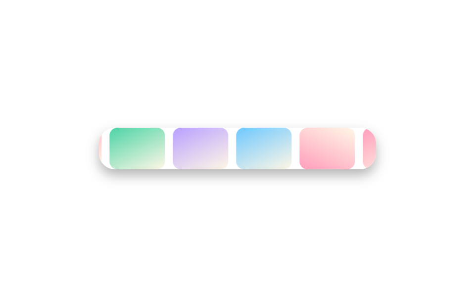
写真5枚に columns: 2 を指定するだけで、JavaScriptなしでも高さがバラバラな写真がカラムに沿って隙間なく積み重なるウォーターフォールになり、break-inside: avoid で写真がカラムの境目で真っ二つに切れるのを防ぎます。
使いどころPinterest風のムードボード、縦長写真が混ざる旅行アルバム
columns:2break-inside:avoidcolumn-gap

<main class="stage">
  <ul class="gallery is-demo" aria-label="写真ギャラリー">
    <li class="tile tile--a" tabindex="0"></li>
    <li class="tile tile--b" tabindex="0"></li>
    <li class="tile tile--c" tabindex="0"></li>
    <li class="tile tile--d" tabindex="0"></li>
    <li class="tile tile--e" tabindex="0"></li>
  </ul>
</main>
@use "../../../../site/static/demo-tokens" as *;
$duration: $dur-quick; // 타일이 나타나는 시간
$easing: $ease-out;
$color: $subject-blue; // 타일 그러데이션
@include stage($stage-paper);
.stage { padding: clamp(8px, 2.4vw, 16px); }
.gallery {
columns: 2;
column-gap: $sp-2;
list-style: none;
margin: 0;
padding: 0;
width: 176px;
max-width: 100%;
}
.tile {
break-inside: avoid;
margin: 0 0 $sp-2;
border-radius: $r-sm;
outline: none;
cursor: pointer;
box-shadow: $shadow-press;
opacity: 1;
transform: translateY(0);
transition: transform $duration $easing, box-shadow $duration $easing;
}
.tile--a { height: 40px; background: linear-gradient(150deg, $color 0%, $stage-ink 100%); }
.tile--b { height: 52px; background: linear-gradient(210deg, $subject-cream 0%, $color 100%); }
.tile--c { height: 34px; background: linear-gradient(60deg, $stage-ink 0%, $color 100%); }
.tile--d { height: 46px; background: linear-gradient(160deg, $color 0%, $subject-cream 100%); }
.tile--e { height: 38px; background: linear-gradient(320deg, $subject-cream 0%, $stage-ink 100%); }
.tile:hover, .tile:focus-visible, .tile:active {
transform: translateY(-3px);
box-shadow: $shadow-raised;
}
.gallery.is-demo .tile { animation: rise-loop $dur-loop $easing infinite; }
.gallery.is-demo .tile--b { animation-delay: -0.4s; }
.gallery.is-demo .tile--c { animation-delay: -0.8s; }
.gallery.is-demo .tile--d { animation-delay: -1.2s; }
.gallery.is-demo .tile--e { animation-delay: -1.6s; }
@keyframes rise-loop {
0%, 8% { transform: translateY(0); box-shadow: $shadow-press; }
24%, 40% { transform: translateY(-3px); box-shadow: $shadow-raised; }
56%, 100% { transform: translateY(0); box-shadow: $shadow-press; }
}
@media (hover: none) {
.tile:active { transform: translateY(-3px); box-shadow: $shadow-raised; }
}
@media (prefers-reduced-motion: reduce) {
.tile { transition: none; }
.gallery.is-demo .tile { animation: none; }
}html, body {
margin: 0;
overflow: hidden;
}
.stage {
box-sizing: border-box;
min-height: 100vh;
display: grid;
place-items: center;
margin: 0;
background: #ffffff;
font-family: -apple-system, "Segoe UI", "Noto Sans KR", sans-serif;
padding: clamp(8px, 4vw, 24px);
}
.stage {
padding: clamp(8px, 2.4vw, 16px);
}
.gallery {
columns: 2;
column-gap: 8px;
list-style: none;
margin: 0;
padding: 0;
width: 176px;
max-width: 100%;
}
.tile {
break-inside: avoid;
margin: 0 0 8px;
border-radius: 8px;
outline: none;
cursor: pointer;
box-shadow: 0 6px 12px rgba(23, 20, 26, 0.32);
opacity: 1;
transform: translateY(0);
transition: transform 220ms ease-out, box-shadow 220ms ease-out;
}
.tile--a {
height: 40px;
background: linear-gradient(150deg, #2f6df6 0%, #17141a 100%);
}
.tile--b {
height: 52px;
background: linear-gradient(210deg, #fff7e6 0%, #2f6df6 100%);
}
.tile--c {
height: 34px;
background: linear-gradient(60deg, #17141a 0%, #2f6df6 100%);
}
.tile--d {
height: 46px;
background: linear-gradient(160deg, #2f6df6 0%, #fff7e6 100%);
}
.tile--e {
height: 38px;
background: linear-gradient(320deg, #fff7e6 0%, #17141a 100%);
}
.tile:hover, .tile:focus-visible, .tile:active {
transform: translateY(-3px);
box-shadow: 0 14px 24px rgba(23, 20, 26, 0.32);
}
.gallery.is-demo .tile {
animation: rise-loop 2s ease-out infinite;
}
.gallery.is-demo .tile--b {
animation-delay: -0.4s;
}
.gallery.is-demo .tile--c {
animation-delay: -0.8s;
}
.gallery.is-demo .tile--d {
animation-delay: -1.2s;
}
.gallery.is-demo .tile--e {
animation-delay: -1.6s;
}
@keyframes rise-loop {
0%, 8% {
transform: translateY(0);
box-shadow: 0 6px 12px rgba(23, 20, 26, 0.32);
}
24%, 40% {
transform: translateY(-3px);
box-shadow: 0 14px 24px rgba(23, 20, 26, 0.32);
}
56%, 100% {
transform: translateY(0);
box-shadow: 0 6px 12px rgba(23, 20, 26, 0.32);
}
}
@media (hover: none) {
.tile:active {
transform: translateY(-3px);
box-shadow: 0 14px 24px rgba(23, 20, 26, 0.32);
}
}
@media (prefers-reduced-motion: reduce) {
.tile {
transition: none;
}
.gallery.is-demo .tile {
animation: none;
}
}import type { CSSProperties } from "react";
import styles from "./MasonryColumnsGallery.module.scss";
export type MasonryColumnsGalleryProps = {
/** 타일 높이(px) 배열 — 사진마다 다른 높이 */
heights?: number[];
/** 타일이 나타나는 시간 (기본 220ms) */
duration?: number;
easing?: string;
color?: string;
};
type Vars = CSSProperties & { "--duration"?: string; "--easing"?: string; "--color"?: string };
/** columns: 2 만으로 자바스크립트 없이 워터폴을 만든다. break-inside: avoid 로 사진이 반으로 잘리지 않는다 */
export default function MasonryColumnsGallery({
heights = [40, 52, 34, 46, 38],
duration = 220,
easing = "ease-out",
color = "#2f6df6",
}: MasonryColumnsGalleryProps) {
const vars: Vars = { "--duration": `${duration}ms`, "--easing": easing, "--color": color };
return (
<ul className={styles.gallery} style={vars} aria-label="Photo gallery">
{heights.map((h, i) => (
<li key={i} className={styles.tile} style={{ height: h }} tabIndex={0} />
))}
</ul>
);
}04 マルチカラム・ウォーターフォール — 計測 累積面積 3.547% · 動いたフレーム 23/23GODRICH オリジナル · SCSS と React は zip に同梱 · CSS フォト ギャラリー 9選 — メイソンリーからライトボックスまで
このデモが属する記事
 CSS フォト ギャラリー 9選 — メイソンリーからライトボックスまでCSS フォト ギャラリーは、複数の写真をグリッドやウォーターフォール状に並べ、ホバーやクリックに反応させるレイアウト技法です。Pinterestで保存したあのギャラリーのように見えても、実際にコードに落とすとグリッドの数式や画像のクロップ この記事のデモをすべて見る