07チケット破り確認
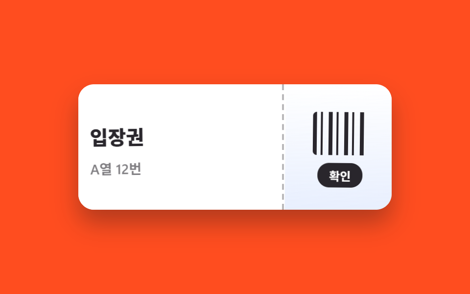
確認の瞬間、チケットの点線のミシン目が光り、左右の半分が逆方向へ傾いて開き、破れた二枚として画面から抜ける。
使いどころ注文確認・チェックイン完了、クーポン使用
rotate 분리opacity 퇴장점선 마디
<main class="stage">
  <section class="tear is-demo" aria-label="確認の瞬間チケットが左右に破れて2枚になる">
    <input class="tear__check" type="checkbox" id="tear-ok">
    <div class="tear__ticket">
      <div class="tear__half tear__half--l">
        <p class="tear__title">入場券</p>
        <p class="tear__seat">A列 12番</p>
      </div>
      <div class="tear__half tear__half--r">
        <span class="tear__barcode" aria-hidden="true"></span>
        <label class="tear__btn" for="tear-ok">確認</label>
      </div>
      <span class="tear__perf" aria-hidden="true"></span>
    </div>
  </section>
</main>
@use "../../../../site/static/demo-tokens" as *;
$duration: 720ms; // 찢겨 빠지는 시간
$easing: $ease-spring;
$color: $subject-blue; // 티켓 포인트색
@include stage($stage-orange);
.tear { display: grid; place-items: center; }
.tear__check { position: absolute; opacity: 0; pointer-events: none; }
.tear__ticket {
position: relative;
display: flex;
width: min(320px, 90vw);
height: 128px;
border-radius: $r-card;
background: $stage-paper;
box-shadow: $shadow-raised;
overflow: hidden;
}
.tear__half {
box-sizing: border-box;
display: grid;
align-content: center;
gap: $sp-2;
padding: $sp-4;
background: $stage-paper;
transition: transform $duration $easing, opacity $duration $easing;
z-index: 1;
}
.tear__half--l { flex: 1 1 auto; border-right: 0; }
.tear__half--r {
flex: 0 0 112px;
justify-items: center;
background: linear-gradient(180deg, $stage-paper 0%, rgba($color, .12) 100%);
}
.tear__title {
margin: 0;
font-weight: 800;
font-size: clamp(16px, 4.6vw, 20px);
font-family: inherit;
color: $stage-ink;
}
.tear__seat {
margin: 0;
font-weight: 600;
font-size: clamp(12px, 3.4vw, 14px);
font-family: inherit;
color: rgba(23, 20, 26, .6);
}
.tear__barcode {
width: 56px; height: 44px;
border-radius: $r-xs;
background: repeating-linear-gradient(90deg,
$stage-ink 0 4px, transparent 4px 8px, $stage-ink 8px 10px, transparent 10px 16px);
}
.tear__btn {
padding: $sp-1 $sp-3;
border-radius: $r-control;
background: $stage-ink;
font-weight: 700;
font-size: 12px;
font-family: inherit;
color: $stage-paper;
cursor: pointer;
transition: transform $dur-quick $easing;
}
.tear__btn:active { transform: scale(.94); }
// 가운데 점선 미신흔 — 찢기는 순간 밝아진다
.tear__perf {
position: absolute; top: 0; bottom: 0; left: calc(100% - 112px);
width: 0;
border-left: 2px dashed rgba(23, 20, 26, .3);
z-index: 2;
transition: border-color $dur-quick $easing;
}
// 확인: 왼쪽·오른쪽 반대 방향으로 기울며 벌어져 빠진다
#tear-ok:checked ~ .tear__ticket .tear__perf { border-color: rgba(23, 20, 26, .9); }
#tear-ok:checked ~ .tear__ticket .tear__half--l {
transform: translate(-52px, 26px) rotate(-9deg);
opacity: 0;
}
#tear-ok:checked ~ .tear__ticket .tear__half--r {
transform: translate(44px, 30px) rotate(8deg);
opacity: 0;
}
// 렌더·갤러리용 자동 루프: 온전 → 미싯값 밝아짐 → 찢김 퇴장 → 재등장
.tear.is-demo .tear__half--l { animation: half-l $dur-loop $easing infinite; }
.tear.is-demo .tear__half--r { animation: half-r $dur-loop $easing infinite; }
.tear.is-demo .tear__perf { animation: perf $dur-loop $easing infinite; }
@keyframes half-l {
0%, 24% { transform: translate(0, 0) rotate(0); opacity: 1; }
56%, 84% { transform: translate(-52px, 26px) rotate(-9deg); opacity: 0; }
92%, 100% { transform: translate(0, 0) rotate(0); opacity: 1; }
}
@keyframes half-r {
0%, 24% { transform: translate(0, 0) rotate(0); opacity: 1; }
56%, 84% { transform: translate(44px, 30px) rotate(8deg); opacity: 0; }
92%, 100% { transform: translate(0, 0) rotate(0); opacity: 1; }
}
@keyframes perf {
0%, 24% { border-color: rgba(23, 20, 26, .3); }
32%, 52% { border-color: rgba(23, 20, 26, .9); }
60%, 100% { border-color: rgba(23, 20, 26, .3); }
}
@media (prefers-reduced-motion: reduce) {
.tear__half, .tear__perf, .tear__btn { transition: none; }
.tear.is-demo .tear__half,
.tear.is-demo .tear__perf { animation: none; } // 찢김 없이 즉시 사라진다
}html, body {
margin: 0;
overflow: hidden;
}
.stage {
box-sizing: border-box;
min-height: 100vh;
display: grid;
place-items: center;
margin: 0;
background: #ff4d1f;
font-family: -apple-system, "Segoe UI", "Noto Sans KR", sans-serif;
padding: clamp(8px, 4vw, 24px);
}
.tear {
display: grid;
place-items: center;
}
.tear__check {
position: absolute;
opacity: 0;
pointer-events: none;
}
.tear__ticket {
position: relative;
display: flex;
width: min(320px, 90vw);
height: 128px;
border-radius: 16px;
background: #ffffff;
box-shadow: 0 14px 24px rgba(23, 20, 26, 0.32);
overflow: hidden;
}
.tear__half {
box-sizing: border-box;
display: grid;
align-content: center;
gap: 8px;
padding: 16px;
background: #ffffff;
transition: transform 720ms cubic-bezier(0.2, 0.8, 0.2, 1), opacity 720ms cubic-bezier(0.2, 0.8, 0.2, 1);
z-index: 1;
}
.tear__half--l {
flex: 1 1 auto;
border-right: 0;
}
.tear__half--r {
flex: 0 0 112px;
justify-items: center;
background: linear-gradient(180deg, #ffffff 0%, rgba(47, 109, 246, 0.12) 100%);
}
.tear__title {
margin: 0;
font-weight: 800;
font-size: clamp(16px, 4.6vw, 20px);
font-family: inherit;
color: #17141a;
}
.tear__seat {
margin: 0;
font-weight: 600;
font-size: clamp(12px, 3.4vw, 14px);
font-family: inherit;
color: rgba(23, 20, 26, 0.6);
}
.tear__barcode {
width: 56px;
height: 44px;
border-radius: 4px;
background: repeating-linear-gradient(90deg, #17141a 0 4px, transparent 4px 8px, #17141a 8px 10px, transparent 10px 16px);
}
.tear__btn {
padding: 4px 12px;
border-radius: 12px;
background: #17141a;
font-weight: 700;
font-size: 12px;
font-family: inherit;
color: #ffffff;
cursor: pointer;
transition: transform 220ms cubic-bezier(0.2, 0.8, 0.2, 1);
}
.tear__btn:active {
transform: scale(0.94);
}
.tear__perf {
position: absolute;
top: 0;
bottom: 0;
left: calc(100% - 112px);
width: 0;
border-left: 2px dashed rgba(23, 20, 26, 0.3);
z-index: 2;
transition: border-color 220ms cubic-bezier(0.2, 0.8, 0.2, 1);
}
#tear-ok:checked ~ .tear__ticket .tear__perf {
border-color: rgba(23, 20, 26, 0.9);
}
#tear-ok:checked ~ .tear__ticket .tear__half--l {
transform: translate(-52px, 26px) rotate(-9deg);
opacity: 0;
}
#tear-ok:checked ~ .tear__ticket .tear__half--r {
transform: translate(44px, 30px) rotate(8deg);
opacity: 0;
}
.tear.is-demo .tear__half--l {
animation: half-l 2s cubic-bezier(0.2, 0.8, 0.2, 1) infinite;
}
.tear.is-demo .tear__half--r {
animation: half-r 2s cubic-bezier(0.2, 0.8, 0.2, 1) infinite;
}
.tear.is-demo .tear__perf {
animation: perf 2s cubic-bezier(0.2, 0.8, 0.2, 1) infinite;
}
@keyframes half-l {
0%, 24% {
transform: translate(0, 0) rotate(0);
opacity: 1;
}
56%, 84% {
transform: translate(-52px, 26px) rotate(-9deg);
opacity: 0;
}
92%, 100% {
transform: translate(0, 0) rotate(0);
opacity: 1;
}
}
@keyframes half-r {
0%, 24% {
transform: translate(0, 0) rotate(0);
opacity: 1;
}
56%, 84% {
transform: translate(44px, 30px) rotate(8deg);
opacity: 0;
}
92%, 100% {
transform: translate(0, 0) rotate(0);
opacity: 1;
}
}
@keyframes perf {
0%, 24% {
border-color: rgba(23, 20, 26, 0.3);
}
32%, 52% {
border-color: rgba(23, 20, 26, 0.9);
}
60%, 100% {
border-color: rgba(23, 20, 26, 0.3);
}
}
@media (prefers-reduced-motion: reduce) {
.tear__half, .tear__perf, .tear__btn {
transition: none;
}
.tear.is-demo .tear__half,
.tear.is-demo .tear__perf {
animation: none;
}
}import type { CSSProperties } from "react";
import { useState } from "react";
import styles from "./TicketTearConfirm.module.scss";
export type TicketTearConfirmProps = {
title: string;
meta: string;
confirmLabel: string;
/** 찢겨 빠지는 시간 (기본 720ms) */
duration?: number;
easing?: string;
color?: string;
};
type Vars = CSSProperties & { "--duration"?: string; "--easing"?: string; "--color"?: string };
export default function TicketTearConfirm({
title,
meta,
confirmLabel,
duration = 720,
easing = "cubic-bezier(.2,.8,.2,1)",
color = "#2f6df6",
}: TicketTearConfirmProps) {
const [torn, setTorn] = useState(false);
const vars: Vars = { "--duration": `${duration}ms`, "--easing": easing, "--color": color };
return (
<section className={styles.tear} style={vars} aria-label={title}>
<div className={styles.ticket}>
<div className={`${styles.half} ${styles.halfL} ${torn ? styles.halfLGo : ""}`}>
<p className={styles.title}>{title}</p>
<p className={styles.meta}>{meta}</p>
</div>
<div className={`${styles.half} ${styles.halfR} ${torn ? styles.halfRGo : ""}`}>
<span className={styles.barcode} aria-hidden="true" />
<button type="button" className={styles.btn} onClick={() => setTorn(true)}>{confirmLabel}</button>
</div>
<span className={`${styles.perf} ${torn ? styles.perfOn : ""}`} aria-hidden="true" />
</div>
</section>
);
}07 チケット破り確認 — 計測 累積面積 8.812% · 動いたフレーム 10/23GODRICH オリジナル · SCSS と React は zip に同梱 · CSS 画面切り替え アニメーション9選
このデモが属する記事
 CSS 画面切り替え アニメーション9選CSS 画面切り替え アニメーションとは、ページを読み込み直さずに、画像が別の画像に変わったり、注文が確定したり、フォームが次の段階へ進んだりするとき、その変化を滑らかに見せる短い動きのことです。画面が切り替わる瞬間ごとにそのまま貼れる9種 この記事のデモをすべて見る