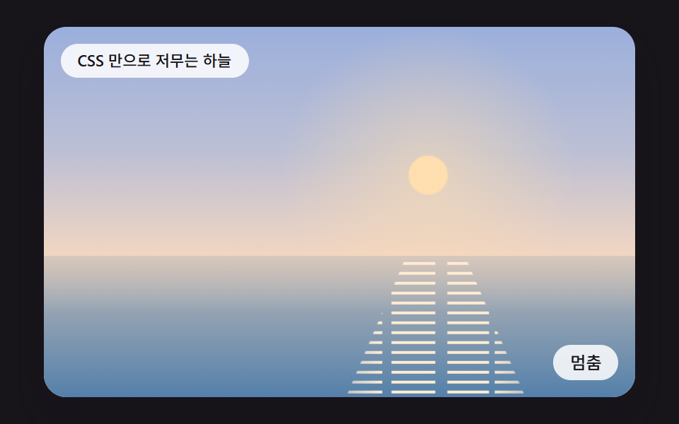
09登録プロパティで色の位置を動かす純粋なCSSの夕焼けグラデーション
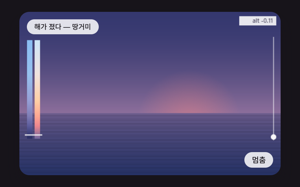
グラデーションの色と停止位置を登録プロパティで宣言し、キーフレームが値の間をつなぐので、JavaScriptなしで空がゆっくり暮れていく。
使いどころ軽い夕焼け背景
@property--sky-top--stop-a--sun-y
<main class="stage">
<div class="sc" id="scRoot">
  <input class="sc__toggle" type="checkbox" id="scPause" aria-label="一時停止">
  <div class="sc__sky"></div>
  <div class="sc__sea"><div class="sc__glint"></div></div>
  <p class="sc__status" role="status" aria-live="polite">CSS だけで暮れていく空</p>
  <label class="sc__btn" for="scPause"><span class="sc__off">一時停止</span><span class="sc__on">再生</span></label>
</div>
</main>
@use "../../../../site/static/demo-tokens" as *;
@include stage($stage-ink);
$duration: 3.2s;
$easing: ease-in-out;
$horizon: 62%;
$sun-x: 65%;
@property --sky-top {
syntax: "<color>";
inherits: true;
initial-value: #807eb6;
}
@property --sky-mid {
syntax: "<color>";
inherits: true;
initial-value: #b38fa8;
}
@property --sky-low {
syntax: "<color>";
inherits: true;
initial-value: #e6b7ab;
}
@property --stop-a {
syntax: "<percentage>";
inherits: true;
initial-value: 44%;
}
@property --stop-b {
syntax: "<percentage>";
inherits: true;
initial-value: 63%;
}
@property --sun-y {
syntax: "<percentage>";
inherits: true;
initial-value: 56.0%;
}
@property --sun {
syntax: "<color>";
inherits: true;
initial-value: #e4bca4;
}
@property --sea-top {
syntax: "<color>";
inherits: true;
initial-value: #bc8d8f;
}
@property --sea-deep {
syntax: "<color>";
inherits: true;
initial-value: #3e5c8a;
}
@property --glint-a {
syntax: "<number>";
inherits: true;
initial-value: 0.98;
}
@keyframes sunset {
0% {
--sky-top: #a1c1e3;
--sky-mid: #bacee8;
--sky-low: #f0e2de;
--stop-a: 30%;
--stop-b: 66%;
--sun-y: 32.0%;
--sun: #ffe9bf;
--sea-top: #b9c0cc;
--sea-deep: #5480aa;
--glint-a: 1;
}
30% {
--sky-top: #96a0d6;
--sky-mid: #c0b3c3;
--sky-low: #ffd0a6;
--stop-a: 38%;
--stop-b: 64%;
--sun-y: 47.0%;
--sun: #ffd4a2;
--sea-top: #c3b4a7;
--sea-deep: #5480aa;
--glint-a: 1;
}
55% {
--sky-top: #807eb6;
--sky-mid: #b38fa8;
--sky-low: #e6b7ab;
--stop-a: 44%;
--stop-b: 63%;
--sun-y: 56.0%;
--sun: #e4bca4;
--sea-top: #bc8d8f;
--sea-deep: #3e5c8a;
--glint-a: 0.98;
}
80% {
--sky-top: #5c5c9c;
--sky-mid: #966d96;
--sky-low: #df959a;
--stop-a: 48%;
--stop-b: 62%;
--sun-y: 62.0%;
--sun: #e1a99c;
--sea-top: #ac6f85;
--sea-deep: #304474;
--glint-a: 0.3;
}
100% {
--sky-top: #393c74;
--sky-mid: #5f5283;
--sky-low: #99729a;
--stop-a: 50%;
--stop-b: 62%;
--sun-y: 67.0%;
--sun: #e09a97;
--sea-top: #705b86;
--sea-deep: #243062;
--glint-a: 0;
}
}
@keyframes shimmer {
50% { transform: translate(.6em, 7px); }
to { transform: translate(0, 14px); }
}
.sc {
position: relative;
width: min(92vw, calc(160vh - 12.8vw));
aspect-ratio: 480 / 300;
font-size: calc(min(92vw, 160vh - 12.8vw) / 30);
margin: 0 auto;
border-radius: $r-card;
overflow: hidden;
box-shadow: $shadow-raised;
background: $subject-ink;
animation: sunset $duration $easing infinite alternate;
}
.sc__sky {
position: absolute;
inset: 0;
background:
radial-gradient(circle at $sun-x var(--sun-y), color-mix(in srgb, var(--sun) 55%, transparent) 0, transparent 7.5em),
radial-gradient(circle at $sun-x var(--sun-y), var(--sun) 0.94em, transparent 1.04em),
linear-gradient(180deg, var(--sky-top) 0%, var(--sky-mid) var(--stop-a), var(--sky-low) var(--stop-b));
}
.sc__sea {
position: absolute;
left: 0;
right: 0;
top: $horizon;
bottom: 0;
overflow: hidden;
background:
linear-gradient(180deg, color-mix(in srgb, var(--sky-low) 45%, transparent) 0, transparent 40%),
linear-gradient(180deg, var(--sea-top), var(--sea-deep));
}
.sc__glint {
position: absolute;
inset: -1em 0;
background:
repeating-linear-gradient(180deg, color-mix(in srgb, var(--sun) 55%, white) 0 2px, transparent 2px 7px),
repeating-linear-gradient(180deg, white 0 1px, transparent 1px 14px);
clip-path: polygon(61% 0, 69% 0, 82% 100%, 48% 100%);
mask-image:
linear-gradient(90deg, transparent 40%, #000 56%, #000 74%, transparent 90%),
repeating-linear-gradient(90deg, #000 0 6%, transparent 6% 7.5%, #000 7.5% 15%, transparent 15% 17%, #000 17% 24%, transparent 24% 25%);
mask-composite: intersect;
opacity: var(--glint-a);
animation: shimmer 1.6s linear infinite;
}
.sc__toggle {
position: absolute;
width: 1px;
height: 1px;
opacity: 0;
}
.sc__status {
position: absolute;
left: $sp-3;
top: $sp-3;
max-width: 62%;
margin: 0;
padding: $sp-1 $sp-3;
border-radius: $r-pill;
background: rgba(255, 255, 255, .85);
color: $subject-ink;
font-weight: 500;
font-size: 11px;
line-height: 1.4;
pointer-events: none;
}
.sc__btn {
position: absolute;
right: $sp-3;
bottom: $sp-3;
margin: 0;
padding: $sp-1 $sp-3;
border-radius: $r-pill;
background: rgba(255, 255, 255, .85);
color: $subject-ink;
font-weight: 500;
font-size: 12px;
line-height: 1.4;
cursor: pointer;
}
.sc__on { display: none; }
.sc__toggle:checked ~ .sc__btn .sc__on { display: inline; }
.sc__toggle:checked ~ .sc__btn .sc__off { display: none; }
.sc__toggle:focus-visible ~ .sc__btn { outline: 2px solid #ffffff; outline-offset: 2px; }
.sc:has(.sc__toggle:checked),
.sc:has(.sc__toggle:checked) .sc__glint {
animation-play-state: paused;
}
@media (max-width: 340px) {
.sc__btn { font-size: 10px; padding: $sp-1 $sp-2; }
.sc__status { font-size: 10px; max-width: 58%; }
}
@media (prefers-reduced-motion: reduce) {
.sc, .sc__glint { animation: none; }
}html, body {
margin: 0;
overflow: hidden;
}
.stage {
box-sizing: border-box;
min-height: 100vh;
display: grid;
place-items: center;
margin: 0;
background: #17141a;
font-family: -apple-system, "Segoe UI", "Noto Sans KR", sans-serif;
padding: clamp(8px, 4vw, 24px);
}
@property --sky-top {
syntax: "<color>";
inherits: true;
initial-value: #807eb6;
}
@property --sky-mid {
syntax: "<color>";
inherits: true;
initial-value: #b38fa8;
}
@property --sky-low {
syntax: "<color>";
inherits: true;
initial-value: #e6b7ab;
}
@property --stop-a {
syntax: "<percentage>";
inherits: true;
initial-value: 44%;
}
@property --stop-b {
syntax: "<percentage>";
inherits: true;
initial-value: 63%;
}
@property --sun-y {
syntax: "<percentage>";
inherits: true;
initial-value: 56%;
}
@property --sun {
syntax: "<color>";
inherits: true;
initial-value: #e4bca4;
}
@property --sea-top {
syntax: "<color>";
inherits: true;
initial-value: #bc8d8f;
}
@property --sea-deep {
syntax: "<color>";
inherits: true;
initial-value: #3e5c8a;
}
@property --glint-a {
syntax: "<number>";
inherits: true;
initial-value: 0.98;
}
@keyframes sunset {
0% {
--sky-top: #a1c1e3;
--sky-mid: #bacee8;
--sky-low: #f0e2de;
--stop-a: 30%;
--stop-b: 66%;
--sun-y: 32.0%;
--sun: #ffe9bf;
--sea-top: #b9c0cc;
--sea-deep: #5480aa;
--glint-a: 1;
}
30% {
--sky-top: #96a0d6;
--sky-mid: #c0b3c3;
--sky-low: #ffd0a6;
--stop-a: 38%;
--stop-b: 64%;
--sun-y: 47.0%;
--sun: #ffd4a2;
--sea-top: #c3b4a7;
--sea-deep: #5480aa;
--glint-a: 1;
}
55% {
--sky-top: #807eb6;
--sky-mid: #b38fa8;
--sky-low: #e6b7ab;
--stop-a: 44%;
--stop-b: 63%;
--sun-y: 56.0%;
--sun: #e4bca4;
--sea-top: #bc8d8f;
--sea-deep: #3e5c8a;
--glint-a: 0.98;
}
80% {
--sky-top: #5c5c9c;
--sky-mid: #966d96;
--sky-low: #df959a;
--stop-a: 48%;
--stop-b: 62%;
--sun-y: 62.0%;
--sun: #e1a99c;
--sea-top: #ac6f85;
--sea-deep: #304474;
--glint-a: 0.3;
}
100% {
--sky-top: #393c74;
--sky-mid: #5f5283;
--sky-low: #99729a;
--stop-a: 50%;
--stop-b: 62%;
--sun-y: 67.0%;
--sun: #e09a97;
--sea-top: #705b86;
--sea-deep: #243062;
--glint-a: 0;
}
}
@keyframes shimmer {
50% {
transform: translate(0.6em, 7px);
}
to {
transform: translate(0, 14px);
}
}
.sc {
position: relative;
width: min(92vw, 160vh - 12.8vw);
aspect-ratio: 480/300;
font-size: calc(min(92vw, 160vh - 12.8vw) / 30);
margin: 0 auto;
border-radius: 16px;
overflow: hidden;
box-shadow: 0 14px 24px rgba(23, 20, 26, 0.32);
background: #17141a;
animation: sunset 3.2s ease-in-out infinite alternate;
}
.sc__sky {
position: absolute;
inset: 0;
background: radial-gradient(circle at 65% var(--sun-y), color-mix(in srgb, var(--sun) 55%, transparent) 0, transparent 7.5em), radial-gradient(circle at 65% var(--sun-y), var(--sun) 0.94em, transparent 1.04em), linear-gradient(180deg, var(--sky-top) 0%, var(--sky-mid) var(--stop-a), var(--sky-low) var(--stop-b));
}
.sc__sea {
position: absolute;
left: 0;
right: 0;
top: 62%;
bottom: 0;
overflow: hidden;
background: linear-gradient(180deg, color-mix(in srgb, var(--sky-low) 45%, transparent) 0, transparent 40%), linear-gradient(180deg, var(--sea-top), var(--sea-deep));
}
.sc__glint {
position: absolute;
inset: -1em 0;
background: repeating-linear-gradient(180deg, color-mix(in srgb, var(--sun) 55%, white) 0 2px, transparent 2px 7px), repeating-linear-gradient(180deg, white 0 1px, transparent 1px 14px);
clip-path: polygon(61% 0, 69% 0, 82% 100%, 48% 100%);
mask-image: linear-gradient(90deg, transparent 40%, #000 56%, #000 74%, transparent 90%), repeating-linear-gradient(90deg, #000 0 6%, transparent 6% 7.5%, #000 7.5% 15%, transparent 15% 17%, #000 17% 24%, transparent 24% 25%);
mask-composite: intersect;
opacity: var(--glint-a);
animation: shimmer 1.6s linear infinite;
}
.sc__toggle {
position: absolute;
width: 1px;
height: 1px;
opacity: 0;
}
.sc__status {
position: absolute;
left: 12px;
top: 12px;
max-width: 62%;
margin: 0;
padding: 4px 12px;
border-radius: 999px;
background: rgba(255, 255, 255, 0.85);
color: #17141a;
font-weight: 500;
font-size: 11px;
line-height: 1.4;
pointer-events: none;
}
.sc__btn {
position: absolute;
right: 12px;
bottom: 12px;
margin: 0;
padding: 4px 12px;
border-radius: 999px;
background: rgba(255, 255, 255, 0.85);
color: #17141a;
font-weight: 500;
font-size: 12px;
line-height: 1.4;
cursor: pointer;
}
.sc__on {
display: none;
}
.sc__toggle:checked ~ .sc__btn .sc__on {
display: inline;
}
.sc__toggle:checked ~ .sc__btn .sc__off {
display: none;
}
.sc__toggle:focus-visible ~ .sc__btn {
outline: 2px solid #ffffff;
outline-offset: 2px;
}
.sc:has(.sc__toggle:checked),
.sc:has(.sc__toggle:checked) .sc__glint {
animation-play-state: paused;
}
@media (max-width: 340px) {
.sc__btn {
font-size: 10px;
padding: 4px 8px;
}
.sc__status {
font-size: 10px;
max-width: 58%;
}
}
@media (prefers-reduced-motion: reduce) {
.sc, .sc__glint {
animation: none;
}
}import styles from "./SsPropertyGradientStopsLoop.module.scss";
export default function SsPropertyGradientStopsLoop() {
return (
<main className={styles.stage}>
<div className={styles.sc}>
<input className={styles.sc__toggle} type="checkbox" id="scPause" aria-label="멈춤" />
<div className={styles.sc__sky} />
<div className={styles.sc__sea}><div className={styles.sc__glint} /></div>
<p className={styles.sc__status} role="status" aria-live="polite">CSS 만으로 저무는 하늘</p>
<label className={styles.sc__btn} htmlFor="scPause"><span className={styles.sc__off}>멈춤</span><span className={styles.sc__on}>재생</span></label>
</div>
</main>
);
}09 登録プロパティで色の位置を動かす純粋なCSSの夕焼けグラデーション — 計測 累積面積 73.117% · 動いたフレーム 23/23GODRICH オリジナル · SCSS と React は zip に同梱 · css sunset gradient 9パターン — 太陽が低くなると空と海もついて変わる
このデモが属する記事
 css sunset gradient 9パターン — 太陽が低くなると空と海もついて変わるcss sunset gradient を色二つを混ぜた背景だけで作ると、太陽が低くなっても空は変わらず、海に光の道はなく、雲の下側は暗いまま — 01番・04番・05番が計算で直す。太陽の高さ一つが、九つの場面すべてを描き直します。 この記事のデモをすべて見る