01@themeカスタムキーフレーム
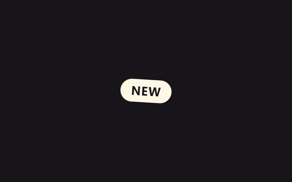
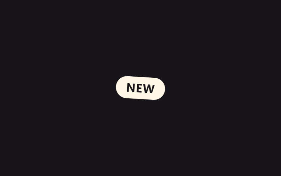
`tailwind.config.js` なしに CSS の `@theme` ブロックへ `--animate-pop-spin` 変数と `@keyframes` を一緒に書くと、その名前がそのまま `animate-pop-spin` ユーティリティクラスになり、バッジが回転しながら飛び出す。
使いどころ新着バッジの登場、通知カウントの更新
cubic-bezier 오버슈트@keyframes 동봉900ms
<main class="stage">
  <span class="badge is-demo">NEW</span>
</main>
@use "../../../../site/static/demo-tokens" as *;
// ── 변수 3개 ──────────────────────────────────────────
// Tailwind v4 의 @theme { --animate-pop-spin: pop-spin 900ms ...; } 와 같은 값을
// 여기서는 리터럴 ms 로 그대로 재현한다 (이 편의 목적은 Tailwind 유틸 값의 재현이라
// $dur-* 토큰을 쓰지 않는다 — 무대·피사체 색은 토큰 그대로 쓴다. 사실.md 참고).
$duration: 900ms; // @theme --animate-pop-spin 의 900ms
$easing: cubic-bezier(.34, 1.56, .64, 1); // 살짝 오버슈트하는 back-out 곡선
$color: $subject-cream; // 배지 색
// ── 데모 무대 ──────────────────────────────────────────
@include stage($stage-ink);
.badge {
display: inline-flex;
align-items: center;
justify-content: center;
padding: $sp-2 $sp-4;
border-radius: $r-pill;
background: $color;
color: $subject-ink;
font-weight: 700;
font-size: clamp(14px, 4vw, 18px);
line-height: 1;
font-family: inherit;
letter-spacing: .04em;
opacity: 0;
transform: scale(.5) rotate(-8deg);
}
// 데모: 등장 → 유지 → 사라짐을 2초 주기로 반복 (실사용은 .is-appear 로 한 번만)
.badge.is-demo {
animation: pop-spin-loop 2s $easing infinite;
}
@keyframes pop-spin-loop {
0% { opacity: 0; transform: scale(.5) rotate(-8deg); }
20% { opacity: 1; transform: scale(1.08) rotate(3deg); }
32% { opacity: 1; transform: scale(1) rotate(0deg); }
70% { opacity: 1; transform: scale(1) rotate(0deg); }
100% { opacity: 0; transform: scale(.5) rotate(-8deg); }
}
// 실사용: 한 번만 재생하는 진입 클래스 (JS 가 등장 시점에 건다)
.badge.is-appear {
animation: pop-spin $duration $easing both;
}
@keyframes pop-spin {
0% { opacity: 0; transform: scale(.5) rotate(-8deg); }
60% { opacity: 1; transform: scale(1.08) rotate(3deg); }
100% { opacity: 1; transform: scale(1) rotate(0deg); }
}
// ── 접근성: 움직임 줄이기 설정이면 즉시 나타나기만 ──────
@media (prefers-reduced-motion: reduce) {
.badge.is-demo, .badge.is-appear { animation: none; opacity: 1; transform: none; }
}html, body {
margin: 0;
overflow: hidden;
}
.stage {
box-sizing: border-box;
min-height: 100vh;
display: grid;
place-items: center;
margin: 0;
background: #17141a;
font-family: -apple-system, "Segoe UI", "Noto Sans KR", sans-serif;
padding: clamp(8px, 4vw, 24px);
}
.badge {
display: inline-flex;
align-items: center;
justify-content: center;
padding: 8px 16px;
border-radius: 999px;
background: #fff7e6;
color: #17141a;
font-weight: 700;
font-size: clamp(14px, 4vw, 18px);
line-height: 1;
font-family: inherit;
letter-spacing: 0.04em;
opacity: 0;
transform: scale(0.5) rotate(-8deg);
}
.badge.is-demo {
animation: pop-spin-loop 2s cubic-bezier(0.34, 1.56, 0.64, 1) infinite;
}
@keyframes pop-spin-loop {
0% {
opacity: 0;
transform: scale(0.5) rotate(-8deg);
}
20% {
opacity: 1;
transform: scale(1.08) rotate(3deg);
}
32% {
opacity: 1;
transform: scale(1) rotate(0deg);
}
70% {
opacity: 1;
transform: scale(1) rotate(0deg);
}
100% {
opacity: 0;
transform: scale(0.5) rotate(-8deg);
}
}
.badge.is-appear {
animation: pop-spin 900ms cubic-bezier(0.34, 1.56, 0.64, 1) both;
}
@keyframes pop-spin {
0% {
opacity: 0;
transform: scale(0.5) rotate(-8deg);
}
60% {
opacity: 1;
transform: scale(1.08) rotate(3deg);
}
100% {
opacity: 1;
transform: scale(1) rotate(0deg);
}
}
@media (prefers-reduced-motion: reduce) {
.badge.is-demo, .badge.is-appear {
animation: none;
opacity: 1;
transform: none;
}
}import type { CSSProperties } from "react";
import styles from "./ThemeKeyframesBadge.module.scss";
export type ThemeKeyframesBadgeProps = {
label?: string;
/** @theme --animate-pop-spin 의 지속 시간, ms */
duration?: number;
easing?: string;
color?: string;
};
type Vars = CSSProperties & { "--duration"?: string; "--easing"?: string; "--color"?: string };
export default function ThemeKeyframesBadge({
label = "NEW",
duration = 900,
easing = "cubic-bezier(.34,1.56,.64,1)",
color = "#fff7e6",
}: ThemeKeyframesBadgeProps) {
const vars: Vars = { "--duration": `${duration}ms`, "--easing": easing, "--color": color };
return (
<span className={styles.badge} style={vars}>
{label}
</span>
);
}01 @themeカスタムキーフレーム — 計測 累積面積 2.196% · 動いたフレーム 11/23GODRICH オリジナル · SCSS と React は zip に同梱 · Tailwind アニメーション9選(v4) 一行でコピペOK
このデモが属する記事
 Tailwind アニメーション9選(v4) 一行でコピペOKtailwind アニメーションは、tailwind.config.jsを使わずCSSの@themeブロックに--animate-変数と@keyframesを一緒に書くと、その名前がそのままユーティリティクラスになるTailwind v4の この記事のデモをすべて見る