09虹色文字
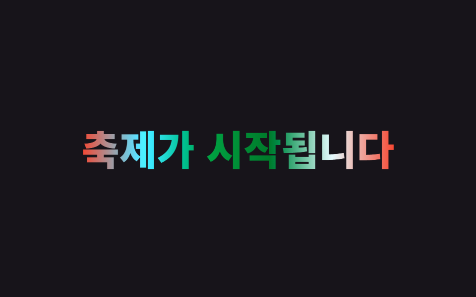
固定した虹色の多色グラデーションを background-clip:text で流し込み、位置や角度ではなく filter:hue-rotate を0degから360degへ回し続けて色相環全体を巡回させる。
使いどころ遊び心のあるブランドロゴ、フェス・イベントタイトル
filter:hue-rotate고정 그러데이션360° 순환
<main class="stage">
  <h1 class="rainbow">フェスティバル開幕</h1>
</main>
@use "../../../../site/static/demo-tokens" as *;
$duration: $dur-loop; // 색상환이 360도 한 바퀴 도는 시간
$easing: linear;
$color: $subject-blue; // 그러데이션의 시작 색
@include stage($stage-ink);
.rainbow {
margin: 0;
font-weight: 800; font-size: clamp(28px, 8.6vw, 46px); line-height: 1.2; font-family: inherit;
text-align: center;
background: linear-gradient(90deg, $color, $stage-yellow, $stage-orange, $error, $subject-cream, $color);
-webkit-background-clip: text;
background-clip: text;
color: transparent;
-webkit-text-fill-color: transparent;
animation: hue-cycle $duration $easing infinite; // 위치가 아니라 색상환 자체를 돌린다
}
@keyframes hue-cycle {
from { filter: hue-rotate(0deg); }
to { filter: hue-rotate(360deg); }
}
@media (prefers-reduced-motion: reduce) {
.rainbow { animation: none; filter: hue-rotate(0deg); }
}html, body {
margin: 0;
overflow: hidden;
}
.stage {
box-sizing: border-box;
min-height: 100vh;
display: grid;
place-items: center;
margin: 0;
background: #17141a;
font-family: -apple-system, "Segoe UI", "Noto Sans KR", sans-serif;
padding: clamp(8px, 4vw, 24px);
}
.rainbow {
margin: 0;
font-weight: 800;
font-size: clamp(28px, 8.6vw, 46px);
line-height: 1.2;
font-family: inherit;
text-align: center;
background: linear-gradient(90deg, #2f6df6, #ffd23f, #ff4d1f, #c2361a, #fff7e6, #2f6df6);
-webkit-background-clip: text;
background-clip: text;
color: transparent;
-webkit-text-fill-color: transparent;
animation: hue-cycle 2s linear infinite;
}
@keyframes hue-cycle {
from {
filter: hue-rotate(0deg);
}
to {
filter: hue-rotate(360deg);
}
}
@media (prefers-reduced-motion: reduce) {
.rainbow {
animation: none;
filter: hue-rotate(0deg);
}
}import type { CSSProperties } from "react";
import styles from "./RainbowText.module.scss";
export type RainbowTextProps = {
text: string;
/** 색상환이 360도 한 바퀴 도는 시간 (기본 2000ms) */
duration?: number;
easing?: string;
/** 그러데이션 시작 색 */
color?: string;
};
type Vars = CSSProperties & { "--duration"?: string; "--easing"?: string; "--color"?: string };
export default function RainbowText({
text,
duration = 2000,
easing = "linear",
color = "#2f6df6",
}: RainbowTextProps) {
const vars: Vars = { "--duration": `${duration}ms`, "--easing": easing, "--color": color };
return <h1 className={styles.rainbow} style={vars}>{text}</h1>;
}09 虹色文字 — 計測 累積面積 4.147% · 動いたフレーム 23/23GODRICH オリジナル · SCSS と React は zip に同梱 · CSS テキスト グラデーション アニメーション 9選 — 一行でコピペOK
このデモが属する記事
 CSS テキスト グラデーション アニメーション 9選 — 一行でコピペOKcss テキスト グラデーション アニメーションは、文字の中に流し込んだ色が動いたり光を放ったりして見える、background-clip:textやfilterだけで組める小さな演出です。この記事では9種類を選び、6〜25行のコードとして この記事のデモをすべて見る