06背景塗りつぶし
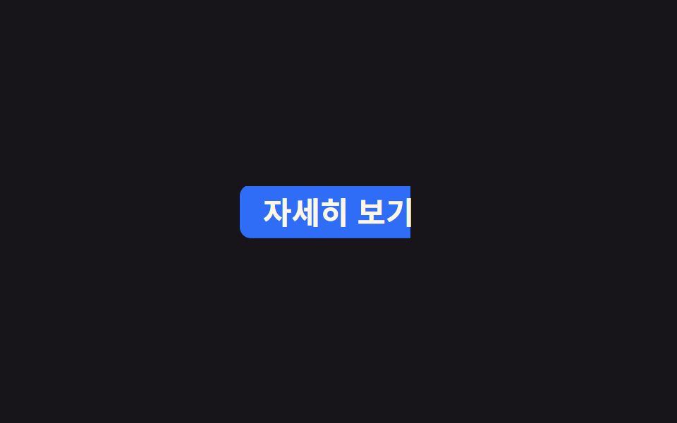
リンクの背景に linear-gradient を敷き、background-size を 0% 100% から 100% 100% へアニメーションして左から色が満ちるようにし、background-position: left で固定して塗られた部分が後退しないようにする。
使いどころナビメニューのリンク、カード内のテキストボタン
background-sizebackground-position:left2s
<main class="stage">
  <a class="nav" href="#">詳しく見る</a>
</main>
@use "../../../../site/static/demo-tokens" as *;
// ── 변수 3개 ─────────────────────────────
$duration: $dur-loop;
$easing: $ease-out;
$color: $subject-blue; // 채워지는 색
// ── 데모 무대 ───────────────────────────────
@include stage($stage-ink);
.nav {
display: inline-block;
padding: $sp-2 $sp-4;
border-radius: $r-sm;
color: $subject-cream;
text-decoration: none;
font-weight: 700;
font-size: clamp(16px, 4.6vw, 22px);
line-height: 1;
font-family: inherit;
// 배경만 왼쪽부터 차오른다. 위치는 left 로 고정해 채워진 가장자리가 밀리지 않는다
background: linear-gradient(90deg, $color, $color);
background-repeat: no-repeat;
background-position: left center;
background-size: 0% 100%;
animation: fill-thickness $duration $easing infinite;
}
@keyframes fill {
0% { background-size: 0% 100%; }
25% { background-size: 100% 100%; }
75% { background-size: 100% 100%; }
100% { background-size: 0% 100%; }
}
// 페인트 물성: 채워지는 동안 수직 두께(펜 압력)가 불규칙 요동친다 — 이중 background-size 값 보간
@keyframes fill-thickness {
0% { background-size: 0% 100%; }
6% { background-size: 22% 92%; }
12% { background-size: 44% 96%; }
18% { background-size: 68% 88%; }
25% { background-size: 100% 104%; }
32% { background-size: 100% 96%; }
45% { background-size: 100% 101%; }
60% { background-size: 100% 94%; }
75% { background-size: 100% 102%; }
82% { background-size: 74% 97%; }
90% { background-size: 38% 93%; }
100% { background-size: 0% 100%; }
}
@media (prefers-reduced-motion: reduce) {
.nav { animation: none; background-size: 100% 100%; }
}html, body {
margin: 0;
overflow: hidden;
}
.stage {
box-sizing: border-box;
min-height: 100vh;
display: grid;
place-items: center;
margin: 0;
background: #17141a;
font-family: -apple-system, "Segoe UI", "Noto Sans KR", sans-serif;
padding: clamp(8px, 4vw, 24px);
}
.nav {
display: inline-block;
padding: 8px 16px;
border-radius: 8px;
color: #fff7e6;
text-decoration: none;
font-weight: 700;
font-size: clamp(16px, 4.6vw, 22px);
line-height: 1;
font-family: inherit;
background: linear-gradient(90deg, #2f6df6, #2f6df6);
background-repeat: no-repeat;
background-position: left center;
background-size: 0% 100%;
animation: fill-thickness 2s ease-out infinite;
}
@keyframes fill {
0% {
background-size: 0% 100%;
}
25% {
background-size: 100% 100%;
}
75% {
background-size: 100% 100%;
}
100% {
background-size: 0% 100%;
}
}
@keyframes fill-thickness {
0% {
background-size: 0% 100%;
}
6% {
background-size: 22% 92%;
}
12% {
background-size: 44% 96%;
}
18% {
background-size: 68% 88%;
}
25% {
background-size: 100% 104%;
}
32% {
background-size: 100% 96%;
}
45% {
background-size: 100% 101%;
}
60% {
background-size: 100% 94%;
}
75% {
background-size: 100% 102%;
}
82% {
background-size: 74% 97%;
}
90% {
background-size: 38% 93%;
}
100% {
background-size: 0% 100%;
}
}
@media (prefers-reduced-motion: reduce) {
.nav {
animation: none;
background-size: 100% 100%;
}
}import type { CSSProperties, ReactNode } from "react";
import styles from "./BgFillLink.module.scss";
export type BgFillLinkProps = {
children: ReactNode;
href?: string;
/** 배경이 다 차는 시간 (기본 2000ms) */
duration?: number;
easing?: string;
/** 채워지는 색 */
color?: string;
};
type Vars = CSSProperties & {
"--duration"?: string;
"--easing"?: string;
"--color"?: string;
};
export default function BgFillLink({
children,
href = "#",
duration = 2000,
easing = "ease-out",
color = "#2f6df6",
}: BgFillLinkProps) {
const vars: Vars = {
"--duration": `${duration}ms`,
"--easing": easing,
"--color": color,
};
return (
<a className={styles.nav} href={href} style={vars}>
{children}
</a>
);
}06 背景塗りつぶし — 計測 累積面積 3.281% · 動いたフレーム 21/23GODRICH オリジナル · SCSS と React は zip に同梱 · CSS 下線 アニメーション9選 — 一行でコピペOK
このデモが属する記事
 CSS 下線 アニメーション9選 — 一行でコピペOKcss 下線 アニメーションは、単語や文の下・背後に敷いた線や面を動かして、読む人の視線をその一語に止める技法です。今回はこの技法を9つ選び、それぞれ6〜25行のコードにまとめました。上のグリッドは表示された瞬間から自動で繰り返し動いていて この記事のデモをすべて見る