01多段サイトマップフッター
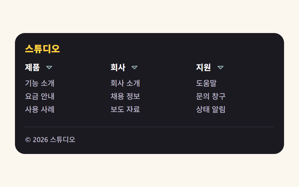
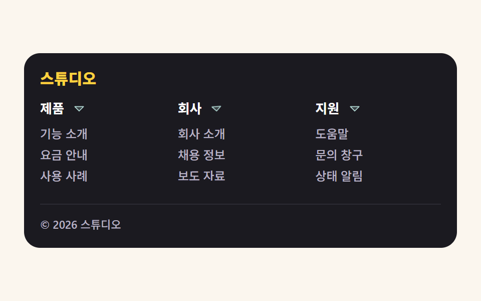
広い画面ではリンクのまとまりが複数段に展開し、狭い画面では各段がアコーディオンになって、見出しのカラットが回りながら順番に開きます。
使いどころリンクの多いサービスサイトの下部・サイトマップ整理
grid-template-rowsaria-expanded:focus-visible
<main class="stage">
  <footer class="fsm is-demo" role="contentinfo">
    <p class="fsm__brand">スタジオ</p>

    <div class="fsm__cols">
      <section class="fsm__col">
        <h2 class="fsm__head">
          <button class="fsm__btn" type="button" aria-expanded="true" aria-controls="fsm-p1">
            <span class="fsm__btn-t">製品</span>
            <svg class="fsm__caret" viewBox="0 0 256 256" width="14" height="14" aria-hidden="true" focusable="false"><g fill="currentColor"><path d="m208 96l-80 80l-80-80Z" opacity=".2"/><path d="M215.39 92.94A8 8 0 0 0 208 88H48a8 8 0 0 0-5.66 13.66l80 80a8 8 0 0 0 11.32 0l80-80a8 8 0 0 0 1.73-8.72M128 164.69L67.31 104h121.38Z"/></g></svg>
          </button>
        </h2>
        <div class="fsm__panel" id="fsm-p1">
          <nav class="fsm__list" aria-label="製品リンク">
            <a href="#">機能紹介</a>
            <a href="#">料金案内</a>
            <a href="#">導入事例</a>
          </nav>
        </div>
      </section>

      <section class="fsm__col">
        <h2 class="fsm__head">
          <button class="fsm__btn" type="button" aria-expanded="true" aria-controls="fsm-p2">
            <span class="fsm__btn-t">会社</span>
            <svg class="fsm__caret" viewBox="0 0 256 256" width="14" height="14" aria-hidden="true" focusable="false"><g fill="currentColor"><path d="m208 96l-80 80l-80-80Z" opacity=".2"/><path d="M215.39 92.94A8 8 0 0 0 208 88H48a8 8 0 0 0-5.66 13.66l80 80a8 8 0 0 0 11.32 0l80-80a8 8 0 0 0 1.73-8.72M128 164.69L67.31 104h121.38Z"/></g></svg>
          </button>
        </h2>
        <div class="fsm__panel" id="fsm-p2">
          <nav class="fsm__list" aria-label="会社リンク">
            <a href="#">会社概要</a>
            <a href="#">採用情報</a>
            <a href="#">プレス資料</a>
          </nav>
        </div>
      </section>

      <section class="fsm__col">
        <h2 class="fsm__head">
          <button class="fsm__btn" type="button" aria-expanded="true" aria-controls="fsm-p3">
            <span class="fsm__btn-t">サポート</span>
            <svg class="fsm__caret" viewBox="0 0 256 256" width="14" height="14" aria-hidden="true" focusable="false"><g fill="currentColor"><path d="m208 96l-80 80l-80-80Z" opacity=".2"/><path d="M215.39 92.94A8 8 0 0 0 208 88H48a8 8 0 0 0-5.66 13.66l80 80a8 8 0 0 0 11.32 0l80-80a8 8 0 0 0 1.73-8.72M128 164.69L67.31 104h121.38Z"/></g></svg>
          </button>
        </h2>
        <div class="fsm__panel" id="fsm-p3">
          <nav class="fsm__list" aria-label="サポートリンク">
            <a href="#">ヘルプ</a>
            <a href="#">問い合わせ窓口</a>
            <a href="#">稼働状況</a>
          </nav>
        </div>
      </section>
    </div>

    <p class="fsm__legal">© 2026 スタジオ</p>
  </footer>
</main>@use "../../../../site/static/demo-tokens" as *;
// 272 푸터 팔레트 — 세 항목이 같은 값을 쓴다. 괄호 안은 실측 대비비
$ft-ink: #1b1a20; // 어두운 푸터 바닥
$ft-ink2: #2c2a33; // 바닥 위 구분선
$ft-paper: $stage-paper; // 흰 글자 on ink 17.28:1
$ft-cream: #fbf6ee; // 무대
$ft-mist: #b9b3c4; // 보조 글자 on ink 8.48:1
$ft-amber: $stage-yellow; // 브랜드 on ink 11.97:1
$ft-aqua: #b3dad5; // 캐럿·링크 강조 on ink 11.58:1
$duration: $dur-loop; // 세 단이 한 바퀴 열렸다 닫히는 주기
$easing: $ease-spring; // 목록이 펼쳐질 때의 감속
$color: $ft-cream; // 무대(크림)
@include stage($ft-cream);
.fsm {
box-sizing: border-box;
width: clamp(320px, 92vw, 432px);
padding: $sp-4;
border-radius: $r-card;
background: $ft-ink;
color: $ft-paper;
}
.fsm__brand {
margin: 0 0 $sp-3;
color: $ft-amber;
font-weight: 800; font-size: 15px; line-height: 1.2;
letter-spacing: .02em;
}
// 넓은 화면: 링크 묶음 세 단이 나란히. 단이 접혀도 바닥 높이가 흔들리지 않게 min-height 로 자리를 잡아 둔다
.fsm__cols {
display: grid;
grid-template-columns: repeat(3, 1fr);
align-items: start;
gap: $sp-3;
min-height: 92px;
}
.fsm__head { margin: 0; }
.fsm__btn {
display: flex;
align-items: center;
justify-content: flex-start; // 캐럿은 열 이름 바로 옆 — 단 폭이 넓어도 멀어지지 않는다
gap: $sp-2;
width: 100%;
padding: 0;
border: 0;
border-radius: $r-xs;
background: none;
color: $ft-paper;
font-family: inherit;
font-weight: 700; font-size: 13px; line-height: 1.4;
text-align: left;
cursor: pointer;
}
.fsm__btn:focus-visible {
outline: 2px solid $ft-aqua;
outline-offset: 2px;
}
.fsm__caret {
flex: 0 0 auto;
color: $ft-aqua;
transition: transform $dur-quick $easing;
}
// 접힌 단의 캐럿은 오른쪽을 가리킨다 (정적 상태 규칙 — .is-demo 를 떼도 말이 된다)
.fsm__btn[aria-expanded="false"] .fsm__caret { transform: rotate(-90deg); }
// 여닫기의 본체: 0fr ↔ 1fr. 높이 auto 로는 보간이 안 되지만 grid 트랙은 보간된다
.fsm__panel {
display: grid;
grid-template-rows: 1fr;
overflow: hidden;
transition: grid-template-rows $dur-base $easing;
}
.fsm__panel > * { min-height: 0; }
.fsm__col:has(.fsm__btn[aria-expanded="false"]) .fsm__panel { grid-template-rows: 0fr; }
.fsm__list {
display: flex;
flex-direction: column;
gap: $sp-1;
padding-top: $sp-2;
}
.fsm__list a {
color: $ft-mist;
font-weight: 500; font-size: 12px; line-height: 1.4;
text-decoration: none;
}
.fsm__list a:hover { color: $ft-aqua; }
.fsm__list a:focus-visible {
outline: 2px solid $ft-aqua;
outline-offset: 2px;
border-radius: $r-xs;
}
.fsm__legal {
margin: $sp-3 0 0;
padding-top: $sp-3;
border-top: 1px solid $ft-ink2;
color: $ft-mist;
font-weight: 500; font-size: 11px; line-height: 1.4;
}
// 자동 재생 — 세 단이 1/3 주기씩 어긋나 차례로 열렸다 닫힌다.
// animation 단축은 delay 를 0 으로 리셋하므로 낱개 속성으로 쓴다
.fsm.is-demo .fsm__panel,
.fsm.is-demo .fsm__caret {
animation-duration: $duration;
animation-iteration-count: infinite;
animation-fill-mode: backwards;
}
.fsm.is-demo .fsm__panel {
animation-name: fsmSweep;
animation-timing-function: $easing;
transition: none;
}
.fsm.is-demo .fsm__caret {
animation-name: fsmCaret;
animation-timing-function: $easing;
transition: none;
}
.fsm.is-demo .fsm__col:nth-child(2) .fsm__panel,
.fsm.is-demo .fsm__col:nth-child(2) .fsm__caret { animation-delay: -.6667s; }
.fsm.is-demo .fsm__col:nth-child(3) .fsm__panel,
.fsm.is-demo .fsm__col:nth-child(3) .fsm__caret { animation-delay: -1.3333s; }
// 복귀는 90% 안에 끝낸다 — 24프레임의 마지막 장은 95.8% 지점이라 그 뒤는 샘플이 없다
@keyframes fsmSweep {
0% { grid-template-rows: 0fr; }
8%, 74% { grid-template-rows: 1fr; }
86%, 100% { grid-template-rows: 0fr; }
}
@keyframes fsmCaret {
0% { transform: rotate(-90deg); }
8%, 74% { transform: rotate(0deg); }
86%, 100% { transform: rotate(-90deg); }
}
// 좁은 화면: 각 단이 아코디언이 된다. 세로 여유가 174px 뿐이라 값을 올리지 않고 내린다
@media (max-width: 340px), (max-height: 220px) {
.fsm { width: 100%; padding: $sp-2; }
.fsm__brand { margin-bottom: $sp-1; font-size: 10px; }
.fsm__cols { grid-template-columns: 1fr; gap: $sp-1; min-height: 0; }
// 한 단이 한 줄을 통째로 쓰는 아코디언이 되므로 캐럿을 줄 오른쪽 끝으로 보낸다
.fsm__btn { justify-content: space-between; font-size: 11px; }
.fsm__list {
flex-direction: row;
flex-wrap: wrap;
gap: 0 $sp-2;
padding-top: $sp-1;
}
.fsm__list a { font-size: 10px; line-height: 1.3; }
.fsm__list a:nth-child(3) { display: none; }
.fsm__legal { margin-top: $sp-1; padding-top: $sp-1; font-size: 10px; }
}
@media (prefers-reduced-motion: reduce) {
// .fsm.is-demo .fsm__panel (0,3,0) 을 이기려면 !important 가 필요하다
.fsm__panel, .fsm__caret { animation: none !important; transition: none !important; }
}html, body {
margin: 0;
overflow: hidden;
}
.stage {
box-sizing: border-box;
min-height: 100vh;
display: grid;
place-items: center;
margin: 0;
background: #fbf6ee;
font-family: -apple-system, "Segoe UI", "Noto Sans KR", sans-serif;
padding: clamp(8px, 4vw, 24px);
}
.fsm {
box-sizing: border-box;
width: clamp(320px, 92vw, 432px);
padding: 16px;
border-radius: 16px;
background: #1b1a20;
color: #ffffff;
}
.fsm__brand {
margin: 0 0 12px;
color: #ffd23f;
font-weight: 800;
font-size: 15px;
line-height: 1.2;
letter-spacing: 0.02em;
}
.fsm__cols {
display: grid;
grid-template-columns: repeat(3, 1fr);
align-items: start;
gap: 12px;
min-height: 92px;
}
.fsm__head {
margin: 0;
}
.fsm__btn {
display: flex;
align-items: center;
justify-content: flex-start;
gap: 8px;
width: 100%;
padding: 0;
border: 0;
border-radius: 4px;
background: none;
color: #ffffff;
font-family: inherit;
font-weight: 700;
font-size: 13px;
line-height: 1.4;
text-align: left;
cursor: pointer;
}
.fsm__btn:focus-visible {
outline: 2px solid #b3dad5;
outline-offset: 2px;
}
.fsm__caret {
flex: 0 0 auto;
color: #b3dad5;
transition: transform 220ms cubic-bezier(0.2, 0.8, 0.2, 1);
}
.fsm__btn[aria-expanded=false] .fsm__caret {
transform: rotate(-90deg);
}
.fsm__panel {
display: grid;
grid-template-rows: 1fr;
overflow: hidden;
transition: grid-template-rows 300ms cubic-bezier(0.2, 0.8, 0.2, 1);
}
.fsm__panel > * {
min-height: 0;
}
.fsm__col:has(.fsm__btn[aria-expanded=false]) .fsm__panel {
grid-template-rows: 0fr;
}
.fsm__list {
display: flex;
flex-direction: column;
gap: 4px;
padding-top: 8px;
}
.fsm__list a {
color: #b9b3c4;
font-weight: 500;
font-size: 12px;
line-height: 1.4;
text-decoration: none;
}
.fsm__list a:hover {
color: #b3dad5;
}
.fsm__list a:focus-visible {
outline: 2px solid #b3dad5;
outline-offset: 2px;
border-radius: 4px;
}
.fsm__legal {
margin: 12px 0 0;
padding-top: 12px;
border-top: 1px solid #2c2a33;
color: #b9b3c4;
font-weight: 500;
font-size: 11px;
line-height: 1.4;
}
.fsm.is-demo .fsm__panel,
.fsm.is-demo .fsm__caret {
animation-duration: 2s;
animation-iteration-count: infinite;
animation-fill-mode: backwards;
}
.fsm.is-demo .fsm__panel {
animation-name: fsmSweep;
animation-timing-function: cubic-bezier(0.2, 0.8, 0.2, 1);
transition: none;
}
.fsm.is-demo .fsm__caret {
animation-name: fsmCaret;
animation-timing-function: cubic-bezier(0.2, 0.8, 0.2, 1);
transition: none;
}
.fsm.is-demo .fsm__col:nth-child(2) .fsm__panel,
.fsm.is-demo .fsm__col:nth-child(2) .fsm__caret {
animation-delay: -0.6667s;
}
.fsm.is-demo .fsm__col:nth-child(3) .fsm__panel,
.fsm.is-demo .fsm__col:nth-child(3) .fsm__caret {
animation-delay: -1.3333s;
}
@keyframes fsmSweep {
0% {
grid-template-rows: 0fr;
}
8%, 74% {
grid-template-rows: 1fr;
}
86%, 100% {
grid-template-rows: 0fr;
}
}
@keyframes fsmCaret {
0% {
transform: rotate(-90deg);
}
8%, 74% {
transform: rotate(0deg);
}
86%, 100% {
transform: rotate(-90deg);
}
}
@media (max-width: 340px), (max-height: 220px) {
.fsm {
width: 100%;
padding: 8px;
}
.fsm__brand {
margin-bottom: 4px;
font-size: 10px;
}
.fsm__cols {
grid-template-columns: 1fr;
gap: 4px;
min-height: 0;
}
.fsm__btn {
justify-content: space-between;
font-size: 11px;
}
.fsm__list {
flex-direction: row;
flex-wrap: wrap;
gap: 0 8px;
padding-top: 4px;
}
.fsm__list a {
font-size: 10px;
line-height: 1.3;
}
.fsm__list a:nth-child(3) {
display: none;
}
.fsm__legal {
margin-top: 4px;
padding-top: 4px;
font-size: 10px;
}
}
@media (prefers-reduced-motion: reduce) {
.fsm__panel, .fsm__caret {
animation: none !important;
transition: none !important;
}
}(function () {
var root = document.querySelector('.fsm');
var btns = [].slice.call(root.querySelectorAll('.fsm__btn'));
// 사람이 손을 대면 자동 루프를 끄고 aria-expanded 가 상태의 유일한 출처가 된다
function stopLoop() { root.classList.remove('is-demo'); }
btns.forEach(function (b, i) {
b.addEventListener('click', function () {
stopLoop();
b.setAttribute('aria-expanded', b.getAttribute('aria-expanded') === 'true' ? 'false' : 'true');
});
// 위아래 화살표로 열 머리 사이를 옮긴다. Enter·Space 는 button 이 기본으로 처리한다
b.addEventListener('keydown', function (e) {
var step = e.key === 'ArrowDown' ? 1 : e.key === 'ArrowUp' ? -1 : 0;
if (!step) { return; }
e.preventDefault();
stopLoop();
btns[(i + step + btns.length) % btns.length].focus({ preventScroll: true });
});
});
root.addEventListener('pointerenter', stopLoop);
root.addEventListener('focusin', stopLoop);
})();import { useRef, useState } from "react";
import type { CSSProperties, ReactNode } from "react";
import styles from "./FooterSitemapMega.module.scss";
/* ambient 에 KeyboardEvent 가 없어 파일 안에 필요한 만큼만 선언한다 */
type KeyEvt = { key: string; preventDefault(): void };
export type SitemapColumn = {
/** 열 머리 이름 */
title: string;
/** 링크 묶음의 이름 — nav 의 aria-label 이 된다 */
navLabel: string;
links: string[];
};
export type FooterSitemapMegaProps = {
brand?: string;
legal?: string;
columns?: SitemapColumn[];
/** 세 단이 한 바퀴 열렸다 닫히는 주기(ms) */
duration?: number;
easing?: string;
/** 무대 색 */
color?: string;
};
type Vars = CSSProperties & { "--duration"?: string; "--easing"?: string; "--color"?: string };
const DEFAULT_COLUMNS: SitemapColumn[] = [
{ title: "제품", navLabel: "제품 링크", links: ["기능 소개", "요금 안내", "사용 사례"] },
{ title: "회사", navLabel: "회사 링크", links: ["회사 소개", "채용 정보", "보도 자료"] },
{ title: "지원", navLabel: "지원 링크", links: ["도움말", "문의 창구", "상태 알림"] },
];
const Caret = (): ReactNode => (
<svg className={styles.caret} viewBox="0 0 256 256" width="14" height="14" aria-hidden="true" focusable="false">
<g fill="currentColor">
<path d="m208 96l-80 80l-80-80Z" opacity=".2" />
<path d="M215.39 92.94A8 8 0 0 0 208 88H48a8 8 0 0 0-5.66 13.66l80 80a8 8 0 0 0 11.32 0l80-80a8 8 0 0 0 1.73-8.72M128 164.69L67.31 104h121.38Z" />
</g>
</svg>
);
export default function FooterSitemapMega({
brand = "스튜디오",
legal = "© 2026 스튜디오",
columns = DEFAULT_COLUMNS,
duration = 2000,
easing = "cubic-bezier(.2,.8,.2,1)",
color = "#fbf6ee",
}: FooterSitemapMegaProps): ReactNode {
/* aria-expanded 가 열림/닫힘의 유일한 출처다 */
const [open, setOpen] = useState<boolean[]>(columns.map(() => true));
const [loop, setLoop] = useState<boolean>(true);
const btns = useRef<Array<HTMLButtonElement | null>>([]);
const vars: Vars = { "--duration": `${duration}ms`, "--easing": easing, "--color": color };
const toggle = (i: number): void => {
setLoop(false);
setOpen((prev: boolean[]) => prev.map((v: boolean, k: number) => (k === i ? !v : v)));
};
/* 위아래 화살표로 열 머리 사이를 옮긴다. Enter·Space 는 button 이 기본으로 처리한다 */
const onKey = (e: KeyEvt, i: number): void => {
const step = e.key === "ArrowDown" ? 1 : e.key === "ArrowUp" ? -1 : 0;
if (step === 0) { return; }
e.preventDefault();
setLoop(false);
const list = btns.current;
if (!list) { return; }
const next = list[(i + step + list.length) % list.length];
if (next) { next.focus({ preventScroll: true }); }
};
return (
<footer
className={loop ? `${styles.fsm} ${styles.isDemo}` : styles.fsm}
style={vars}
role="contentinfo"
onPointerEnter={() => setLoop(false)}
onFocus={() => setLoop(false)}
>
<p className={styles.brand}>{brand}</p>
<div className={styles.cols}>
{columns.map((c: SitemapColumn, i: number) => (
<section className={styles.col} key={c.title}>
<h2 className={styles.head}>
<button
className={styles.btn}
type="button"
aria-expanded={open[i] ? "true" : "false"}
aria-controls={`fsm-p${i + 1}`}
ref={(el: HTMLButtonElement | null) => { if (btns.current) { btns.current[i] = el; } }}
onClick={() => toggle(i)}
onKeyDown={(e: KeyEvt) => onKey(e, i)}
>
<span className={styles.btnT}>{c.title}</span>
<Caret />
</button>
</h2>
<div className={styles.panel} id={`fsm-p${i + 1}`}>
<nav className={styles.list} aria-label={c.navLabel}>
{c.links.map((l: string) => (
<a href="#" key={l}>{l}</a>
))}
</nav>
</div>
</section>
))}
</div>
<p className={styles.legal}>{legal}</p>
</footer>
);
}01 多段サイトマップフッター — 計測 累積面積 2.053% · 動いたフレーム 12/23GODRICH オリジナル · SCSS と React は zip に同梱 · フッター デザイン コピペで終わるパターン9選
このデモが属する記事
 フッター デザイン コピペで終わるパターン9選フッター デザイン コピペで探しているのは、ページの一番下でサイト全体を締めくくる区画のひな形です。ここではリンクの一覧で終わらせない九つのフッターを、そのまま貼れるHTMLとSCSSで載せました。サイトマップから波の境目まで、すべて画面の この記事のデモをすべて見る