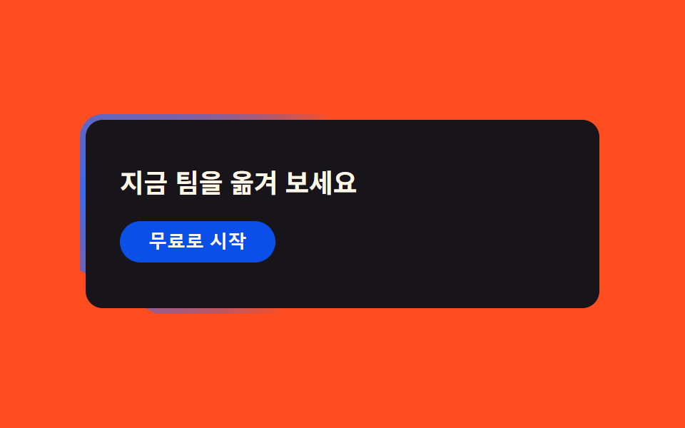
07アラート帯
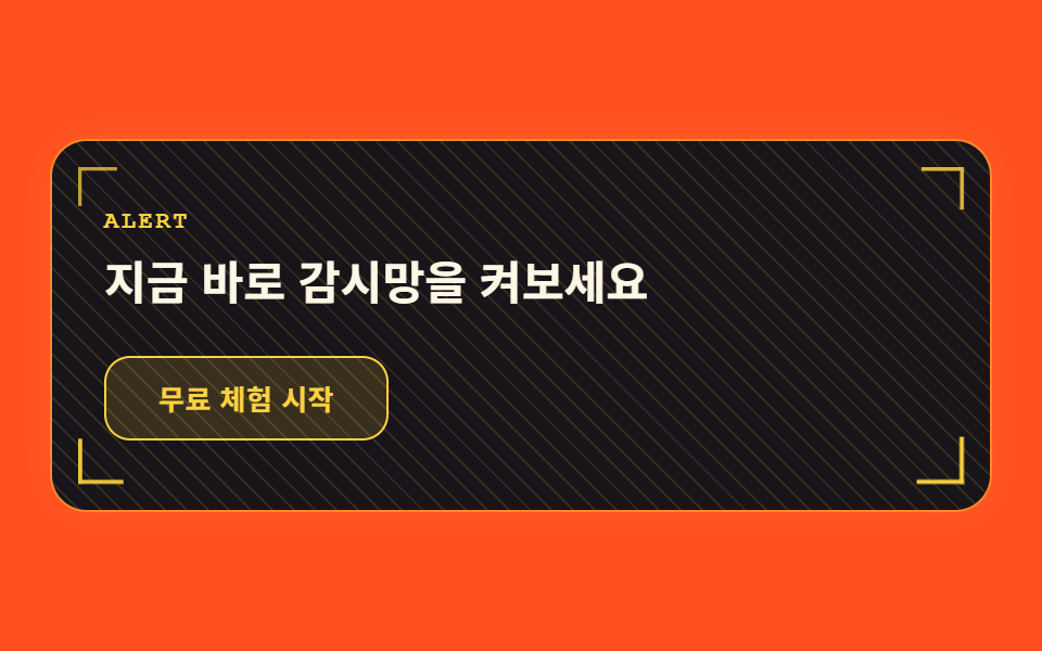
画面幅いっぱいの帯の上を斜めのスキャンラインがゆっくり流れ、角のブラケットが脈打ち、ボタンにカーソルを合わせると一瞬グリッチが点滅します。
使いどころ登録誘導帯・無料トライアル開始
대각 스캔 드리프트브래킷 맥동글리치 호버
<main class="stage">
  <div class="ctaband is-demo">
    <span class="ctaband__corner ctaband__corner--tl" aria-hidden="true"></span>
    <span class="ctaband__corner ctaband__corner--tr" aria-hidden="true"></span>
    <span class="ctaband__corner ctaband__corner--bl" aria-hidden="true"></span>
    <span class="ctaband__corner ctaband__corner--br" aria-hidden="true"></span>
    <div class="ctaband__scan" aria-hidden="true"></div>
    <p class="ctaband__eyebrow">ALERT</p>
    <h2 class="ctaband__title">今すぐ監視網をオンにしましょう</h2>
    <button class="ctaband__cta" type="button">無料トライアルを始める</button>
  </div>
</main>
@use "../../../../site/static/demo-tokens" as *;
$duration: $dur-loop; // 대각 스캔 드리프트 + 버튼 글리치 한 주기
$easing: $ease-out; // 스캔이 흐르는 곡선
$color: $stage-yellow; // 호박색 터미널 강조색
@include stage($stage-orange);
.ctaband {
position: relative;
box-sizing: border-box;
width: clamp(280px, 90vw, 520px);
padding: $sp-8 $sp-6;
border-radius: $r-card;
background: $subject-ink;
box-shadow: 0 0 0 1px rgba($color, .4), 0 0 24px rgba($color, .16);
overflow: hidden;
}
.ctaband__scan {
position: absolute;
inset: 0;
pointer-events: none;
background: repeating-linear-gradient(45deg, rgba($color, 0) 0 6px, rgba($color, .12) 6px 7px);
background-size: 200% 200%;
background-position: 0% 0%;
animation: diagDrift $duration linear infinite;
}
@keyframes diagDrift {
0% { background-position: 0% 0%; }
100% { background-position: 100% 100%; }
}
.ctaband__corner {
position: absolute;
width: 20px;
height: 20px;
pointer-events: none;
border-color: $color;
border-style: solid;
border-width: 0;
animation: cornerPulse $duration $easing infinite;
}
.ctaband__corner--tl { top: $sp-3; left: $sp-3; border-top-width: 2px; border-left-width: 2px; transform-origin: top left; } // 규칙8: 괄호 꼭짓점 모서리 고정
.ctaband__corner--tr { top: $sp-3; right: $sp-3; border-top-width: 2px; border-right-width: 2px; transform-origin: top right; animation-delay: -.15s; } // 규칙8: 괄호 꼭짓점 모서리 고정
.ctaband__corner--bl { bottom: $sp-3; left: $sp-3; border-bottom-width: 2px; border-left-width: 2px; transform-origin: bottom left; animation-delay: -.3s; } // 규칙8: 괄호 꼭짓점 모서리 고정
.ctaband__corner--br { bottom: $sp-3; right: $sp-3; border-bottom-width: 2px; border-right-width: 2px; transform-origin: bottom right; animation-delay: -.45s; } // 규칙8: 괄호 꼭짓점 모서리 고정
@keyframes cornerPulse {
0%, 100% { transform: scale(.55); opacity: .35; }
50% { transform: scale(1); opacity: 1; }
}
.ctaband__eyebrow {
position: relative;
margin: 0 0 $sp-2;
color: $color;
font-family: "Courier New", monospace;
font-weight: 700;
font-size: clamp(10px, 2.4vw, 11px);
line-height: 1;
letter-spacing: .12em;
}
.ctaband__title {
position: relative;
margin: 0 0 $sp-5;
max-width: 22ch;
color: $subject-cream;
font-weight: 700;
font-size: clamp(18px, 4.4vw, 24px);
line-height: 1.3;
font-family: inherit;
}
.ctaband__cta {
position: relative;
box-sizing: border-box;
border: 1px solid $color;
border-radius: $r-control;
background: rgba($color, .14);
color: $color;
padding: $sp-3 $sp-6;
font-weight: 700;
font-size: clamp(12px, 2.8vw, 13px);
line-height: 1;
font-family: inherit;
letter-spacing: .02em;
animation: ctaGlitch $duration linear infinite;
}
@keyframes ctaGlitch {
0%, 59%, 64%, 100% { transform: translateX(0); opacity: 1; }
60% { transform: translateX(-1px); opacity: .85; }
61% { transform: translateX(1px); opacity: 1; }
62% { transform: translateX(-1px); opacity: .9; }
63% { transform: translateX(0); opacity: 1; }
}
@media (prefers-reduced-motion: reduce) {
.ctaband__scan, .ctaband__corner, .ctaband__cta {
animation: none !important;
}
.ctaband__corner { transform: scale(1); opacity: 1; }
.ctaband__cta { transform: translateX(0); opacity: 1; }
}html, body {
margin: 0;
overflow: hidden;
}
.stage {
box-sizing: border-box;
min-height: 100vh;
display: grid;
place-items: center;
margin: 0;
background: #ff4d1f;
font-family: -apple-system, "Segoe UI", "Noto Sans KR", sans-serif;
padding: clamp(8px, 4vw, 24px);
}
.ctaband {
position: relative;
box-sizing: border-box;
width: clamp(280px, 90vw, 520px);
padding: 32px 24px;
border-radius: 16px;
background: #17141a;
box-shadow: 0 0 0 1px rgba(255, 210, 63, 0.4), 0 0 24px rgba(255, 210, 63, 0.16);
overflow: hidden;
}
.ctaband__scan {
position: absolute;
inset: 0;
pointer-events: none;
background: repeating-linear-gradient(45deg, rgba(255, 210, 63, 0) 0 6px, rgba(255, 210, 63, 0.12) 6px 7px);
background-size: 200% 200%;
background-position: 0% 0%;
animation: diagDrift 2s linear infinite;
}
@keyframes diagDrift {
0% {
background-position: 0% 0%;
}
100% {
background-position: 100% 100%;
}
}
.ctaband__corner {
position: absolute;
width: 20px;
height: 20px;
pointer-events: none;
border-color: #ffd23f;
border-style: solid;
border-width: 0;
animation: cornerPulse 2s ease-out infinite;
}
.ctaband__corner--tl {
top: 12px;
left: 12px;
border-top-width: 2px;
border-left-width: 2px;
transform-origin: top left;
}
.ctaband__corner--tr {
top: 12px;
right: 12px;
border-top-width: 2px;
border-right-width: 2px;
transform-origin: top right;
animation-delay: -0.15s;
}
.ctaband__corner--bl {
bottom: 12px;
left: 12px;
border-bottom-width: 2px;
border-left-width: 2px;
transform-origin: bottom left;
animation-delay: -0.3s;
}
.ctaband__corner--br {
bottom: 12px;
right: 12px;
border-bottom-width: 2px;
border-right-width: 2px;
transform-origin: bottom right;
animation-delay: -0.45s;
}
@keyframes cornerPulse {
0%, 100% {
transform: scale(0.55);
opacity: 0.35;
}
50% {
transform: scale(1);
opacity: 1;
}
}
.ctaband__eyebrow {
position: relative;
margin: 0 0 8px;
color: #ffd23f;
font-family: "Courier New", monospace;
font-weight: 700;
font-size: clamp(10px, 2.4vw, 11px);
line-height: 1;
letter-spacing: 0.12em;
}
.ctaband__title {
position: relative;
margin: 0 0 20px;
max-width: 22ch;
color: #fff7e6;
font-weight: 700;
font-size: clamp(18px, 4.4vw, 24px);
line-height: 1.3;
font-family: inherit;
}
.ctaband__cta {
position: relative;
box-sizing: border-box;
border: 1px solid #ffd23f;
border-radius: 12px;
background: rgba(255, 210, 63, 0.14);
color: #ffd23f;
padding: 12px 24px;
font-weight: 700;
font-size: clamp(12px, 2.8vw, 13px);
line-height: 1;
font-family: inherit;
letter-spacing: 0.02em;
animation: ctaGlitch 2s linear infinite;
}
@keyframes ctaGlitch {
0%, 59%, 64%, 100% {
transform: translateX(0);
opacity: 1;
}
60% {
transform: translateX(-1px);
opacity: 0.85;
}
61% {
transform: translateX(1px);
opacity: 1;
}
62% {
transform: translateX(-1px);
opacity: 0.9;
}
63% {
transform: translateX(0);
opacity: 1;
}
}
@media (prefers-reduced-motion: reduce) {
.ctaband__scan, .ctaband__corner, .ctaband__cta {
animation: none !important;
}
.ctaband__corner {
transform: scale(1);
opacity: 1;
}
.ctaband__cta {
transform: translateX(0);
opacity: 1;
}
}import type { CSSProperties } from "react";
import styles from "./CtaBandHud.module.scss";
export type CtaBandHudProps = {
eyebrow?: string;
title?: string;
cta?: string;
duration?: number;
easing?: string;
color?: string;
};
type Vars = CSSProperties & { "--duration"?: string; "--easing"?: string; "--color"?: string };
export default function CtaBandHud({
eyebrow = "ALERT",
title = "지금 바로 감시망을 켜보세요",
cta = "무료 체험 시작",
duration = 2000,
easing = "ease-out",
color = "#ffd23f",
}: CtaBandHudProps) {
const vars: Vars = { "--duration": `${duration}ms`, "--easing": easing, "--color": color };
return (
<div className={styles.band} style={vars}>
<span className={`${styles.corner} ${styles.cornerTl}`} aria-hidden="true" />
<span className={`${styles.corner} ${styles.cornerTr}`} aria-hidden="true" />
<span className={`${styles.corner} ${styles.cornerBl}`} aria-hidden="true" />
<span className={`${styles.corner} ${styles.cornerBr}`} aria-hidden="true" />
<div className={styles.scan} aria-hidden="true" />
<p className={styles.eyebrow}>{eyebrow}</p>
<h2 className={styles.title}>{title}</h2>
<button type="button" className={styles.cta}>{cta}</button>
</div>
);
}07 アラート帯 — 計測 累積面積 48.985% · 動いたフレーム 23/23GODRICH オリジナル · SCSS と React は zip に同梱 · HUD デザインとは?画面に見つめ返される9パーツ
このデモが属する記事
 HUD デザインとは?画面に見つめ返される9パーツHUD デザインとは、ゲームやSF映画の照準器やレーダーのように、座標や状態の数値を画面に重ねて表示し、まるで自分が見つめ返されているような印象を与えるインターフェース手法です。この記事では、その監視カメラのような雰囲気をそのまま動くランデ この記事のデモをすべて見る