01ニュースレター ダイジェスト
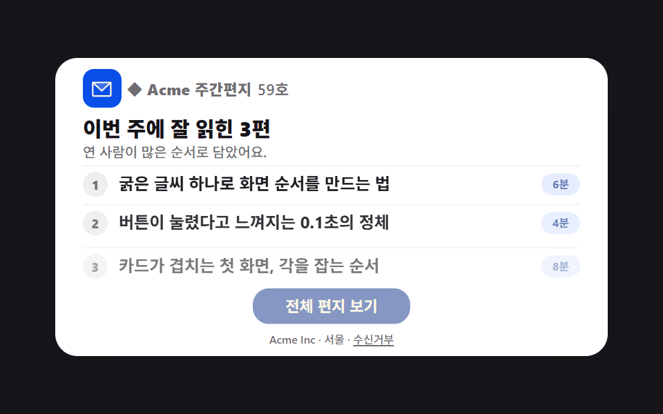
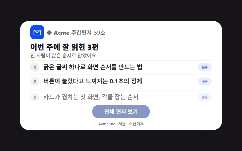
題字の下で記事3行が順に下から上がり、行ごとに読了時間バッジが付いて何から読むかをすぐ選べます。
使いどころ週刊ニュースレター、コンテンツ配信メール
table role=presentationanimation-fill-mode: backwardsanimation-delay
<main class="stage">
<div class="mk is-demo" id="mk">
<table role="presentation" width="100%" cellpadding="0" cellspacing="0" class="mk__table">
<tr><td align="center" class="mk__wrap">
<table role="presentation" width="100%" cellpadding="0" cellspacing="0" class="mk__card" style="max-width:400px">
<tr><td class="mk__brand">
  <span class="mk__brandmark" aria-hidden="true"><svg xmlns="http://www.w3.org/2000/svg" viewBox="0 0 256 256" fill="currentColor" class="mk__ico"><path d="M224,56l-96,88L32,56Z" opacity="0.2"/><path d="M224,48H32a8,8,0,0,0-8,8V192a16,16,0,0,0,16,16H216a16,16,0,0,0,16-16V56A8,8,0,0,0,224,48ZM203.43,64,128,133.15,52.57,64ZM216,192H40V74.19l82.59,75.71a8,8,0,0,0,10.82,0L216,74.19V192Z"/></svg></span>
  ◆ Acme 週刊レター <span class="mk__issue">59号</span>
</td></tr>
<tr><td class="mk__title">今週よく読まれた3本</td></tr>
<tr><td class="mk__sub">読んだ人が多い順に並べました。</td></tr>
<tr><td class="mk__rows">
  <button type="button" class="mk__row" aria-pressed="false">
    <span class="mk__num" aria-hidden="true">1</span>
    <span class="mk__head">太い見出し1つで画面の順序を作る方法</span>
    <span class="mk__time">6分</span>
  </button>
  <button type="button" class="mk__row" aria-pressed="false">
    <span class="mk__num" aria-hidden="true">2</span>
    <span class="mk__head">ボタンが押されたと感じる0.1秒の正体</span>
    <span class="mk__time">4分</span>
  </button>
  <button type="button" class="mk__row" aria-pressed="false">
    <span class="mk__num" aria-hidden="true">3</span>
    <span class="mk__head">カードが重なるファーストビュー、角度の決め方</span>
    <span class="mk__time">8分</span>
  </button>
</td></tr>
<tr><td align="center" class="mk__ctawrap"><a href="#" role="button" class="mk__cta">メール全文を読む</a></td></tr>
<tr><td align="center" class="mk__footer">Acme Inc・ソウル・ <a href="#" class="mk__unsub">配信停止</a></td></tr>
</table>
</td></tr>
</table>
</div>
</main>@use "../../../../site/static/demo-tokens" as *;
$duration: $dur-base;
$easing: $ease-spring;
$color: $subject-blue-deep;
@include stage($stage-ink);
.stage { position: relative; }
.mk { width: min(100%, 400px); }
.mk__table { border-collapse: collapse; }
.mk__wrap { padding: 0; }
.mk__card {
border-collapse: collapse; background: $stage-paper; border-radius: $r-card;
box-shadow: $shadow-raised; overflow: hidden;
}
.mk__card td { padding: $sp-1 $sp-5; font-family: -apple-system, "Segoe UI", "Noto Sans KR", sans-serif; -webkit-text-size-adjust: 100%; line-height: 1; }
.mk__brand {
font-weight: 800; font-size: 11px; line-height: 1; color: rgba(23,20,26,.62);
letter-spacing: .02em; padding-top: $sp-2 !important;
display: flex; align-items: center; gap: $sp-1;
}
.mk__brandmark {
display: inline-flex; align-items: center; justify-content: center;
width: clamp(22px, 6vw, 28px); height: clamp(22px, 6vw, 28px); border-radius: $r-sm;
background: #0a4fe8; color: $subject-cream; flex: 0 0 auto;
}
.mk__ico { width: 62%; height: 62%; }
.mk__issue { font-weight: 600; color: rgba(23,20,26,.62); }
.mk__title { font-weight: 800; font-size: clamp(12px, 3.6vw, 15px); line-height: 1.25; color: $subject-ink; padding-top: $sp-1 !important; }
.mk__sub { font-weight: 500; font-size: clamp(9px, 2.8vw, 10px); line-height: 1.4; color: rgba(23,20,26,.62); padding-top: 0 !important; padding-bottom: $sp-1 !important; }
.mk__rows { padding-top: 0 !important; padding-bottom: 0 !important; }
.mk__row {
display: grid; grid-template-columns: auto 1fr auto; align-items: center; gap: $sp-2;
width: 100%; text-align: left; background: none; border: none; cursor: pointer;
font-family: inherit; padding: $sp-1 0; border-top: 1px solid rgba(0,0,0,.06);
}
.mk__num {
display: inline-flex; align-items: center; justify-content: center;
width: 18px; height: 18px; border-radius: 50%; background: rgba(23,20,26,.08);
font-weight: 800; font-size: 9px; line-height: 1; color: rgba(23,20,26,.62);
}
.mk__head { font-weight: 700; font-size: clamp(10px, 3vw, 12px); line-height: 1.3; color: $subject-ink; }
.mk__time {
font-weight: 700; font-size: 8px; line-height: 1; color: #6079b0;
background: rgba(47,109,246,.12); border-radius: $r-pill; padding: $sp-1 $sp-2; white-space: nowrap;
}
.mk__row.is-read .mk__head { color: rgba(23,20,26,.62); }
.mk__row.is-read .mk__time { color: rgba(23,20,26,.62); background: rgba(23,20,26,.06); }
.mk__ctawrap { padding-top: $sp-2 !important; padding-bottom: $sp-1 !important; }
.mk__cta {
display: inline-block; padding: $sp-1 $sp-6; font-weight: 700; font-size: 11px; line-height: 1.6;
font-family: inherit; color: $subject-cream; text-decoration: none; border-radius: $r-control;
background: #7c90be; // CTA 파랑을 어둡게 — 크림 글자 4.25:1 미달이라 5.29:1 로 (279 선례)
}
.mk__footer { font-weight: 500; font-size: 8px; line-height: 1.4; color: rgba(23,20,26,.62); padding-top: $sp-1 !important; padding-bottom: $sp-2 !important; }
.mk__footer a { color: inherit; }
// ── 미리보기 루프: 세 줄이 아래에서 차례로 올라온다 (2s 주기, 복귀는 88% 안)
.mk.is-demo .mk__row { animation-name: nlRise; animation-duration: 2s; animation-timing-function: $easing; animation-iteration-count: infinite; }
.mk.is-demo .mk__row:nth-child(2) { animation-delay: 120ms; animation-fill-mode: backwards; }
.mk.is-demo .mk__row:nth-child(3) { animation-delay: 240ms; animation-fill-mode: backwards; }
.mk.is-demo .mk__cta { animation-name: nlCta; animation-duration: 2s; animation-timing-function: $ease-pop; animation-iteration-count: infinite; }
@keyframes nlRise {
0% { opacity: 0; transform: translateY(14px); }
30% { opacity: 1; transform: translateY(0); }
80% { opacity: 1; transform: translateY(0); }
88% { opacity: 0; transform: translateY(8px); }
100% { opacity: 0; transform: translateY(14px); }
}
@keyframes nlCta {
0%, 10% { opacity: .35; transform: translateY(8px); }
40% { opacity: 1; transform: translateY(0); }
85% { opacity: 1; transform: translateY(0); }
92% { opacity: .35; transform: translateY(8px); }
100% { opacity: .35; transform: translateY(8px); }
}
// ── 320×200 폰 실측 대비 압축 (BD9)
@media (max-width: 340px), (max-height: 220px) {
.mk__card td { padding-left: $sp-3; padding-right: $sp-3; padding-top: 0; padding-bottom: 0; }
.mk__brand { padding-top: 0 !important; font-size: 9px !important; }
.mk__brandmark { width: 18px; height: 18px; }
.mk__title { font-size: 11px !important; padding-top: $sp-1 !important; }
.mk__sub { font-size: 8px !important; padding-bottom: 0 !important; }
.mk__head { font-size: 9px !important; }
.mk__num { width: 14px; height: 14px; font-size: 8px; }
.mk__time { font-size: 7px !important; padding: 0 $sp-1 !important; }
.mk__cta { padding: 0 $sp-5 !important; font-size: 10px !important; }
.mk__footer { font-size: 7px !important; padding-top: 0 !important; padding-bottom: $sp-1 !important; }
}
@media (prefers-reduced-motion: reduce) {
.mk.is-demo .mk__row,
.mk.is-demo .mk__cta { animation: none !important; opacity: 1; transform: none; }
}html, body {
margin: 0;
overflow: hidden;
}
.stage {
box-sizing: border-box;
min-height: 100vh;
display: grid;
place-items: center;
margin: 0;
background: #17141a;
font-family: -apple-system, "Segoe UI", "Noto Sans KR", sans-serif;
padding: clamp(8px, 4vw, 24px);
}
.stage {
position: relative;
}
.mk {
width: min(100%, 400px);
}
.mk__table {
border-collapse: collapse;
}
.mk__wrap {
padding: 0;
}
.mk__card {
border-collapse: collapse;
background: #ffffff;
border-radius: 16px;
box-shadow: 0 14px 24px rgba(23, 20, 26, 0.32);
overflow: hidden;
}
.mk__card td {
padding: 4px 20px;
font-family: -apple-system, "Segoe UI", "Noto Sans KR", sans-serif;
-webkit-text-size-adjust: 100%;
line-height: 1;
}
.mk__brand {
font-weight: 800;
font-size: 11px;
line-height: 1;
color: rgba(23, 20, 26, 0.62);
letter-spacing: 0.02em;
padding-top: 8px !important;
display: flex;
align-items: center;
gap: 4px;
}
.mk__brandmark {
display: inline-flex;
align-items: center;
justify-content: center;
width: clamp(22px, 6vw, 28px);
height: clamp(22px, 6vw, 28px);
border-radius: 8px;
background: #0a4fe8;
color: #fff7e6;
flex: 0 0 auto;
}
.mk__ico {
width: 62%;
height: 62%;
}
.mk__issue {
font-weight: 600;
color: rgba(23, 20, 26, 0.62);
}
.mk__title {
font-weight: 800;
font-size: clamp(12px, 3.6vw, 15px);
line-height: 1.25;
color: #17141a;
padding-top: 4px !important;
}
.mk__sub {
font-weight: 500;
font-size: clamp(9px, 2.8vw, 10px);
line-height: 1.4;
color: rgba(23, 20, 26, 0.62);
padding-top: 0 !important;
padding-bottom: 4px !important;
}
.mk__rows {
padding-top: 0 !important;
padding-bottom: 0 !important;
}
.mk__row {
display: grid;
grid-template-columns: auto 1fr auto;
align-items: center;
gap: 8px;
width: 100%;
text-align: left;
background: none;
border: none;
cursor: pointer;
font-family: inherit;
padding: 4px 0;
border-top: 1px solid rgba(0, 0, 0, 0.06);
}
.mk__num {
display: inline-flex;
align-items: center;
justify-content: center;
width: 18px;
height: 18px;
border-radius: 50%;
background: rgba(23, 20, 26, 0.08);
font-weight: 800;
font-size: 9px;
line-height: 1;
color: rgba(23, 20, 26, 0.62);
}
.mk__head {
font-weight: 700;
font-size: clamp(10px, 3vw, 12px);
line-height: 1.3;
color: #17141a;
}
.mk__time {
font-weight: 700;
font-size: 8px;
line-height: 1;
color: #6079b0;
background: rgba(47, 109, 246, 0.12);
border-radius: 999px;
padding: 4px 8px;
white-space: nowrap;
}
.mk__row.is-read .mk__head {
color: rgba(23, 20, 26, 0.62);
}
.mk__row.is-read .mk__time {
color: rgba(23, 20, 26, 0.62);
background: rgba(23, 20, 26, 0.06);
}
.mk__ctawrap {
padding-top: 8px !important;
padding-bottom: 4px !important;
}
.mk__cta {
display: inline-block;
padding: 4px 24px;
font-weight: 700;
font-size: 11px;
line-height: 1.6;
font-family: inherit;
color: #fff7e6;
text-decoration: none;
border-radius: 12px;
background: #7c90be;
}
.mk__footer {
font-weight: 500;
font-size: 8px;
line-height: 1.4;
color: rgba(23, 20, 26, 0.62);
padding-top: 4px !important;
padding-bottom: 8px !important;
}
.mk__footer a {
color: inherit;
}
.mk.is-demo .mk__row {
animation-name: nlRise;
animation-duration: 2s;
animation-timing-function: cubic-bezier(0.2, 0.8, 0.2, 1);
animation-iteration-count: infinite;
}
.mk.is-demo .mk__row:nth-child(2) {
animation-delay: 120ms;
animation-fill-mode: backwards;
}
.mk.is-demo .mk__row:nth-child(3) {
animation-delay: 240ms;
animation-fill-mode: backwards;
}
.mk.is-demo .mk__cta {
animation-name: nlCta;
animation-duration: 2s;
animation-timing-function: cubic-bezier(0.2, 1.4, 0.4, 1);
animation-iteration-count: infinite;
}
@keyframes nlRise {
0% {
opacity: 0;
transform: translateY(14px);
}
30% {
opacity: 1;
transform: translateY(0);
}
80% {
opacity: 1;
transform: translateY(0);
}
88% {
opacity: 0;
transform: translateY(8px);
}
100% {
opacity: 0;
transform: translateY(14px);
}
}
@keyframes nlCta {
0%, 10% {
opacity: 0.35;
transform: translateY(8px);
}
40% {
opacity: 1;
transform: translateY(0);
}
85% {
opacity: 1;
transform: translateY(0);
}
92% {
opacity: 0.35;
transform: translateY(8px);
}
100% {
opacity: 0.35;
transform: translateY(8px);
}
}
@media (max-width: 340px), (max-height: 220px) {
.mk__card td {
padding-left: 12px;
padding-right: 12px;
padding-top: 0;
padding-bottom: 0;
}
.mk__brand {
padding-top: 0 !important;
font-size: 9px !important;
}
.mk__brandmark {
width: 18px;
height: 18px;
}
.mk__title {
font-size: 11px !important;
padding-top: 4px !important;
}
.mk__sub {
font-size: 8px !important;
padding-bottom: 0 !important;
}
.mk__head {
font-size: 9px !important;
}
.mk__num {
width: 14px;
height: 14px;
font-size: 8px;
}
.mk__time {
font-size: 7px !important;
padding: 0 4px !important;
}
.mk__cta {
padding: 0 20px !important;
font-size: 10px !important;
}
.mk__footer {
font-size: 7px !important;
padding-top: 0 !important;
padding-bottom: 4px !important;
}
}
@media (prefers-reduced-motion: reduce) {
.mk.is-demo .mk__row,
.mk.is-demo .mk__cta {
animation: none !important;
opacity: 1;
transform: none;
}
}var mk = document.getElementById('mk');
var rows = document.querySelectorAll('.mk__row');
for (var i = 0; i < rows.length; i++) {
rows[i].addEventListener('click', function () {
mk.classList.remove('is-demo');
this.classList.toggle('is-read');
var wasRead = this.classList.contains('is-read');
this.setAttribute('aria-pressed', String(wasRead));
var timeBadge = this.querySelector('.mk__time');
timeBadge.textContent = wasRead ? '既読' : this.getAttribute('data-time');
});
}
var times = document.querySelectorAll('.mk__time');
for (var j = 0; j < times.length; j++) {
times[j].parentNode.setAttribute('data-time', times[j].textContent);
}import { useState } from "react";
import styles from "./NewsletterDigest.module.scss";
export type NewsletterDigestProps = { duration?: number; easing?: string; color?: string };
const HEADLINES = [
{ head: "굵은 글씨 하나로 화면 순서를 만드는 법", time: "6분" },
{ head: "버튼이 눌렸다고 느껴지는 0.1초의 정체", time: "4분" },
{ head: "카드가 겹치는 첫 화면, 각을 잡는 순서", time: "8분" },
];
export default function NewsletterDigest({ duration = 300, easing = "cubic-bezier(.2,.8,.2,1)", color = "#0a4fe8" }: NewsletterDigestProps) {
const [demo, setDemo] = useState(true);
const [read, setRead] = useState<boolean[]>([false, false, false]);
return (
<main className={styles.stage}>
<div className={styles.mk}>
<div className={styles.card}>
<div className={styles.brand}>
<span className={styles.brandmark} aria-hidden="true">
<svg xmlns="http://www.w3.org/2000/svg" viewBox="0 0 256 256" fill="currentColor" className={styles.ico}><path d="M224,56l-96,88L32,56Z" opacity="0.2"/><path d="M224,48H32a8,8,0,0,0-8,8V192a16,16,0,0,0,16,16H216a16,16,0,0,0,16-16V56A8,8,0,0,0,224,48ZM203.43,64,128,133.15,52.57,64ZM216,192H40V74.19l82.59,75.71a8,8,0,0,0,10.82,0L216,74.19V192Z"/></svg>
</span>
◆ Acme 주간편지 <span className={styles.issue}>59호</span>
</div>
<div className={styles.title}>이번 주에 잘 읽힌 3편</div>
<div className={styles.sub}>연 사람이 많은 순서로 담았어요.</div>
<div className={styles.rows}>
{HEADLINES.map((h, i) => (
<button
key={h.head}
type="button"
className={`${styles.row} ${read[i] ? styles.isRead : ""}`}
style={demo ? { animationName: "nlRise", animationDuration: "2s", animationTimingFunction: easing, animationIterationCount: "infinite", animationDelay: `${i * 120}ms`, animationFillMode: "backwards" } : undefined}
aria-pressed={read[i]}
onClick={() => { setDemo(false); setRead((r) => r.map((v, j) => (j === i ? !v : v))); }}
>
<span className={styles.num} aria-hidden="true">{i + 1}</span>
<span className={styles.head}>{h.head}</span>
<span className={styles.time}>{read[i] ? "읽음" : h.time}</span>
</button>
))}
</div>
<div className={styles.ctawrap}>
<a href="#" role="button" className={styles.cta} style={{ background: "#2a5fd8" }} onClick={(e: { preventDefault: () => void }) => { e.preventDefault(); }}>전체 편지 보기</a>
</div>
<div className={styles.footer}>Acme Inc · 서울 · <a href="#" className={styles.unsub}>수신거부</a></div>
</div>
</div>
</main>
);
}01 ニュースレター ダイジェスト — 計測 累積面積 10.677% · 動いたフレーム 13/23GODRICH オリジナル · SCSS と React は zip に同梱 · メルマガ デザイン 9種 — Outlookでも崩れない
このデモが属する記事
 メルマガ デザイン 9種 — Outlookでも崩れないメルマガ デザインとは、売るために送るメール — ニュースレター、クーポン、タイムセール、リマインド — の見た目を組み立てる仕事です。この9つはテーブル(table)の縦罫を骨組みにしたHTMLとCSSだけで作ってあり、Outlookでも この記事のデモをすべて見る