04スクロールで小さく折りたたむヘッダー
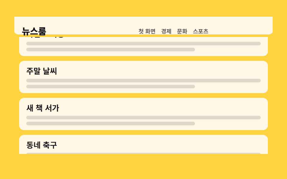
本文がスクロールして流れると、空のバー背景とロゴが一緒に小さくなり、その分だけ本文が上へ引き寄せられ、戻れば元の大きさに戻ります。
使いどころ一覧やマガジンのようにスクロールが長いページの上部
scaleYIntersectionObservertransform-origin
<main class="stage">
  <div class="ns is-demo">
    <header class="ns__head">
      <div class="ns__inner">
        <p class="ns__brand">ニュースルーム</p>
        <nav class="ns__nav">
          <a class="ns__link" href="#">ホーム</a>
          <a class="ns__link" href="#">経済</a>
          <a class="ns__link" href="#">文化</a>
          <a class="ns__link" href="#">スポーツ</a>
        </nav>
      </div>
    </header>
    <div class="ns__main">
      <div class="ns__feed" tabindex="0">
        <div class="ns__sentinel" aria-hidden="true"></div>
        <div class="ns__track">
          <article class="ns__card">
            <h3 class="ns__t">朝のブリーフィング</h3>
            <i class="ns__bar"></i><i class="ns__bar ns__bar--s"></i>
          </article>
          <article class="ns__card">
            <h3 class="ns__t">週末の天気</h3>
            <i class="ns__bar"></i><i class="ns__bar ns__bar--s"></i>
          </article>
          <article class="ns__card">
            <h3 class="ns__t">新刊の本棚</h3>
            <i class="ns__bar"></i><i class="ns__bar ns__bar--s"></i>
          </article>
          <article class="ns__card">
            <h3 class="ns__t">町のサッカー</h3>
            <i class="ns__bar"></i><i class="ns__bar ns__bar--s"></i>
          </article>
          <article class="ns__card">
            <h3 class="ns__t">地下鉄の遅延</h3>
            <i class="ns__bar"></i><i class="ns__bar ns__bar--s"></i>
          </article>
          <article class="ns__card">
            <h3 class="ns__t">夜間開場</h3>
            <i class="ns__bar"></i><i class="ns__bar ns__bar--s"></i>
          </article>
        </div>
      </div>
    </div>
  </div>
</main>@use "../../../../site/static/demo-tokens" as *;
// ── 변수 3개 ──────────────────────────────────────────
$duration: $dur-loop; // 격자 미리보기 루프 한 바퀴 2초
$easing: $ease-out; // 스크롤 관성 — 빠르게 시작해 천천히 멈춘다
$color: $subject-ink; // 노랑 무대 위 브랜드·기사 제목 글자
@include stage($stage-yellow);
.ns, .ns * { box-sizing: border-box; }
.ns { width: min(432px, 94vw); }
// ── 헤더 ── 배경은 비어 있는 ::before 막대가 담당한다(absolute, 좌우 0 위 0).
// 축소는 막대 scaleY · 내용 scale · 본문 translateY 셋 다 transform 이라 reflow 가 0 — 이게 이 데모의 원리.
.ns__head { position: relative; height: 48px; }
.ns__head::before {
content: "";
position: absolute;
top: 0; left: 0; right: 0; bottom: 0;
background: $subject-cream;
border-radius: 0 0 $r-sm $r-sm;
transform: scaleY(1);
transform-origin: top; // 규칙8: 헤더배경 top에서 줄어듦
transition: transform 220ms $ease-out;
}
.ns__inner {
position: relative;
z-index: 1;
display: flex;
align-items: center;
justify-content: space-between;
height: 100%;
padding: 0 $sp-4;
transform: scale(1);
transform-origin: left center; // 규칙8: 왼쪽 브랜드 고정 축소
transition: transform 220ms $ease-out;
}
.ns__brand { margin: 0; color: $color; font-size: 19px; line-height: 24px; font-weight: 800; }
.ns__nav { display: flex; gap: $sp-3; }
.ns__link { color: rgba(23, 20, 26, .72); font-size: 12px; line-height: 16px; font-weight: 600; text-decoration: none; }
// ── 실제 동작: 센티넬이 화면에서 벗어나면 헤더에 .is-compact 가 붙는다(JS) ──
.ns__head.is-compact::before { transform: scaleY(.62); }
.ns__head.is-compact .ns__inner { transform: scale(.78); }
.ns__head.is-compact + .ns__main { transform: translateY(-14px); }
.ns__main { transition: transform 220ms $ease-out; }
.ns__feed {
height: min(200px, calc(100vh - 104px));
overflow-y: auto;
scrollbar-width: none;
&::-webkit-scrollbar { display: none; }
}
.ns__sentinel { height: 1px; }
.ns__track { display: grid; gap: $sp-2; padding: $sp-2; }
.ns__card { padding: $sp-2 $sp-3; background: $subject-cream; border-radius: $r-sm; }
.ns__t { margin: 0 0 $sp-1; color: $color; font-size: 13px; line-height: 18px; font-weight: 700; }
.ns__bar { display: block; height: 6px; margin-top: $sp-1; border-radius: $r-xs; background: rgba(23, 20, 26, .14); }
.ns__bar--s { width: 72%; }
// ── 격자 미리보기 루프 ──
// 움직이는 건 안쪽 트랙뿐 — 스크롤 상자(viewport)에 transform 을 걸면
// 100% 기준이 상자 폭이 되어 내용이 통째로 날아간다(051 실측).
// 헤더 축소는 steps(1, end) 컷 — 반투명하게 겹치는 중간 프레임이 없다.
// 0~36% 평화 → 40% 컷(축소가 최대 변화 프레임) → 74% 유지 → 78~88% 원상복귀.
.ns.is-demo .ns__track {
animation-name: ns-scroll;
animation-duration: $duration;
animation-timing-function: $easing;
animation-iteration-count: infinite;
}
.ns.is-demo .ns__head::before,
.ns.is-demo .ns__inner,
.ns.is-demo .ns__main {
animation-duration: $duration;
animation-timing-function: steps(1, end);
animation-iteration-count: infinite;
}
.ns.is-demo .ns__head::before { animation-name: ns-cut-bar; }
.ns.is-demo .ns__inner { animation-name: ns-cut-inner; }
.ns.is-demo .ns__main { animation-name: ns-cut-main; }
@keyframes ns-scroll {
0%, 36% { transform: translateY(0); }
74%, 78% { transform: translateY(-132px); }
88%, 100% { transform: translateY(0); }
}
@keyframes ns-cut-bar {
0% { transform: scaleY(1); }
40% { transform: scaleY(.62); }
78%, 100% { transform: scaleY(1); }
}
@keyframes ns-cut-inner {
0% { transform: scale(1); }
40% { transform: scale(.78); }
78%, 100% { transform: scale(1); }
}
@keyframes ns-cut-main {
0% { transform: translateY(0); }
40% { transform: translateY(-14px); }
78%, 100% { transform: translateY(0); }
}
@media (max-width: 340px) {
.ns__inner { padding: 0 $sp-3; }
.ns__brand { font-size: 17px; line-height: 22px; }
.ns__nav { gap: $sp-2; }
.ns__link { font-size: 11px; }
.ns__card { padding: $sp-2; }
.ns__t { font-size: 12px; }
}
@media (prefers-reduced-motion: reduce) {
.ns.is-demo .ns__track,
.ns.is-demo .ns__head::before,
.ns.is-demo .ns__inner,
.ns.is-demo .ns__main { animation: none !important; }
.ns.is-demo .ns__track { transform: none !important; }
.ns__head::before, .ns__inner, .ns__main { transition: none !important; }
}html, body {
margin: 0;
overflow: hidden;
}
.stage {
box-sizing: border-box;
min-height: 100vh;
display: grid;
place-items: center;
margin: 0;
background: #ffd23f;
font-family: -apple-system, "Segoe UI", "Noto Sans KR", sans-serif;
padding: clamp(8px, 4vw, 24px);
}
.ns, .ns * {
box-sizing: border-box;
}
.ns {
width: min(432px, 94vw);
}
.ns__head {
position: relative;
height: 48px;
}
.ns__head::before {
content: "";
position: absolute;
top: 0;
left: 0;
right: 0;
bottom: 0;
background: #fff7e6;
border-radius: 0 0 8px 8px;
transform: scaleY(1);
transform-origin: top;
transition: transform 220ms ease-out;
}
.ns__inner {
position: relative;
z-index: 1;
display: flex;
align-items: center;
justify-content: space-between;
height: 100%;
padding: 0 16px;
transform: scale(1);
transform-origin: left center;
transition: transform 220ms ease-out;
}
.ns__brand {
margin: 0;
color: #17141a;
font-size: 19px;
line-height: 24px;
font-weight: 800;
}
.ns__nav {
display: flex;
gap: 12px;
}
.ns__link {
color: rgba(23, 20, 26, 0.72);
font-size: 12px;
line-height: 16px;
font-weight: 600;
text-decoration: none;
}
.ns__head.is-compact::before {
transform: scaleY(0.62);
}
.ns__head.is-compact .ns__inner {
transform: scale(0.78);
}
.ns__head.is-compact + .ns__main {
transform: translateY(-14px);
}
.ns__main {
transition: transform 220ms ease-out;
}
.ns__feed {
height: min(200px, 100vh - 104px);
overflow-y: auto;
scrollbar-width: none;
}
.ns__feed::-webkit-scrollbar {
display: none;
}
.ns__sentinel {
height: 1px;
}
.ns__track {
display: grid;
gap: 8px;
padding: 8px;
}
.ns__card {
padding: 8px 12px;
background: #fff7e6;
border-radius: 8px;
}
.ns__t {
margin: 0 0 4px;
color: #17141a;
font-size: 13px;
line-height: 18px;
font-weight: 700;
}
.ns__bar {
display: block;
height: 6px;
margin-top: 4px;
border-radius: 4px;
background: rgba(23, 20, 26, 0.14);
}
.ns__bar--s {
width: 72%;
}
.ns.is-demo .ns__track {
animation-name: ns-scroll;
animation-duration: 2s;
animation-timing-function: ease-out;
animation-iteration-count: infinite;
}
.ns.is-demo .ns__head::before,
.ns.is-demo .ns__inner,
.ns.is-demo .ns__main {
animation-duration: 2s;
animation-timing-function: steps(1, end);
animation-iteration-count: infinite;
}
.ns.is-demo .ns__head::before {
animation-name: ns-cut-bar;
}
.ns.is-demo .ns__inner {
animation-name: ns-cut-inner;
}
.ns.is-demo .ns__main {
animation-name: ns-cut-main;
}
@keyframes ns-scroll {
0%, 36% {
transform: translateY(0);
}
74%, 78% {
transform: translateY(-132px);
}
88%, 100% {
transform: translateY(0);
}
}
@keyframes ns-cut-bar {
0% {
transform: scaleY(1);
}
40% {
transform: scaleY(0.62);
}
78%, 100% {
transform: scaleY(1);
}
}
@keyframes ns-cut-inner {
0% {
transform: scale(1);
}
40% {
transform: scale(0.78);
}
78%, 100% {
transform: scale(1);
}
}
@keyframes ns-cut-main {
0% {
transform: translateY(0);
}
40% {
transform: translateY(-14px);
}
78%, 100% {
transform: translateY(0);
}
}
@media (max-width: 340px) {
.ns__inner {
padding: 0 12px;
}
.ns__brand {
font-size: 17px;
line-height: 22px;
}
.ns__nav {
gap: 8px;
}
.ns__link {
font-size: 11px;
}
.ns__card {
padding: 8px;
}
.ns__t {
font-size: 12px;
}
}
@media (prefers-reduced-motion: reduce) {
.ns.is-demo .ns__track,
.ns.is-demo .ns__head::before,
.ns.is-demo .ns__inner,
.ns.is-demo .ns__main {
animation: none !important;
}
.ns.is-demo .ns__track {
transform: none !important;
}
.ns__head::before, .ns__inner, .ns__main {
transition: none !important;
}
}// 실제 동작: 스크롤 상자 맨 위의 센티넬이 화면에서 벗어나는 순간이 축소 신호다.
// 축소는 전부 transform 이라 리플로우가 0이다.
var ns = document.querySelector('.ns');
var feed = ns.querySelector('.ns__feed');
var head = ns.querySelector('.ns__head');
function stopDemo() { ns.classList.remove('is-demo'); } // 사람이 만졌으니 자동 루프를 끈다
ns.addEventListener('pointerdown', stopDemo);
feed.addEventListener('scroll', stopDemo, { passive: true });
new IntersectionObserver(function (entries) {
head.classList.toggle('is-compact', !entries[0].isIntersecting);
}, { root: feed }).observe(ns.querySelector('.ns__sentinel'));import { useState, useEffect, useRef } from "react";
import type { CSSProperties } from "react";
import styles from "./ShrinkScrollHeader.module.scss";
export type ShrinkScrollHeaderProps = {
labels?: { brand?: string; nav?: string[]; articles?: string[] };
/** 격자 미리보기용 2초 자동 루프. 사람이 손대면 꺼진다 */
demo?: boolean;
duration?: number;
easing?: string;
color?: string;
};
type Vars = CSSProperties & { "--duration"?: string; "--easing"?: string; "--color"?: string };
type Box<T> = { current: T | null };
const NAV = ["Home", "Business", "Culture", "Sports"];
const ARTICLES = ["Morning briefing", "Weekend weather", "New book shelf", "Neighborhood soccer", "Subway delays", "Night opening"];
export default function ShrinkScrollHeader({
labels,
demo = true,
duration = 2000,
easing = "ease-out",
color = "#17141a",
}: ShrinkScrollHeaderProps) {
const brand = labels?.brand ?? "Newsroom";
const nav = labels?.nav ?? NAV;
const articles = labels?.articles ?? ARTICLES;
const [live, setLive] = useState(demo);
const [compact, setCompact] = useState(false);
const feedRef: Box<HTMLDivElement> = useRef(null);
const sentRef: Box<HTMLDivElement> = useRef(null);
// 센티넬이 스크롤 상자 밖으로 나가는 순간이 축소 신호다 — 축소는 전부 transform
useEffect(() => {
const feed = feedRef.current;
const sent = sentRef.current;
if (feed === null || sent === null) return;
const io = new IntersectionObserver(
(entries) => entries.forEach((e) => setCompact(!e.isIntersecting)),
{ root: feed }
);
io.observe(sent);
return () => io.disconnect();
}, []);
function touch() {
setLive(false); // 사람이 만졌으니 자동 루프를 끈다
}
const vars: Vars = { "--duration": `${duration}ms`, "--easing": easing, "--color": color };
const cls = [styles.ns, live ? styles.isDemo : "", compact ? styles.isCompact : ""].filter(Boolean).join(" ");
return (
<section className={cls} style={vars} onPointerDown={touch}>
<header className={styles.head}>
<div className={styles.inner}>
<p className={styles.brand}>{brand}</p>
<nav className={styles.nav}>
{nav.map((item) => (
<a className={styles.link} key={item} href="#">{item}</a>
))}
</nav>
</div>
</header>
<div className={styles.main}>
<div className={styles.feed} ref={feedRef} tabIndex={0} onScroll={touch}>
<div className={styles.sentinel} aria-hidden="true" ref={sentRef} />
<div className={styles.track}>
{articles.map((t) => (
<article className={styles.card} key={t}>
<h3 className={styles.t}>{t}</h3>
<i className={styles.bar} />
<i className={styles.barS} />
</article>
))}
</div>
</div>
</div>
</section>
);
}04 スクロールで小さく折りたたむヘッダー — 計測 累積面積 63.282% · 動いたフレーム 14/23GODRICH オリジナル · SCSS と React は zip に同梱 · メガメニュー css 9選 — リンクの羅列からサイトの地図へ
このデモが属する記事
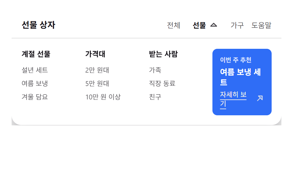 メガメニュー css 9選 — リンクの羅列からサイトの地図へメガメニュー css とは、上部ナビの項目ひとつから画面いっぱいの幅のパネルを開き、サイト全体の構造を一目で渡すメニューの作り方のことです。ここに置いた九つは、そのパネルだけでなく、多段展開・スクロールでの縮小・モバイルへの切り替え・検索・ この記事のデモをすべて見る