05回転グラデーション枠
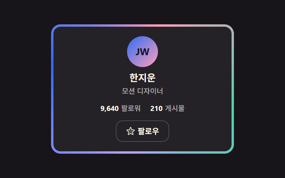
角度を持つカスタムプロパティを登録することで円錐グラデーションがカードの周りを一周し、内側の板がその上を覆って枠だけが光って残ります。
使いどころ有料会員や認証済みアカウントなど、「この人は特別だ」を枠ひとつで伝えたいとき
@propertyconic-gradient--angle
<main class="stage">
  <div class="gr is-demo">
    <div class="gr__rim">
      <article class="gr__face">
        <div class="gr__avatar" aria-hidden="true">JW</div>
        <h2 class="gr__name">ハン・ジウン</h2>
        <p class="gr__role">モーションデザイナー</p>
        <p class="gr__stats">
          <span class="gr__stat"><strong>9,640</strong>フォロワー</span>
          <span class="gr__stat"><strong>210</strong>投稿</span>
        </p>
        <button class="gr__follow" type="button" id="gr-follow" aria-pressed="false">
          <svg class="gr__i gr__i--star" viewBox="0 0 256 256" width="16" height="16" aria-hidden="true"><g fill="currentColor"><path d="m229.06 108.79l-48.7 42l14.88 62.79a8.4 8.4 0 0 1-12.52 9.17L128 189.09l-54.72 33.65a8.4 8.4 0 0 1-12.52-9.17l14.88-62.79l-48.7-42A8.46 8.46 0 0 1 31.73 94l63.91-5.2l24.62-59.6a8.36 8.36 0 0 1 15.48 0l24.62 59.6l63.91 5.2a8.46 8.46 0 0 1 4.79 14.79" opacity=".2"/><path d="M239.18 97.26A16.38 16.38 0 0 0 224.92 86l-59-4.76l-22.78-55.09a16.36 16.36 0 0 0-30.27 0L90.11 81.23L31.08 86a16.46 16.46 0 0 0-9.37 28.86l45 38.83L53 211.75a16.38 16.38 0 0 0 24.5 17.82l50.5-31.08l50.53 31.08A16.4 16.4 0 0 0 203 211.75l-13.76-58.07l45-38.83a16.43 16.43 0 0 0 4.94-17.59m-15.34 5.47l-48.7 42a8 8 0 0 0-2.56 7.91l14.88 62.8a.37.37 0 0 1-.17.48c-.18.14-.23.11-.38 0l-54.72-33.65a8 8 0 0 0-8.38 0l-54.72 33.67c-.15.09-.19.12-.38 0a.37.37 0 0 1-.17-.48l14.88-62.8a8 8 0 0 0-2.56-7.91l-48.7-42c-.12-.1-.23-.19-.13-.5s.18-.27.33-.29l63.92-5.16a8 8 0 0 0 6.72-4.94l24.62-59.61c.08-.17.11-.25.35-.25s.27.08.35.25L153 91.86a8 8 0 0 0 6.75 4.92l63.92 5.16c.15 0 .24 0 .33.29s0 .4-.16.5"/></g></svg>
          <svg class="gr__i gr__i--check" viewBox="0 0 256 256" width="16" height="16" aria-hidden="true"><g fill="currentColor"><path d="M232 56v144a16 16 0 0 1-16 16H40a16 16 0 0 1-16-16V56a16 16 0 0 1 16-16h176a16 16 0 0 1 16 16" opacity=".2"/><path d="m205.66 85.66l-96 96a8 8 0 0 1-11.32 0l-40-40a8 8 0 0 1 11.32-11.32L104 164.69l90.34-90.35a8 8 0 0 1 11.32 11.32"/></g></svg>
          <span class="gr__label" id="gr-label">フォロー</span>
        </button>
      </article>
    </div>
  </div>
</main>
@use "../../../../site/static/demo-tokens" as *;
// 회전 각도 — @property 로 등록해야 --angle 이 보간된다 (등록 없으면 테두리가 안 돈다)
@property --angle {
syntax: "<angle>";
initial-value: 0deg;
inherits: false;
}
$duration: $dur-enter;
$easing: $ease-spring;
$color: $subject-blue;
@include stage($stage-ink);
.gr {
display: grid;
place-items: center;
user-select: none;
-webkit-user-select: none;
}
// 바깥 상자: conic 그라디언트 테두리가 2초에 한 바퀴 돈다 (360deg 순환 — 텔레포트 없음)
.gr__rim {
width: 300px;
padding: $sp-1;
border-radius: $r-card;
background: conic-gradient(from var(--angle),
$subject-blue, $subject-pink, $subject-mint, $subject-lilac, $subject-blue);
animation-name: gr-spin;
animation-duration: $dur-loop;
animation-timing-function: linear;
animation-iteration-count: infinite;
}
@keyframes gr-spin { to { --angle: 360deg; } }
.gr__face {
display: flex;
flex-direction: column;
align-items: center;
padding: $sp-4;
border-radius: $r-control;
background-color: $stage-ink;
background-image: linear-gradient(rgba(255, 255, 255, .06), rgba(255, 255, 255, .06));
}
.gr__avatar {
display: grid;
place-items: center;
width: 52px;
height: 52px;
border-radius: 50%;
background: linear-gradient(135deg, $subject-blue, $subject-pink);
color: $subject-ink;
font-size: 16px;
line-height: 20px;
font-weight: 700;
}
.gr__name {
margin: $sp-2 0 0;
font-size: 16px;
line-height: 20px;
font-weight: 700;
color: $subject-cream;
}
.gr__role {
margin: $sp-1 0 0;
font-size: 12px;
line-height: 16px;
font-weight: 500;
color: rgba(255, 255, 255, .6);
}
.gr__stats {
display: flex;
gap: $sp-4;
margin: $sp-3 0 0;
font-size: 12px;
line-height: 18px;
font-weight: 500;
color: rgba(255, 255, 255, .6);
}
.gr__stat strong {
margin-right: $sp-1;
font-weight: 700;
color: $subject-cream;
font-variant-numeric: tabular-nums;
}
.gr__follow {
display: inline-flex;
align-items: center;
justify-content: center;
gap: $sp-1;
height: 36px;
margin: $sp-3 0 0;
padding: 0 $sp-4;
background: none;
border: 1px solid rgba(255, 255, 255, .22);
border-radius: $r-control;
color: $subject-cream;
font-family: inherit;
font-size: 13px;
line-height: 16px;
font-weight: 600;
cursor: pointer;
transition: background $dur-quick $easing, border-color $duration $easing;
}
.gr__follow:hover { background: rgba(255, 255, 255, .08); }
.gr__follow:focus-visible { outline: 2px solid $color; outline-offset: 2px; }
.gr__follow[aria-pressed="true"] { border-color: rgba($subject-mint, .65); }
.gr__i { display: inline-flex; }
.gr__i--check { display: none; color: $subject-mint; }
.gr__follow[aria-pressed="true"] .gr__i--star { display: none; }
.gr__follow[aria-pressed="true"] .gr__i--check { display: inline-flex; }
@media (max-width: 340px) {
.gr__rim { width: 272px; }
.gr__face { padding: $sp-3; }
.gr__avatar { width: 44px; height: 44px; font-size: 14px; line-height: 16px; }
.gr__name { margin-top: $sp-1; font-size: 13px; line-height: 16px; }
.gr__role { margin-top: 0; font-size: 11px; line-height: 14px; }
.gr__stats { margin-top: $sp-1; gap: $sp-3; font-size: 11px; line-height: 15px; }
.gr__follow { height: 32px; margin-top: $sp-1; padding: 0 $sp-3; font-size: 12px; line-height: 14px; }
}
@media (prefers-reduced-motion: reduce) {
.gr__rim { animation: none !important; }
.gr__follow { transition: none; }
}@property --angle {
syntax: "<angle>";
initial-value: 0deg;
inherits: false;
}
html, body {
margin: 0;
overflow: hidden;
}
.stage {
box-sizing: border-box;
min-height: 100vh;
display: grid;
place-items: center;
margin: 0;
background: #17141a;
font-family: -apple-system, "Segoe UI", "Noto Sans KR", sans-serif;
padding: clamp(8px, 4vw, 24px);
}
.gr {
display: grid;
place-items: center;
user-select: none;
-webkit-user-select: none;
}
.gr__rim {
width: 300px;
padding: 4px;
border-radius: 16px;
background: conic-gradient(from var(--angle), #2f6df6, #ff9ebb, #4cd4a6, #b9a0ff, #2f6df6);
animation-name: gr-spin;
animation-duration: 2s;
animation-timing-function: linear;
animation-iteration-count: infinite;
}
@keyframes gr-spin {
to {
--angle: 360deg;
}
}
.gr__face {
display: flex;
flex-direction: column;
align-items: center;
padding: 16px;
border-radius: 12px;
background-color: #17141a;
background-image: linear-gradient(rgba(255, 255, 255, 0.06), rgba(255, 255, 255, 0.06));
}
.gr__avatar {
display: grid;
place-items: center;
width: 52px;
height: 52px;
border-radius: 50%;
background: linear-gradient(135deg, #2f6df6, #ff9ebb);
color: #17141a;
font-size: 16px;
line-height: 20px;
font-weight: 700;
}
.gr__name {
margin: 8px 0 0;
font-size: 16px;
line-height: 20px;
font-weight: 700;
color: #fff7e6;
}
.gr__role {
margin: 4px 0 0;
font-size: 12px;
line-height: 16px;
font-weight: 500;
color: rgba(255, 255, 255, 0.6);
}
.gr__stats {
display: flex;
gap: 16px;
margin: 12px 0 0;
font-size: 12px;
line-height: 18px;
font-weight: 500;
color: rgba(255, 255, 255, 0.6);
}
.gr__stat strong {
margin-right: 4px;
font-weight: 700;
color: #fff7e6;
font-variant-numeric: tabular-nums;
}
.gr__follow {
display: inline-flex;
align-items: center;
justify-content: center;
gap: 4px;
height: 36px;
margin: 12px 0 0;
padding: 0 16px;
background: none;
border: 1px solid rgba(255, 255, 255, 0.22);
border-radius: 12px;
color: #fff7e6;
font-family: inherit;
font-size: 13px;
line-height: 16px;
font-weight: 600;
cursor: pointer;
transition: background 220ms cubic-bezier(0.2, 0.8, 0.2, 1), border-color 600ms cubic-bezier(0.2, 0.8, 0.2, 1);
}
.gr__follow:hover {
background: rgba(255, 255, 255, 0.08);
}
.gr__follow:focus-visible {
outline: 2px solid #2f6df6;
outline-offset: 2px;
}
.gr__follow[aria-pressed=true] {
border-color: rgba(76, 212, 166, 0.65);
}
.gr__i {
display: inline-flex;
}
.gr__i--check {
display: none;
color: #4cd4a6;
}
.gr__follow[aria-pressed=true] .gr__i--star {
display: none;
}
.gr__follow[aria-pressed=true] .gr__i--check {
display: inline-flex;
}
@media (max-width: 340px) {
.gr__rim {
width: 272px;
}
.gr__face {
padding: 12px;
}
.gr__avatar {
width: 44px;
height: 44px;
font-size: 14px;
line-height: 16px;
}
.gr__name {
margin-top: 4px;
font-size: 13px;
line-height: 16px;
}
.gr__role {
margin-top: 0;
font-size: 11px;
line-height: 14px;
}
.gr__stats {
margin-top: 4px;
gap: 12px;
font-size: 11px;
line-height: 15px;
}
.gr__follow {
height: 32px;
margin-top: 4px;
padding: 0 12px;
font-size: 12px;
line-height: 14px;
}
}
@media (prefers-reduced-motion: reduce) {
.gr__rim {
animation: none !important;
}
.gr__follow {
transition: none;
}
}// 실제 동작: フォロー 토글(aria-pressed) · 첫 조작에 자동 루프 종료 (테두리 회전은 유지)
var root = document.querySelector('.gr');
var btn = document.getElementById('gr-follow');
var label = document.getElementById('gr-label');
function stopDemo() { root.classList.remove('is-demo'); }
root.addEventListener('pointerdown', stopDemo);
root.addEventListener('keydown', stopDemo);
btn.addEventListener('click', function () {
var on = btn.getAttribute('aria-pressed') === 'true';
btn.setAttribute('aria-pressed', on ? 'false' : 'true');
label.textContent = on ? 'フォロー' : 'フォロー中';
});import { useState } from "react";
import type { CSSProperties, ReactNode } from "react";
import styles from "./GradientRimCard.module.scss";
export type GradientRimCardProps = {
name?: string;
role?: string;
initials?: string;
followers?: string;
posts?: string;
duration?: number;
easing?: string;
color?: string;
};
type ClickEvt = { currentTarget: { blur(): void } };
type Vars = CSSProperties & { "--duration"?: string; "--easing"?: string; "--color"?: string };
const IconStar = (): ReactNode => (
<svg viewBox="0 0 256 256" width="16" height="16" aria-hidden="true"><g fill="currentColor"><path d="m229.06 108.79l-48.7 42l14.88 62.79a8.4 8.4 0 0 1-12.52 9.17L128 189.09l-54.72 33.65a8.4 8.4 0 0 1-12.52-9.17l14.88-62.79l-48.7-42A8.46 8.46 0 0 1 31.73 94l63.91-5.2l24.62-59.6a8.36 8.36 0 0 1 15.48 0l24.62 59.6l63.91 5.2a8.46 8.46 0 0 1 4.79 14.79" opacity=".2"/><path d="M239.18 97.26A16.38 16.38 0 0 0 224.92 86l-59-4.76l-22.78-55.09a16.36 16.36 0 0 0-30.27 0L90.11 81.23L31.08 86a16.46 16.46 0 0 0-9.37 28.86l45 38.83L53 211.75a16.38 16.38 0 0 0 24.5 17.82l50.5-31.08l50.53 31.08A16.4 16.4 0 0 0 203 211.75l-13.76-58.07l45-38.83a16.43 16.43 0 0 0 4.94-17.59m-15.34 5.47l-48.7 42a8 8 0 0 0-2.56 7.91l14.88 62.8a.37.37 0 0 1-.17.48c-.18.14-.23.11-.38 0l-54.72-33.65a8 8 0 0 0-8.38 0l-54.72 33.67c-.15.09-.19.12-.38 0a.37.37 0 0 1-.17-.48l14.88-62.8a8 8 0 0 0-2.56-7.91l-48.7-42c-.12-.1-.23-.19-.13-.5s.18-.27.33-.29l63.92-5.16a8 8 0 0 0 6.72-4.94l24.62-59.61c.08-.17.11-.25.35-.25s.27.08.35.25L153 91.86a8 8 0 0 0 6.75 4.92l63.92 5.16c.15 0 .24 0 .33.29s0 .4-.16.5"/></g></svg>
);
const IconCheck = (): ReactNode => (
<svg viewBox="0 0 256 256" width="16" height="16" aria-hidden="true"><g fill="currentColor"><path d="M232 56v144a16 16 0 0 1-16 16H40a16 16 0 0 1-16-16V56a16 16 0 0 1 16-16h176a16 16 0 0 1 16 16" opacity=".2"/><path d="m205.66 85.66l-96 96a8 8 0 0 1-11.32 0l-40-40a8 8 0 0 1 11.32-11.32L104 164.69l90.34-90.35a8 8 0 0 1 11.32 11.32"/></g></svg>
);
export default function GradientRimCard({
name = "한지운",
role = "모션 디자이너",
initials = "JW",
followers = "9,640",
posts = "210",
duration = 600,
easing = "cubic-bezier(.2,.8,.2,1)",
color = "#2f6df6",
}: GradientRimCardProps): ReactNode {
const [on, setOn] = useState(false);
const vars: Vars = { "--duration": `${duration}ms`, "--easing": easing, "--color": color };
const toggle = (e: ClickEvt): void => {
setOn((v: boolean): boolean => !v);
e.currentTarget.blur();
};
return (
<div className={styles.gr} style={vars}>
<div className={styles.rim}>
<article className={styles.face}>
<div className={styles.avatar} aria-hidden="true">{initials}</div>
<h2 className={styles.name}>{name}</h2>
<p className={styles.role}>{role}</p>
<p className={styles.stats}>
<span className={styles.stat}><strong>{followers}</strong>팔로워</span>
<span className={styles.stat}><strong>{posts}</strong>게시물</span>
</p>
<button type="button" className={styles.follow} aria-pressed={on} onClick={toggle}>
{on ? <IconCheck /> : <IconStar />}
<span className={styles.label}>{on ? "팔로잉" : "팔로우"}</span>
</button>
</article>
</div>
</div>
);
}05 回転グラデーション枠 — 計測 累積面積 2.851% · 動いたフレーム 23/23GODRICH オリジナル · SCSS と React は zip に同梱 · プロフィールカード デザイン 9選 — コピペOKのスタイル集
このデモが属する記事
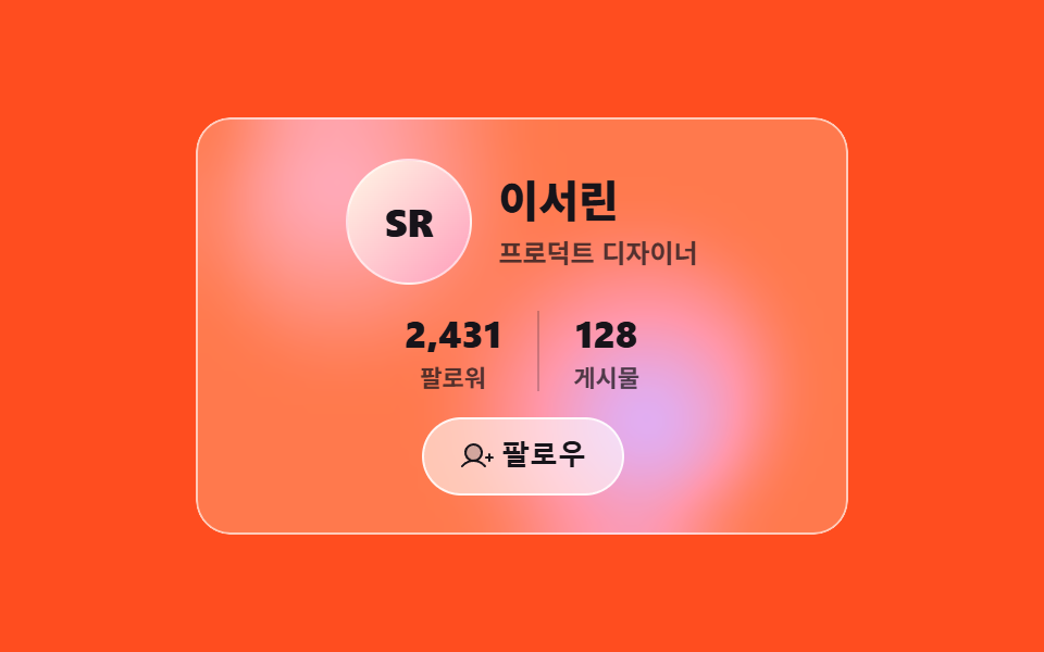 プロフィールカード デザイン 9選 — コピペOKのスタイル集プロフィールカード デザインとは、アバター・名前・肩書き・数値・フォローボタンという決まった中身に、どんな質感を着せるかを決める作業です。9つは内側の構造がすべて同じで、表面と動きだけが違います。 この記事のデモをすべて見る