01イベントヒーロー
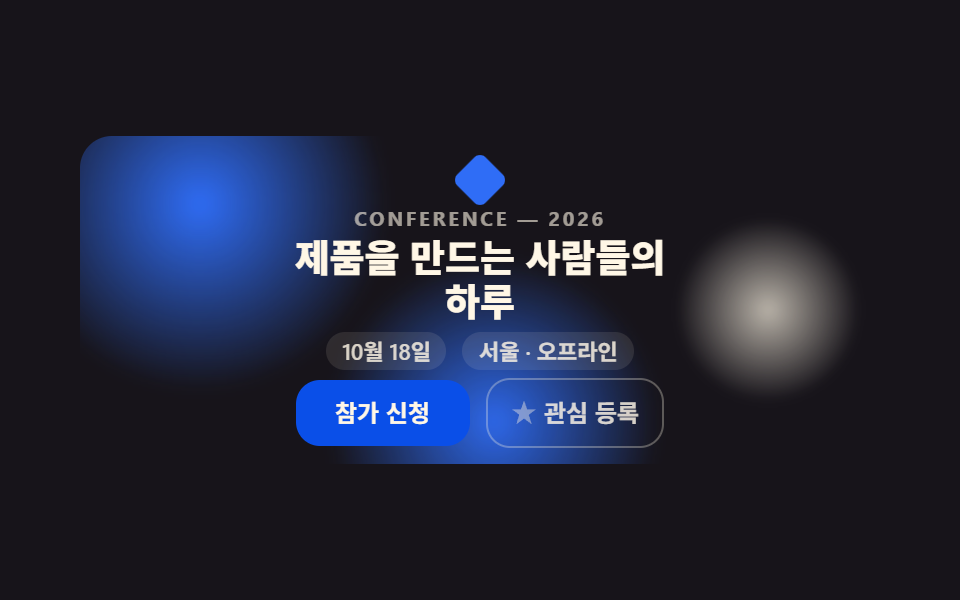
무대 배경에 흐릿한 원 세 개가 느리게 떠다니는 동안 이름표·헤드라인·날짜/장소 알약·CTA가 한 화면에 자리 잡고, 오른쪽 북마크 버튼은 클릭마다 실제로 채움 상태가 바뀝니다.
使いどころ
transformopacityaria-pressed
<main class="stage">
  <section class="eh">
    <span class="eh__orb eh__orb--1" aria-hidden="true"></span>
    <span class="eh__orb eh__orb--2" aria-hidden="true"></span>
    <span class="eh__orb eh__orb--3" aria-hidden="true"></span>
    <span class="eh__mark" aria-hidden="true"></span>
    <p class="eh__eyebrow">CONFERENCE — 2026</p>
    <h1 class="eh__title">プロダクトを作る人たちの<br>一日</h1>
    <div class="eh__meta">
      <span class="eh__pill">10月18日</span>
      <span class="eh__pill">ソウル・オフライン</span>
    </div>
    <div class="eh__row">
      <a class="eh__cta" href="#">参加申込</a>
      <button class="eh__save" type="button" aria-pressed="false">
        <span class="eh__save-ic" aria-hidden="true"></span>
        興味登録
      </button>
    </div>
  </section>
</main>
@use "../../../../site/static/demo-tokens" as *;
// ── 변수 3개 ──────────────────────────────────────────
$duration: $dur-quick; // 관심 등록 버튼 전환
$easing: $ease-pop;
$color: $subject-blue; // CTA·아이콘 강조색
@include stage($stage-ink);
.eh {
position: relative;
box-sizing: border-box; // width 에 패딩을 포함 — 아니면 320px 에서 패딩만큼 넘친다(실측 2026-09-10)
width: min(400px, 92vw);
overflow: hidden;
border-radius: $r-card;
padding: $sp-3 $sp-5 $sp-2;
text-align: center;
isolation: isolate;
}
// ── 배경 원 세 개: 계속 떠다니는 장식(호버 아님, 무조건 재생) ──────────────
.eh__orb {
position: absolute;
border-radius: 50%;
filter: blur(18px);
opacity: .55;
z-index: -1;
}
.eh__orb--1 { width: 170px; height: 170px; left: -45px; top: -35px; background: radial-gradient(circle, $subject-blue, transparent 62%); opacity: 1; filter: blur(3px); animation: eh-float-a 2s ease-in-out infinite; }
.eh__orb--2 { width: 130px; height: 130px; right: -25px; top: 6px; background: radial-gradient(circle, $subject-cream, transparent 62%); opacity: .7; filter: blur(3px); animation: eh-float-b 2s ease-in-out infinite; }
.eh__orb--3 { width: 150px; height: 150px; left: 28%; bottom: -70px; background: radial-gradient(circle, $subject-blue, transparent 62%); opacity: .95; filter: blur(3px); animation: eh-float-a 2s ease-in-out infinite reverse; }
@keyframes eh-float-a {
0%, 100% { transform: translate(0, 0) scale(1); }
50% { transform: translate($sp-10, -$sp-8) scale(1.5); }
}
@keyframes eh-float-b {
0%, 100% { transform: translate(0, 0) scale(1); }
50% { transform: translate(-$sp-8, $sp-8) scale(.6); }
}
// ── 플레이스홀더 워드마크: 실제 로고가 아니라 도형 하나 ──────────────
.eh__mark {
display: block;
width: $sp-5; height: $sp-5;
margin: 0 auto $sp-1;
background: $color;
border-radius: $r-xs;
transform: rotate(45deg);
}
.eh__eyebrow {
margin: 0 0 $sp-1;
font-weight: 700; font-size: 10px; line-height: 1; font-family: inherit;
letter-spacing: .14em;
color: rgba(255, 247, 230, .6);
}
.eh__title {
margin: 0 0 $sp-1;
font-weight: 800; font-size: clamp(16px, 4.6vw, 19px); line-height: 1.14; font-family: inherit;
color: $subject-cream;
}
.eh__meta { display: flex; justify-content: center; gap: $sp-2; flex-wrap: wrap; margin-bottom: $sp-1; }
.eh__pill {
padding: $sp-1 $sp-2;
border-radius: $r-pill;
background: rgba(255, 247, 230, .1);
color: rgba(255, 247, 230, .82);
font-weight: 600; font-size: clamp(10px, 2.8vw, 11px); line-height: 1; font-family: inherit;
}
.eh__row { display: flex; justify-content: center; align-items: center; gap: $sp-2; flex-wrap: wrap; }
.eh__cta {
padding: $sp-2 $sp-5;
border-radius: $r-control;
background: $subject-blue-deep;
color: $subject-cream;
font-weight: 700; font-size: 12px; line-height: 1.4; font-family: inherit;
text-decoration: none;
}
.eh__save {
display: inline-flex; align-items: center; gap: $sp-1;
padding: $sp-2 $sp-3;
border-radius: $r-control;
border: 1px solid rgba(255, 247, 230, .3);
background: transparent;
color: rgba(255, 247, 230, .82);
font-weight: 600; font-size: 12px; line-height: 1.4; font-family: inherit;
cursor: pointer;
transition: background $duration $easing, border-color $duration $easing, transform $duration $easing;
}
.eh__save-ic {
width: $sp-3; height: $sp-3;
border-radius: 0;
background: currentColor;
clip-path: polygon(50% 0%, 63% 38%, 100% 38%, 70% 60%, 82% 100%, 50% 76%, 18% 100%, 30% 60%, 0% 38%, 37% 38%);
opacity: .5;
transition: opacity $duration $easing, transform $duration $easing;
}
.eh__save[aria-pressed="true"] {
background: rgba(255, 247, 230, .12);
border-color: $subject-cream;
}
.eh__save[aria-pressed="true"] .eh__save-ic {
opacity: 1;
color: $color;
transform: scale(1.15);
}
// ── 반응형: 320×200 처럼 세로가 짧은 화면에선 장식을 줄인다(BD9) ──────────────
@media (max-width: 340px), (max-height: 220px) {
.eh { padding: $sp-2 $sp-4; }
.eh__mark { display: none; }
.eh__eyebrow { display: none; }
.eh__title { font-size: 14px; line-height: 1.15; margin-bottom: $sp-1; }
.eh__meta { margin-bottom: $sp-1; }
.eh__pill { padding: $sp-1 $sp-2; font-size: 9px; }
.eh__row { gap: $sp-1; }
.eh__cta, .eh__save { padding: 4px $sp-3; font-size: 10px; }
}
// ── 접근성 ──────────────────────────────────────────
@media (prefers-reduced-motion: reduce) {
.eh__orb { animation: none !important; }
.eh__save, .eh__save-ic { transition: none; }
}html, body {
margin: 0;
overflow: hidden;
}
.stage {
box-sizing: border-box;
min-height: 100vh;
display: grid;
place-items: center;
margin: 0;
background: #17141a;
font-family: -apple-system, "Segoe UI", "Noto Sans KR", sans-serif;
padding: clamp(8px, 4vw, 24px);
}
.eh {
position: relative;
box-sizing: border-box;
width: min(400px, 92vw);
overflow: hidden;
border-radius: 16px;
padding: 12px 20px 8px;
text-align: center;
isolation: isolate;
}
.eh__orb {
position: absolute;
border-radius: 50%;
filter: blur(18px);
opacity: 0.55;
z-index: -1;
}
.eh__orb--1 {
width: 170px;
height: 170px;
left: -45px;
top: -35px;
background: radial-gradient(circle, #2f6df6, transparent 62%);
opacity: 1;
filter: blur(3px);
animation: eh-float-a 2s ease-in-out infinite;
}
.eh__orb--2 {
width: 130px;
height: 130px;
right: -25px;
top: 6px;
background: radial-gradient(circle, #fff7e6, transparent 62%);
opacity: 0.7;
filter: blur(3px);
animation: eh-float-b 2s ease-in-out infinite;
}
.eh__orb--3 {
width: 150px;
height: 150px;
left: 28%;
bottom: -70px;
background: radial-gradient(circle, #2f6df6, transparent 62%);
opacity: 0.95;
filter: blur(3px);
animation: eh-float-a 2s ease-in-out infinite reverse;
}
@keyframes eh-float-a {
0%, 100% {
transform: translate(0, 0) scale(1);
}
50% {
transform: translate(40px, -32px) scale(1.5);
}
}
@keyframes eh-float-b {
0%, 100% {
transform: translate(0, 0) scale(1);
}
50% {
transform: translate(-32px, 32px) scale(0.6);
}
}
.eh__mark {
display: block;
width: 20px;
height: 20px;
margin: 0 auto 4px;
background: #2f6df6;
border-radius: 4px;
transform: rotate(45deg);
}
.eh__eyebrow {
margin: 0 0 4px;
font-weight: 700;
font-size: 10px;
line-height: 1;
font-family: inherit;
letter-spacing: 0.14em;
color: rgba(255, 247, 230, 0.6);
}
.eh__title {
margin: 0 0 4px;
font-weight: 800;
font-size: clamp(16px, 4.6vw, 19px);
line-height: 1.14;
font-family: inherit;
color: #fff7e6;
}
.eh__meta {
display: flex;
justify-content: center;
gap: 8px;
flex-wrap: wrap;
margin-bottom: 4px;
}
.eh__pill {
padding: 4px 8px;
border-radius: 999px;
background: rgba(255, 247, 230, 0.1);
color: rgba(255, 247, 230, 0.82);
font-weight: 600;
font-size: clamp(10px, 2.8vw, 11px);
line-height: 1;
font-family: inherit;
}
.eh__row {
display: flex;
justify-content: center;
align-items: center;
gap: 8px;
flex-wrap: wrap;
}
.eh__cta {
padding: 8px 20px;
border-radius: 12px;
background: #0a4fe8;
color: #fff7e6;
font-weight: 700;
font-size: 12px;
line-height: 1.4;
font-family: inherit;
text-decoration: none;
}
.eh__save {
display: inline-flex;
align-items: center;
gap: 4px;
padding: 8px 12px;
border-radius: 12px;
border: 1px solid rgba(255, 247, 230, 0.3);
background: transparent;
color: rgba(255, 247, 230, 0.82);
font-weight: 600;
font-size: 12px;
line-height: 1.4;
font-family: inherit;
cursor: pointer;
transition: background 220ms cubic-bezier(0.2, 1.4, 0.4, 1), border-color 220ms cubic-bezier(0.2, 1.4, 0.4, 1), transform 220ms cubic-bezier(0.2, 1.4, 0.4, 1);
}
.eh__save-ic {
width: 12px;
height: 12px;
border-radius: 0;
background: currentColor;
clip-path: polygon(50% 0%, 63% 38%, 100% 38%, 70% 60%, 82% 100%, 50% 76%, 18% 100%, 30% 60%, 0% 38%, 37% 38%);
opacity: 0.5;
transition: opacity 220ms cubic-bezier(0.2, 1.4, 0.4, 1), transform 220ms cubic-bezier(0.2, 1.4, 0.4, 1);
}
.eh__save[aria-pressed=true] {
background: rgba(255, 247, 230, 0.12);
border-color: #fff7e6;
}
.eh__save[aria-pressed=true] .eh__save-ic {
opacity: 1;
color: #2f6df6;
transform: scale(1.15);
}
@media (max-width: 340px), (max-height: 220px) {
.eh {
padding: 8px 16px;
}
.eh__mark {
display: none;
}
.eh__eyebrow {
display: none;
}
.eh__title {
font-size: 14px;
line-height: 1.15;
margin-bottom: 4px;
}
.eh__meta {
margin-bottom: 4px;
}
.eh__pill {
padding: 4px 8px;
font-size: 9px;
}
.eh__row {
gap: 4px;
}
.eh__cta, .eh__save {
padding: 4px 12px;
font-size: 10px;
}
}
@media (prefers-reduced-motion: reduce) {
.eh__orb {
animation: none !important;
}
.eh__save, .eh__save-ic {
transition: none;
}
}// 실제 동작: 클릭마다 興味登録 상태가 실제로 바뀐다(아이콘 채움 + aria-pressed).
var btn = document.querySelector('.eh__save');
btn.addEventListener('click', function () {
var on = btn.getAttribute('aria-pressed') === 'true';
btn.setAttribute('aria-pressed', String(!on));
});import { useState } from "react";
import type { CSSProperties } from "react";
import styles from "./EventHero.module.scss";
export type EventHeroProps = {
duration?: number;
easing?: string;
color?: string;
};
type Vars = CSSProperties & { "--duration"?: string; "--easing"?: string; "--color"?: string };
export default function EventHero({ duration = 220, easing = "cubic-bezier(.2,1.4,.4,1)", color = "#2f6df6" }: EventHeroProps) {
const [saved, setSaved] = useState(false);
const vars: Vars = { "--duration": `${duration}ms`, "--easing": easing, "--color": color };
return (
<section className={styles.eh} style={vars}>
<span className={`${styles.orb} ${styles.orb1}`} aria-hidden="true" />
<span className={`${styles.orb} ${styles.orb2}`} aria-hidden="true" />
<span className={styles.mark} aria-hidden="true" />
<p className={styles.eyebrow}>CONFERENCE — 2026</p>
<h1 className={styles.title}>제품을 만드는 사람들의 하루</h1>
<div className={styles.meta}>
<span className={styles.pill}>10월 18일</span>
<span className={styles.pill}>서울 · 오프라인</span>
</div>
<div className={styles.row}>
<a className={styles.cta} href="#">참가 신청</a>
<button
type="button"
className={styles.save}
aria-pressed={saved}
onClick={() => setSaved((v) => !v)}
>
<span className={styles.saveIc} aria-hidden="true" />
관심 등록
</button>
</div>
</section>
);
}01 イベントヒーロー — 計測 累積面積 30.31% · 動いたフレーム 18/23GODRICH オリジナル · SCSS と React は zip に同梱 · 【コピペOK】カンファレンス LP セクション テンプレート9選
このデモが属する記事
 【コピペOK】カンファレンス LP セクション テンプレート9選カンファレンス LP セクションテンプレートは、ヒーロー・スケジュール・登壇者紹介のようなイベントランディングページ用ブロックを、LPにそのまま貼れる形でまとめたコード集です。9つのうち1つは、実際の目標時刻まで秒単位で減っていくカウントダ この記事のデモをすべて見る