09カウントダウン
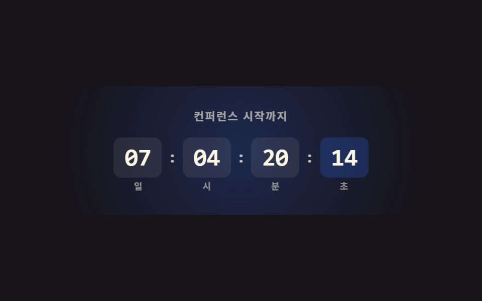
숫자 카드 네 자리(일·시·분·초)가 실제 목표 시각까지 1초마다 갱신되고, 초 단위 카드는 자동 재생에서도 translateY+scale 로 넛지하는 애니메이션을 반복합니다.
使いどころ
translateYsetIntervalDate
<main class="stage">
  <section class="cd">
    <span class="cd__glow" aria-hidden="true"></span>
    <p class="cd__label">カンファレンス開始まで</p>
    <div class="cd__row" role="timer" aria-live="off">
      <div class="cd__unit"><span class="cd__num" data-u="d">07</span><span class="cd__unit-label">日</span></div>
      <span class="cd__sep">:</span>
      <div class="cd__unit"><span class="cd__num" data-u="h">04</span><span class="cd__unit-label">時</span></div>
      <span class="cd__sep">:</span>
      <div class="cd__unit"><span class="cd__num" data-u="m">20</span><span class="cd__unit-label">分</span></div>
      <span class="cd__sep">:</span>
      <div class="cd__unit"><span class="cd__num cd__num--s" data-u="s">15</span><span class="cd__unit-label">秒</span></div>
    </div>
  </section>
</main>
@use "../../../../site/static/demo-tokens" as *;
// ── 변수 3개 ──────────────────────────────────────────
$duration: $dur-quick; // 초 카드 틱 전환
$easing: $ease-pop;
$color: $subject-blue; // 숫자 카드 강조색
@include stage($stage-ink);
.cd {
position: relative;
box-sizing: border-box; // width 에 패딩을 포함 — 아니면 320px 에서 패딩만큼 넘친다(실측 2026-09-10)
width: min(380px, 94vw);
text-align: center;
padding: $sp-6 $sp-4;
isolation: isolate;
overflow: hidden;
}
.cd__glow {
position: absolute; inset: -20% -10%;
z-index: -1;
background: radial-gradient(circle, rgba(47, 109, 246, .3), transparent 70%);
animation: cd-glow 2.6s ease-in-out infinite;
}
@keyframes cd-glow {
0%, 100% { opacity: .5; transform: scale(1); }
50% { opacity: .9; transform: scale(1.08); }
}
.cd__label {
margin: 0 0 $sp-4;
font-weight: 700; font-size: 11px; line-height: 1; font-family: inherit;
letter-spacing: .1em;
color: rgba(255, 247, 230, .6);
}
.cd__row { display: flex; align-items: center; justify-content: center; gap: $sp-2; }
.cd__unit { display: flex; flex-direction: column; align-items: center; gap: $sp-1; }
.cd__num {
display: block;
min-width: 40px;
padding: $sp-2 $sp-1;
border-radius: $r-sm;
background: rgba(255, 247, 230, .08);
color: $subject-cream;
font: 800 clamp(18px, 5.6vw, 24px)/1 "Space Mono", monospace;
font-variant-numeric: tabular-nums;
}
.cd__num--s { background: rgba(47, 109, 246, .22); color: $subject-cream; animation: cd-tick 1s $easing infinite; transform-origin: center; }
@keyframes cd-tick {
0%, 55% { transform: translateY(0) scale(1); }
78% { transform: translateY(-3px) scale(1.1); }
100% { transform: translateY(0) scale(1); }
}
.cd__unit-label { font-weight: 600; font-size: 9px; line-height: 1; font-family: inherit; color: rgba(255, 247, 230, .5); }
.cd__sep { font-weight: 700; font-size: 16px; line-height: 1; font-family: inherit; color: rgba($subject-cream, .72); margin-top: -$sp-4; }
// ── 접근성 ──────────────────────────────────────────
@media (prefers-reduced-motion: reduce) {
.cd__glow, .cd__num--s { animation: none !important; }
}html, body {
margin: 0;
overflow: hidden;
}
.stage {
box-sizing: border-box;
min-height: 100vh;
display: grid;
place-items: center;
margin: 0;
background: #17141a;
font-family: -apple-system, "Segoe UI", "Noto Sans KR", sans-serif;
padding: clamp(8px, 4vw, 24px);
}
.cd {
position: relative;
box-sizing: border-box;
width: min(380px, 94vw);
text-align: center;
padding: 24px 16px;
isolation: isolate;
overflow: hidden;
}
.cd__glow {
position: absolute;
inset: -20% -10%;
z-index: -1;
background: radial-gradient(circle, rgba(47, 109, 246, 0.3), transparent 70%);
animation: cd-glow 2.6s ease-in-out infinite;
}
@keyframes cd-glow {
0%, 100% {
opacity: 0.5;
transform: scale(1);
}
50% {
opacity: 0.9;
transform: scale(1.08);
}
}
.cd__label {
margin: 0 0 16px;
font-weight: 700;
font-size: 11px;
line-height: 1;
font-family: inherit;
letter-spacing: 0.1em;
color: rgba(255, 247, 230, 0.6);
}
.cd__row {
display: flex;
align-items: center;
justify-content: center;
gap: 8px;
}
.cd__unit {
display: flex;
flex-direction: column;
align-items: center;
gap: 4px;
}
.cd__num {
display: block;
min-width: 40px;
padding: 8px 4px;
border-radius: 8px;
background: rgba(255, 247, 230, 0.08);
color: #fff7e6;
font: 800 clamp(18px, 5.6vw, 24px)/1 "Space Mono", monospace;
font-variant-numeric: tabular-nums;
}
.cd__num--s {
background: rgba(47, 109, 246, 0.22);
color: #fff7e6;
animation: cd-tick 1s cubic-bezier(0.2, 1.4, 0.4, 1) infinite;
transform-origin: center;
}
@keyframes cd-tick {
0%, 55% {
transform: translateY(0) scale(1);
}
78% {
transform: translateY(-3px) scale(1.1);
}
100% {
transform: translateY(0) scale(1);
}
}
.cd__unit-label {
font-weight: 600;
font-size: 9px;
line-height: 1;
font-family: inherit;
color: rgba(255, 247, 230, 0.5);
}
.cd__sep {
font-weight: 700;
font-size: 16px;
line-height: 1;
font-family: inherit;
color: rgba(255, 247, 230, 0.72);
margin-top: -16px;
}
@media (prefers-reduced-motion: reduce) {
.cd__glow, .cd__num--s {
animation: none !important;
}
}// 실제 동작: 목표 시각(지금부터 정확히 7日 4시간 20分 15秒 뒤)까지 1초마다 실제로 줄어든다.
var target = Date.now() + ((7 * 24 * 60 * 60) + (4 * 60 * 60) + (20 * 60) + 15) * 1000;
var els = {
d: document.querySelector('[data-u="d"]'),
h: document.querySelector('[data-u="h"]'),
m: document.querySelector('[data-u="m"]'),
s: document.querySelector('[data-u="s"]')
};
function pad(n) { return String(Math.max(0, n)).padStart(2, '0'); }
function tick() {
var diff = Math.max(0, target - Date.now());
var s = Math.floor(diff / 1000);
els.d.textContent = pad(Math.floor(s / 86400));
els.h.textContent = pad(Math.floor((s % 86400) / 3600));
els.m.textContent = pad(Math.floor((s % 3600) / 60));
els.s.textContent = pad(s % 60);
}
tick();
setInterval(tick, 1000);import { useEffect, useState } from "react";
import type { CSSProperties } from "react";
import styles from "./CountdownBand.module.scss";
function pad(n: number) {
return String(Math.max(0, n)).padStart(2, "0");
}
export type CountdownBandProps = { duration?: number; easing?: string; color?: string; targetMs?: number };
type Vars = CSSProperties & { "--duration"?: string; "--easing"?: string; "--color"?: string };
export default function CountdownBand({
duration = 220,
easing = "cubic-bezier(.2,1.4,.4,1)",
color = "#2f6df6",
targetMs = Date.now() + ((7 * 24 * 60 * 60) + (4 * 60 * 60) + (20 * 60) + 15) * 1000,
}: CountdownBandProps) {
const [left, setLeft] = useState(Math.max(0, targetMs - Date.now()));
const vars: Vars = { "--duration": `${duration}ms`, "--easing": easing, "--color": color };
useEffect(() => {
const id = setInterval(() => setLeft(Math.max(0, targetMs - Date.now())), 1000);
return () => clearInterval(id);
}, [targetMs]);
const s = Math.floor(left / 1000);
const d = Math.floor(s / 86400);
const h = Math.floor((s % 86400) / 3600);
const m = Math.floor((s % 3600) / 60);
const sec = s % 60;
return (
<section className={styles.cd} style={vars}>
<span className={styles.glow} aria-hidden="true" />
<p className={styles.label}>컨퍼런스 시작까지</p>
<div className={styles.row} role="timer" aria-live="off">
<div className={styles.unit}><span className={styles.num}>{pad(d)}</span><span className={styles.unitLabel}>일</span></div>
<span className={styles.sep}>:</span>
<div className={styles.unit}><span className={styles.num}>{pad(h)}</span><span className={styles.unitLabel}>시</span></div>
<span className={styles.sep}>:</span>
<div className={styles.unit}><span className={styles.num}>{pad(m)}</span><span className={styles.unitLabel}>분</span></div>
<span className={styles.sep}>:</span>
<div className={styles.unit}><span className={`${styles.num} ${styles.numS}`}>{pad(sec)}</span><span className={styles.unitLabel}>초</span></div>
</div>
</section>
);
}09 カウントダウン — 計測 累積面積 16.861% · 動いたフレーム 12/23GODRICH オリジナル · SCSS と React は zip に同梱 · 【コピペOK】カンファレンス LP セクション テンプレート9選
このデモが属する記事
 【コピペOK】カンファレンス LP セクション テンプレート9選カンファレンス LP セクションテンプレートは、ヒーロー・スケジュール・登壇者紹介のようなイベントランディングページ用ブロックを、LPにそのまま貼れる形でまとめたコード集です。9つのうち1つは、実際の目標時刻まで秒単位で減っていくカウントダ この記事のデモをすべて見る