04ボリュームノブ
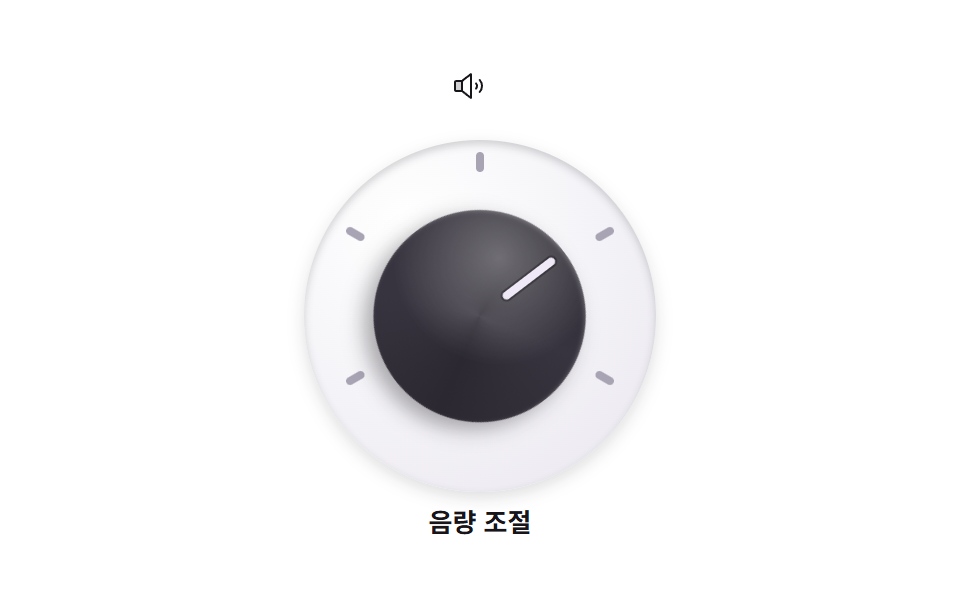
ボリュームノブが目盛りの最小から最大まで左右120度ずつ回り、明るい指針線が目盛りの上を通っていきます。
使いどころオーディオ・動画プレーヤーの設定ウィジェット
rotate 왕복지침 선radius 50%
<main class="stage">
  <section class="volknob" aria-label="ボリュームノブ">
    <span class="volknob__icon" aria-hidden="true">
      <svg xmlns="http://www.w3.org/2000/svg" width="1em" height="1em" viewBox="0 0 256 256"><g fill="currentColor"><path d="M80 88v80H32a8 8 0 0 1-8-8V96a8 8 0 0 1 8-8Z" opacity=".2"/><path d="M155.51 24.81a8 8 0 0 0-8.42.88L77.25 80H32a16 16 0 0 0-16 16v64a16 16 0 0 0 16 16h45.25l69.84 54.31A8 8 0 0 0 160 224V32a8 8 0 0 0-4.49-7.19M32 96h40v64H32Zm112 111.64l-56-43.55V91.91l56-43.55Zm54-106.08a40 40 0 0 1 0 52.88a8 8 0 0 1-12-10.58a24 24 0 0 0 0-31.72a8 8 0 0 1 12-10.58M248 128a79.9 79.9 0 0 1-20.37 53.34a8 8 0 0 1-11.92-10.67a64 64 0 0 0 0-85.33a8 8 0 1 1 11.92-10.67A79.83 79.83 0 0 1 248 128"/></g></svg>
    </span>
    <div class="volknob__panel">
      <span class="volknob__tick volknob__tick--1" aria-hidden="true"></span>
      <span class="volknob__tick volknob__tick--2" aria-hidden="true"></span>
      <span class="volknob__tick volknob__tick--3" aria-hidden="true"></span>
      <span class="volknob__tick volknob__tick--4" aria-hidden="true"></span>
      <span class="volknob__tick volknob__tick--5" aria-hidden="true"></span>
      <div class="volknob__knob">
        <span class="volknob__needle" aria-hidden="true"></span>
      </div>
    </div>
    <p class="volknob__label">音量調整</p>
  </section>
</main>
@use "../../../../site/static/demo-tokens" as *;
// 스큐어모픽 볼륨 노브 — 어두운 몸통에 밝은 지침. 몸통이 돌면 위 하이라이트 대비로 회전이 읽힌다
$knob-body: #2b2831; // 노브 몸통
$knob-face: #38343f; // 노브 윗면
$knob-line: #efe8f7; // 지침 선 (밝게)
$panel-bg: #eceaf1; // 눈금 판
$duration: $dur-loop; // 최소 → 최대 → 최소 한 주기
$easing: $ease-out; // 손을 떼면 감속하며 멈춘다
$color: $knob-body;
@include stage($stage-paper);
.volknob {
display: flex;
flex-direction: column;
align-items: center;
gap: $sp-2;
}
.volknob__icon {
width: 28px;
height: 28px;
color: $subject-ink;
}
// 눈금 판 — 눈금 다섯 개를 원주 위에 미리 돌려 놓는다 (정적)
.volknob__panel {
position: relative;
width: clamp(132px, 42vw, 176px);
aspect-ratio: 1;
border-radius: 50%;
background: radial-gradient(130% 130% at 30% 24%, #ffffff, $panel-bg 70%);
box-shadow: inset 0 2px 4px rgba(23, 20, 26, .18), 0 3px 8px rgba(23, 20, 26, .14);
}
.volknob__tick {
position: absolute;
top: 6px; left: calc(50% - 2px);
width: 4px;
height: 10px;
border-radius: $r-pill;
background: #a9a4b4;
transform-origin: 50% calc(clamp(66px, 21vw, 88px) - 11px); // 패널 중심까지 = 반지름 - 눈금 중심 y
}
.volknob__tick--1 { transform: rotate(-120deg); }
.volknob__tick--2 { transform: rotate(-60deg); }
.volknob__tick--3 { transform: rotate(0deg); }
.volknob__tick--4 { transform: rotate(60deg); }
.volknob__tick--5 { transform: rotate(120deg); }
// 노브 몸통 — 도는 주인공. 윗면 그라디언트가 살짝 비스듬해 회전이 읽힌다
.volknob__knob {
position: absolute;
top: 20%; left: 20%; right: 20%; bottom: 20%;
border-radius: 50%;
background:
radial-gradient(120% 120% at 34% 26%, rgba(255, 255, 255, .32), transparent 42%),
conic-gradient(from 250deg, $knob-face, $knob-body 90deg, $knob-face 170deg, $knob-body 260deg, $knob-face 340deg);
box-shadow: 0 6px 10px rgba(23, 20, 26, .35), inset 0 1px 2px rgba(255, 255, 255, .22);
animation: knobSweep $duration $easing infinite;
}
.volknob__knob:focus-visible {
outline: 3px solid $subject-blue;
outline-offset: 3px;
}
// 지침 선 — 노브 안에서 위로 뻗는다
.volknob__needle {
position: absolute;
top: 6%; left: calc(50% - 2px);
width: 4px;
height: 30%;
border-radius: $r-pill;
background: $knob-line;
box-shadow: 0 0 0 1px rgba(0, 0, 0, .3);
}
.volknob__label {
margin: 0;
color: $subject-ink;
font-weight: 700; font-size: clamp(11px, 2.8vw, 13px); line-height: 1;
font-family: inherit;
}
// 최소 눈금(-120도) 에서 최대(+120도) 까지 돌고 돌아온다 — 양 끝에서 잠시 멈춘다
@keyframes knobSweep {
0%, 8% { transform: rotate(-120deg); }
46%, 56% { transform: rotate(120deg); }
92%, 100% { transform: rotate(-120deg); }
}
@media (max-width: 340px), (max-height: 220px) {
.volknob__icon { width: 20px; height: 20px; }
.volknob__label { display: none; }
}
@media (prefers-reduced-motion: reduce) {
.volknob__knob { animation: none !important; transform: none; }
}html, body {
margin: 0;
overflow: hidden;
}
.stage {
box-sizing: border-box;
min-height: 100vh;
display: grid;
place-items: center;
margin: 0;
background: #ffffff;
font-family: -apple-system, "Segoe UI", "Noto Sans KR", sans-serif;
padding: clamp(8px, 4vw, 24px);
}
.volknob {
display: flex;
flex-direction: column;
align-items: center;
gap: 8px;
}
.volknob__icon {
width: 28px;
height: 28px;
color: #17141a;
}
.volknob__panel {
position: relative;
width: clamp(132px, 42vw, 176px);
aspect-ratio: 1;
border-radius: 50%;
background: radial-gradient(130% 130% at 30% 24%, #ffffff, #eceaf1 70%);
box-shadow: inset 0 2px 4px rgba(23, 20, 26, 0.18), 0 3px 8px rgba(23, 20, 26, 0.14);
}
.volknob__tick {
position: absolute;
top: 6px;
left: calc(50% - 2px);
width: 4px;
height: 10px;
border-radius: 999px;
background: #a9a4b4;
transform-origin: 50% calc(clamp(66px, 21vw, 88px) - 11px);
}
.volknob__tick--1 {
transform: rotate(-120deg);
}
.volknob__tick--2 {
transform: rotate(-60deg);
}
.volknob__tick--3 {
transform: rotate(0deg);
}
.volknob__tick--4 {
transform: rotate(60deg);
}
.volknob__tick--5 {
transform: rotate(120deg);
}
.volknob__knob {
position: absolute;
top: 20%;
left: 20%;
right: 20%;
bottom: 20%;
border-radius: 50%;
background: radial-gradient(120% 120% at 34% 26%, rgba(255, 255, 255, 0.32), transparent 42%), conic-gradient(from 250deg, #38343f, #2b2831 90deg, #38343f 170deg, #2b2831 260deg, #38343f 340deg);
box-shadow: 0 6px 10px rgba(23, 20, 26, 0.35), inset 0 1px 2px rgba(255, 255, 255, 0.22);
animation: knobSweep 2s ease-out infinite;
}
.volknob__knob:focus-visible {
outline: 3px solid #2f6df6;
outline-offset: 3px;
}
.volknob__needle {
position: absolute;
top: 6%;
left: calc(50% - 2px);
width: 4px;
height: 30%;
border-radius: 999px;
background: #efe8f7;
box-shadow: 0 0 0 1px rgba(0, 0, 0, 0.3);
}
.volknob__label {
margin: 0;
color: #17141a;
font-weight: 700;
font-size: clamp(11px, 2.8vw, 13px);
line-height: 1;
font-family: inherit;
}
@keyframes knobSweep {
0%, 8% {
transform: rotate(-120deg);
}
46%, 56% {
transform: rotate(120deg);
}
92%, 100% {
transform: rotate(-120deg);
}
}
@media (max-width: 340px), (max-height: 220px) {
.volknob__icon {
width: 20px;
height: 20px;
}
.volknob__label {
display: none;
}
}
@media (prefers-reduced-motion: reduce) {
.volknob__knob {
animation: none !important;
transform: none;
}
}import type { CSSProperties } from "react";
import styles from "./VolumeKnob.module.scss";
export type VolumeKnobProps = {
label?: string;
/** 스크린리더용 섹션 이름 (기본 "볼륨 노브") */
ariaLabel?: string;
/** 한 주기(기본 2000ms) */
duration?: number;
easing?: string;
color?: string;
};
type Vars = CSSProperties & { "--duration"?: string; "--easing"?: string; "--color"?: string };
export default function VolumeKnob({
label = "음량 조절",
ariaLabel = "볼륨 노브",
duration = 2000,
easing = "ease-out",
color = "#2b2831",
}: VolumeKnobProps) {
const vars: Vars = { "--duration": `${duration}ms`, "--easing": easing, "--color": color };
return (
<section className={styles.volknob} style={vars} aria-label={ariaLabel}>
<span className={styles.icon} aria-hidden="true">
<svg xmlns="http://www.w3.org/2000/svg" width="1em" height="1em" viewBox="0 0 256 256"><g fill="currentColor"><path d="M80 88v80H32a8 8 0 0 1-8-8V96a8 8 0 0 1 8-8Z" opacity=".2"/><path d="M155.51 24.81a8 8 0 0 0-8.42.88L77.25 80H32a16 16 0 0 0-16 16v64a16 16 0 0 0 16 16h45.25l69.84 54.31A8 8 0 0 0 160 224V32a8 8 0 0 0-4.49-7.19M32 96h40v64H32Zm112 111.64l-56-43.55V91.91l56-43.55Zm54-106.08a40 40 0 0 1 0 52.88a8 8 0 0 1-12-10.58a24 24 0 0 0 0-31.72a8 8 0 0 1 12-10.58M248 128a79.9 79.9 0 0 1-20.37 53.34a8 8 0 0 1-11.92-10.67a64 64 0 0 0 0-85.33a8 8 0 1 1 11.92-10.67A79.83 79.83 0 0 1 248 128"/></g></svg>
</span>
<div className={styles.panel}>
<span className={`${styles.tick} ${styles.tick1}`} aria-hidden="true" />
<span className={`${styles.tick} ${styles.tick2}`} aria-hidden="true" />
<span className={`${styles.tick} ${styles.tick3}`} aria-hidden="true" />
<span className={`${styles.tick} ${styles.tick4}`} aria-hidden="true" />
<span className={`${styles.tick} ${styles.tick5}`} aria-hidden="true" />
<div className={styles.knob}>
<span className={styles.needle} aria-hidden="true" />
</div>
</div>
<p className={styles.label}>{label}</p>
</section>
);
}04 ボリュームノブ — 計測 累積面積 8.684% · 動いたフレーム 18/23GODRICH オリジナル · SCSS と React は zip に同梱 · スキューモーフィズムデザインの質感パーツ9選
このデモが属する記事
 スキューモーフィズムデザインの質感パーツ9選スキューモーフィズムデザインは、革・金属・木目・ガラスといった実物の質感を画面に持ち込むスタイルです。革・金属・木目をCSSの値だけで作り、テクスチャ写真を1枚も使わずに、2024年以降の製品サイトに少しずつ戻ってきた「選択的な質感」を貼っ この記事のデモをすべて見る