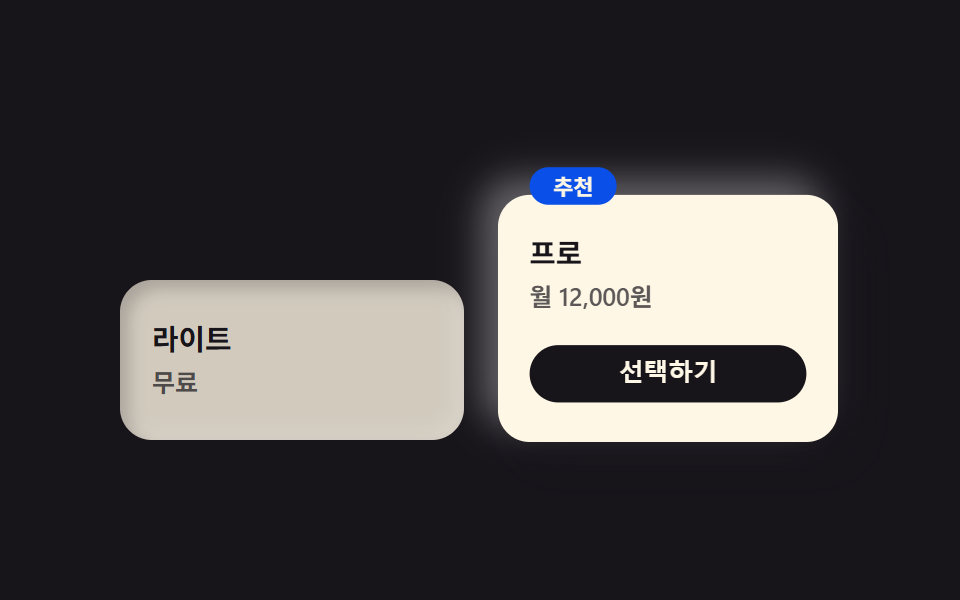
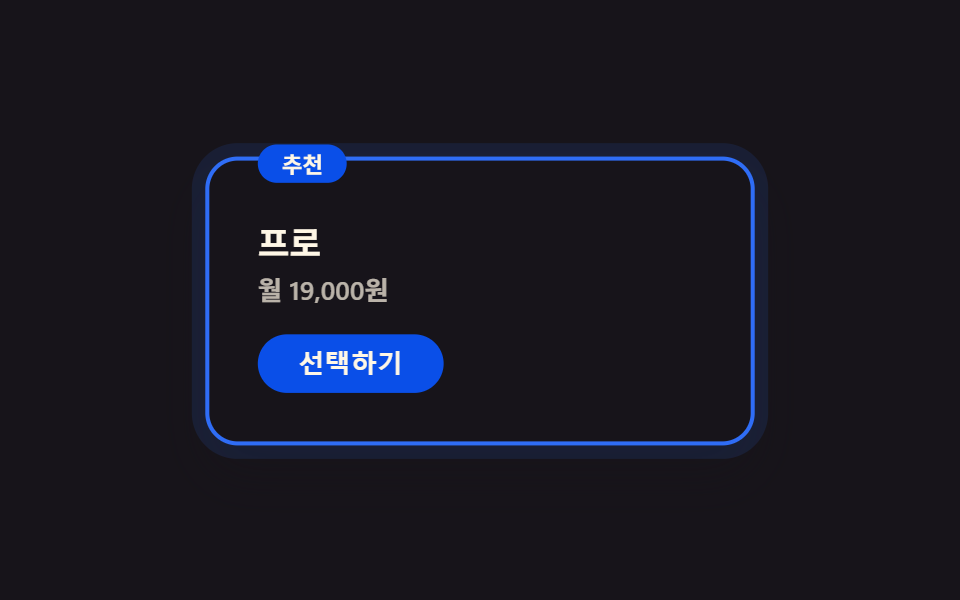
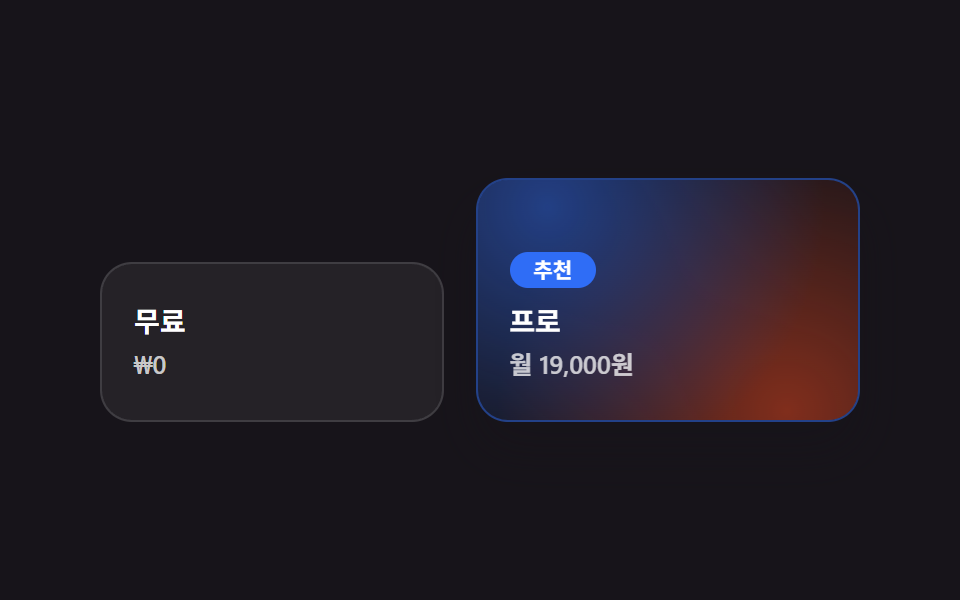
05強調プランのホログラフィック
おすすめプランのカードだけ多色のホログラフィックグラデーションが背景の位置をゆっくり移動し、他のカードはマットなクロムグレーのままでコントラストを作ります。
使いどころ3段階の料金プラン・無料と有料の比較
background-position 이동다색 gradient강조 카드 확대
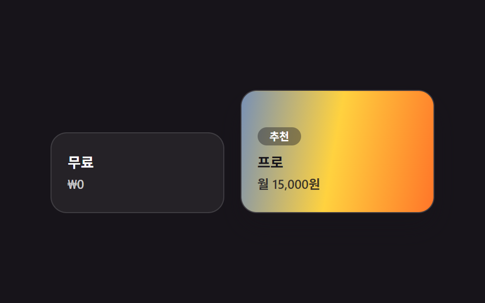
<main class="stage">
  <section class="pricing-c">
    <div class="pricing-c__plan">
      <p class="pricing-c__name">無料</p>
      <p class="pricing-c__price">₩0</p>
    </div>
    <div class="pricing-c__plan pricing-c__plan--pro">
      <span class="pricing-c__badge">おすすめ</span>
      <p class="pricing-c__name">プロ</p>
      <p class="pricing-c__price">月15,000円</p>
    </div>
  </section>
</main>
@use "../../../../site/static/demo-tokens" as *;
$duration: $dur-loop;
$easing: linear;
$color: $subject-blue;
@include stage($stage-ink);
.pricing-c { display: flex; align-items: flex-end; gap: $sp-4; width: clamp(240px, 82vw, 380px); }
.pricing-c__plan {
flex: 1;
border-radius: $r-card;
padding: $sp-5 $sp-4;
background: rgba($stage-paper, .06);
border: 1px solid rgba($stage-paper, .12);
}
.pricing-c__plan--pro {
position: relative;
overflow: hidden;
flex: 1.15;
padding-top: $sp-8;
box-shadow: $shadow-raised;
}
// 추천 플랜만 다색 홀로그램 그라디언트가 배경 위치를 흐르며 이동한다 (유일한 애니메이션). 무료 플랜은 무광 회색 그대로
.pricing-c__plan--pro::before {
content: "";
position: absolute;
inset: 0;
background: linear-gradient(100deg, $color, $stage-yellow, $stage-orange, $subject-cream, $color);
background-size: 320% 100%;
animation: holoShift $duration $easing infinite;
}
.pricing-c__badge {
position: relative;
z-index: 1;
display: inline-block;
margin-bottom: $sp-2;
border-radius: $r-pill;
background: rgba($stage-ink, .4);
color: $stage-paper;
padding: $sp-1 $sp-3;
font-weight: 700;
font-size: clamp(9.5px, 2.2vw, 11px);
line-height: 1;
font-family: -apple-system, "Segoe UI", "Noto Sans KR", sans-serif;
}
.pricing-c__name {
position: relative;
z-index: 1;
margin: 0 0 $sp-1;
color: $stage-paper;
font-weight: 700;
font-size: clamp(12px, 3vw, 14px);
line-height: 1.3;
font-family: -apple-system, "Segoe UI", "Noto Sans KR", sans-serif;
}
.pricing-c__price {
position: relative;
z-index: 1;
margin: 0;
color: rgba($stage-paper, .75);
font-weight: 600;
font-size: clamp(11px, 2.6vw, 12.5px);
line-height: 1.3;
font-family: inherit;
}
.pricing-c__plan--pro .pricing-c__name { color: $stage-ink; }
.pricing-c__plan--pro .pricing-c__price { color: rgba($stage-ink, .8); }
@keyframes holoShift { 0% { background-position: 0% 50%; } 100% { background-position: 320% 50%; } }
@media (prefers-reduced-motion: reduce) {
.pricing-c__plan--pro::before { animation: none; }
}html, body {
margin: 0;
overflow: hidden;
}
.stage {
box-sizing: border-box;
min-height: 100vh;
display: grid;
place-items: center;
margin: 0;
background: #17141a;
font-family: -apple-system, "Segoe UI", "Noto Sans KR", sans-serif;
padding: clamp(8px, 4vw, 24px);
}
.pricing-c {
display: flex;
align-items: flex-end;
gap: 16px;
width: clamp(240px, 82vw, 380px);
}
.pricing-c__plan {
flex: 1;
border-radius: 16px;
padding: 20px 16px;
background: rgba(255, 255, 255, 0.06);
border: 1px solid rgba(255, 255, 255, 0.12);
}
.pricing-c__plan--pro {
position: relative;
overflow: hidden;
flex: 1.15;
padding-top: 32px;
box-shadow: 0 14px 24px rgba(23, 20, 26, 0.32);
}
.pricing-c__plan--pro::before {
content: "";
position: absolute;
inset: 0;
background: linear-gradient(100deg, #2f6df6, #ffd23f, #ff4d1f, #fff7e6, #2f6df6);
background-size: 320% 100%;
animation: holoShift 2s linear infinite;
}
.pricing-c__badge {
position: relative;
z-index: 1;
display: inline-block;
margin-bottom: 8px;
border-radius: 999px;
background: rgba(23, 20, 26, 0.4);
color: #ffffff;
padding: 4px 12px;
font-weight: 700;
font-size: clamp(9.5px, 2.2vw, 11px);
line-height: 1;
font-family: -apple-system, "Segoe UI", "Noto Sans KR", sans-serif;
}
.pricing-c__name {
position: relative;
z-index: 1;
margin: 0 0 4px;
color: #ffffff;
font-weight: 700;
font-size: clamp(12px, 3vw, 14px);
line-height: 1.3;
font-family: -apple-system, "Segoe UI", "Noto Sans KR", sans-serif;
}
.pricing-c__price {
position: relative;
z-index: 1;
margin: 0;
color: rgba(255, 255, 255, 0.75);
font-weight: 600;
font-size: clamp(11px, 2.6vw, 12.5px);
line-height: 1.3;
font-family: inherit;
}
.pricing-c__plan--pro .pricing-c__name {
color: #17141a;
}
.pricing-c__plan--pro .pricing-c__price {
color: rgba(23, 20, 26, 0.8);
}
@keyframes holoShift {
0% {
background-position: 0% 50%;
}
100% {
background-position: 320% 50%;
}
}
@media (prefers-reduced-motion: reduce) {
.pricing-c__plan--pro::before {
animation: none;
}
}import type { CSSProperties } from "react";
import styles from "./PricingChrome.module.scss";
export type PricingChromeProps = {
freeName?: string;
freePrice?: string;
proName?: string;
proPrice?: string;
badge?: string;
/** 한 주기(기본 2000ms) */
duration?: number;
easing?: string;
color?: string;
};
type Vars = CSSProperties & { "--duration"?: string; "--easing"?: string; "--color"?: string };
export default function PricingChrome({
freeName = "Free",
freePrice = "$0",
proName = "Pro",
proPrice = "$15/mo",
badge = "Recommended",
duration = 2000,
easing = "linear",
color = "#2f6df6",
}: PricingChromeProps) {
const vars: Vars = { "--duration": `${duration}ms`, "--easing": easing, "--color": color };
return (
<section className={styles.pricing} style={vars}>
<div className={styles.plan}>
<p className={styles.name}>{freeName}</p>
<p className={styles.price}>{freePrice}</p>
</div>
<div className={`${styles.plan} ${styles.plaPro}`}>
<span className={styles.badge}>{badge}</span>
<p className={styles.name}>{proName}</p>
<p className={styles.price}>{proPrice}</p>
</div>
</section>
);
}05 強調プランのホログラフィック — 計測 累積面積 15.662% · 動いたフレーム 23/23GODRICH オリジナル · SCSS と React は zip に同梱 · y2k webデザインとは?クロムとホログラフィックのLPパーツ9選
このデモが属する記事
 y2k webデザインとは?クロムとホログラフィックのLPパーツ9選y2k webデザインとは、2000年代のCDやホログラム包装紙にあったクロムの輝きと虹色の反射を、CSSだけで蘇らせるスタイルです。CDの裏で虹色ににじんでいたあの光が、今度はボタンや見出しの中に入ってきました。 この記事のデモをすべて見る