07ブラッシュドアルミCTA帯
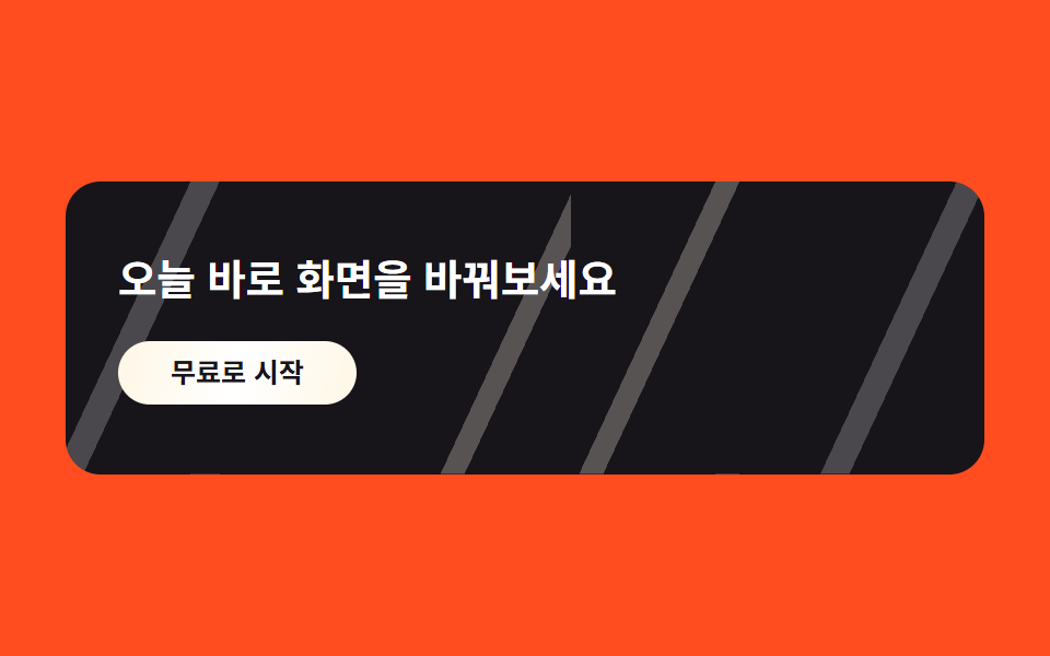
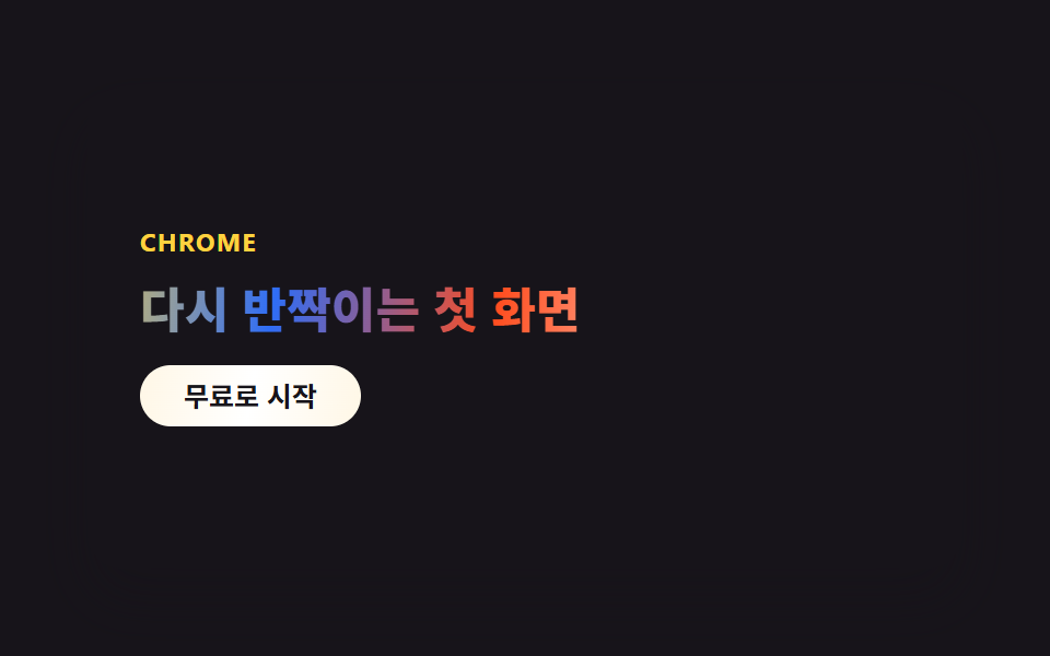
画面幅いっぱいの帯の上を斜めの光の筋が2本ゆっくり流れ、ブラッシュドアルミが光を受けた瞬間のように見えます。
使いどころ登録誘導帯・無料トライアル開始
대각선 라이트 밴드background-position 애니메이션metallic 버튼
<main class="stage">
  <section class="cta-c">
    <h3 class="cta-c__title">今日、画面を変えてみましょう</h3>
    <button class="cta-c__btn" type="button">無料で始める</button>
  </section>
</main>
@use "../../../../site/static/demo-tokens" as *;
$duration: $dur-loop;
$easing: linear;
$color: $subject-cream;
@include stage($stage-orange);
.stage { padding: clamp(8px, 4vw, 24px); }
.cta-c {
position: relative;
overflow: hidden;
box-sizing: border-box;
width: clamp(260px, 90vw, 420px);
border-radius: $r-card;
padding: $sp-8 $sp-6;
background: $stage-ink;
}
// 브러시드 알루미늄 — 대각선 빛줄기 두 가닥이 천천히 흘러간다 (유일한 애니메이션)
.cta-c::before {
content: "";
position: absolute;
inset: 0;
background: repeating-linear-gradient(115deg,
rgba($stage-ink, 0) 0 60px,
rgba($color, .28) 60px 70px,
rgba($stage-ink, 0) 70px 160px,
rgba($stage-paper, .22) 160px 172px,
rgba($stage-ink, 0) 172px 260px);
background-size: 220% 100%;
animation: bandSweep $duration $easing infinite;
}
.cta-c__title {
position: relative;
z-index: 1;
margin: 0 0 $sp-4;
color: $stage-paper;
font-weight: 700;
font-size: clamp(16px, 4vw, 20px);
line-height: 1.3;
font-family: -apple-system, "Segoe UI", "Noto Sans KR", sans-serif;
}
.cta-c__btn {
position: relative;
z-index: 1;
border: 0;
border-radius: $r-pill;
background: linear-gradient(100deg, $color, $stage-paper, $color);
color: $stage-ink;
padding: $sp-2 $sp-6;
font-weight: 700;
font-size: clamp(11px, 2.6vw, 13px);
line-height: 1;
font-family: inherit;
}
@keyframes bandSweep { 0% { background-position: 0% 50%; } 100% { background-position: -220% 50%; } }
@media (prefers-reduced-motion: reduce) {
.cta-c::before { animation: none; }
}html, body {
margin: 0;
overflow: hidden;
}
.stage {
box-sizing: border-box;
min-height: 100vh;
display: grid;
place-items: center;
margin: 0;
background: #ff4d1f;
font-family: -apple-system, "Segoe UI", "Noto Sans KR", sans-serif;
padding: clamp(8px, 4vw, 24px);
}
.stage {
padding: clamp(8px, 4vw, 24px);
}
.cta-c {
position: relative;
overflow: hidden;
box-sizing: border-box;
width: clamp(260px, 90vw, 420px);
border-radius: 16px;
padding: 32px 24px;
background: #17141a;
}
.cta-c::before {
content: "";
position: absolute;
inset: 0;
background: repeating-linear-gradient(115deg, rgba(23, 20, 26, 0) 0 60px, rgba(255, 247, 230, 0.28) 60px 70px, rgba(23, 20, 26, 0) 70px 160px, rgba(255, 255, 255, 0.22) 160px 172px, rgba(23, 20, 26, 0) 172px 260px);
background-size: 220% 100%;
animation: bandSweep 2s linear infinite;
}
.cta-c__title {
position: relative;
z-index: 1;
margin: 0 0 16px;
color: #ffffff;
font-weight: 700;
font-size: clamp(16px, 4vw, 20px);
line-height: 1.3;
font-family: -apple-system, "Segoe UI", "Noto Sans KR", sans-serif;
}
.cta-c__btn {
position: relative;
z-index: 1;
border: 0;
border-radius: 999px;
background: linear-gradient(100deg, #fff7e6, #ffffff, #fff7e6);
color: #17141a;
padding: 8px 24px;
font-weight: 700;
font-size: clamp(11px, 2.6vw, 13px);
line-height: 1;
font-family: inherit;
}
@keyframes bandSweep {
0% {
background-position: 0% 50%;
}
100% {
background-position: -220% 50%;
}
}
@media (prefers-reduced-motion: reduce) {
.cta-c::before {
animation: none;
}
}import type { CSSProperties } from "react";
import styles from "./CtaBandChrome.module.scss";
export type CtaBandChromeProps = {
title?: string;
cta?: string;
/** 한 주기(기본 2000ms) */
duration?: number;
easing?: string;
color?: string;
};
type Vars = CSSProperties & { "--duration"?: string; "--easing"?: string; "--color"?: string };
export default function CtaBandChrome({
title = "Switch your screen today",
cta = "Start for free",
duration = 2000,
easing = "linear",
color = "#fff7e6",
}: CtaBandChromeProps) {
const vars: Vars = { "--duration": `${duration}ms`, "--easing": easing, "--color": color };
return (
<section className={styles.cta} style={vars}>
<h3 className={styles.title}>{title}</h3>
<button type="button" className={styles.btn}>{cta}</button>
</section>
);
}07 ブラッシュドアルミCTA帯 — 計測 累積面積 36.008% · 動いたフレーム 23/23GODRICH オリジナル · SCSS と React は zip に同梱 · y2k webデザインとは?クロムとホログラフィックのLPパーツ9選
このデモが属する記事
 y2k webデザインとは?クロムとホログラフィックのLPパーツ9選y2k webデザインとは、2000年代のCDやホログラム包装紙にあったクロムの輝きと虹色の反射を、CSSだけで蘇らせるスタイルです。CDの裏で虹色ににじんでいたあの光が、今度はボタンや見出しの中に入ってきました。 この記事のデモをすべて見る