02조건이 차야 열리는 버튼
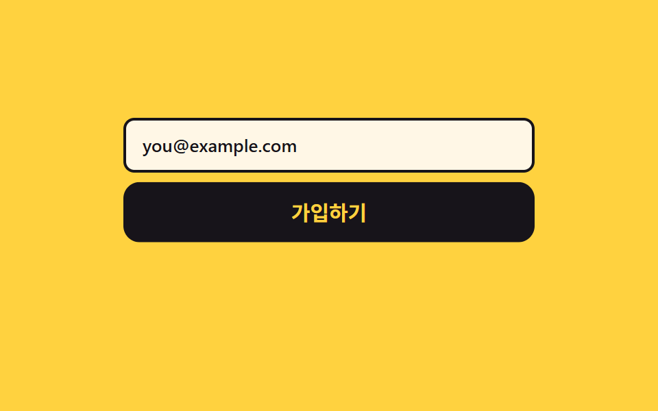
입력칸이 조건을 채우기 전에는 버튼이 흐리게 잠겨 있고, 초점은 받되 눌러도 아무 일이 없으며 왜 못 누르는지 이유가 말풍선으로 붙습니다.
쓰임약관 동의·필수 입력이 남은 회원가입과 결제 폼
aria-disabledcheckValiditypointer-events
<main class="stage">
  <div class="eg is-demo">
    <div class="eg__field">
      <input class="eg__input" id="eg-mail" type="email" required placeholder="[email protected]" aria-label="이메일 주소">
      <span class="eg__ghost" aria-hidden="true">[email protected]</span>
    </div>
    <div class="eg__wrap">
      <button class="eg__btn" id="eg-btn" type="button" aria-disabled="true" aria-describedby="eg-why">가입하기</button>
      <p class="eg__tip" id="eg-why" role="note">이메일 형식이 맞아야 눌립니다</p>
    </div>
  </div>
</main>
@use "../../../../site/static/demo-tokens" as *;
$duration: $dur-base;
$easing: $ease-spring;
$color: $subject-ink;
@include stage($stage-yellow);
.eg {
box-sizing: border-box;
display: flex;
flex-direction: column;
gap: $sp-3;
width: min(300px, 86vw);
font-family: -apple-system, "Segoe UI", "Noto Sans KR", sans-serif;
color: $color;
}
.eg__field {
position: relative;
height: 40px;
}
.eg__input {
box-sizing: border-box;
margin: 0;
padding: 0 $sp-3;
width: 100%;
height: 100%;
border: 2px solid $color;
border-radius: $r-sm;
background-color: $subject-cream;
color: $color;
font-family: inherit;
font-size: 13px;
line-height: 20px;
font-weight: 500;
}
.eg__input:focus-visible { outline: 3px solid $color; outline-offset: 2px; }
// 루프에서만 쓰는 가짜 입력 글자 — 진짜 입력칸 위에 겹쳐 한 글자씩 드러난다
.eg__ghost {
position: absolute;
left: 14px;
top: 10px;
overflow: hidden;
white-space: nowrap;
width: 0;
font-size: 13px;
line-height: 20px;
font-weight: 500;
color: $color;
}
.eg:not(.is-demo) .eg__ghost { display: none; }
.eg.is-demo .eg__input::placeholder { color: transparent; }
.eg__wrap {
position: relative;
padding-bottom: $sp-8; // 절대 배치한 말풍선 높이만큼 자리를 미리 비워 둔다 (scrollHeight 넘침 방지)
}
.eg__btn {
box-sizing: border-box;
margin: 0;
padding: 0 $sp-4;
width: 100%;
height: 44px;
border: 0;
border-radius: $r-control;
background-color: $subject-cream;
color: $color;
font-family: inherit;
font-size: 15px;
line-height: 20px;
font-weight: 700;
cursor: pointer;
}
.eg__btn:focus-visible { outline: 3px solid $color; outline-offset: 3px; }
.eg__btn[aria-disabled="true"] { opacity: .45; cursor: not-allowed; }
.eg__btn[aria-disabled="false"] { background-color: $color; color: $stage-yellow; box-shadow: $shadow-raised; }
.eg__btn[data-sent="1"] { background-color: $subject-mint; color: $color; }
.eg__tip {
position: absolute;
left: 0;
right: 0;
bottom: 0;
margin: 0;
padding: $sp-1 $sp-2;
border-radius: $r-xs;
background-color: $color;
color: $subject-cream;
text-align: center;
font-size: 11px;
line-height: 16px;
font-weight: 500;
pointer-events: none; // 말풍선이 버튼의 호버·클릭을 가로채면 안 된다
opacity: 0;
}
.eg:not(.is-demo) .eg__btn[aria-disabled="true"]:hover + .eg__tip,
.eg:not(.is-demo) .eg__btn:focus-visible + .eg__tip,
.eg:not(.is-demo) .eg__btn[data-why="1"] + .eg__tip { opacity: 1; }
// ── 자동 루프: 잠김 → 한 글자씩 입력(20~46%) → 열림(50%) → 다시 잠김(86%) ──
.eg.is-demo .eg__ghost {
animation-name: eg-type;
animation-duration: $dur-loop;
animation-timing-function: steps(8, end);
animation-iteration-count: infinite;
}
@keyframes eg-type {
0% { width: 0; }
20% { width: 0; }
46% { width: 120px; }
86% { width: 120px; }
87% { width: 0; }
100% { width: 0; }
}
.eg.is-demo .eg__btn {
animation-name: eg-open;
animation-duration: $dur-loop;
animation-timing-function: steps(1, end);
animation-iteration-count: infinite;
}
@keyframes eg-open {
0% { opacity: .45; background-color: $subject-cream; color: $color; }
50% { opacity: 1; background-color: $color; color: $stage-yellow; }
86% { opacity: .45; background-color: $subject-cream; color: $color; }
100% { opacity: .45; background-color: $subject-cream; color: $color; }
}
.eg.is-demo .eg__tip {
animation-name: eg-tip;
animation-duration: $dur-loop;
animation-timing-function: steps(1, end);
animation-iteration-count: infinite;
}
@keyframes eg-tip {
0% { opacity: 1; }
50% { opacity: 0; }
86% { opacity: 1; }
100% { opacity: 1; }
}
// 열리는 순간 버튼이 한 번 솟는다 — 컷 두 번만으로는 움직인 프레임이 모자란다
.eg.is-demo .eg__wrap {
animation-name: eg-rise;
animation-duration: $dur-loop;
animation-timing-function: $easing;
animation-iteration-count: infinite;
}
@keyframes eg-rise {
0% { transform: translateY(0); }
48% { transform: translateY(0); }
54% { transform: translateY(-6px); }
66% { transform: translateY(0); }
100% { transform: translateY(0); }
}
@media (max-width: 340px) {
.eg { gap: $sp-2; }
.eg__field { height: 36px; }
.eg__btn { height: 40px; font-size: 13px; line-height: 18px; }
.eg__ghost { top: 8px; }
.eg__wrap { padding-bottom: $sp-6; }
}
@media (prefers-reduced-motion: reduce) {
.eg.is-demo .eg__ghost,
.eg.is-demo .eg__btn,
.eg.is-demo .eg__tip,
.eg.is-demo .eg__wrap { animation: none !important; }
.eg.is-demo .eg__tip { opacity: 1; }
}html, body {
margin: 0;
overflow: hidden;
}
.stage {
box-sizing: border-box;
min-height: 100vh;
display: grid;
place-items: center;
margin: 0;
background: #ffd23f;
font-family: -apple-system, "Segoe UI", "Noto Sans KR", sans-serif;
padding: clamp(8px, 4vw, 24px);
}
.eg {
box-sizing: border-box;
display: flex;
flex-direction: column;
gap: 12px;
width: min(300px, 86vw);
font-family: -apple-system, "Segoe UI", "Noto Sans KR", sans-serif;
color: #17141a;
}
.eg__field {
position: relative;
height: 40px;
}
.eg__input {
box-sizing: border-box;
margin: 0;
padding: 0 12px;
width: 100%;
height: 100%;
border: 2px solid #17141a;
border-radius: 8px;
background-color: #fff7e6;
color: #17141a;
font-family: inherit;
font-size: 13px;
line-height: 20px;
font-weight: 500;
}
.eg__input:focus-visible {
outline: 3px solid #17141a;
outline-offset: 2px;
}
.eg__ghost {
position: absolute;
left: 14px;
top: 10px;
overflow: hidden;
white-space: nowrap;
width: 0;
font-size: 13px;
line-height: 20px;
font-weight: 500;
color: #17141a;
}
.eg:not(.is-demo) .eg__ghost {
display: none;
}
.eg.is-demo .eg__input::placeholder {
color: transparent;
}
.eg__wrap {
position: relative;
padding-bottom: 32px;
}
.eg__btn {
box-sizing: border-box;
margin: 0;
padding: 0 16px;
width: 100%;
height: 44px;
border: 0;
border-radius: 12px;
background-color: #fff7e6;
color: #17141a;
font-family: inherit;
font-size: 15px;
line-height: 20px;
font-weight: 700;
cursor: pointer;
}
.eg__btn:focus-visible {
outline: 3px solid #17141a;
outline-offset: 3px;
}
.eg__btn[aria-disabled=true] {
opacity: 0.45;
cursor: not-allowed;
}
.eg__btn[aria-disabled=false] {
background-color: #17141a;
color: #ffd23f;
box-shadow: 0 14px 24px rgba(23, 20, 26, 0.32);
}
.eg__btn[data-sent="1"] {
background-color: #4cd4a6;
color: #17141a;
}
.eg__tip {
position: absolute;
left: 0;
right: 0;
bottom: 0;
margin: 0;
padding: 4px 8px;
border-radius: 4px;
background-color: #17141a;
color: #fff7e6;
text-align: center;
font-size: 11px;
line-height: 16px;
font-weight: 500;
pointer-events: none;
opacity: 0;
}
.eg:not(.is-demo) .eg__btn[aria-disabled=true]:hover + .eg__tip,
.eg:not(.is-demo) .eg__btn:focus-visible + .eg__tip,
.eg:not(.is-demo) .eg__btn[data-why="1"] + .eg__tip {
opacity: 1;
}
.eg.is-demo .eg__ghost {
animation-name: eg-type;
animation-duration: 2s;
animation-timing-function: steps(8, end);
animation-iteration-count: infinite;
}
@keyframes eg-type {
0% {
width: 0;
}
20% {
width: 0;
}
46% {
width: 120px;
}
86% {
width: 120px;
}
87% {
width: 0;
}
100% {
width: 0;
}
}
.eg.is-demo .eg__btn {
animation-name: eg-open;
animation-duration: 2s;
animation-timing-function: steps(1, end);
animation-iteration-count: infinite;
}
@keyframes eg-open {
0% {
opacity: 0.45;
background-color: #fff7e6;
color: #17141a;
}
50% {
opacity: 1;
background-color: #17141a;
color: #ffd23f;
}
86% {
opacity: 0.45;
background-color: #fff7e6;
color: #17141a;
}
100% {
opacity: 0.45;
background-color: #fff7e6;
color: #17141a;
}
}
.eg.is-demo .eg__tip {
animation-name: eg-tip;
animation-duration: 2s;
animation-timing-function: steps(1, end);
animation-iteration-count: infinite;
}
@keyframes eg-tip {
0% {
opacity: 1;
}
50% {
opacity: 0;
}
86% {
opacity: 1;
}
100% {
opacity: 1;
}
}
.eg.is-demo .eg__wrap {
animation-name: eg-rise;
animation-duration: 2s;
animation-timing-function: cubic-bezier(0.2, 0.8, 0.2, 1);
animation-iteration-count: infinite;
}
@keyframes eg-rise {
0% {
transform: translateY(0);
}
48% {
transform: translateY(0);
}
54% {
transform: translateY(-6px);
}
66% {
transform: translateY(0);
}
100% {
transform: translateY(0);
}
}
@media (max-width: 340px) {
.eg {
gap: 8px;
}
.eg__field {
height: 36px;
}
.eg__btn {
height: 40px;
font-size: 13px;
line-height: 18px;
}
.eg__ghost {
top: 8px;
}
.eg__wrap {
padding-bottom: 24px;
}
}
@media (prefers-reduced-motion: reduce) {
.eg.is-demo .eg__ghost,
.eg.is-demo .eg__btn,
.eg.is-demo .eg__tip,
.eg.is-demo .eg__wrap {
animation: none !important;
}
.eg.is-demo .eg__tip {
opacity: 1;
}
}// 실제 동작: disabled 대신 aria-disabled 를 쓴다. 초점은 받되 동작만 막아, 왜 못 누르는지 읽힐 수 있다
var root = document.querySelector('.eg');
var mail = document.getElementById('eg-mail');
var btn = document.getElementById('eg-btn');
function validate() {
var ok = mail.checkValidity() && mail.value.length > 0;
btn.setAttribute('aria-disabled', String(!ok));
return ok;
}
mail.addEventListener('input', function () {
root.classList.remove('is-demo');
validate();
});
btn.addEventListener('click', function () {
root.classList.remove('is-demo');
if (!validate()) {
btn.setAttribute('data-why', '1'); // 잠긴 이유를 한 번 흔들어 보여 준다
setTimeout(function () { btn.removeAttribute('data-why'); }, 1400);
return;
}
btn.setAttribute('data-sent', '1');
});import { useState, useRef, useEffect } from "react";
import type { CSSProperties } from "react";
import styles from "./EnableGateButton.module.scss";
export type EnableGateButtonProps = {
labels?: { submit: string; tip: string; placeholder: string; mail: string };
duration?: number;
easing?: string;
color?: string;
};
type Vars = CSSProperties & { "--duration"?: string; "--easing"?: string; "--color"?: string };
type Timer = ReturnType<typeof setTimeout>;
type MailEvt = { currentTarget: { value: string; checkValidity(): boolean } };
const TIP_ID = "eg-why";
const WHY_MS = 1400; // 잠긴 이유를 보여 주는 시간
export default function EnableGateButton({
labels = {
submit: "Sign up",
tip: "Enter a valid email first",
placeholder: "[email protected]",
mail: "Email address",
},
duration = 300,
easing = "cubic-bezier(.2,.8,.2,1)",
color = "#17141a",
}: EnableGateButtonProps) {
const [demo, setDemo] = useState(true);
const [ok, setOk] = useState(false);
const [why, setWhy] = useState(false);
const [sent, setSent] = useState(false);
const tw = useRef<Timer>(null);
const vars: Vars = { "--duration": `${duration}ms`, "--easing": easing, "--color": color };
useEffect(() => () => {
if (tw.current !== null) clearTimeout(tw.current); // 떠날 때 예약된 타이머를 버린다
}, []);
// disabled 대신 aria-disabled 를 쓴다. 초점은 받되 동작만 막아, 왜 못 누르는지 읽힐 수 있다
function check(e: MailEvt) {
setDemo(false); // 사람이 입력했으니 자동 루프를 끈다
const el = e.currentTarget;
setOk(el.checkValidity() && el.value.length > 0);
}
function press() {
setDemo(false);
if (!ok) {
setWhy(true); // 잠긴 이유를 한 번 흔들어 보여 준다
if (tw.current !== null) clearTimeout(tw.current);
tw.current = setTimeout(() => setWhy(false), WHY_MS);
return;
}
setSent(true);
}
return (
<div className={`${styles.eg} ${demo ? styles.isDemo : ""}`} style={vars}>
<div className={styles.field}>
<input
className={styles.input}
type="email"
required
placeholder={labels.placeholder}
aria-label={labels.mail}
onChange={check}
/>
<span className={styles.ghost} aria-hidden="true">{labels.placeholder}</span>
</div>
<div className={styles.wrap}>
<button
className={styles.btn}
type="button"
aria-disabled={!ok}
aria-describedby={TIP_ID}
data-why={why ? "1" : undefined}
data-sent={sent ? "1" : undefined}
onClick={press}
>
{labels.submit}
</button>
<p className={styles.tip} id={TIP_ID} role="note">{labels.tip}</p>
</div>
</div>
);
}02 조건이 차야 열리는 버튼 — 측정 누적면적 15.819% · 움직인 프레임 12/23GODRICH 원작 · zip 에 SCSS·React 포함 · css 버튼 클릭 효과 9종 — 누른 다음이 진짜다
이 데모가 속한 글
 css 버튼 클릭 효과 9종 — 누른 다음이 진짜다css 버튼 클릭 효과는 누른 순간부터 결과가 나올 때까지 버튼이 스스로 모습을 바꿔 알려 주는 방식입니다. 아홉 개 모두 색만 바뀌는 흉내가 아니라 실제로 잠기고 돌고 되돌아오며, 그 사실을 ARIA 속성 한 곳에 이 글의 데모 전부 보기