04스퀴즈 드롭 아이콘 목록
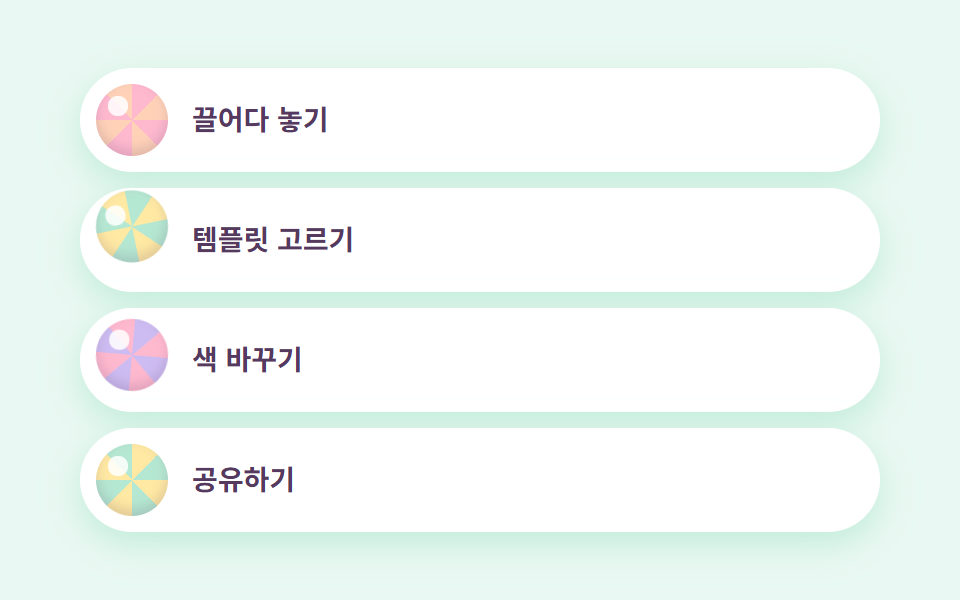
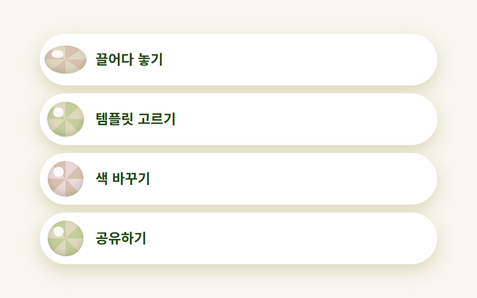
행마다 알약 모양 흰 카드가 있고 그 안의 동그란 아이콘이 방사형 그라디언트로 그린 과육 무늬입니다. 아이콘마다 시작 시각을 어긋내 놓으면 방울이 각자 다른 박자로 통통 튑니다.
쓰임기능 목록, 온보딩 스텝
radial 과육 무늬어긋난 바운스radius pill
<main class="stage">
  <ul class="listcitrus">
    <li class="listcitrus__row">
      <span class="listcitrus__drop listcitrus__drop--a" aria-hidden="true"></span>
      <span class="listcitrus__label">끌어다 놓기</span>
    </li>
    <li class="listcitrus__row">
      <span class="listcitrus__drop listcitrus__drop--b" aria-hidden="true"></span>
      <span class="listcitrus__label">템플릿 고르기</span>
    </li>
    <li class="listcitrus__row">
      <span class="listcitrus__drop listcitrus__drop--c" aria-hidden="true"></span>
      <span class="listcitrus__label">색 바꾸기</span>
    </li>
    <li class="listcitrus__row">
      <span class="listcitrus__drop listcitrus__drop--d" aria-hidden="true"></span>
      <span class="listcitrus__label">공유하기</span>
    </li>
  </ul>
</main>
@use "../../../../site/static/demo-tokens" as *;
$duration: $dur-loop; // 방울이 한 번 튀고 쉬는 주기
$easing: $ease-pop; // 튀어 오르는 감
$color: $stage-ink;
$citrus-cream: #fffaf0;
$citrus-orange: #d8c1b1;
$citrus-lime: #c4ce9c;
$citrus-grapefruit: #ebd6da;
$citrus-lemon: #dfd8be;
$citrus-lemon-deep: #bdb27a;
$citrus-ink: #204a17;
// 무대 — 레몬 물색
@include stage(mix($citrus-lemon, $stage-paper, 24%));
.listcitrus {
box-sizing: border-box;
width: clamp(260px, 88vw, 400px);
margin: 0;
padding: 0;
list-style: none;
display: flex;
flex-direction: column;
gap: $sp-2;
}
.listcitrus__row {
display: flex;
align-items: center;
gap: $sp-3;
padding: $sp-2 $sp-4 $sp-2 $sp-2;
border-radius: $r-pill;
background: $stage-paper;
box-shadow: 0 6px 16px rgba($citrus-lemon-deep, .45);
}
// 과육 무늬 — conic gradient 를 원으로 잘라 쓰고 하이라이트 점을 얹는다
.listcitrus__drop {
flex: 0 0 auto;
width: clamp(28px, 8vw, 36px);
aspect-ratio: 1;
border-radius: 50%;
position: relative;
box-shadow: inset 0 -3px 6px rgba($citrus-ink, .18);
}
.listcitrus__drop::after {
content: "";
position: absolute;
top: 18%;
left: 18%;
width: 26%;
aspect-ratio: 1;
border-radius: 50%;
background: rgba($stage-paper, .85);
}
.listcitrus__drop--a {
background: repeating-conic-gradient($citrus-orange 0deg 45deg, $citrus-lemon 45deg 90deg);
animation: dropSqueeze $duration $easing infinite;
}
.listcitrus__drop--b {
background: repeating-conic-gradient($citrus-lime 0deg 45deg, $citrus-lemon 45deg 90deg);
animation: dropSqueeze $duration $easing infinite;
animation-delay: calc($duration / -4);
}
.listcitrus__drop--c {
background: repeating-conic-gradient($citrus-grapefruit 0deg 45deg, $citrus-orange 45deg 90deg);
animation: dropSqueeze $duration $easing infinite;
animation-delay: calc($duration / -2);
}
.listcitrus__drop--d {
background: repeating-conic-gradient($citrus-lemon 0deg 45deg, $citrus-lime 45deg 90deg);
animation: dropSqueeze $duration $easing infinite;
animation-delay: calc($duration / -4 * 3);
}
.listcitrus__label {
color: $citrus-ink;
font-weight: 600; font-size: clamp(12px, 3vw, 14px); line-height: 1;
font-family: inherit;
}
// 데모: 방울 네 개가 시작 시각을 어긋내 각자 다른 박자로 눌렸다 튄다(스퀴즈)
@keyframes dropSqueeze {
0%, 40%, 100% { transform: scale(1, 1); }
15% { transform: scale(1.18, .78); }
28% { transform: scale(.92, 1.1); }
34% { transform: scale(1.05, .96); }
}
// 반응형: 320×200 처럼 세로가 짧은 화면에선 행 속을 줄인다(BD9)
@media (max-width: 340px), (max-height: 220px) {
.listcitrus { gap: $sp-1; }
.listcitrus__row { padding: $sp-1 $sp-3 $sp-1 $sp-1; gap: $sp-2; }
.listcitrus__drop { width: 20px; }
.listcitrus__label { font-size: 11px; }
}
@media (prefers-reduced-motion: reduce) {
.listcitrus__drop { animation: none !important; transform: none; }
}html, body {
margin: 0;
overflow: hidden;
}
.stage {
box-sizing: border-box;
min-height: 100vh;
display: grid;
place-items: center;
margin: 0;
background: rgb(96.9882352941%, 96.3294117647%, 93.8823529412%);
font-family: -apple-system, "Segoe UI", "Noto Sans KR", sans-serif;
padding: clamp(8px, 4vw, 24px);
}
.listcitrus {
box-sizing: border-box;
width: clamp(260px, 88vw, 400px);
margin: 0;
padding: 0;
list-style: none;
display: flex;
flex-direction: column;
gap: 8px;
}
.listcitrus__row {
display: flex;
align-items: center;
gap: 12px;
padding: 8px 16px 8px 8px;
border-radius: 999px;
background: #ffffff;
box-shadow: 0 6px 16px rgba(189, 178, 122, 0.45);
}
.listcitrus__drop {
flex: 0 0 auto;
width: clamp(28px, 8vw, 36px);
aspect-ratio: 1;
border-radius: 50%;
position: relative;
box-shadow: inset 0 -3px 6px rgba(32, 74, 23, 0.18);
}
.listcitrus__drop::after {
content: "";
position: absolute;
top: 18%;
left: 18%;
width: 26%;
aspect-ratio: 1;
border-radius: 50%;
background: rgba(255, 255, 255, 0.85);
}
.listcitrus__drop--a {
background: repeating-conic-gradient(#d8c1b1 0deg 45deg, #dfd8be 45deg 90deg);
animation: dropSqueeze 2s cubic-bezier(0.2, 1.4, 0.4, 1) infinite;
}
.listcitrus__drop--b {
background: repeating-conic-gradient(#c4ce9c 0deg 45deg, #dfd8be 45deg 90deg);
animation: dropSqueeze 2s cubic-bezier(0.2, 1.4, 0.4, 1) infinite;
animation-delay: -0.5s;
}
.listcitrus__drop--c {
background: repeating-conic-gradient(#ebd6da 0deg 45deg, #d8c1b1 45deg 90deg);
animation: dropSqueeze 2s cubic-bezier(0.2, 1.4, 0.4, 1) infinite;
animation-delay: -1s;
}
.listcitrus__drop--d {
background: repeating-conic-gradient(#dfd8be 0deg 45deg, #c4ce9c 45deg 90deg);
animation: dropSqueeze 2s cubic-bezier(0.2, 1.4, 0.4, 1) infinite;
animation-delay: -1.5s;
}
.listcitrus__label {
color: #204a17;
font-weight: 600;
font-size: clamp(12px, 3vw, 14px);
line-height: 1;
font-family: inherit;
}
@keyframes dropSqueeze {
0%, 40%, 100% {
transform: scale(1, 1);
}
15% {
transform: scale(1.18, 0.78);
}
28% {
transform: scale(0.92, 1.1);
}
34% {
transform: scale(1.05, 0.96);
}
}
@media (max-width: 340px), (max-height: 220px) {
.listcitrus {
gap: 4px;
}
.listcitrus__row {
padding: 4px 12px 4px 4px;
gap: 8px;
}
.listcitrus__drop {
width: 20px;
}
.listcitrus__label {
font-size: 11px;
}
}
@media (prefers-reduced-motion: reduce) {
.listcitrus__drop {
animation: none !important;
transform: none;
}
}import type { CSSProperties } from "react";
import styles from "./FeatureListCitrus.module.scss";
export type FeatureListCitrusItem = { label: string; tone: "a" | "b" | "c" | "d" };
export type FeatureListCitrusProps = {
items?: FeatureListCitrusItem[];
duration?: number;
easing?: string;
color?: string;
};
type Vars = CSSProperties & { "--duration"?: string; "--easing"?: string; "--color"?: string };
const DEFAULT_ITEMS: FeatureListCitrusItem[] = [
{ label: "끌어다 놓기", tone: "a" },
{ label: "템플릿 고르기", tone: "b" },
{ label: "색 바꾸기", tone: "c" },
{ label: "공유하기", tone: "d" },
];
export default function FeatureListCitrus({
items = DEFAULT_ITEMS,
duration = 2000,
easing = "cubic-bezier(.2,1.4,.4,1)",
color = "#ff9a52",
}: FeatureListCitrusProps) {
const vars: Vars = { "--duration": `${duration}ms`, "--easing": easing, "--color": color };
return (
<ul className={styles.listcitrus} style={vars}>
{items.map((it, i) => (
<li key={it.label} className={styles.row}>
<span
className={`${styles.drop} ${styles[`drop${it.tone.toUpperCase()}`]}`}
aria-hidden="true"
style={{ animationDelay: `${(-duration / 4) * i}ms` } as CSSProperties}
/>
<span className={styles.label}>{it.label}</span>
</li>
))}
</ul>
);
}04 스퀴즈 드롭 아이콘 목록 — 측정 누적면적 2.135% · 움직인 프레임 23/23GODRICH 원작 · zip 에 SCSS·React 포함 · 청량한 디자인 랜딩 UI 키트, 시트러스 컬러 섹션 9개
이 데모가 속한 글
 청량한 디자인 랜딩 UI 키트, 시트러스 컬러 섹션 9개청량한 디자인은 오렌지·라임·자몽·레몬처럼 채도 높은 과일 색을 크림 바탕 위에 얹고, 카드마다 같은 계열의 진한 색 그림자를 드리워 파스텔보다 더 쨍하고 여름 음료 브랜드처럼 싱그럽게 보이게 만드는 스타일입니다. 이 글의 데모 전부 보기