01길게 늘어나는 화살표
화살표 옆 링크에 마우스를 올리면 화살표 몸통이 길게 늘어나며 다음 페이지로 가라고 재촉합니다.
쓰임더보기·다음 글 링크, 카드 하단 CTA 텍스트
scaleXtranslateXhover
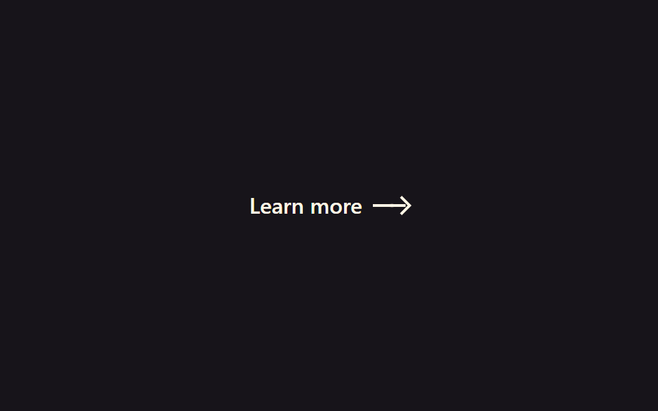
<main class="stage">
  <a class="ae-link is-demo" href="#">
    <span class="ae-link__label">Learn more</span>
    <span class="ae-link__arrow">
      <span class="ae-link__shaft"></span>
      <span class="ae-link__head"></span>
      <span class="ae-link__trail ae-link__trail--1" aria-hidden="true"></span>
      <span class="ae-link__trail ae-link__trail--2" aria-hidden="true"></span>
    </span>
  </a>
</main>
@use "../../../../site/static/demo-tokens" as *;
// ── 변수 3개 ──────────────────────────────────────────
$duration: $dur-loop; // is-demo 강제 루프 주기(캡처용). 실제 호버 전환은 아래 220ms 를 쓴다
$easing: $ease-elastic; // 고무줄식 오버슛 — 늘어났다 살짝 되돌아와 멈춘다
$color: $subject-cream;
@include stage($stage-ink);
.ae-link {
display: inline-flex;
align-items: center;
gap: $sp-2;
color: $color;
text-decoration: none;
font: 600 16px/1 -apple-system, "Segoe UI", sans-serif;
}
.ae-link__arrow {
position: relative;
display: inline-flex;
align-items: center;
width: 26px;
height: 12px;
}
.ae-link__shaft {
position: absolute;
left: 0;
width: 16px;
height: 2px;
background: $color;
transform-origin: left center; // 규칙8: 화살대 왼쪽서 늘어남
transform: scaleX(1);
transition: transform 260ms $easing;
}
.ae-link__head {
position: absolute;
left: 10px;
width: 8px;
height: 8px;
border-top: 2px solid $color;
border-right: 2px solid $color;
transform: translateX(0) rotate(45deg);
transition: transform 260ms $easing;
}
// 화살촉 트레일 파티클 — 신장하는 동안 화살촉 뒤로 작은 점 두 개가 지연·감쇠하며 따라붙는다
.ae-link__trail {
position: absolute;
left: 10px;
width: 4px;
height: 4px;
border-radius: 50%;
background: $color;
opacity: 0;
}
// 실사용: 링크에 마우스를 올리면 몸통(shaft)이 길게 늘어나고 화살촉(head)이 따라 밀려난다. $easing 이 고무줄 오버슛을 만든다
.ae-link:hover .ae-link__shaft { transform: scaleX(1.8); }
.ae-link:hover .ae-link__head { transform: translateX(10px) rotate(45deg); }
@keyframes ae-trail-hover {
0% { opacity: 0; transform: translateX(0) scale(.6); }
45% { opacity: .5; transform: translateX(5px) scale(1); }
100% { opacity: 0; transform: translateX(9px) scale(.4); }
}
.ae-link:hover .ae-link__trail--1 { animation: ae-trail-hover 420ms $ease-out forwards; }
.ae-link:hover .ae-link__trail--2 { animation: ae-trail-hover 420ms $ease-out 70ms forwards; }
// 데모 루프: is-demo 는 :hover 를 흉내 낸 keyframes 로 무한 반복 (헤드리스는 :hover 를 못 건다)
@keyframes ae-extend-shaft {
0%, 20% { transform: scaleX(1); }
50%, 70% { transform: scaleX(1.8); }
100% { transform: scaleX(1); }
}
@keyframes ae-extend-head {
0%, 20% { transform: translateX(0) rotate(45deg); }
50%, 70% { transform: translateX(10px) rotate(45deg); }
100% { transform: translateX(0) rotate(45deg); }
}
@keyframes ae-trail-loop {
0%, 20% { opacity: 0; transform: translateX(0) scale(.6); }
38% { opacity: .5; transform: translateX(5px) scale(1); }
50%, 70% { opacity: 0; transform: translateX(9px) scale(.4); }
100% { opacity: 0; transform: translateX(0) scale(.6); }
}
.ae-link.is-demo .ae-link__shaft { animation: ae-extend-shaft $duration $easing infinite; }
.ae-link.is-demo .ae-link__head { animation: ae-extend-head $duration $easing infinite; }
.ae-link.is-demo .ae-link__trail--1 { animation: ae-trail-loop $duration $ease-out infinite; }
.ae-link.is-demo .ae-link__trail--2 { animation: ae-trail-loop $duration $ease-out 60ms infinite; }
@media (prefers-reduced-motion: reduce) {
.ae-link:hover .ae-link__shaft,
.ae-link.is-demo .ae-link__shaft {
animation: none !important;
transition: none !important;
transform: scaleX(1) !important;
}
.ae-link:hover .ae-link__head,
.ae-link.is-demo .ae-link__head {
animation: none !important;
transition: none !important;
transform: translateX(0) rotate(45deg) !important;
}
.ae-link__trail,
.ae-link:hover .ae-link__trail,
.ae-link.is-demo .ae-link__trail {
animation: none !important;
opacity: 0 !important;
}
}html, body {
margin: 0;
overflow: hidden;
}
.stage {
box-sizing: border-box;
min-height: 100vh;
display: grid;
place-items: center;
margin: 0;
background: #17141a;
font-family: -apple-system, "Segoe UI", "Noto Sans KR", sans-serif;
padding: clamp(8px, 4vw, 24px);
}
.ae-link {
display: inline-flex;
align-items: center;
gap: 8px;
color: #fff7e6;
text-decoration: none;
font: 600 16px/1 -apple-system, "Segoe UI", sans-serif;
}
.ae-link__arrow {
position: relative;
display: inline-flex;
align-items: center;
width: 26px;
height: 12px;
}
.ae-link__shaft {
position: absolute;
left: 0;
width: 16px;
height: 2px;
background: #fff7e6;
transform-origin: left center;
transform: scaleX(1);
transition: transform 260ms cubic-bezier(0.34, 1.56, 0.64, 1);
}
.ae-link__head {
position: absolute;
left: 10px;
width: 8px;
height: 8px;
border-top: 2px solid #fff7e6;
border-right: 2px solid #fff7e6;
transform: translateX(0) rotate(45deg);
transition: transform 260ms cubic-bezier(0.34, 1.56, 0.64, 1);
}
.ae-link__trail {
position: absolute;
left: 10px;
width: 4px;
height: 4px;
border-radius: 50%;
background: #fff7e6;
opacity: 0;
}
.ae-link:hover .ae-link__shaft {
transform: scaleX(1.8);
}
.ae-link:hover .ae-link__head {
transform: translateX(10px) rotate(45deg);
}
@keyframes ae-trail-hover {
0% {
opacity: 0;
transform: translateX(0) scale(0.6);
}
45% {
opacity: 0.5;
transform: translateX(5px) scale(1);
}
100% {
opacity: 0;
transform: translateX(9px) scale(0.4);
}
}
.ae-link:hover .ae-link__trail--1 {
animation: ae-trail-hover 420ms ease-out forwards;
}
.ae-link:hover .ae-link__trail--2 {
animation: ae-trail-hover 420ms ease-out 70ms forwards;
}
@keyframes ae-extend-shaft {
0%, 20% {
transform: scaleX(1);
}
50%, 70% {
transform: scaleX(1.8);
}
100% {
transform: scaleX(1);
}
}
@keyframes ae-extend-head {
0%, 20% {
transform: translateX(0) rotate(45deg);
}
50%, 70% {
transform: translateX(10px) rotate(45deg);
}
100% {
transform: translateX(0) rotate(45deg);
}
}
@keyframes ae-trail-loop {
0%, 20% {
opacity: 0;
transform: translateX(0) scale(0.6);
}
38% {
opacity: 0.5;
transform: translateX(5px) scale(1);
}
50%, 70% {
opacity: 0;
transform: translateX(9px) scale(0.4);
}
100% {
opacity: 0;
transform: translateX(0) scale(0.6);
}
}
.ae-link.is-demo .ae-link__shaft {
animation: ae-extend-shaft 2s cubic-bezier(0.34, 1.56, 0.64, 1) infinite;
}
.ae-link.is-demo .ae-link__head {
animation: ae-extend-head 2s cubic-bezier(0.34, 1.56, 0.64, 1) infinite;
}
.ae-link.is-demo .ae-link__trail--1 {
animation: ae-trail-loop 2s ease-out infinite;
}
.ae-link.is-demo .ae-link__trail--2 {
animation: ae-trail-loop 2s ease-out 60ms infinite;
}
@media (prefers-reduced-motion: reduce) {
.ae-link:hover .ae-link__shaft,
.ae-link.is-demo .ae-link__shaft {
animation: none !important;
transition: none !important;
transform: scaleX(1) !important;
}
.ae-link:hover .ae-link__head,
.ae-link.is-demo .ae-link__head {
animation: none !important;
transition: none !important;
transform: translateX(0) rotate(45deg) !important;
}
.ae-link__trail,
.ae-link:hover .ae-link__trail,
.ae-link.is-demo .ae-link__trail {
animation: none !important;
opacity: 0 !important;
}
}import { CSSProperties } from "react";
import styles from "./ExtendingArrow.module.scss";
export interface ExtendingArrowProps {
duration?: string;
easing?: string;
color?: string;
}
// 실사용: :hover 만으로 동작한다. is-demo 강제 루프는 넣지 않는다 (블로그공장 react 컨벤션)
export default function ExtendingArrow({
duration = "260ms",
easing = "cubic-bezier(.34, 1.56, .64, 1)",
color = "#fff7e6",
}: ExtendingArrowProps) {
const style = { "--duration": duration, "--easing": easing, "--color": color } as CSSProperties;
return (
<a className={styles.link} href="#" style={style}>
<span>Learn more</span>
<span className={styles.arrow}>
<span className={styles.shaft} />
<span className={styles.head} />
<span className={`${styles.trail} ${styles.trail1}`} aria-hidden="true" />
<span className={`${styles.trail} ${styles.trail2}`} aria-hidden="true" />
</span>
</a>
);
}01 길게 늘어나는 화살표 — 측정 누적면적 0.163% · 움직인 프레임 15/23GODRICH 원작 · zip 에 SCSS·React 포함 · CSS 화살표 애니메이션 9종
이 데모가 속한 글
 CSS 화살표 애니메이션 9종화살표 아이콘이 저절로 움직이는 웹사이트를 본 적 있으신가요? 마우스를 올리면 화살표가 길어지거나, 버튼을 눌러 보라는 듯 통통 튀거나 — 이런 작은 움직임 하나가 방문자의 시선을 붙잡아 줍니다. 이 글은 그런 CS 이 글의 데모 전부 보기