06잔상 트레일
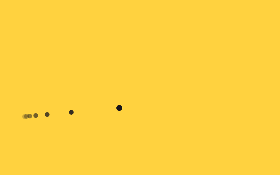
커서가 지나간 자리에 작은 점들을 짧은 간격으로 찍고 각각 opacity를 0으로 트랜지션시켜, 움직임 뒤에 옅어지는 꼬리가 남는다.
쓰임크리에이티브 포트폴리오, 인터랙티브 아트 랜딩
animation-delayopacity 트랜지션잔상 점
<main class="stage">
  <div class="trail is-demo" aria-hidden="true">
    <span></span><span></span><span></span><span></span><span></span><span></span>
  </div>
  <div class="cursor is-demo" aria-hidden="true"></div>
</main>
@use "../../../../site/static/demo-tokens" as *;
$duration: $dur-loop; // 경로를 한 바퀴 도는 시간
$easing: $ease-spring;
$color: $subject-ink; // 점 색
@include stage($stage-yellow);
.stage { position: relative; overflow: hidden; cursor: none; }
.cursor {
position: absolute;
top: 0;
left: 0;
width: 10px;
height: 10px;
margin: -5px 0 0 -5px;
border-radius: 50%;
background: $color;
pointer-events: none;
&.is-demo { animation: cursor-path $duration $easing infinite; }
}
.trail span {
position: absolute;
top: 0;
left: 0;
width: 8px;
height: 8px;
margin: -4px 0 0 -4px;
border-radius: 50%;
background: $color;
pointer-events: none;
}
// 점마다 같은 경로를 시차(음수 delay)를 두고 돌아 순간마다 서로 다른 위치에 있게 되고, 그게 꼬리로 보인다.
@for $i from 1 through 6 {
.trail.is-demo span:nth-child(#{$i}) {
opacity: 1 - $i * .13;
animation: cursor-path $duration $easing infinite;
animation-delay: -#{$i * 90}ms;
}
}
@keyframes cursor-path {
0% { transform: translate(40px, 200px); }
30% { transform: translate(140px, 60px); }
60% { transform: translate(260px, 180px); }
100% { transform: translate(40px, 200px); }
}
@media (pointer: coarse) {
.cursor, .trail { display: none; }
.stage { cursor: auto; }
}
@media (prefers-reduced-motion: reduce) {
.cursor.is-demo { animation: none; transform: translate(40px, 200px); }
.trail.is-demo span { animation: none; opacity: 0; }
}html, body {
margin: 0;
overflow: hidden;
}
.stage {
box-sizing: border-box;
min-height: 100vh;
display: grid;
place-items: center;
margin: 0;
background: #ffd23f;
font-family: -apple-system, "Segoe UI", "Noto Sans KR", sans-serif;
padding: clamp(8px, 4vw, 24px);
}
.stage {
position: relative;
overflow: hidden;
cursor: none;
}
.cursor {
position: absolute;
top: 0;
left: 0;
width: 10px;
height: 10px;
margin: -5px 0 0 -5px;
border-radius: 50%;
background: #17141a;
pointer-events: none;
}
.cursor.is-demo {
animation: cursor-path 2s cubic-bezier(0.2, 0.8, 0.2, 1) infinite;
}
.trail span {
position: absolute;
top: 0;
left: 0;
width: 8px;
height: 8px;
margin: -4px 0 0 -4px;
border-radius: 50%;
background: #17141a;
pointer-events: none;
}
.trail.is-demo span:nth-child(1) {
opacity: 0.87;
animation: cursor-path 2s cubic-bezier(0.2, 0.8, 0.2, 1) infinite;
animation-delay: -90ms;
}
.trail.is-demo span:nth-child(2) {
opacity: 0.74;
animation: cursor-path 2s cubic-bezier(0.2, 0.8, 0.2, 1) infinite;
animation-delay: -180ms;
}
.trail.is-demo span:nth-child(3) {
opacity: 0.61;
animation: cursor-path 2s cubic-bezier(0.2, 0.8, 0.2, 1) infinite;
animation-delay: -270ms;
}
.trail.is-demo span:nth-child(4) {
opacity: 0.48;
animation: cursor-path 2s cubic-bezier(0.2, 0.8, 0.2, 1) infinite;
animation-delay: -360ms;
}
.trail.is-demo span:nth-child(5) {
opacity: 0.35;
animation: cursor-path 2s cubic-bezier(0.2, 0.8, 0.2, 1) infinite;
animation-delay: -450ms;
}
.trail.is-demo span:nth-child(6) {
opacity: 0.22;
animation: cursor-path 2s cubic-bezier(0.2, 0.8, 0.2, 1) infinite;
animation-delay: -540ms;
}
@keyframes cursor-path {
0% {
transform: translate(40px, 200px);
}
30% {
transform: translate(140px, 60px);
}
60% {
transform: translate(260px, 180px);
}
100% {
transform: translate(40px, 200px);
}
}
@media (pointer: coarse) {
.cursor, .trail {
display: none;
}
.stage {
cursor: auto;
}
}
@media (prefers-reduced-motion: reduce) {
.cursor.is-demo {
animation: none;
transform: translate(40px, 200px);
}
.trail.is-demo span {
animation: none;
opacity: 0;
}
}// 실제 포인터를 움직이면 맨 앞 점이 그 좌표를 따라간다. 꼬리 점들은 같은 경로를 시차를 두고 도는 채로 남는다.
if (matchMedia('(pointer: fine)').matches) {
var stage = document.querySelector('.stage'), cur = document.querySelector('.cursor');
stage.addEventListener('pointermove', function (e) {
cur.classList.remove('is-demo');
var r = stage.getBoundingClientRect();
cur.style.transform = 'translate(' + (e.clientX - r.left) + 'px,' + (e.clientY - r.top) + 'px)';
});
}import { useState } from "react";
import type { CSSProperties, PointerEvent } from "react";
import styles from "./CursorTrail.module.scss";
export type CursorTrailProps = {
dots?: number;
duration?: number;
easing?: string;
color?: string;
};
type Vars = CSSProperties & { "--duration"?: string; "--easing"?: string; "--color"?: string };
export default function CursorTrail({
dots = 6,
duration = 2000,
easing = "cubic-bezier(.2,.8,.2,1)",
color = "#17141a",
}: CursorTrailProps) {
const [demo, setDemo] = useState(true);
const [pos, setPos] = useState({ x: 40, y: 200 });
const move = (e: PointerEvent<HTMLDivElement>) => {
const r = e.currentTarget.getBoundingClientRect();
setDemo(false);
setPos({ x: e.clientX - r.left, y: e.clientY - r.top });
};
const vars: Vars = { "--duration": `${duration}ms`, "--easing": easing, "--color": color };
return (
<div className={styles.stage} style={vars} onPointerMove={move}>
{demo &&
Array.from({ length: dots }).map((_, i) => (
<span
key={i}
className={styles.trailDot}
style={{ opacity: 1 - (i + 1) * 0.13, animationDelay: `${-(i + 1) * 90}ms` }}
/>
))}
<div
className={demo ? `${styles.cursor} ${styles.isDemo}` : styles.cursor}
style={demo ? undefined : { transform: `translate(${pos.x}px,${pos.y}px)` }}
aria-hidden="true"
/>
</div>
);
}06 잔상 트레일 — 측정 누적면적 2.407% · 움직인 프레임 23/23GODRICH 원작 · zip 에 SCSS·React 포함 · CSS 마우스 커서 효과 9종 — 한 줄 복붙으로
이 데모가 속한 글
 CSS 마우스 커서 효과 9종 — 한 줄 복붙으로CSS 마우스 커서 효과는 브라우저 기본 화살표 대신 프로젝트에 맞춘 모양·잔상·블렌드 반응을 붙이는 것을 말합니다. 아홉 개 중 셋은 자석처럼 끌리거나 배경 색을 반전시키는, 흔한 예제 모음에서는 잘 안 보이는 조 이 글의 데모 전부 보기