09이징 비교 데모
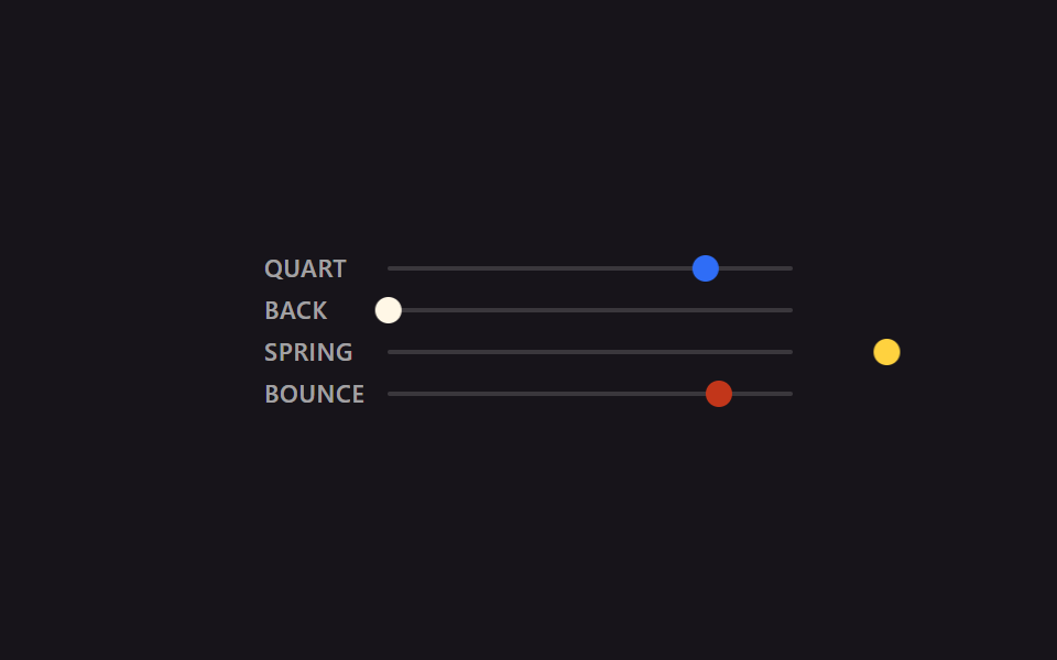
quart·back·spring·bounce 네 곡선을 같은 2초·같은 거리로 나란히 돌리면, 감속의 모양이 눈으로 바로 갈린다.
쓰임이징을 고르기 전 후보 몇 개를 한 화면에서 비교할 때
cubic-bezierlinear()비교
<main class="stage is-demo">
  <div class="compare">
    <div class="lane">
      <span class="label">quart</span>
      <div class="track"><div class="puck puck--quart"></div></div>
    </div>
    <div class="lane">
      <span class="label">back</span>
      <div class="track"><div class="puck puck--back"></div></div>
    </div>
    <div class="lane">
      <span class="label">spring</span>
      <div class="track"><div class="puck puck--spring"></div></div>
    </div>
    <div class="lane">
      <span class="label">bounce</span>
      <div class="track"><div class="puck puck--bounce"></div></div>
    </div>
  </div>
</main>
@use "../../../../site/static/demo-tokens" as *;
// ── 변수 3개 ──────────────────────────────────────────
$duration: $dur-loop; // 2s — 네 레인 전부 같은 길이라야 곡선 모양만으로 비교가 된다
$easing: cubic-bezier(.25, 1, .5, 1); // 대표값(quart). 레인마다 실제 값은 아래 참고
$color: $subject-blue;
@include stage($stage-ink);
$track-w: 184px;
$puck-w: $sp-3;
$travel: $track-w - $puck-w;
.compare {
display: flex;
flex-direction: column;
gap: $sp-2;
width: $track-w + $sp-12 + $sp-2; // 라벨 폭 + 간격 + 트랙 폭
}
.lane {
display: flex;
align-items: center;
gap: $sp-2;
}
.label {
width: $sp-12;
flex: 0 0 auto;
font: 600 11px/1 -apple-system, "Segoe UI", "Noto Sans KR", sans-serif;
color: rgba(255, 255, 255, .6);
text-transform: uppercase;
letter-spacing: .03em;
}
.track {
position: relative;
flex: 1 1 auto;
width: $track-w;
height: 2px;
background: rgba(255, 255, 255, .15);
border-radius: $r-xs;
}
.puck {
position: absolute;
top: 50%;
left: 0;
width: $puck-w;
height: $puck-w;
border-radius: $r-pill;
transform: translate(0, -50%);
}
.puck--quart { background: $subject-blue; }
.puck--back { background: $subject-cream; }
.puck--spring { background: $stage-yellow; }
.puck--bounce { background: $error; }
.stage.is-demo .puck--quart {
// ease-out-quart — 01번과 같은 값
animation: move $duration cubic-bezier(.25, 1, .5, 1) infinite alternate;
}
.stage.is-demo .puck--back {
// ease-in-out-back — 02번과 같은 값. 출발 전 뒤로 당겼다가 도착 뒤 넘어간다
animation: move $duration cubic-bezier(.68, -.6, .32, 1.6) infinite alternate;
}
.stage.is-demo .puck--spring {
// spring-snappy — 06번과 같은 값. 오버슈트 뒤 여러 번 오간다
animation: move $duration linear(0, .055, .197, .394, .612, .824, 1.009, 1.153, 1.25, 1.3, 1.307, 1.281, 1.231, 1.167, 1.099, 1.035, .982, .942, .916, .905, .907, .917, .935, .955, .976, .995, 1) infinite alternate;
}
.stage.is-demo .puck--bounce {
// bounce-linear — 04번과 같은 값. 방향을 안 바꾸고 매 루프 제자리로 순간 복귀한다
animation: move-once $duration linear(0, .013, .053, .118, .21, .328, .473, .643, .84, .97, .875, .807, .766, .75, .761, .798, .861, .951, .973, .943, .939, .962, .995, .984, 1) infinite;
}
@keyframes move {
from { transform: translate(0, -50%); }
to { transform: translate($travel, -50%); }
}
@keyframes move-once {
from { transform: translate(0, -50%); }
to { transform: translate($travel, -50%); }
}
@media (prefers-reduced-motion: reduce) {
.stage.is-demo .puck { animation: none; transform: translate($travel, -50%); }
}html, body {
margin: 0;
overflow: hidden;
}
.stage {
box-sizing: border-box;
min-height: 100vh;
display: grid;
place-items: center;
margin: 0;
background: #17141a;
font-family: -apple-system, "Segoe UI", "Noto Sans KR", sans-serif;
padding: clamp(8px, 4vw, 24px);
}
.compare {
display: flex;
flex-direction: column;
gap: 8px;
width: 240px;
}
.lane {
display: flex;
align-items: center;
gap: 8px;
}
.label {
width: 48px;
flex: 0 0 auto;
font: 600 11px/1 -apple-system, "Segoe UI", "Noto Sans KR", sans-serif;
color: rgba(255, 255, 255, 0.6);
text-transform: uppercase;
letter-spacing: 0.03em;
}
.track {
position: relative;
flex: 1 1 auto;
width: 184px;
height: 2px;
background: rgba(255, 255, 255, 0.15);
border-radius: 4px;
}
.puck {
position: absolute;
top: 50%;
left: 0;
width: 12px;
height: 12px;
border-radius: 999px;
transform: translate(0, -50%);
}
.puck--quart {
background: #2f6df6;
}
.puck--back {
background: #fff7e6;
}
.puck--spring {
background: #ffd23f;
}
.puck--bounce {
background: #c2361a;
}
.stage.is-demo .puck--quart {
animation: move 2s cubic-bezier(0.25, 1, 0.5, 1) infinite alternate;
}
.stage.is-demo .puck--back {
animation: move 2s cubic-bezier(0.68, -0.6, 0.32, 1.6) infinite alternate;
}
.stage.is-demo .puck--spring {
animation: move 2s linear(0, 0.055, 0.197, 0.394, 0.612, 0.824, 1.009, 1.153, 1.25, 1.3, 1.307, 1.281, 1.231, 1.167, 1.099, 1.035, 0.982, 0.942, 0.916, 0.905, 0.907, 0.917, 0.935, 0.955, 0.976, 0.995, 1) infinite alternate;
}
.stage.is-demo .puck--bounce {
animation: move-once 2s linear(0, 0.013, 0.053, 0.118, 0.21, 0.328, 0.473, 0.643, 0.84, 0.97, 0.875, 0.807, 0.766, 0.75, 0.761, 0.798, 0.861, 0.951, 0.973, 0.943, 0.939, 0.962, 0.995, 0.984, 1) infinite;
}
@keyframes move {
from {
transform: translate(0, -50%);
}
to {
transform: translate(172px, -50%);
}
}
@keyframes move-once {
from {
transform: translate(0, -50%);
}
to {
transform: translate(172px, -50%);
}
}
@media (prefers-reduced-motion: reduce) {
.stage.is-demo .puck {
animation: none;
transform: translate(172px, -50%);
}
}import type { CSSProperties } from "react";
import styles from "./EasingCompare.module.scss";
export type EasingCompareProps = {
/** 네 레인 공통 주기 (기본 2000ms) — 같은 길이라야 곡선 모양만으로 비교가 된다 */
duration?: number;
};
const LANES = [
{ key: "quart", label: "QUART", cls: styles.puckQuart },
{ key: "back", label: "BACK", cls: styles.puckBack },
{ key: "spring", label: "SPRING", cls: styles.puckSpring },
{ key: "bounce", label: "BOUNCE", cls: styles.puckBounce },
] as const;
export default function EasingCompare({ duration = 2000 }: EasingCompareProps) {
return (
<div className={styles.stage} style={{ "--duration": `${duration}ms` } as CSSProperties}>
<div className={styles.compare}>
{LANES.map((lane) => (
<div className={styles.lane} key={lane.key}>
<span className={styles.label}>{lane.label}</span>
<div className={styles.track}>
<div className={`${styles.puck} ${lane.cls}`} />
</div>
</div>
))}
</div>
</div>
);
}09 이징 비교 데모 — 측정 누적면적 4.24% · 움직인 프레임 23/23GODRICH 원작 · zip 에 SCSS·React 포함 · cubic-bezier css 이징 커브·스프링 9종 — 복붙용 애니메이션 곡선
이 데모가 속한 글
 cubic-bezier css 이징 커브·스프링 9종 — 복붙용 애니메이션 곡선버튼을 누르거나 카드가 나타날 때, 움직임이 일정한 속도면 딱딱해 보이고 처음엔 빠르다가 점점 느려지거나 끝에서 살짝 튕기면 자연스럽다. 이 속도 변화를 CSS 에서 숫자 네 개로 적는 방법이 cubic-bezier 이 글의 데모 전부 보기