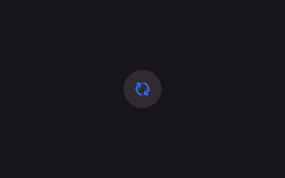
05새로고침 회전
화살표 두 개로 된 새로고침 아이콘이 도형 중심을 축으로 한 바퀴 회전한다.
쓰임목록·피드를 다시 불러오는 새로고침 버튼
transform-box: fill-box360deg 600ms연속 회전(.is-demo)
<main class="stage">
  <button class="iconbtn is-demo" type="button" aria-label="새로고침">
    <svg viewBox="0 0 24 24" width="30" height="30" aria-hidden="true">
      <g class="refresh-ghost">
        <path d="M4 12a8 8 0 0 1 13.9-5.4" fill="none" stroke="currentColor" stroke-width="2" stroke-linecap="round"/>
        <path d="M20 12a8 8 0 0 1-13.9 5.4" fill="none" stroke="currentColor" stroke-width="2" stroke-linecap="round"/>
        <path d="M17.5 3.2v4.4h-4.4" fill="none" stroke="currentColor" stroke-width="2" stroke-linecap="round" stroke-linejoin="round"/>
        <path d="M6.5 20.8v-4.4h4.4" fill="none" stroke="currentColor" stroke-width="2" stroke-linecap="round" stroke-linejoin="round"/>
      </g>
      <g class="refresh">
        <path d="M4 12a8 8 0 0 1 13.9-5.4" fill="none" stroke="currentColor" stroke-width="2" stroke-linecap="round"/>
        <path d="M20 12a8 8 0 0 1-13.9 5.4" fill="none" stroke="currentColor" stroke-width="2" stroke-linecap="round"/>
        <path d="M17.5 3.2v4.4h-4.4" fill="none" stroke="currentColor" stroke-width="2" stroke-linecap="round" stroke-linejoin="round"/>
        <path d="M6.5 20.8v-4.4h4.4" fill="none" stroke="currentColor" stroke-width="2" stroke-linecap="round" stroke-linejoin="round"/>
      </g>
      <circle class="refresh-spark" r="0.9" cx="17.9" cy="3.2"/>
      <circle class="refresh-bit" r=".5" cx="17.9" cy="3.2" style="--dx:0px;--dy:-2.6px"/>
      <circle class="refresh-bit" r=".45" cx="17.9" cy="3.2" style="--dx:2.1px;--dy:-1.4px"/>
      <circle class="refresh-bit" r=".45" cx="6.1" cy="20.8" style="--dx:-2.1px;--dy:1.4px"/>
      <circle class="refresh-bit" r=".5" cx="6.1" cy="20.8" style="--dx:0px;--dy:2.6px"/>
    </svg>
  </button>
</main>
@use "../../../../site/static/demo-tokens" as *;
// ── 변수 3개 ──────────────────────────────
$duration: $dur-enter; // 600ms — 한 바퀴
$easing: $ease-out;
$color: $subject-blue;
// ── 데모 무대 ───────────────────────────────
@include stage($stage-ink);
.iconbtn {
border: 0; border-radius: $r-pill; cursor: pointer;
width: clamp(52px, 14vw, 64px); height: clamp(52px, 14vw, 64px);
display: grid; place-items: center;
background: rgba(255, 247, 230, .1); color: $color;
-webkit-tap-highlight-color: transparent;
}
.iconbtn:focus-visible { outline: 2px solid $color; outline-offset: 3px; }
// 화살표 두 개가 만드는 도형은 24×24 뷰박스의 정중앙에 있지 않다.
// transform-box: fill-box 로 이 도형 자신의 경계 상자 중심을 축으로 돌린다
.refresh {
transform-box: fill-box;
transform-origin: 50% 50%;
}
.iconbtn.is-spinning .refresh { animation: spin-once $duration $easing; }
.iconbtn.is-demo .refresh { animation: spin-loop $dur-loop $easing infinite; }
@keyframes spin-once { to { transform: rotate(360deg); } }
@keyframes spin-loop {
0%, 10% { transform: rotate(0); }
55% { transform: rotate(360deg); }
100% { transform: rotate(360deg); }
}
// ── 한 겹: 화살촉 스파크 + 미광 잔상 ──────────────────────
// 잔상 — 본체와 같은 타임라인을 공유하되 각도를 뒤처지게 해, 도는 동안에만 뒤따라 빛난다
.refresh-ghost {
transform-box: fill-box;
transform-origin: 50% 50%;
opacity: 0; // 멈춰 있을 땐 보이지 않는다
filter: blur(.6px);
}
.iconbtn.is-spinning .refresh-ghost { animation: ghost-once $duration $ease-out; }
.iconbtn.is-demo .refresh-ghost { animation: ghost-loop $dur-loop $ease-out infinite; }
@keyframes ghost-once {
0% { transform: rotate(0); opacity: 0; }
60% { transform: rotate(260deg); opacity: .4; } // 본체보다 뒤처진 각도
100% { transform: rotate(360deg); opacity: 0; }
}
@keyframes ghost-loop {
0%, 10% { transform: rotate(0); opacity: 0; }
30% { transform: rotate(170deg); opacity: .4; }
55% { transform: rotate(330deg); opacity: .3; }
62%, 100% { transform: rotate(360deg); opacity: 0; }
}
// 화살촉 끝 스파크 — JS 가 실측 회전각으로 좌표를 옮긴다
.refresh-spark {
fill: $color;
opacity: 0;
pointer-events: none;
transform: scale(1.5); transform-origin: center; transform-box: fill-box;
filter: drop-shadow(0 0 1px $color); // 미광 — 끝이 살짝 발광한다
}
// 화살촉이 스치고 간 자리에 흩어지는 찌꺼기 — 접선 뒤쪽으로 튄다
.refresh-bit {
fill: $color;
opacity: 0;
transform: translate(0, 0);
pointer-events: none;
animation: bit-fly 420ms $ease-out forwards;
}
@keyframes bit-fly {
0% { opacity: .9; transform: translate(0, 0) scale(1); }
100% { opacity: 0; transform: translate(var(--dx), var(--dy)) scale(.3); }
}
@media (prefers-reduced-motion: reduce) {
.iconbtn.is-spinning .refresh, .iconbtn.is-demo .refresh { animation: none; }
.refresh-ghost { display: none; }
.refresh-spark { display: none; }
.refresh-bit { display: none; }
}html, body {
margin: 0;
overflow: hidden;
}
.stage {
box-sizing: border-box;
min-height: 100vh;
display: grid;
place-items: center;
margin: 0;
background: #17141a;
font-family: -apple-system, "Segoe UI", "Noto Sans KR", sans-serif;
padding: clamp(8px, 4vw, 24px);
}
.iconbtn {
border: 0;
border-radius: 999px;
cursor: pointer;
width: clamp(52px, 14vw, 64px);
height: clamp(52px, 14vw, 64px);
display: grid;
place-items: center;
background: rgba(255, 247, 230, 0.1);
color: #2f6df6;
-webkit-tap-highlight-color: transparent;
}
.iconbtn:focus-visible {
outline: 2px solid #2f6df6;
outline-offset: 3px;
}
.refresh {
transform-box: fill-box;
transform-origin: 50% 50%;
}
.iconbtn.is-spinning .refresh {
animation: spin-once 600ms ease-out;
}
.iconbtn.is-demo .refresh {
animation: spin-loop 2s ease-out infinite;
}
@keyframes spin-once {
to {
transform: rotate(360deg);
}
}
@keyframes spin-loop {
0%, 10% {
transform: rotate(0);
}
55% {
transform: rotate(360deg);
}
100% {
transform: rotate(360deg);
}
}
.refresh-ghost {
transform-box: fill-box;
transform-origin: 50% 50%;
opacity: 0;
filter: blur(0.6px);
}
.iconbtn.is-spinning .refresh-ghost {
animation: ghost-once 600ms ease-out;
}
.iconbtn.is-demo .refresh-ghost {
animation: ghost-loop 2s ease-out infinite;
}
@keyframes ghost-once {
0% {
transform: rotate(0);
opacity: 0;
}
60% {
transform: rotate(260deg);
opacity: 0.4;
}
100% {
transform: rotate(360deg);
opacity: 0;
}
}
@keyframes ghost-loop {
0%, 10% {
transform: rotate(0);
opacity: 0;
}
30% {
transform: rotate(170deg);
opacity: 0.4;
}
55% {
transform: rotate(330deg);
opacity: 0.3;
}
62%, 100% {
transform: rotate(360deg);
opacity: 0;
}
}
.refresh-spark {
fill: #2f6df6;
opacity: 0;
pointer-events: none;
transform: scale(1.5);
transform-origin: center;
transform-box: fill-box;
filter: drop-shadow(0 0 1px #2f6df6);
}
.refresh-bit {
fill: #2f6df6;
opacity: 0;
transform: translate(0, 0);
pointer-events: none;
animation: bit-fly 420ms ease-out forwards;
}
@keyframes bit-fly {
0% {
opacity: 0.9;
transform: translate(0, 0) scale(1);
}
100% {
opacity: 0;
transform: translate(var(--dx), var(--dy)) scale(0.3);
}
}
@media (prefers-reduced-motion: reduce) {
.iconbtn.is-spinning .refresh, .iconbtn.is-demo .refresh {
animation: none;
}
.refresh-ghost {
display: none;
}
.refresh-spark {
display: none;
}
.refresh-bit {
display: none;
}
}// 실제 클릭 한 번 = 한 바퀴. 데모(.is-demo)는 계속 돈다
document.querySelectorAll(".iconbtn").forEach(function (b) {
b.addEventListener("click", function () {
b.classList.remove("is-demo");
b.classList.remove("is-spinning");
void b.offsetWidth;
b.classList.add("is-spinning");
});
b.addEventListener("animationend", function (e) {
if (e.animationName === "spin-once") b.classList.remove("is-spinning");
});
});
// ── 한 겹: 화살촉 스파크 + 미광 잔상 ──────────────────────
// 회전은 stroke-dashoffset 이 아니라 transform 이다 — 펜 끝 좌표를 getPointAtLength 로 얻는
// 01 과 달리, 실측 transform 행렬에서 각도를 읽어 화살촉 두 개(뷰박스 좌표 17.9,3.2 · 6.1,20.8)를
// 도형 중심(12,12) 기준 회전으로 직접 계산한다. 잔상은 ghost 레이어가 지연 회전으로 흉내 낸다.
(function () {
var icon = document.querySelector('.iconbtn svg');
if (!icon) return;
var g = icon.querySelector('.refresh');
var spark = icon.querySelector('.refresh-spark');
var bits = [].slice.call(icon.querySelectorAll('.refresh-bit'));
var reduce = window.matchMedia('(prefers-reduced-motion: reduce)').matches;
if (reduce || !spark || !g) { if (spark) spark.style.display = 'none'; return; }
var CX = 12, CY = 12; // 회전축 (fill-box 중심과 일치)
var TIP_A = { x: 17.9, y: 3.2 }; // 오른쪽 위 화살촉 끝
var TIP_B = { x: 6.1, y: 20.8 }; // 왼쪽 아래 화살촉 끝
function angle() {
// getComputedStyle transform 은 px 단위 행렬로 온다: matrix(a,b,c,d,e,f)
var tr = getComputedStyle(g).transform;
if (!tr || tr === 'none') return 0;
var m = new DOMMatrixReadOnly(tr);
return Math.atan2(m.b, m.a); // 라디안
}
function rot(p, rad) {
var cos = Math.cos(rad), sin = Math.sin(rad), dx = p.x - CX, dy = p.y - CY;
return { x: CX + dx * cos - dy * sin, y: CY + dx * sin + dy * cos };
}
var prev = null, lastEmit = 0, emitIdx = 0;
function frame(t) {
var rad = angle();
var moved = prev !== null && Math.abs(rad - prev) > .002;
var a = rot(TIP_A, rad);
// 스파크는 진행 앞쪽 화살촉에 붙인다 — 도는 동안만 켜진다
spark.setAttribute('cx', a.x);
spark.setAttribute('cy', a.y);
spark.style.opacity = moved ? 1 : 0;
if (moved) {
// 회전 접선의 뒤쪽으로 찌꺼기 방출 (초당 최대 ~14개)
if (t - lastEmit > 70) {
lastEmit = t;
var up = Math.random() < .7; // 위 화살촉이 더 자주
var p = up ? a : rot(TIP_B, rad);
var tang = rad + (up ? Math.PI / 2 : -Math.PI / 2); // 접선 방향
var back = tang + Math.PI + (Math.random() - .5) * 1.2;
var sp = .4 + Math.random() * .5;
var b = bits[emitIdx++ % bits.length];
b.setAttribute('cx', p.x);
b.setAttribute('cy', p.y);
b.style.setProperty('--dx', (Math.cos(back) * sp * 6).toFixed(2) + 'px');
b.style.setProperty('--dy', (Math.sin(back) * sp * 6).toFixed(2) + 'px');
b.style.animation = 'none';
void b.getBoundingClientRect();
b.style.animation = '';
b.style.animationName = 'bit-fly';
}
}
prev = rad;
requestAnimationFrame(frame);
}
requestAnimationFrame(frame);
})();import { useEffect, useRef, useState } from "react";
import type { CSSProperties } from "react";
import styles from "./RefreshSpin.module.scss";
export type RefreshSpinProps = {
/** 한 바퀴 도는 시간, ms */
duration?: number;
easing?: string;
color?: string;
onRefresh?: () => void;
};
type Vars = CSSProperties & { "--duration"?: string; "--easing"?: string; "--color"?: string };
const PATHS = [
"M4 12a8 8 0 0 1 13.9-5.4",
"M20 12a8 8 0 0 1-13.9 5.4",
"M17.5 3.2v4.4h-4.4",
"M6.5 20.8v-4.4h4.4",
];
const BIT_DIRS: Array<[number, number]> = [
[0, -2.6],
[2.1, -1.4],
[-2.1, 1.4],
[0, 2.6],
];
// 화살촉 끝 (뷰박스 좌표) — 회전축은 도형 중심 (12,12)
const TIP_A = { x: 17.9, y: 3.2 };
const TIP_B = { x: 6.1, y: 20.8 };
export default function RefreshSpin({
duration = 600,
easing = "ease-out",
color = "#2f6df6",
onRefresh,
}: RefreshSpinProps) {
const [spinning, setSpinning] = useState(false);
const groupRef = useRef<SVGGElement>(null);
const sparkRef = useRef<SVGCircleElement>(null);
const bitRefs = useRef<Array<SVGCircleElement | null>>([]) as unknown as { current: Array<SVGCircleElement | null> };
const vars: Vars = { "--duration": `${duration}ms`, "--easing": easing, "--color": color };
// 한 겹: 화살촉 스파크 + 미광 잔상 (vanilla 데모와 동일 계산) — 실측 회전각에서
// 화살촉 좌표를 직접 계산해 스파크를 옮기고 접선 뒤쪽으로 찌꺼기를 뿌린다
useEffect(() => {
const g = groupRef.current, spark = sparkRef.current;
if (!g || !spark) return;
if (window.matchMedia("(prefers-reduced-motion: reduce)").matches) return;
const bits = bitRefs.current.filter(Boolean) as SVGCircleElement[];
let prev: number | null = null, lastEmit = 0, emitIdx = 0, raf = 0;
const frame = (t: number) => {
const tr = getComputedStyle(g).transform;
const rad = tr && tr !== "none" ? Math.atan2(new DOMMatrixReadOnly(tr).b, new DOMMatrixReadOnly(tr).a) : 0;
const moved = prev !== null && Math.abs(rad - prev) > 0.002;
const cos = Math.cos(rad), sin = Math.sin(rad);
const ax = 12 + (TIP_A.x - 12) * cos - (TIP_A.y - 12) * sin;
const ay = 12 + (TIP_A.x - 12) * sin + (TIP_A.y - 12) * cos;
spark.setAttribute("cx", ax.toFixed(2));
spark.setAttribute("cy", ay.toFixed(2));
spark.style.opacity = moved ? "1" : "0";
if (moved && t - lastEmit > 70 && bits.length) {
lastEmit = t;
const up = Math.random() < 0.7;
let px = ax, py = ay;
if (!up) {
px = 12 + (TIP_B.x - 12) * cos - (TIP_B.y - 12) * sin;
py = 12 + (TIP_B.x - 12) * sin + (TIP_B.y - 12) * cos;
}
const back = rad + (up ? 0.5 * Math.PI : -0.5 * Math.PI) + Math.PI + (Math.random() - 0.5) * 1.2;
const sp = 0.4 + Math.random() * 0.5;
const b = bits[emitIdx++ % bits.length];
b.setAttribute("cx", px.toFixed(2));
b.setAttribute("cy", py.toFixed(2));
b.style.setProperty("--dx", (Math.cos(back) * sp * 6).toFixed(2) + "px");
b.style.setProperty("--dy", (Math.sin(back) * sp * 6).toFixed(2) + "px");
b.style.animation = "none";
void b.getBoundingClientRect();
b.style.animation = "";
}
prev = rad;
raf = requestAnimationFrame(frame);
};
raf = requestAnimationFrame(frame);
return () => cancelAnimationFrame(raf);
}, []);
return (
<button
type="button"
className={styles.iconbtn}
style={vars}
aria-label="새로고침"
onClick={() => {
setSpinning(true);
onRefresh?.();
}}
>
<svg viewBox="0 0 24 24" width="30" height="30" aria-hidden="true">
<g className={styles["refresh-ghost"]}>
{PATHS.map((d) => (
<path key={d} d={d} fill="none" stroke="currentColor" strokeWidth={2} strokeLinecap="round" />
))}
</g>
<g
ref={groupRef}
className={styles.refresh}
data-spinning={spinning || undefined}
onAnimationEnd={() => setSpinning(false)}
>
{PATHS.map((d) => (
<path key={d} d={d} fill="none" stroke="currentColor" strokeWidth={2} strokeLinecap="round" strokeLinejoin="round" />
))}
</g>
<circle ref={sparkRef} className={styles["refresh-spark"]} r={0.9} cx={17.9} cy={3.2} />
{BIT_DIRS.map(([dx, dy], i) => (
<circle
key={i}
ref={(el: SVGCircleElement | null) => { bitRefs.current[i] = el; }}
className={styles["refresh-bit"]}
r={i === 0 || i === 3 ? 0.5 : 0.45}
cx={i < 2 ? 17.9 : 6.1}
cy={i < 2 ? 3.2 : 20.8}
style={{ "--dx": `${dx}px`, "--dy": `${dy}px` } as CSSProperties}
/>
))}
</svg>
</button>
);
}05 새로고침 회전 — 측정 누적면적 0.43% · 움직인 프레임 15/23GODRICH 원작 · zip 에 SCSS·React 포함 · CSS 아이콘 애니메이션 9종 — SVG 로고도 한 줄 복붙으로
이 데모가 속한 글
 CSS 아이콘 애니메이션 9종 — SVG 로고도 한 줄 복붙으로CSS 아이콘 애니메이션은 재생·알림·새로고침처럼 화면에 흔한 인터페이스 아이콘을 인라인 SVG로 그려 움직이게 만드는 것이다. 문자 글리프 대신 좌표가 있는 path를 쓰므로 서체가 바뀌어도 모양이 깨지지 않는다. 이 글의 데모 전부 보기