02끈적한 점 3개
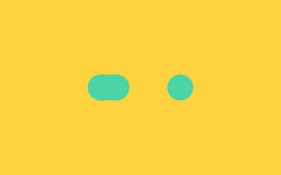
점 세 개가 서로 다가갔다 멀어질 때 blur 와 contrast 필터가 겹쳐 점들이 막대처럼 늘어붙었다 떨어지며, 끈적한 젤리가 흔들리는 듯한 대기 표시가 됩니다.
쓰임채팅 답변 대기, 버튼 누른 직후 짧은 처리 표시
filter: blur + contrasttranslateX$duration
<main class="stage">
  <!-- gooey: 색이 아니라 알파(불투명도)를 증폭해 끈적이는 이음새를 만든다 -->
  <svg width="0" height="0" style="position:absolute" aria-hidden="true">
    <defs>
      <filter id="goo-filter">
        <feGaussianBlur in="SourceGraphic" stdDeviation="8" result="blur"/>
        <feColorMatrix in="blur" mode="matrix"
          values="1 0 0 0 0  0 1 0 0 0  0 0 1 0 0  0 0 0 18 -7"/>
      </filter>
    </defs>
  </svg>
  <div class="goo is-demo" aria-hidden="true">
    <span class="goo-dot gd-a"></span>
    <span class="goo-dot gd-b"></span>
    <span class="goo-dot gd-c"></span>
  </div>
</main>
@use "../../../../site/static/demo-tokens" as *;
// ── 변수 3개 ──────────────────────────────────────────
$duration: 2s;
$easing: $ease-spring;
$color: $subject-mint;
@include stage($stage-yellow);
// gooey 필터: SVG feGaussianBlur 로 번지게 한 뒤 feColorMatrix 로
// 알파(불투명도)만 증폭해 경계를 다시 세운다. 색 채널은 건드리지 않아
// blur+contrast 조합이 노란 배경에서 만드는 붉은 테두리가 생기지 않는다.
.goo {
position: relative;
display: flex;
align-items: center;
padding: $sp-6 $sp-8;
filter: url(#goo-filter);
}
.goo-dot {
width: 44px;
height: 44px;
border-radius: 50%;
background: $color;
margin-right: $sp-6;
}
.goo-dot:last-child { margin-right: 0; }
// 실사용: 로딩 중에만 .is-loading — 가운데 점이 좌우 끝점을 차례로 찾아간다
.goo.is-loading .gd-b,
.goo.is-demo .gd-b {
animation: goo-slide $duration $easing infinite;
}
@keyframes goo-slide {
0%, 50%, 100% { transform: translateX(0); }
25% { transform: translateX(-68px); }
75% { transform: translateX(68px); }
}
@media (prefers-reduced-motion: reduce) {
.goo.is-loading .gd-b,
.goo.is-demo .gd-b {
animation: none !important;
transform: none !important;
}
.goo { filter: none; }
}html, body {
margin: 0;
overflow: hidden;
}
.stage {
box-sizing: border-box;
min-height: 100vh;
display: grid;
place-items: center;
margin: 0;
background: #ffd23f;
font-family: -apple-system, "Segoe UI", "Noto Sans KR", sans-serif;
padding: clamp(8px, 4vw, 24px);
}
.goo {
position: relative;
display: flex;
align-items: center;
padding: 24px 32px;
filter: url(#goo-filter);
}
.goo-dot {
width: 44px;
height: 44px;
border-radius: 50%;
background: #4cd4a6;
margin-right: 24px;
}
.goo-dot:last-child {
margin-right: 0;
}
.goo.is-loading .gd-b,
.goo.is-demo .gd-b {
animation: goo-slide 2s cubic-bezier(0.2, 0.8, 0.2, 1) infinite;
}
@keyframes goo-slide {
0%, 50%, 100% {
transform: translateX(0);
}
25% {
transform: translateX(-68px);
}
75% {
transform: translateX(68px);
}
}
@media (prefers-reduced-motion: reduce) {
.goo.is-loading .gd-b,
.goo.is-demo .gd-b {
animation: none !important;
transform: none !important;
}
.goo {
filter: none;
}
}import { CSSProperties } from "react";
import styles from "./GooeyDots.module.scss";
type Vars = CSSProperties & {
"--duration"?: string;
"--easing"?: string;
"--color"?: string;
};
export interface GooeyDotsProps {
duration?: string;
easing?: string;
color?: string;
/** 페이지에 필터가 여러 개면 겹치지 않게 다른 id 를 준다 */
filterId?: string;
}
export default function GooeyDots({
duration = "2s",
easing = "cubic-bezier(.2, .8, .2, 1)",
color = "#4cd4a6",
filterId = "goo-loader",
}: GooeyDotsProps) {
const style: Vars = {
"--duration": duration,
"--easing": easing,
"--color": color,
};
return (
<>
<svg width="0" height="0" style={{ position: "absolute" }} aria-hidden="true">
<defs>
<filter id={filterId}>
<feGaussianBlur in="SourceGraphic" stdDeviation="8" result="blur" />
<feColorMatrix
in="blur"
mode="matrix"
values="1 0 0 0 0 0 1 0 0 0 0 0 1 0 0 0 0 0 18 -7"
/>
</filter>
</defs>
</svg>
<div
className={styles.goo}
style={{ ...style, filter: `url(#${filterId})` }}
aria-hidden="true"
>
<span className={styles.dot} />
<span className={`${styles.dot} ${styles.dotB}`} />
<span className={styles.dot} />
</div>
</>
);
}02 끈적한 점 3개 — 측정 누적면적 3.392% · 움직인 프레임 23/23GODRICH 원작 · zip 에 SCSS·React 포함 · 로딩페이지 디자인 9종 — 복붙하는 예쁜 CSS 로딩 화면
이 데모가 속한 글
 로딩페이지 디자인 9종 — 복붙하는 예쁜 CSS 로딩 화면로딩페이지 디자인은 서비스가 켜지는 첫 순간에 사용자에게 "기다리고 있네"라고 말해주는 화면입니다. 기본 스피너 하나로도 되지만, 파스텔 링이나 차오르는 물처럼 예쁜 로딩 화면은 복붙 몇 줄로 사이트 인상을 바꿔 놓 이 글의 데모 전부 보기