09텍스트 셰도 팝
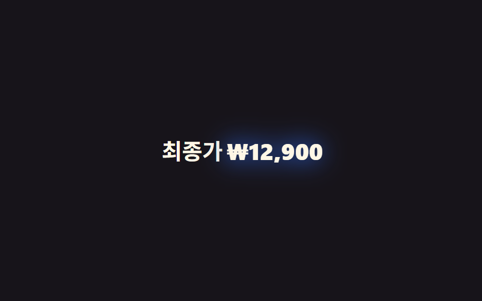
@property로 <length> 타입을 등록해 filter: drop-shadow()의 흐림 반경을 0에서 10px까지 애니메이션하고, 동시에 transform: scale(1→1.05→1)로 살짝 튀게 해 키워드가 한 번 통통 튀며 진하게 강조된다.
쓰임가격표의 최종가, 카운트다운 숫자 강조
@property <length>filter:drop-shadow1s
<main class="stage">
  <p class="line">최종가 <span class="hl">₩12,900</span></p>
</main>
@use "../../../../site/static/demo-tokens" as *;
// ── 변수 3개 ─────────────────────────────
$duration: 1s; // 한 번 통통 튀는 데 걸리는 시간
$easing: $ease-pop;
$color: $subject-blue; // 글로우 색
// @property 로 <length> 를 등록해야 filter 안의 흐림 반경이 부드럽게 보간된다
@property --shadow-blur {
syntax: "<length>";
inherits: false;
initial-value: 0px;
}
// 페인트 물성: 글로우의 번짐 위치(x-offset)도 변수로 등록해 따로 보간시킨다
@property --shadow-x {
syntax: "<length>";
inherits: false;
initial-value: 0px;
}
// ── 데모 무대 ───────────────────────────────
@include stage($stage-ink);
.line {
margin: 0;
color: $subject-cream;
font-weight: 600;
font-size: clamp(16px, 4.6vw, 22px);
line-height: 1.4;
font-family: inherit;
}
.hl {
display: inline-block;
color: $subject-cream;
font-weight: 800;
filter: drop-shadow(var(--shadow-x, 0px) 0 var(--shadow-blur) $color);
animation: pop $duration $easing infinite, pop-glow $duration $easing infinite;
}
@keyframes pop {
0% { transform: scale(1); --shadow-blur: 0px; }
40% { transform: scale(1.06); --shadow-blur: 10px; }
70% { transform: scale(1); --shadow-blur: 4px; }
100% { transform: scale(1); --shadow-blur: 0px; }
}
// 페인트 물성: blur 하강을 촘촘히 요동시키고(불균일 번짐) x-offset 도 미세 진동 — 변수 2개가 각자 보간
@keyframes pop-glow {
0% { --shadow-blur: 0px; --shadow-x: 0px; }
12% { --shadow-blur: 11px; --shadow-x: -1px; }
24% { --shadow-blur: 3px; --shadow-x: 1.5px; }
36% { --shadow-blur: 8px; --shadow-x: -0.5px; }
48% { --shadow-blur: 1px; --shadow-x: 1px; }
60% { --shadow-blur: 6px; --shadow-x: -1.5px; }
72% { --shadow-blur: 2px; --shadow-x: 0.5px; }
84% { --shadow-blur: 4px; --shadow-x: -1px; }
100% { --shadow-blur: 0px; --shadow-x: 0px; }
}
@media (prefers-reduced-motion: reduce) {
.hl { animation: none; filter: drop-shadow(0 0 4px $color); }
}@property --shadow-blur {
syntax: "<length>";
inherits: false;
initial-value: 0px;
}
@property --shadow-x {
syntax: "<length>";
inherits: false;
initial-value: 0px;
}
html, body {
margin: 0;
overflow: hidden;
}
.stage {
box-sizing: border-box;
min-height: 100vh;
display: grid;
place-items: center;
margin: 0;
background: #17141a;
font-family: -apple-system, "Segoe UI", "Noto Sans KR", sans-serif;
padding: clamp(8px, 4vw, 24px);
}
.line {
margin: 0;
color: #fff7e6;
font-weight: 600;
font-size: clamp(16px, 4.6vw, 22px);
line-height: 1.4;
font-family: inherit;
}
.hl {
display: inline-block;
color: #fff7e6;
font-weight: 800;
filter: drop-shadow(var(--shadow-x, 0px) 0 var(--shadow-blur) #2f6df6);
animation: pop 1s cubic-bezier(0.2, 1.4, 0.4, 1) infinite, pop-glow 1s cubic-bezier(0.2, 1.4, 0.4, 1) infinite;
}
@keyframes pop {
0% {
transform: scale(1);
--shadow-blur: 0px;
}
40% {
transform: scale(1.06);
--shadow-blur: 10px;
}
70% {
transform: scale(1);
--shadow-blur: 4px;
}
100% {
transform: scale(1);
--shadow-blur: 0px;
}
}
@keyframes pop-glow {
0% {
--shadow-blur: 0px;
--shadow-x: 0px;
}
12% {
--shadow-blur: 11px;
--shadow-x: -1px;
}
24% {
--shadow-blur: 3px;
--shadow-x: 1.5px;
}
36% {
--shadow-blur: 8px;
--shadow-x: -0.5px;
}
48% {
--shadow-blur: 1px;
--shadow-x: 1px;
}
60% {
--shadow-blur: 6px;
--shadow-x: -1.5px;
}
72% {
--shadow-blur: 2px;
--shadow-x: 0.5px;
}
84% {
--shadow-blur: 4px;
--shadow-x: -1px;
}
100% {
--shadow-blur: 0px;
--shadow-x: 0px;
}
}
@media (prefers-reduced-motion: reduce) {
.hl {
animation: none;
filter: drop-shadow(0 0 4px #2f6df6);
}
}import type { CSSProperties, ReactNode } from "react";
import styles from "./TextShadowPop.module.scss";
export type TextShadowPopProps = {
label: ReactNode;
/** 튀는 값 */
value: ReactNode;
/** 한 번 통통 튀는 시간 (기본 1000ms) */
duration?: number;
easing?: string;
/** 글로우 색 */
color?: string;
};
type Vars = CSSProperties & {
"--duration"?: string;
"--easing"?: string;
"--color"?: string;
};
export default function TextShadowPop({
label,
value,
duration = 1000,
easing = "cubic-bezier(.2,1.4,.4,1)",
color = "#2f6df6",
}: TextShadowPopProps) {
const vars: Vars = {
"--duration": `${duration}ms`,
"--easing": easing,
"--color": color,
};
return (
<p className={styles.line}>
{label} <span className={styles.hl} style={vars}>{value}</span>
</p>
);
}09 텍스트 셰도 팝 — 측정 누적면적 3.196% · 움직인 프레임 23/23GODRICH 원작 · zip 에 SCSS·React 포함 · CSS 텍스트 강조 애니메이션 9종 — 한 줄 복붙으로
이 데모가 속한 글
 CSS 텍스트 강조 애니메이션 9종 — 한 줄 복붙으로CSS 텍스트 강조 애니메이션은 본문 속 한 단어나 문장에 형광펜·밑줄·취소선 같은 시각 효과를 얹어 읽는 사람의 시선을 그 자리에 멈추게 하는 기법입니다. 아홉 가지를 모았고, 전부 자바스크립트 없이 순수 CSS 이 글의 데모 전부 보기