04낙관적 좋아요(즉시+되돌림)
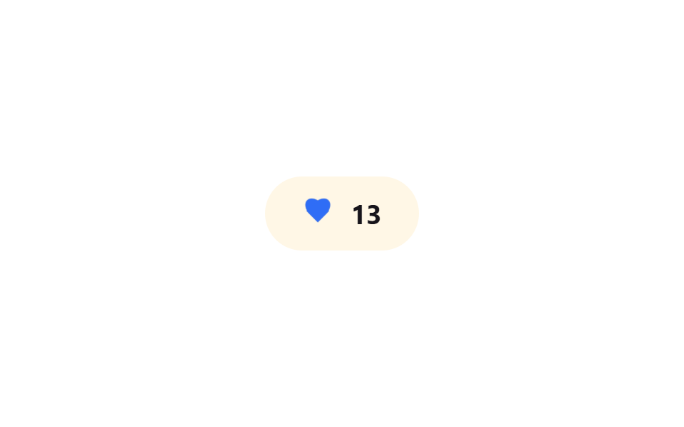
하트를 누르면 서버 응답을 기다리지 않고 즉시 빨갛게 채워지고 숫자가 올라가며, 실패를 가정한 루프에서는 0.8초 뒤 원래 상태로 되돌아간다.
쓰임SNS 좋아요 버튼, 북마크 토글
낙관적 업데이트롤백 애니메이션0.8초
<main class="stage">
  <button class="like is-demo" type="button" aria-pressed="false" aria-label="좋아요">
    <span class="like__icon" aria-hidden="true">
      <span class="like__heart like__heart--base"></span>
      <span class="like__heart like__heart--fill"></span>
    </span>
    <span class="like__count" aria-hidden="true">
      <span class="like__count-track">
        <span class="like__count-num">12</span>
        <span class="like__count-num">13</span>
      </span>
    </span>
  </button>
</main>
@use "../../../../site/static/demo-tokens" as *;
// ── 변수 3개 ──────────────────────────────────────────
$duration: $dur-quick; // 하트가 차오르는 시간
$easing: $ease-pop; // 팝업 이징
$color: $subject-blue; // 좋아요 강조색
// ── 데모 무대 ──────────────────────────────────────────
@include stage($stage-paper);
@mixin heart-shape {
content: "";
position: absolute;
top: 0;
width: 50%;
height: 80%;
border-radius: 50% 50% 0 0;
background: currentColor;
}
.like {
display: inline-flex;
align-items: center;
gap: clamp(8px, 2.6vw, 12px);
border: 0;
border-radius: $r-pill;
padding: clamp(12px, 4vw, 16px) clamp(20px, 6vw, 26px);
font-weight: 700;
font-size: clamp(15px, 4.2vw, 19px);
line-height: 1;
font-family: inherit;
color: $stage-ink;
background: $subject-cream;
cursor: pointer;
-webkit-tap-highlight-color: transparent;
&__icon { position: relative; width: 22px; height: 20px; flex: none; color: $stage-ink; }
&__heart {
position: absolute; inset: 0;
transform: scale(1);
&::before { @include heart-shape; left: 50%; transform: rotate(-45deg); transform-origin: 0 100%; } // 규칙8: 하트 로브 꼭짓점 조형
&::after { @include heart-shape; left: 0; transform: rotate(45deg); transform-origin: 100% 100%; } // 규칙8: 하트 로브 꼭짓점 조형
}
&__heart--base { opacity: .28; }
&__heart--fill {
color: $color;
opacity: 0;
transform: scale(.5);
transition: opacity $duration $easing, transform $duration $easing;
}
&__count { position: relative; height: 1em; overflow: hidden; }
&__count-track {
display: flex;
flex-direction: column;
transform: translateY(0);
transition: transform $duration $easing;
}
&__count-num { height: 1em; line-height: 1; }
&.is-liked &__heart--fill { opacity: 1; transform: scale(1); }
&.is-liked &__count-track { transform: translateY(-50%); }
&.is-demo &__heart--fill { animation: fill-loop $dur-loop $easing infinite; }
&.is-demo &__count-track { animation: count-loop $dur-loop $easing infinite; }
}
@keyframes fill-loop {
0%, 20% { opacity: 0; transform: scale(.5); }
35%, 60% { opacity: 1; transform: scale(1); }
80%, 100% { opacity: 0; transform: scale(.5); }
}
@keyframes count-loop {
0%, 20% { transform: translateY(0); }
35%, 60% { transform: translateY(-50%); }
80%, 100% { transform: translateY(0); }
}
// ── 접근성: 움직임 줄이기 설정이면 순간 전환만, 롤백 상태는 유지 ────
@media (prefers-reduced-motion: reduce) {
.like__heart--fill, .like__count-track { transition: none; }
.like.is-demo .like__heart--fill,
.like.is-demo .like__count-track { animation: none !important; }
}html, body {
margin: 0;
overflow: hidden;
}
.stage {
box-sizing: border-box;
min-height: 100vh;
display: grid;
place-items: center;
margin: 0;
background: #ffffff;
font-family: -apple-system, "Segoe UI", "Noto Sans KR", sans-serif;
padding: clamp(8px, 4vw, 24px);
}
.like {
display: inline-flex;
align-items: center;
gap: clamp(8px, 2.6vw, 12px);
border: 0;
border-radius: 999px;
padding: clamp(12px, 4vw, 16px) clamp(20px, 6vw, 26px);
font-weight: 700;
font-size: clamp(15px, 4.2vw, 19px);
line-height: 1;
font-family: inherit;
color: #17141a;
background: #fff7e6;
cursor: pointer;
-webkit-tap-highlight-color: transparent;
}
.like__icon {
position: relative;
width: 22px;
height: 20px;
flex: none;
color: #17141a;
}
.like__heart {
position: absolute;
inset: 0;
transform: scale(1);
}
.like__heart::before {
content: "";
position: absolute;
top: 0;
width: 50%;
height: 80%;
border-radius: 50% 50% 0 0;
background: currentColor;
left: 50%;
transform: rotate(-45deg);
transform-origin: 0 100%;
}
.like__heart::after {
content: "";
position: absolute;
top: 0;
width: 50%;
height: 80%;
border-radius: 50% 50% 0 0;
background: currentColor;
left: 0;
transform: rotate(45deg);
transform-origin: 100% 100%;
}
.like__heart--base {
opacity: 0.28;
}
.like__heart--fill {
color: #2f6df6;
opacity: 0;
transform: scale(0.5);
transition: opacity 220ms cubic-bezier(0.2, 1.4, 0.4, 1), transform 220ms cubic-bezier(0.2, 1.4, 0.4, 1);
}
.like__count {
position: relative;
height: 1em;
overflow: hidden;
}
.like__count-track {
display: flex;
flex-direction: column;
transform: translateY(0);
transition: transform 220ms cubic-bezier(0.2, 1.4, 0.4, 1);
}
.like__count-num {
height: 1em;
line-height: 1;
}
.like.is-liked .like__heart--fill {
opacity: 1;
transform: scale(1);
}
.like.is-liked .like__count-track {
transform: translateY(-50%);
}
.like.is-demo .like__heart--fill {
animation: fill-loop 2s cubic-bezier(0.2, 1.4, 0.4, 1) infinite;
}
.like.is-demo .like__count-track {
animation: count-loop 2s cubic-bezier(0.2, 1.4, 0.4, 1) infinite;
}
@keyframes fill-loop {
0%, 20% {
opacity: 0;
transform: scale(0.5);
}
35%, 60% {
opacity: 1;
transform: scale(1);
}
80%, 100% {
opacity: 0;
transform: scale(0.5);
}
}
@keyframes count-loop {
0%, 20% {
transform: translateY(0);
}
35%, 60% {
transform: translateY(-50%);
}
80%, 100% {
transform: translateY(0);
}
}
@media (prefers-reduced-motion: reduce) {
.like__heart--fill, .like__count-track {
transition: none;
}
.like.is-demo .like__heart--fill,
.like.is-demo .like__count-track {
animation: none !important;
}
}// 실제 클릭: 서버 응답 없이 즉시 좋아요 표시 → 0.8초 뒤 실패했다고 가정하고 되돌린다.
var b = document.querySelector('.like');
b.addEventListener('click', function () {
b.classList.remove('is-demo');
var liked = b.classList.toggle('is-liked');
b.setAttribute('aria-pressed', liked);
if (liked) setTimeout(function () { b.classList.remove('is-liked'); b.setAttribute('aria-pressed', 'false'); }, 800);
});import { useEffect, useRef, useState } from "react";
import type { CSSProperties } from "react";
import styles from "./OptimisticLikeButton.module.scss";
export type OptimisticLikeButtonProps = {
count: number;
ariaLabel: string;
/** 낙관적 업데이트가 유지되는 시간 — 이후 실패로 가정하고 롤백 (기본 800ms) */
rollbackAfter?: number;
duration?: number;
easing?: string;
color?: string;
/** 실제로는 여기서 서버에 요청을 보내고, 실패하면 되돌린다 */
onToggle?: (liked: boolean) => Promise<boolean>;
};
type Vars = CSSProperties & { "--duration"?: string; "--easing"?: string; "--color"?: string };
export default function OptimisticLikeButton({
count,
ariaLabel,
rollbackAfter = 800,
duration = 220,
easing = "cubic-bezier(.2,1.4,.4,1)",
color = "#2f6df6",
onToggle,
}: OptimisticLikeButtonProps) {
const [liked, setLiked] = useState(false);
const timer = useRef<ReturnType<typeof setTimeout> | null>(null);
const vars: Vars = { "--duration": `${duration}ms`, "--easing": easing, "--color": color };
useEffect(() => () => { if (timer.current) clearTimeout(timer.current); }, []);
const handle = async () => {
setLiked(true); // 서버 응답을 기다리지 않고 즉시 반영
const ok = onToggle ? await onToggle(true) : false;
if (!ok) timer.current = setTimeout(() => setLiked(false), rollbackAfter);
};
return (
<button
type="button"
className={liked ? `${styles.like} ${styles.liked}` : styles.like}
style={vars}
aria-pressed={liked}
aria-label={ariaLabel}
onClick={handle}
>
<span className={styles.icon} aria-hidden="true">
<span className={`${styles.heart} ${styles.base}`} />
<span className={`${styles.heart} ${styles.fill}`} />
</span>
<span className={styles.count} aria-hidden="true">
<span className={styles.track}>
<span className={styles.num}>{count}</span>
<span className={styles.num}>{count + 1}</span>
</span>
</span>
</button>
);
}04 낙관적 좋아요(즉시+되돌림) — 측정 누적면적 0.354% · 움직인 프레임 9/23GODRICH 원작 · zip 에 SCSS·React 포함 · 바이브코딩 마이크로 인터랙션 9종 — 한 줄 복붙으로
이 데모가 속한 글
 바이브코딩 마이크로 인터랙션 9종 — 한 줄 복붙으로마이크로 인터랙션은 클릭 한 번, 저장 한 번처럼 아주 작은 동작에 화면이 곧바로 반응해 주는 짧은 피드백입니다. 아홉 개 중 하나(04)는 서버 응답을 기다리지 않고 먼저 화면부터 바꿨다가, 실패했다고 가정하면 스 이 글의 데모 전부 보기