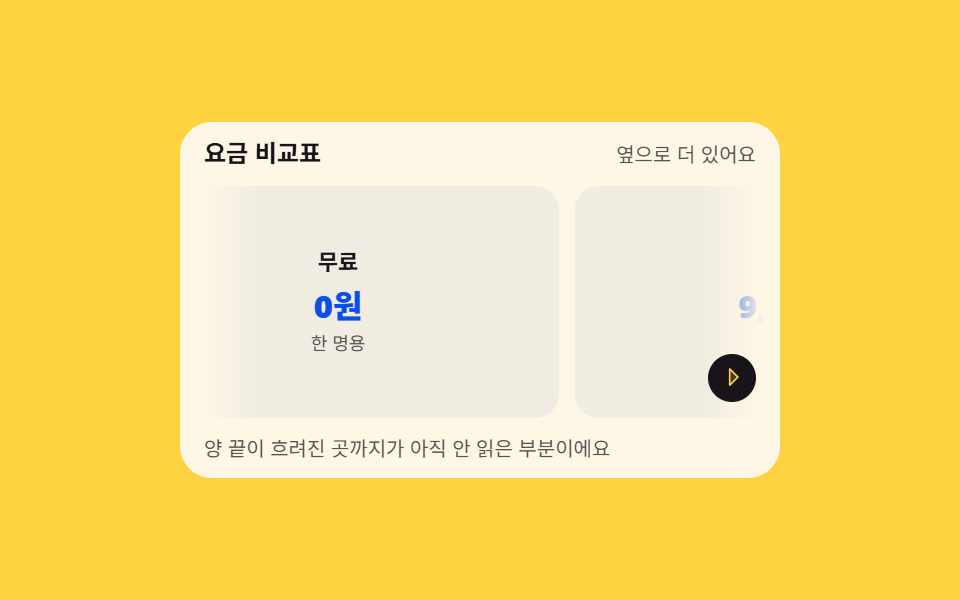
06옆으로 더 있다고 알려 주는 가장자리 그늘
scrollWidth 가 보이는 폭보다 넓을 때만 양 끝에 linear-gradient 그늘이 켜지고, scrollLeft 가 한쪽 끝에 닿으면 그쪽 그늘만 꺼집니다. 오른쪽 그늘 위의 작은 화살표가 한 번 밀렸다 돌아와 아직 남았다고 말합니다.
쓰임폰에서 옆으로 미는 요금 비교표, 칸이 많은 통계 표
scrollLeftscrollWidthlinear-gradient
<main class="stage">
  <section class="ot is-demo" id="ot" aria-label="옆으로 더 있다는 가장자리 알림">
    <header class="ot__head">
      <p class="ot__title">요금 비교표</p>
      <p class="ot__state" id="ot-state">옆으로 더 있어요</p>
    </header>
    <div class="ot__view" id="ot-view" tabindex="0" role="region" aria-label="요금표 — 좌우로 살펴보기">
      <div class="ot__track" id="ot-track">
        <div class="ot__card"><b>무료</b><span>0원</span><i>한 명용</i></div>
        <div class="ot__card"><b>기본</b><span>9,000원</span><i>다섯 명용</i></div>
        <div class="ot__card"><b>팀</b><span>19,000원</span><i>열 명용</i></div>
        <div class="ot__card"><b>단체</b><span>39,000원</span><i>제한 없음</i></div>
      </div>
    </div>
    <div class="ot__shade ot__shade--l" id="ot-l" aria-hidden="true"></div>
    <div class="ot__shade ot__shade--r" id="ot-r" aria-hidden="true">
      <span class="ot__nudge"><svg viewBox="0 0 256 256" width="1em" height="1em" fill="currentColor" aria-hidden="true"><path d="M176,128,96,208V48Z" opacity="0.2"/><path d="M181.66,122.34l-80-80A8,8,0,0,0,88,48V208a8,8,0,0,0,13.66,5.66l80-80A8,8,0,0,0,181.66,122.34ZM104,188.69V67.31L164.69,128Z"/></svg></span>
    </div>
    <p class="ot__note" aria-hidden="true">양 끝이 흐려진 곳까지가 아직 안 읽은 부분이에요</p>
  </section>
</main>
@use "../../../../site/static/demo-tokens" as *;
// 옆으로 더 있다고 알려 주는 가장자리 그늘 — 스크롤포트와 트랙을 분리하고 transform 은 트랙에만
$duration: $dur-loop;
$easing: $ease-out;
$color: $subject-ink;
@include stage($stage-yellow);
.ot {
position: relative;
box-sizing: border-box;
width: min(300px, 92vw);
border-radius: $r-card;
background: $subject-cream;
color: $subject-ink;
font-family: -apple-system, "Segoe UI", "Noto Sans KR", sans-serif;
overflow: hidden;
}
.ot__head {
display: flex;
align-items: baseline;
justify-content: space-between;
gap: $sp-2;
padding: $sp-2 $sp-3 0;
}
.ot__title {
margin: 0;
font-size: 12px;
font-weight: 700;
line-height: 1.3;
}
.ot__state {
margin: 0;
font-size: 10px;
line-height: 1.3;
color: rgba($stage-ink, .72);
}
// 스크롤포트(overflow) — 이 상자 자체에는 transform 을 걸지 않는다 (051 실측)
.ot__view {
box-sizing: border-box;
height: 116px;
margin: $sp-2 $sp-2 0;
overflow-x: auto;
overflow-y: hidden;
scrollbar-width: none;
scroll-snap-type: x mandatory;
&::-webkit-scrollbar { display: none; }
&:focus-visible { outline: 2px solid $color; outline-offset: 2px; }
}
.ot__track {
display: grid;
grid-auto-flow: column;
grid-auto-columns: 72%;
gap: $sp-2;
width: max-content;
height: 100%;
padding: 0 $sp-1;
}
.ot__card {
box-sizing: border-box;
display: grid;
align-content: center;
justify-items: center;
gap: $sp-1;
padding: $sp-2;
border-radius: $r-control;
background: #f0ece2;
scroll-snap-align: center;
}
.ot__card b { font-size: 11px; line-height: 1.3; }
.ot__card span { font-size: 16px; font-weight: 800; line-height: 1.2; color: $subject-blue-deep; }
.ot__card i { font-size: 9px; font-style: normal; line-height: 1.3; color: rgba($stage-ink, .72); }
// ── 가장자리 그늘 — 뷰 위에 얹힌다. linear-gradient 로 카드 끝을 감쪽같이 녹인다 ──
// 그늘의 세로 범위는 스크롤 상자와 정확히 같아야 한다 — 머리말·아래 설명까지 덮으면
// 카드 전체가 흐려 보인다 (실측: 상자는 카드 위에서 32px, 아래에서 30px 자리에 있다)
.ot__shade {
position: absolute;
top: 32px;
bottom: 30px;
width: 32px;
pointer-events: none;
opacity: 1;
// 정적 경로 — 한쪽 끝에 닿으면 그쪽만 .is-off 로 꺼진다
transition: opacity $dur-quick $easing;
}
.ot__shade--l {
left: $sp-2;
background: linear-gradient(to right, $subject-cream, rgba(255, 247, 230, 0));
}
.ot__shade--r {
right: $sp-2;
background: linear-gradient(to left, $subject-cream, rgba(255, 247, 230, 0));
display: grid;
align-items: end;
justify-items: center;
}
.ot__shade.is-off { opacity: 0; }
.ot__nudge {
display: inline-grid;
place-items: center;
width: 24px;
height: 24px;
margin-bottom: $sp-2;
border-radius: 50%;
background: $subject-ink;
color: $stage-yellow;
font-size: 13px;
line-height: 1;
}
.ot__note {
margin: 0;
padding: $sp-2 $sp-3;
font-size: 10px;
line-height: 1.4;
color: rgba($stage-ink, .72);
}
// ── 격자 미리보기 루프 — 트랙이 오른쪽으로 살짝 밀렸다 돌아오고 그늘·화살표가 호흡한다 ──
@keyframes ot-slide {
0%, 16% { transform: translateX(0); }
44%, 72% { transform: translateX(-56%); }
92%, 100% { transform: translateX(0); }
}
@keyframes ot-shade-l {
0%, 16% { opacity: 1; }
20%, 72% { opacity: 0; }
80%, 100% { opacity: 1; }
}
@keyframes ot-shade-r {
0% { opacity: 1; }
44%, 72% { opacity: 0; }
80%, 100% { opacity: 1; }
}
@keyframes ot-nudge {
0%, 10% { transform: translateX(0); }
16% { transform: translateX(4px); }
24%, 90% { transform: translateX(0); }
94% { transform: translateX(4px); }
100% { transform: translateX(0); }
}
@keyframes ot-say {
0%, 42% { opacity: 1; }
43%, 71% { opacity: .35; }
72%, 100% { opacity: 1; }
}
.ot.is-demo {
.ot__track {
animation-name: ot-slide;
animation-duration: $duration;
animation-timing-function: $easing;
animation-iteration-count: infinite;
// 미리보기 동안 스냅이 트랙을 붙잡지 않게 (262 실측)
scroll-snap-type: none;
}
.ot__shade--l {
animation-name: ot-shade-l;
animation-duration: $duration;
animation-timing-function: steps(1, end);
animation-iteration-count: infinite;
}
.ot__shade--r {
animation-name: ot-shade-r;
animation-duration: $duration;
animation-timing-function: steps(1, end);
animation-iteration-count: infinite;
}
.ot__nudge {
animation-name: ot-nudge;
animation-duration: $duration;
animation-timing-function: $ease-spring;
animation-iteration-count: infinite;
}
.ot__state {
animation-name: ot-say;
animation-duration: $duration;
animation-timing-function: steps(1, end);
animation-iteration-count: infinite;
}
}
@media (max-width: 340px) {
.ot__view { height: 104px; }
.ot__track { grid-auto-columns: 78%; }
.ot__shade { width: 24px; }
}
@media (prefers-reduced-motion: reduce) {
.ot.is-demo .ot__track,
.ot.is-demo .ot__nudge,
.ot.is-demo .ot__state { animation: none !important; transform: none !important; }
// 정지 상태 — 왼쪽 끝에 있으니 왼쪽 그늘은 꺼지고 오른쪽만 켜진 채 머문다
.ot.is-demo .ot__shade--l { animation: none !important; opacity: 0 !important; }
.ot.is-demo .ot__shade--r { animation: none !important; opacity: 1 !important; }
}html, body {
margin: 0;
overflow: hidden;
}
.stage {
box-sizing: border-box;
min-height: 100vh;
display: grid;
place-items: center;
margin: 0;
background: #ffd23f;
font-family: -apple-system, "Segoe UI", "Noto Sans KR", sans-serif;
padding: clamp(8px, 4vw, 24px);
}
.ot {
position: relative;
box-sizing: border-box;
width: min(300px, 92vw);
border-radius: 16px;
background: #fff7e6;
color: #17141a;
font-family: -apple-system, "Segoe UI", "Noto Sans KR", sans-serif;
overflow: hidden;
}
.ot__head {
display: flex;
align-items: baseline;
justify-content: space-between;
gap: 8px;
padding: 8px 12px 0;
}
.ot__title {
margin: 0;
font-size: 12px;
font-weight: 700;
line-height: 1.3;
}
.ot__state {
margin: 0;
font-size: 10px;
line-height: 1.3;
color: rgba(23, 20, 26, 0.72);
}
.ot__view {
box-sizing: border-box;
height: 116px;
margin: 8px 8px 0;
overflow-x: auto;
overflow-y: hidden;
scrollbar-width: none;
scroll-snap-type: x mandatory;
}
.ot__view::-webkit-scrollbar {
display: none;
}
.ot__view:focus-visible {
outline: 2px solid #17141a;
outline-offset: 2px;
}
.ot__track {
display: grid;
grid-auto-flow: column;
grid-auto-columns: 72%;
gap: 8px;
width: max-content;
height: 100%;
padding: 0 4px;
}
.ot__card {
box-sizing: border-box;
display: grid;
align-content: center;
justify-items: center;
gap: 4px;
padding: 8px;
border-radius: 12px;
background: #f0ece2;
scroll-snap-align: center;
}
.ot__card b {
font-size: 11px;
line-height: 1.3;
}
.ot__card span {
font-size: 16px;
font-weight: 800;
line-height: 1.2;
color: #0a4fe8;
}
.ot__card i {
font-size: 9px;
font-style: normal;
line-height: 1.3;
color: rgba(23, 20, 26, 0.72);
}
.ot__shade {
position: absolute;
top: 32px;
bottom: 30px;
width: 32px;
pointer-events: none;
opacity: 1;
transition: opacity 220ms ease-out;
}
.ot__shade--l {
left: 8px;
background: linear-gradient(to right, #fff7e6, rgba(255, 247, 230, 0));
}
.ot__shade--r {
right: 8px;
background: linear-gradient(to left, #fff7e6, rgba(255, 247, 230, 0));
display: grid;
align-items: end;
justify-items: center;
}
.ot__shade.is-off {
opacity: 0;
}
.ot__nudge {
display: inline-grid;
place-items: center;
width: 24px;
height: 24px;
margin-bottom: 8px;
border-radius: 50%;
background: #17141a;
color: #ffd23f;
font-size: 13px;
line-height: 1;
}
.ot__note {
margin: 0;
padding: 8px 12px;
font-size: 10px;
line-height: 1.4;
color: rgba(23, 20, 26, 0.72);
}
@keyframes ot-slide {
0%, 16% {
transform: translateX(0);
}
44%, 72% {
transform: translateX(-56%);
}
92%, 100% {
transform: translateX(0);
}
}
@keyframes ot-shade-l {
0%, 16% {
opacity: 1;
}
20%, 72% {
opacity: 0;
}
80%, 100% {
opacity: 1;
}
}
@keyframes ot-shade-r {
0% {
opacity: 1;
}
44%, 72% {
opacity: 0;
}
80%, 100% {
opacity: 1;
}
}
@keyframes ot-nudge {
0%, 10% {
transform: translateX(0);
}
16% {
transform: translateX(4px);
}
24%, 90% {
transform: translateX(0);
}
94% {
transform: translateX(4px);
}
100% {
transform: translateX(0);
}
}
@keyframes ot-say {
0%, 42% {
opacity: 1;
}
43%, 71% {
opacity: 0.35;
}
72%, 100% {
opacity: 1;
}
}
.ot.is-demo .ot__track {
animation-name: ot-slide;
animation-duration: 2s;
animation-timing-function: ease-out;
animation-iteration-count: infinite;
scroll-snap-type: none;
}
.ot.is-demo .ot__shade--l {
animation-name: ot-shade-l;
animation-duration: 2s;
animation-timing-function: steps(1, end);
animation-iteration-count: infinite;
}
.ot.is-demo .ot__shade--r {
animation-name: ot-shade-r;
animation-duration: 2s;
animation-timing-function: steps(1, end);
animation-iteration-count: infinite;
}
.ot.is-demo .ot__nudge {
animation-name: ot-nudge;
animation-duration: 2s;
animation-timing-function: cubic-bezier(0.2, 0.8, 0.2, 1);
animation-iteration-count: infinite;
}
.ot.is-demo .ot__state {
animation-name: ot-say;
animation-duration: 2s;
animation-timing-function: steps(1, end);
animation-iteration-count: infinite;
}
@media (max-width: 340px) {
.ot__view {
height: 104px;
}
.ot__track {
grid-auto-columns: 78%;
}
.ot__shade {
width: 24px;
}
}
@media (prefers-reduced-motion: reduce) {
.ot.is-demo .ot__track,
.ot.is-demo .ot__nudge,
.ot.is-demo .ot__state {
animation: none !important;
transform: none !important;
}
.ot.is-demo .ot__shade--l {
animation: none !important;
opacity: 0 !important;
}
.ot.is-demo .ot__shade--r {
animation: none !important;
opacity: 1 !important;
}
}// 옆으로 더 있다고 알려 주는 가장자리 그늘 — scrollLeft/scrollWidth 로 양 끝을 각각 지운다
var ot = document.getElementById('ot');
var view = document.getElementById('ot-view');
var l = document.getElementById('ot-l');
var r = document.getElementById('ot-r');
var state = document.getElementById('ot-state');
view.addEventListener('scroll', function () {
ot.classList.remove('is-demo');
var max = view.scrollWidth - view.clientWidth;
var atLeft = view.scrollLeft <= 4;
var atRight = view.scrollLeft >= max - 4;
l.classList.toggle('is-off', atLeft);
r.classList.toggle('is-off', atRight);
state.textContent = atRight ? '끝까지 왔어요' : '옆으로 더 있어요';
});import { useRef, useState } from "react";
import type { CSSProperties } from "react";
import styles from "./OverflowEdgeHint.module.scss";
export type OverflowEdgeHintProps = {
title?: string;
stateMore?: string;
stateEnd?: string;
plans?: [string, string, string][];
note?: string;
groupLabel?: string;
tableLabel?: string;
/** 격자 미리보기용 2초 자동 루프. 사람이 손대면 꺼진다 */
demo?: boolean;
duration?: number;
easing?: string;
color?: string;
};
type Vars = CSSProperties & { "--duration"?: string; "--easing"?: string; "--color"?: string };
// ambient 가 얇아 DOM 요소 타입을 못 쓴다 — 필요한 꼴만 로컬 타입으로 선언
type ScrollBox = { scrollLeft: number; scrollWidth: number; clientWidth: number };
const DEFAULT_PLANS: [string, string, string][] = [
["무료", "0원", "한 명용"],
["기본", "9,000원", "다섯 명용"],
["팀", "19,000원", "열 명용"],
["단체", "39,000원", "제한 없음"],
];
function CaretRightIcon() {
return <svg viewBox="0 0 256 256" width="1em" height="1em" fill="currentColor" aria-hidden="true"><path d="M176,128,96,208V48Z" opacity="0.2"/><path d="M181.66,122.34l-80-80A8,8,0,0,0,88,48V208a8,8,0,0,0,13.66,5.66l80-80A8,8,0,0,0,181.66,122.34ZM104,188.69V67.31L164.69,128Z"/></svg>;
}
export default function OverflowEdgeHint({
title = "요금 비교표",
stateMore = "옆으로 더 있어요",
stateEnd = "끝까지 왔어요",
plans = DEFAULT_PLANS,
note = "양 끝이 흐려진 곳까지가 아직 안 읽은 부분이에요",
groupLabel = "옆으로 더 있다는 가장자리 알림",
tableLabel = "요금표 — 좌우로 살펴보기",
demo = true,
duration = 2000,
easing = "ease-out",
color = "#17141a",
}: OverflowEdgeHintProps) {
const [atLeft, setAtLeft] = useState(true);
const [atRight, setAtRight] = useState(false);
const [live, setLive] = useState(demo);
const viewRef = useRef<ScrollBox>(null);
const vars: Vars = { "--duration": `${duration}ms`, "--easing": easing, "--color": color };
// scrollLeft/scrollWidth 로 양 끝을 각각 지운다
function onScroll() {
const el = viewRef.current;
if (!el) return;
setLive(false);
const max = el.scrollWidth - el.clientWidth;
setAtLeft(el.scrollLeft <= 4);
setAtRight(el.scrollLeft >= max - 4);
}
const cls = [styles.ot, live ? styles.isDemo : ""].filter(Boolean).join(" ");
return (
<section className={cls} style={vars} aria-label={groupLabel}>
<header className={styles.head}>
<p className={styles.otitle}>{title}</p>
<p className={styles.state}>{atRight ? stateEnd : stateMore}</p>
</header>
<div className={styles.view} ref={viewRef} onScroll={onScroll} tabIndex={0} role="region" aria-label={tableLabel}>
<div className={styles.track}>
{plans.map(([name, price, who]) => (
<div className={styles.card} key={name}>
<b>{name}</b>
<span>{price}</span>
<i>{who}</i>
</div>
))}
</div>
</div>
<div className={`${styles.shade} ${styles.shadeL} ${live || !atLeft ? "" : styles.off}`} aria-hidden="true"></div>
<div className={`${styles.shade} ${styles.shadeR} ${live || !atRight ? "" : styles.off}`} aria-hidden="true">
<span className={styles.nudge}><CaretRightIcon /></span>
</div>
<p className={styles.onote} aria-hidden="true">{note}</p>
</section>
);
}06 옆으로 더 있다고 알려 주는 가장자리 그늘 — 측정 누적면적 11.281% · 움직인 프레임 15/23GODRICH 원작 · zip 에 SCSS·React 포함 · 스크롤 인디케이터 9종 — 어디까지 읽었는지 보여주는
이 데모가 속한 글
 스크롤 인디케이터 9종 — 어디까지 읽었는지 보여주는스크롤 인디케이터는 지금 이 화면의 어디쯤을 보고 있는지, 아래로 얼마나 더 남았는지를 눈에 보이게 그려 주는 장치입니다. 여기 모은 아홉 벌은 HTML·SCSS·JS 만으로 짜여 있어 복사해 붙이면 그 자리에서 움 이 글의 데모 전부 보기