05자막 토글과 자막 스타일
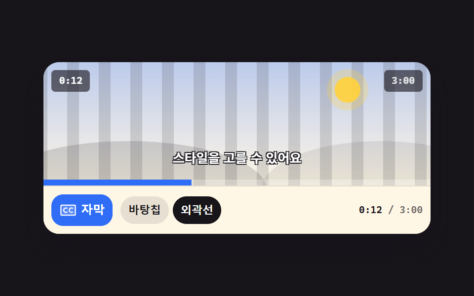
CC 버튼을 누르면 자막이 문장마다 아래에서 올라오며 갈아 끼워지고, 스타일 고르개로 바탕칩·외곽선 두 모습을 바꿉니다. 버튼의 눌린 상태는 aria-pressed 로 남습니다.
쓰임소리 없이 보는 사람이 많은 짧은 영상·요리 영상 위에 자막을 직접 다는 자리
aria-pressedtranslateYopacity
<main class="stage">
  <figure class="pl is-demo" id="pl">
    <div class="pl__screen">
      <div class="pl__stripes" aria-hidden="true"></div>
      <div class="pl__world" aria-hidden="true"><span class="pl__sun"></span><span class="pl__hill pl__hill--a"></span><span class="pl__hill pl__hill--b"></span></div>
      <span class="pl__clock" id="clock">0:12</span>
      <span class="pl__badge">3:00</span>
      <div class="cap" id="cap">
        <span class="cap__l cap__l--1 is-on">영상이 시작됩니다</span>
        <span class="cap__l cap__l--2">자막을 켜 보세요</span>
        <span class="cap__l cap__l--3">스타일을 고를 수 있어요</span>
        <span class="cap__l cap__l--4">이제 준비가 끝났어요</span>
      </div>
      <span class="pl__fillwrap" aria-hidden="true"><span class="pl__fill" id="fill"></span></span>
    </div>
    <div class="pl__bar">
      <button class="cc" type="button" id="cc" aria-pressed="true">
        <span class="cc__ic" aria-hidden="true"><svg xmlns="http://www.w3.org/2000/svg" width="18" height="18" viewBox="0 0 256 256"><g fill="currentColor"><path d="M232 64v128a8 8 0 0 1-8 8H32a8 8 0 0 1-8-8V64a8 8 0 0 1 8-8h192a8 8 0 0 1 8 8" opacity=".2"/><path d="M224 48H32a16 16 0 0 0-16 16v128a16 16 0 0 0 16 16h192a16 16 0 0 0 16-16V64a16 16 0 0 0-16-16m0 144H32V64h192zm-105.07-40.29a8 8 0 0 1-2.93 10.93a40 40 0 1 1 0-69.28a8 8 0 1 1-8 13.85a24 24 0 1 0 0 41.58a8 8 0 0 1 10.93 2.92m80 0a8 8 0 0 1-2.93 10.93a40 40 0 1 1 0-69.28a8 8 0 1 1-8 13.85a24 24 0 1 0 0 41.58a8 8 0 0 1 10.93 2.92"/></g></svg></span>
        <span class="cc__t">자막</span>
      </button>
      <div class="seg" id="seg" role="group" aria-label="자막 스타일">
        <button class="seg__b seg__b--chip is-on" type="button" data-s="chip" aria-pressed="true">바탕칩</button>
        <button class="seg__b seg__b--line" type="button" data-s="line" aria-pressed="false">외곽선</button>
      </div>
      <span class="pl__time"><b id="t-now">0:12</b> / 3:00</span>
    </div>
  </figure>
</main>@use "../../../../site/static/demo-tokens" as *;
$duration: $dur-quick;
$easing: $ease-spring;
$color: $subject-blue;
@include stage($stage-ink);
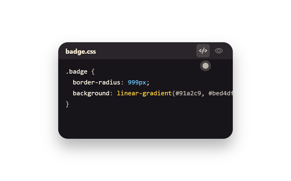
.pl {
position: relative;
box-sizing: border-box;
width: min(392px, 92vw);
margin: 0;
border-radius: $r-card;
background: $subject-cream;
box-shadow: $shadow-raised;
overflow: hidden;
}
// ── 화면 ──
.pl__screen {
position: relative;
height: clamp(96px, 26vw, 140px);
overflow: hidden;
background: linear-gradient(180deg, rgba(47, 109, 246, .32), rgba(255, 247, 230, .96));
}
.pl__stripes {
position: absolute;
inset: 0 -72px;
background: repeating-linear-gradient(90deg, rgba(23, 20, 26, .14) 0 12px, transparent 12px 32px);
animation-name: pl-pan;
animation-duration: $dur-loop;
animation-timing-function: linear;
animation-iteration-count: infinite;
}
@keyframes pl-pan { from { transform: translateX(0); } to { transform: translateX(-64px); } }
.pl__world { position: absolute; inset: 0; }
.pl__sun {
position: absolute; right: 18%; top: 12%;
width: 26px; height: 26px; border-radius: 50%;
background: rgba(255, 210, 63, .95);
box-shadow: 0 0 0 8px rgba(255, 210, 63, .25);
}
.pl__hill { position: absolute; bottom: -46%; height: 82%; border-radius: 50%; }
.pl__hill--a { left: -14%; width: 72%; background: rgba(23, 20, 26, .15); }
.pl__hill--b { right: -18%; width: 62%; background: rgba(23, 20, 26, .09); }
.pl__clock, .pl__badge {
position: absolute; top: $sp-2;
padding: $sp-1 $sp-2;
border-radius: $r-xs;
background: rgba(23, 20, 26, .62);
font-family: ui-monospace, "Cascadia Mono", Menlo, Consolas, monospace;
font-size: 10px; line-height: 14px; font-weight: 700;
}
.pl__clock { left: $sp-2; color: #fff; }
.pl__badge { right: $sp-2; color: rgba(255, 255, 255, .85); }
.pl__fillwrap { position: absolute; left: 0; right: 0; bottom: 0; height: 6px; background: rgba(255, 255, 255, .28); }
.pl__fill {
display: block; height: 100%;
background: $color;
transform-origin: left center; // 규칙8: 좌변서 차오름
transform: scaleX(.07);
}
// ── 자막 줄 (네 문장이 같은 칸에 겹쳐 쌓인다 — 한 번에 하나만 보인다) ──
.cap {
position: absolute;
left: 0; right: 0; bottom: $sp-4;
display: grid;
place-items: center;
opacity: 1;
transition: opacity $duration $easing;
}
.pl.is-off .cap { opacity: 0; }
.cap__l {
grid-area: 1 / 1;
box-sizing: border-box;
max-width: 92%;
padding: $sp-1 $sp-2;
border-radius: $r-pill;
background-color: rgba(23, 20, 26, .72);
color: #fff;
font-size: clamp(10px, 2.9vw, 13px);
line-height: 16px;
font-weight: 700;
white-space: nowrap;
text-shadow: 0 0 0 rgba(23, 20, 26, 0), 0 0 0 rgba(23, 20, 26, 0), 0 0 0 rgba(23, 20, 26, 0), 0 0 0 rgba(23, 20, 26, 0);
opacity: 0;
transform: translateY(10px);
transition: opacity $duration $easing, transform $duration $easing;
}
.cap__l.is-on { opacity: 1; transform: none; }
.pl.is-outline .cap__l {
background-color: rgba(23, 20, 26, 0);
text-shadow: 1px 1px 0 rgba(23, 20, 26, .95), -1px 1px 0 rgba(23, 20, 26, .95), 1px -1px 0 rgba(23, 20, 26, .95), -1px -1px 0 rgba(23, 20, 26, .95);
}
// ── 조작 줄 ──
.pl__bar {
display: flex;
align-items: center;
gap: $sp-2;
padding: $sp-2;
border-top: 1px solid rgba(23, 20, 26, .12);
background: $subject-cream;
}
.cc {
box-sizing: border-box;
height: 32px;
flex: 0 0 auto;
display: inline-flex; align-items: center; gap: $sp-1;
padding: 0 $sp-2;
border: 0;
border-radius: $r-control;
background: $color;
color: #fff;
cursor: pointer;
font-size: 12px; line-height: 16px; font-weight: 700;
transition: background $duration $easing, color $duration $easing;
}
.cc[aria-pressed="false"] { background: rgba(23, 20, 26, .1); color: $subject-ink; }
.cc:focus-visible { outline: 2px solid $stage-yellow; outline-offset: 2px; }
.cc__ic { display: inline-flex; }
.seg { display: flex; align-items: center; gap: $sp-1; }
.seg__b {
box-sizing: border-box;
height: 28px;
flex: 0 0 auto;
display: inline-flex; align-items: center;
padding: 0 $sp-2;
border: 0;
border-radius: $r-pill;
background-color: rgba(23, 20, 26, .1);
color: $subject-ink;
cursor: pointer;
font-size: 11px; line-height: 14px; font-weight: 700;
transition: background-color $duration $easing, color $duration $easing;
}
.seg__b.is-on { background-color: $subject-ink; color: #fff; }
.seg__b:focus-visible { outline: 2px solid $stage-yellow; outline-offset: 2px; }
.pl__time {
margin-left: auto;
color: rgba(23, 20, 26, .66);
font-family: ui-monospace, "Cascadia Mono", Menlo, Consolas, monospace;
font-size: 10px; line-height: 14px; font-weight: 600;
}
.pl__time b { color: $subject-ink; font-weight: 700; }
// ── 자동 루프: 2초 안에 네 문장이 아래에서 올라오며 갈아 끼워지고, 절반 지점에서 스타일이 바뀐다 ──
// 문장 교체는 steps(1, end) 로 한 프레임 컷 — 두 문장이 절대 겹치지 않는다. 부드러움은 등장 rise 로만.
.pl.is-demo .cap__l--1 {
animation-name: cap-1, cap-style;
animation-duration: $dur-loop, $dur-loop;
animation-timing-function: $easing, steps(1, end);
animation-iteration-count: infinite, infinite;
}
.pl.is-demo .cap__l--2 {
animation-name: cap-2, cap-style;
animation-duration: $dur-loop, $dur-loop;
animation-timing-function: $easing, steps(1, end);
animation-iteration-count: infinite, infinite;
}
.pl.is-demo .cap__l--3 {
animation-name: cap-3, cap-style;
animation-duration: $dur-loop, $dur-loop;
animation-timing-function: $easing, steps(1, end);
animation-iteration-count: infinite, infinite;
}
.pl.is-demo .cap__l--4 {
animation-name: cap-4, cap-style;
animation-duration: $dur-loop, $dur-loop;
animation-timing-function: $easing, steps(1, end);
animation-iteration-count: infinite, infinite;
}
// 자막 교체: opacity 는 0.01% 폭으로 **컷**하고(두 문장이 겹치는 프레임도, 아무 문장도 없는 프레임도 없다),
// 부드러움은 translateY 등장 rise 로만 준다. 예전 판은 나가는 문장과 들어오는 문장 사이에 빈 구간이 있어
// 정확히 25% 지점 프레임(24프레임 중 7번째)이 자막 없는 빈 화면이었고 그게 poster 로 뽑혔다 (실측 2026-09-12)
@keyframes cap-1 {
0%, 21.99% { opacity: 1; transform: none; }
22%, 87.99% { opacity: 0; transform: translateY(10px); }
88% { opacity: 1; transform: translateY(10px); }
93%, 100% { opacity: 1; transform: none; }
}
@keyframes cap-2 {
0%, 21.99% { opacity: 0; transform: translateY(10px); }
22% { opacity: 1; transform: translateY(10px); }
27%, 43.99% { opacity: 1; transform: none; }
44%, 100% { opacity: 0; transform: translateY(10px); }
}
@keyframes cap-3 {
0%, 43.99% { opacity: 0; transform: translateY(10px); }
44% { opacity: 1; transform: translateY(10px); }
49%, 65.99% { opacity: 1; transform: none; }
66%, 100% { opacity: 0; transform: translateY(10px); }
}
@keyframes cap-4 {
0%, 65.99% { opacity: 0; transform: translateY(10px); }
66% { opacity: 1; transform: translateY(10px); }
71%, 87.99% { opacity: 1; transform: none; }
88%, 100% { opacity: 0; transform: translateY(10px); }
}
@keyframes cap-style {
0%, 49% {
background-color: rgba(23, 20, 26, .72);
text-shadow: 0 0 0 rgba(23, 20, 26, 0), 0 0 0 rgba(23, 20, 26, 0), 0 0 0 rgba(23, 20, 26, 0), 0 0 0 rgba(23, 20, 26, 0);
}
50%, 87% {
background-color: rgba(23, 20, 26, 0);
text-shadow: 1px 1px 0 rgba(23, 20, 26, .95), -1px 1px 0 rgba(23, 20, 26, .95), 1px -1px 0 rgba(23, 20, 26, .95), -1px -1px 0 rgba(23, 20, 26, .95);
}
88%, 100% {
background-color: rgba(23, 20, 26, .72);
text-shadow: 0 0 0 rgba(23, 20, 26, 0), 0 0 0 rgba(23, 20, 26, 0), 0 0 0 rgba(23, 20, 26, 0), 0 0 0 rgba(23, 20, 26, 0);
}
}
.pl.is-demo .seg__b--chip {
animation-name: seg-chip;
animation-duration: $dur-loop;
animation-timing-function: steps(1, end);
animation-iteration-count: infinite;
}
.pl.is-demo .seg__b--line {
animation-name: seg-line;
animation-duration: $dur-loop;
animation-timing-function: steps(1, end);
animation-iteration-count: infinite;
}
@keyframes seg-chip {
0%, 49% { background-color: $subject-ink; color: #fff; }
50%, 87% { background-color: rgba(23, 20, 26, .1); color: $subject-ink; }
88%, 100% { background-color: $subject-ink; color: #fff; }
}
@keyframes seg-line {
0%, 49% { background-color: rgba(23, 20, 26, .1); color: $subject-ink; }
50%, 87% { background-color: $subject-ink; color: #fff; }
88%, 100% { background-color: rgba(23, 20, 26, .1); color: $subject-ink; }
}
.pl.is-demo .pl__fill {
animation-name: cap-fill;
animation-duration: $dur-loop;
animation-timing-function: linear;
animation-iteration-count: infinite;
}
@keyframes cap-fill {
0% { transform: scaleX(.07); }
88%, 100% { transform: scaleX(.62); }
}
// ── 좁은 화면: 간격을 올리지 않는다. 덜 중요한 것을 뺀다 ──
@media (max-width: 340px) {
.pl__time { display: none; }
.cap__l { line-height: 14px; }
.cc { font-size: 11px; }
.seg__b { font-size: 10px; }
}
@media (prefers-reduced-motion: reduce) {
.pl.is-demo .cap__l--1, .pl.is-demo .cap__l--2, .pl.is-demo .cap__l--3, .pl.is-demo .cap__l--4,
.pl.is-demo .seg__b--chip, .pl.is-demo .seg__b--line, .pl.is-demo .pl__fill,
.pl__stripes { animation: none !important; }
.cap, .cap__l, .cc, .seg__b { transition: none; }
}html, body {
margin: 0;
overflow: hidden;
}
.stage {
box-sizing: border-box;
min-height: 100vh;
display: grid;
place-items: center;
margin: 0;
background: #17141a;
font-family: -apple-system, "Segoe UI", "Noto Sans KR", sans-serif;
padding: clamp(8px, 4vw, 24px);
}
.pl {
position: relative;
box-sizing: border-box;
width: min(392px, 92vw);
margin: 0;
border-radius: 16px;
background: #fff7e6;
box-shadow: 0 14px 24px rgba(23, 20, 26, 0.32);
overflow: hidden;
}
.pl__screen {
position: relative;
height: clamp(96px, 26vw, 140px);
overflow: hidden;
background: linear-gradient(180deg, rgba(47, 109, 246, 0.32), rgba(255, 247, 230, 0.96));
}
.pl__stripes {
position: absolute;
inset: 0 -72px;
background: repeating-linear-gradient(90deg, rgba(23, 20, 26, 0.14) 0 12px, transparent 12px 32px);
animation-name: pl-pan;
animation-duration: 2s;
animation-timing-function: linear;
animation-iteration-count: infinite;
}
@keyframes pl-pan {
from {
transform: translateX(0);
}
to {
transform: translateX(-64px);
}
}
.pl__world {
position: absolute;
inset: 0;
}
.pl__sun {
position: absolute;
right: 18%;
top: 12%;
width: 26px;
height: 26px;
border-radius: 50%;
background: rgba(255, 210, 63, 0.95);
box-shadow: 0 0 0 8px rgba(255, 210, 63, 0.25);
}
.pl__hill {
position: absolute;
bottom: -46%;
height: 82%;
border-radius: 50%;
}
.pl__hill--a {
left: -14%;
width: 72%;
background: rgba(23, 20, 26, 0.15);
}
.pl__hill--b {
right: -18%;
width: 62%;
background: rgba(23, 20, 26, 0.09);
}
.pl__clock, .pl__badge {
position: absolute;
top: 8px;
padding: 4px 8px;
border-radius: 4px;
background: rgba(23, 20, 26, 0.62);
font-family: ui-monospace, "Cascadia Mono", Menlo, Consolas, monospace;
font-size: 10px;
line-height: 14px;
font-weight: 700;
}
.pl__clock {
left: 8px;
color: #fff;
}
.pl__badge {
right: 8px;
color: rgba(255, 255, 255, 0.85);
}
.pl__fillwrap {
position: absolute;
left: 0;
right: 0;
bottom: 0;
height: 6px;
background: rgba(255, 255, 255, 0.28);
}
.pl__fill {
display: block;
height: 100%;
background: #2f6df6;
transform-origin: left center;
transform: scaleX(0.07);
}
.cap {
position: absolute;
left: 0;
right: 0;
bottom: 16px;
display: grid;
place-items: center;
opacity: 1;
transition: opacity 220ms cubic-bezier(0.2, 0.8, 0.2, 1);
}
.pl.is-off .cap {
opacity: 0;
}
.cap__l {
grid-area: 1/1;
box-sizing: border-box;
max-width: 92%;
padding: 4px 8px;
border-radius: 999px;
background-color: rgba(23, 20, 26, 0.72);
color: #fff;
font-size: clamp(10px, 2.9vw, 13px);
line-height: 16px;
font-weight: 700;
white-space: nowrap;
text-shadow: 0 0 0 rgba(23, 20, 26, 0), 0 0 0 rgba(23, 20, 26, 0), 0 0 0 rgba(23, 20, 26, 0), 0 0 0 rgba(23, 20, 26, 0);
opacity: 0;
transform: translateY(10px);
transition: opacity 220ms cubic-bezier(0.2, 0.8, 0.2, 1), transform 220ms cubic-bezier(0.2, 0.8, 0.2, 1);
}
.cap__l.is-on {
opacity: 1;
transform: none;
}
.pl.is-outline .cap__l {
background-color: rgba(23, 20, 26, 0);
text-shadow: 1px 1px 0 rgba(23, 20, 26, 0.95), -1px 1px 0 rgba(23, 20, 26, 0.95), 1px -1px 0 rgba(23, 20, 26, 0.95), -1px -1px 0 rgba(23, 20, 26, 0.95);
}
.pl__bar {
display: flex;
align-items: center;
gap: 8px;
padding: 8px;
border-top: 1px solid rgba(23, 20, 26, 0.12);
background: #fff7e6;
}
.cc {
box-sizing: border-box;
height: 32px;
flex: 0 0 auto;
display: inline-flex;
align-items: center;
gap: 4px;
padding: 0 8px;
border: 0;
border-radius: 12px;
background: #2f6df6;
color: #fff;
cursor: pointer;
font-size: 12px;
line-height: 16px;
font-weight: 700;
transition: background 220ms cubic-bezier(0.2, 0.8, 0.2, 1), color 220ms cubic-bezier(0.2, 0.8, 0.2, 1);
}
.cc[aria-pressed=false] {
background: rgba(23, 20, 26, 0.1);
color: #17141a;
}
.cc:focus-visible {
outline: 2px solid #ffd23f;
outline-offset: 2px;
}
.cc__ic {
display: inline-flex;
}
.seg {
display: flex;
align-items: center;
gap: 4px;
}
.seg__b {
box-sizing: border-box;
height: 28px;
flex: 0 0 auto;
display: inline-flex;
align-items: center;
padding: 0 8px;
border: 0;
border-radius: 999px;
background-color: rgba(23, 20, 26, 0.1);
color: #17141a;
cursor: pointer;
font-size: 11px;
line-height: 14px;
font-weight: 700;
transition: background-color 220ms cubic-bezier(0.2, 0.8, 0.2, 1), color 220ms cubic-bezier(0.2, 0.8, 0.2, 1);
}
.seg__b.is-on {
background-color: #17141a;
color: #fff;
}
.seg__b:focus-visible {
outline: 2px solid #ffd23f;
outline-offset: 2px;
}
.pl__time {
margin-left: auto;
color: rgba(23, 20, 26, 0.66);
font-family: ui-monospace, "Cascadia Mono", Menlo, Consolas, monospace;
font-size: 10px;
line-height: 14px;
font-weight: 600;
}
.pl__time b {
color: #17141a;
font-weight: 700;
}
.pl.is-demo .cap__l--1 {
animation-name: cap-1, cap-style;
animation-duration: 2s, 2s;
animation-timing-function: cubic-bezier(0.2, 0.8, 0.2, 1), steps(1, end);
animation-iteration-count: infinite, infinite;
}
.pl.is-demo .cap__l--2 {
animation-name: cap-2, cap-style;
animation-duration: 2s, 2s;
animation-timing-function: cubic-bezier(0.2, 0.8, 0.2, 1), steps(1, end);
animation-iteration-count: infinite, infinite;
}
.pl.is-demo .cap__l--3 {
animation-name: cap-3, cap-style;
animation-duration: 2s, 2s;
animation-timing-function: cubic-bezier(0.2, 0.8, 0.2, 1), steps(1, end);
animation-iteration-count: infinite, infinite;
}
.pl.is-demo .cap__l--4 {
animation-name: cap-4, cap-style;
animation-duration: 2s, 2s;
animation-timing-function: cubic-bezier(0.2, 0.8, 0.2, 1), steps(1, end);
animation-iteration-count: infinite, infinite;
}
@keyframes cap-1 {
0%, 21.99% {
opacity: 1;
transform: none;
}
22%, 87.99% {
opacity: 0;
transform: translateY(10px);
}
88% {
opacity: 1;
transform: translateY(10px);
}
93%, 100% {
opacity: 1;
transform: none;
}
}
@keyframes cap-2 {
0%, 21.99% {
opacity: 0;
transform: translateY(10px);
}
22% {
opacity: 1;
transform: translateY(10px);
}
27%, 43.99% {
opacity: 1;
transform: none;
}
44%, 100% {
opacity: 0;
transform: translateY(10px);
}
}
@keyframes cap-3 {
0%, 43.99% {
opacity: 0;
transform: translateY(10px);
}
44% {
opacity: 1;
transform: translateY(10px);
}
49%, 65.99% {
opacity: 1;
transform: none;
}
66%, 100% {
opacity: 0;
transform: translateY(10px);
}
}
@keyframes cap-4 {
0%, 65.99% {
opacity: 0;
transform: translateY(10px);
}
66% {
opacity: 1;
transform: translateY(10px);
}
71%, 87.99% {
opacity: 1;
transform: none;
}
88%, 100% {
opacity: 0;
transform: translateY(10px);
}
}
@keyframes cap-style {
0%, 49% {
background-color: rgba(23, 20, 26, 0.72);
text-shadow: 0 0 0 rgba(23, 20, 26, 0), 0 0 0 rgba(23, 20, 26, 0), 0 0 0 rgba(23, 20, 26, 0), 0 0 0 rgba(23, 20, 26, 0);
}
50%, 87% {
background-color: rgba(23, 20, 26, 0);
text-shadow: 1px 1px 0 rgba(23, 20, 26, 0.95), -1px 1px 0 rgba(23, 20, 26, 0.95), 1px -1px 0 rgba(23, 20, 26, 0.95), -1px -1px 0 rgba(23, 20, 26, 0.95);
}
88%, 100% {
background-color: rgba(23, 20, 26, 0.72);
text-shadow: 0 0 0 rgba(23, 20, 26, 0), 0 0 0 rgba(23, 20, 26, 0), 0 0 0 rgba(23, 20, 26, 0), 0 0 0 rgba(23, 20, 26, 0);
}
}
.pl.is-demo .seg__b--chip {
animation-name: seg-chip;
animation-duration: 2s;
animation-timing-function: steps(1, end);
animation-iteration-count: infinite;
}
.pl.is-demo .seg__b--line {
animation-name: seg-line;
animation-duration: 2s;
animation-timing-function: steps(1, end);
animation-iteration-count: infinite;
}
@keyframes seg-chip {
0%, 49% {
background-color: #17141a;
color: #fff;
}
50%, 87% {
background-color: rgba(23, 20, 26, 0.1);
color: #17141a;
}
88%, 100% {
background-color: #17141a;
color: #fff;
}
}
@keyframes seg-line {
0%, 49% {
background-color: rgba(23, 20, 26, 0.1);
color: #17141a;
}
50%, 87% {
background-color: #17141a;
color: #fff;
}
88%, 100% {
background-color: rgba(23, 20, 26, 0.1);
color: #17141a;
}
}
.pl.is-demo .pl__fill {
animation-name: cap-fill;
animation-duration: 2s;
animation-timing-function: linear;
animation-iteration-count: infinite;
}
@keyframes cap-fill {
0% {
transform: scaleX(0.07);
}
88%, 100% {
transform: scaleX(0.62);
}
}
@media (max-width: 340px) {
.pl__time {
display: none;
}
.cap__l {
line-height: 14px;
}
.cc {
font-size: 11px;
}
.seg__b {
font-size: 10px;
}
}
@media (prefers-reduced-motion: reduce) {
.pl.is-demo .cap__l--1, .pl.is-demo .cap__l--2, .pl.is-demo .cap__l--3, .pl.is-demo .cap__l--4,
.pl.is-demo .seg__b--chip, .pl.is-demo .seg__b--line, .pl.is-demo .pl__fill,
.pl__stripes {
animation: none !important;
}
.cap, .cap__l, .cc, .seg__b {
transition: none;
}
}// 실제 동작: CC 버튼으로 자막을 켜고 끄고, 세그먼트로 자막 스타일을 고른다. 더미 재생 시계가 문장을 갈아 끼운다.
var root = document.getElementById('pl'), cc = document.getElementById('cc'),
seg = document.getElementById('seg'), clock = document.getElementById('clock'),
now = document.getElementById('t-now'), fill = document.getElementById('fill'),
lines = root.querySelectorAll('.cap__l');
var DUR = 180, t = 12, last = Date.now();
function fmt(s) { s = Math.floor(s); return Math.floor(s / 60) + ':' + ('0' + (s % 60)).slice(-2); }
function show(n) {
var i = n % lines.length;
for (var k = 0; k < lines.length; k++) lines[k].classList.toggle('is-on', k === i);
}
function calm() { if (root.classList.contains('is-demo')) root.classList.remove('is-demo'); }
setInterval(function () {
var n = Date.now();
t = (t + (n - last) / 1000) % DUR;
last = n;
clock.textContent = fmt(t);
now.textContent = fmt(t);
fill.style.transform = 'scaleX(' + (t / DUR).toFixed(4) + ')';
if (!root.classList.contains('is-demo')) show(Math.floor(t / 2));
}, 250);
cc.addEventListener('click', function () {
calm();
var on = cc.getAttribute('aria-pressed') !== 'true';
cc.setAttribute('aria-pressed', String(on));
root.classList.toggle('is-off', !on);
});
seg.addEventListener('click', function (e) {
var b = e.target.closest ? e.target.closest('.seg__b') : null;
if (!b) return;
calm();
var bs = seg.querySelectorAll('.seg__b');
for (var k = 0; k < bs.length; k++) {
var on = bs[k] === b;
bs[k].setAttribute('aria-pressed', String(on));
bs[k].classList.toggle('is-on', on);
}
root.classList.toggle('is-outline', b.getAttribute('data-s') === 'line');
});import { useEffect, useState } from "react";
import type { CSSProperties } from "react";
import styles from "./CaptionToggle.module.scss";
export type CaptionToggleProps = {
/** 더미 영상 길이(초) */
total?: number;
/** 시작 위치(초) */
start?: number;
/** 돌려 가며 보여 줄 자막 문장 */
lines?: string[];
duration?: number;
easing?: string;
color?: string;
};
type Vars = CSSProperties & { "--duration"?: string; "--easing"?: string; "--color"?: string };
function fmt(s: number) {
const n = Math.floor(s);
return Math.floor(n / 60) + ":" + ("0" + (n % 60)).slice(-2);
}
function CcIcon() {
return (
<svg viewBox="0 0 256 256" width="18" height="18" aria-hidden="true">
<g fill="currentColor">
<path d="M232 64v128a8 8 0 0 1-8 8H32a8 8 0 0 1-8-8V64a8 8 0 0 1 8-8h192a8 8 0 0 1 8 8" opacity=".2" />
<path d="M224 48H32a16 16 0 0 0-16 16v128a16 16 0 0 0 16 16h192a16 16 0 0 0 16-16V64a16 16 0 0 0-16-16m0 144H32V64h192zm-105.07-40.29a8 8 0 0 1-2.93 10.93a40 40 0 1 1 0-69.28a8 8 0 1 1-8 13.85a24 24 0 1 0 0 41.58a8 8 0 0 1 10.93 2.92m80 0a8 8 0 0 1-2.93 10.93a40 40 0 1 1 0-69.28a8 8 0 1 1-8 13.85a24 24 0 1 0 0 41.58a8 8 0 0 1 10.93 2.92" />
</g>
</svg>
);
}
export default function CaptionToggle({
total = 180,
start = 12,
lines = ["영상이 시작됩니다", "자막을 켜 보세요", "스타일을 고를 수 있어요", "이제 준비가 끝났어요"],
duration = 220,
easing = "cubic-bezier(.2,.8,.2,1)",
color = "#2f6df6",
}: CaptionToggleProps) {
const [on, setOn] = useState(true);
const [outline, setOutline] = useState(false);
const [t, setT] = useState(start);
// 더미 재생 시계 — 바닐라의 setInterval(250ms) 과 같은 방식(경과 시간으로 걷는다)
useEffect(() => {
let last = Date.now();
const id = setInterval(() => {
const n = Date.now();
const step = (n - last) / 1000;
last = n;
setT((p) => (p + step) % total);
}, 250);
return () => clearInterval(id);
}, [total]);
const vars: Vars = { "--duration": `${duration}ms`, "--easing": easing, "--color": color };
// 시계가 2초마다 문장을 갈아 끼운다
const cur = Math.floor(t / 2) % lines.length;
return (
<figure
className={`${styles.player} ${on ? "" : styles.isOff} ${outline ? styles.isOutline : ""}`}
style={vars}
>
<div className={styles.screen}>
<div className={styles.stripes} aria-hidden="true" />
<div className={styles.world} aria-hidden="true">
<span className={styles.sun} />
<span className={`${styles.hill} ${styles.hillA}`} />
<span className={`${styles.hill} ${styles.hillB}`} />
</div>
<span className={styles.clock}>{fmt(t)}</span>
<span className={styles.badge}>{fmt(total)}</span>
<div className={styles.cap}>
{lines.map((l, k) => (
<span key={l} className={`${styles.line} ${k === cur ? styles.isOn : ""}`}>
{l}
</span>
))}
</div>
<span className={styles.fillwrap} aria-hidden="true">
<span className={styles.fill} style={{ transform: `scaleX(${(t / total).toFixed(4)})` }} />
</span>
</div>
<div className={styles.bar}>
<button
className={styles.cc}
type="button"
aria-pressed={on}
onClick={() => setOn((v) => !v)}
>
<span className={styles.ccIc} aria-hidden="true">
<CcIcon />
</span>
<span>자막</span>
</button>
<div className={styles.seg} role="group" aria-label="자막 스타일">
<button
className={`${styles.segBtn} ${outline ? "" : styles.isOn}`}
type="button"
aria-pressed={!outline}
onClick={() => setOutline(false)}
>
바탕칩
</button>
<button
className={`${styles.segBtn} ${outline ? styles.isOn : ""}`}
type="button"
aria-pressed={outline}
onClick={() => setOutline(true)}
>
외곽선
</button>
</div>
<span className={styles.time}>
<b>{fmt(t)}</b> / {fmt(total)}
</span>
</div>
</figure>
);
}05 자막 토글과 자막 스타일 — 측정 누적면적 34.058% · 움직인 프레임 23/23GODRICH 원작 · zip 에 SCSS·React 포함 · 동영상 플레이어 만들기 9종 — 영상 파일 없이도 진짜로 돈다
이 데모가 속한 글
 동영상 플레이어 만들기 9종 — 영상 파일 없이도 진짜로 돈다동영상 플레이어 만들기는 브라우저가 기본으로 주는 밋밋한 재생 막대를 버리고 재생 버튼·시간 바·음량·자막을 직접 그려 붙이는 일입니다. 여기 아홉 개는 영상 파일을 하나도 쓰지 않고, 화면 속 풍경까지 CSS 로 이 글의 데모 전부 보기