02Viền sáng xoay
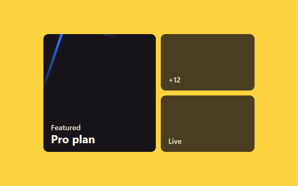
Một vệt sáng conic-gradient quay quanh viền card nhờ góc lưu trong biến đăng ký bằng @property, nên card trông như đang sống ngay cả lúc chưa hover.
Dùng choCard gói cước cao cấp, card giới thiệu tính năng AI
conic-gradient@property angleopacity

<main class="stage">
  <article class="card is-demo" tabindex="0">
    <span class="card__ring" aria-hidden="true"></span>
    <div class="card__inner">
      <h3 class="card__title">Gói Premium</h3>
      <p class="card__meta">Bao gồm tính năng AI</p>
    </div>
  </article>
</main>
@use "../../../../site/static/demo-tokens" as *;
$duration: $dur-loop; // 빛이 한 바퀴 도는 시간
$easing: linear; // 회전은 일정 속도로
$color: $subject-blue; // 빛 색
@include stage($stage-yellow);
.stage { padding: clamp(6px, 2.4vw, 16px); }
@property --angle {
syntax: "<angle>";
inherits: false;
initial-value: 0deg;
}
// 스포트라이트(커서 하이라이트) + 미세 3D 틸트 — 기존 테두리 회전 효과 위에 얹는 층
@property --mx { syntax: "<percentage>"; inherits: true; initial-value: 50%; }
@property --my { syntax: "<percentage>"; inherits: true; initial-value: 50%; }
@property --sp { syntax: "<number>"; inherits: true; initial-value: 0; }
@property --rx { syntax: "<angle>"; inherits: true; initial-value: 0deg; }
@property --ry { syntax: "<angle>"; inherits: true; initial-value: 0deg; }
.card {
position: relative;
width: min(190px, 58vw);
padding: 2px;
border-radius: $r-card;
outline: none;
cursor: pointer;
overflow: hidden; // 빛이 카드 테두리 밖으로 안 번지게, 얇은 띠만 보이게
isolation: isolate;
transform: rotateX(var(--rx, 0deg)) rotateY(var(--ry, 0deg));
transition: transform $dur-base $ease-spring;
}
.card::after {
content: '';
position: absolute; inset: 0; border-radius: inherit; pointer-events: none;
background: radial-gradient(120px circle at var(--mx) var(--my), rgba(255, 255, 255, .32), transparent 70%);
opacity: var(--sp);
}
.card__ring {
position: absolute;
inset: -50%;
background: conic-gradient(from var(--angle), transparent 0deg, $color 40deg, transparent 100deg);
opacity: 0;
transition: opacity $dur-quick $ease-out;
z-index: -1;
}
.card__inner {
position: relative;
z-index: 1;
border-radius: $r-card - 2px;
background: $stage-ink;
padding: 16px 14px;
}
.card__title { margin: 0 0 4px; font-weight: 700; font-size: clamp(12px, 3.4vw, 14px); line-height: 1.3; font-family: inherit; color: $subject-cream; }
.card__meta { margin: 0; font-weight: 500; font-size: clamp(11px, 3vw, 12px); line-height: 1.3; font-family: inherit; color: rgba($subject-cream, .7); }
.card:hover .card__ring,
.card:focus-visible .card__ring,
.card:active .card__ring,
.card.is-demo .card__ring {
opacity: 1;
animation: spin $duration $easing infinite;
}
.card.is-demo { animation: tilt-loop $dur-loop $easing infinite, spot-loop $dur-loop $easing infinite; }
@keyframes spin { to { --angle: 360deg; } }
@keyframes tilt-loop {
0%, 15% { --rx: 0deg; --ry: 0deg; }
35% { --rx: -4deg; --ry: 5deg; }
65% { --rx: 3deg; --ry: -5deg; }
85%, 100% { --rx: 0deg; --ry: 0deg; }
}
@keyframes spot-loop {
0%, 15% { --sp: 0; --mx: 15%; --my: 20%; }
30% { --sp: 1; }
50% { --mx: 85%; --my: 30%; }
70% { --mx: 50%; --my: 80%; }
85%, 100% { --sp: 0; }
}
@media (hover: none) {
.card:active .card__ring { opacity: 1; animation: spin $duration $easing infinite; }
}
@media (prefers-reduced-motion: reduce) {
.card__ring { transition: none; animation: none !important; opacity: .55; }
.card { transition: none; }
.card.is-demo { animation: none; --rx: 0deg; --ry: 0deg; --sp: 0; }
}html, body {
margin: 0;
overflow: hidden;
}
.stage {
box-sizing: border-box;
min-height: 100vh;
display: grid;
place-items: center;
margin: 0;
background: #ffd23f;
font-family: -apple-system, "Segoe UI", "Noto Sans KR", sans-serif;
padding: clamp(8px, 4vw, 24px);
}
.stage {
padding: clamp(6px, 2.4vw, 16px);
}
@property --angle {
syntax: "<angle>";
inherits: false;
initial-value: 0deg;
}
@property --mx {
syntax: "<percentage>";
inherits: true;
initial-value: 50%;
}
@property --my {
syntax: "<percentage>";
inherits: true;
initial-value: 50%;
}
@property --sp {
syntax: "<number>";
inherits: true;
initial-value: 0;
}
@property --rx {
syntax: "<angle>";
inherits: true;
initial-value: 0deg;
}
@property --ry {
syntax: "<angle>";
inherits: true;
initial-value: 0deg;
}
.card {
position: relative;
width: min(190px, 58vw);
padding: 2px;
border-radius: 16px;
outline: none;
cursor: pointer;
overflow: hidden;
isolation: isolate;
transform: rotateX(var(--rx, 0deg)) rotateY(var(--ry, 0deg));
transition: transform 300ms cubic-bezier(0.2, 0.8, 0.2, 1);
}
.card::after {
content: "";
position: absolute;
inset: 0;
border-radius: inherit;
pointer-events: none;
background: radial-gradient(120px circle at var(--mx) var(--my), rgba(255, 255, 255, 0.32), transparent 70%);
opacity: var(--sp);
}
.card__ring {
position: absolute;
inset: -50%;
background: conic-gradient(from var(--angle), transparent 0deg, #2f6df6 40deg, transparent 100deg);
opacity: 0;
transition: opacity 220ms ease-out;
z-index: -1;
}
.card__inner {
position: relative;
z-index: 1;
border-radius: 14px;
background: #17141a;
padding: 16px 14px;
}
.card__title {
margin: 0 0 4px;
font-weight: 700;
font-size: clamp(12px, 3.4vw, 14px);
line-height: 1.3;
font-family: inherit;
color: #fff7e6;
}
.card__meta {
margin: 0;
font-weight: 500;
font-size: clamp(11px, 3vw, 12px);
line-height: 1.3;
font-family: inherit;
color: rgba(255, 247, 230, 0.7);
}
.card:hover .card__ring,
.card:focus-visible .card__ring,
.card:active .card__ring,
.card.is-demo .card__ring {
opacity: 1;
animation: spin 2s linear infinite;
}
.card.is-demo {
animation: tilt-loop 2s linear infinite, spot-loop 2s linear infinite;
}
@keyframes spin {
to {
--angle: 360deg;
}
}
@keyframes tilt-loop {
0%, 15% {
--rx: 0deg;
--ry: 0deg;
}
35% {
--rx: -4deg;
--ry: 5deg;
}
65% {
--rx: 3deg;
--ry: -5deg;
}
85%, 100% {
--rx: 0deg;
--ry: 0deg;
}
}
@keyframes spot-loop {
0%, 15% {
--sp: 0;
--mx: 15%;
--my: 20%;
}
30% {
--sp: 1;
}
50% {
--mx: 85%;
--my: 30%;
}
70% {
--mx: 50%;
--my: 80%;
}
85%, 100% {
--sp: 0;
}
}
@media (hover: none) {
.card:active .card__ring {
opacity: 1;
animation: spin 2s linear infinite;
}
}
@media (prefers-reduced-motion: reduce) {
.card__ring {
transition: none;
animation: none !important;
opacity: 0.55;
}
.card {
transition: none;
}
.card.is-demo {
animation: none;
--rx: 0deg;
--ry: 0deg;
--sp: 0;
}
}// 커서 위치로 스포트라이트(--mx/--my/--sp)와 미세 3D 틸트(--rx/--ry)를 얹는다. 기존 테두리 회전 효과는 :hover 로 그대로 유지.
var card = document.querySelector('.card');
card.addEventListener('pointermove', function (e) {
card.classList.remove('is-demo');
var r = card.getBoundingClientRect();
var px = (e.clientX - r.left) / r.width - .5, py = (e.clientY - r.top) / r.height - .5;
card.style.setProperty('--mx', ((e.clientX - r.left) / r.width * 100) + '%');
card.style.setProperty('--my', ((e.clientY - r.top) / r.height * 100) + '%');
card.style.setProperty('--sp', 1);
card.style.setProperty('--rx', (-py * 6) + 'deg');
card.style.setProperty('--ry', (px * 7) + 'deg');
});
card.addEventListener('pointerleave', function () {
card.style.setProperty('--sp', 0);
card.style.setProperty('--rx', '0deg');
card.style.setProperty('--ry', '0deg');
});import { useCallback, useRef } from "react";
import type { CSSProperties, PointerEvent } from "react";
import styles from "./BorderLightSpinCard.module.scss";
export type BorderLightSpinCardProps = {
title: string;
meta: string;
/** 한 바퀴 도는 시간 (기본 2000ms) */
duration?: number;
easing?: string;
/** 빛 색 */
color?: string;
};
type Vars = CSSProperties & { "--duration"?: string; "--easing"?: string; "--color"?: string };
export default function BorderLightSpinCard({
title,
meta,
duration = 2000,
easing = "linear",
color = "#2f6df6",
}: BorderLightSpinCardProps) {
const ref = useRef<HTMLElement>(null);
// 커서 위치로 스포트라이트(--mx/--my/--sp)와 미세 3D 틸트(--rx/--ry)를 얹는다.
const move = useCallback((e: PointerEvent<HTMLElement>) => {
const el = ref.current;
if (!el) return;
const r = el.getBoundingClientRect();
const px = (e.clientX - r.left) / r.width - 0.5;
const py = (e.clientY - r.top) / r.height - 0.5;
el.style.setProperty("--mx", `${((e.clientX - r.left) / r.width) * 100}%`);
el.style.setProperty("--my", `${((e.clientY - r.top) / r.height) * 100}%`);
el.style.setProperty("--sp", "1");
el.style.setProperty("--rx", `${-py * 6}deg`);
el.style.setProperty("--ry", `${px * 7}deg`);
}, []);
const leave = useCallback(() => {
const el = ref.current;
if (!el) return;
el.style.setProperty("--sp", "0");
el.style.setProperty("--rx", "0deg");
el.style.setProperty("--ry", "0deg");
}, []);
const vars: Vars = { "--duration": `${duration}ms`, "--easing": easing, "--color": color };
return (
<article
ref={ref}
className={styles.card}
style={vars}
tabIndex={0}
onPointerMove={move}
onPointerLeave={leave}
>
<span className={styles.ring} aria-hidden="true" />
<div className={styles.inner}>
<h3 className={styles.title}>{title}</h3>
<p className={styles.meta}>{meta}</p>
</div>
</article>
);
}02 Viền sáng xoay — Diện tích đo được 1.778% · khung hình chuyển động 23/23Nguyên tác GODRICH · SCSS và React nằm trong tệp zip · 9 CSS Card Hover Effects — dán 1 dòng là chạy
Bài viết chứa demo này
 9 CSS Card Hover Effects — dán 1 dòng là chạyCSS card hover effects là các hiệu ứng CSS khiến thẻ card phản hồi khi con trỏ dừng trên nó — nổi lên, viền phát sáng, n Xem tất cả demo trong bài này