05Xoay refresh
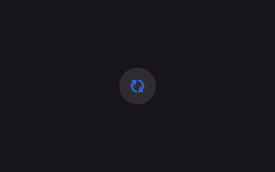
Icon refresh hai mũi tên xoay trọn một vòng quanh tâm của chính hình dạng đó, không phải tâm viewport.
Dùng choNút làm mới để tải lại danh sách hay feed
transform-box: fill-box360deg 600ms연속 회전(.is-demo)
<main class="stage">
  <button class="iconbtn is-demo" type="button" aria-label="Làm mới">
    <svg viewBox="0 0 24 24" width="30" height="30" aria-hidden="true">
      <g class="refresh-ghost">
        <path d="M4 12a8 8 0 0 1 13.9-5.4" fill="none" stroke="currentColor" stroke-width="2" stroke-linecap="round"/>
        <path d="M20 12a8 8 0 0 1-13.9 5.4" fill="none" stroke="currentColor" stroke-width="2" stroke-linecap="round"/>
        <path d="M17.5 3.2v4.4h-4.4" fill="none" stroke="currentColor" stroke-width="2" stroke-linecap="round" stroke-linejoin="round"/>
        <path d="M6.5 20.8v-4.4h4.4" fill="none" stroke="currentColor" stroke-width="2" stroke-linecap="round" stroke-linejoin="round"/>
      </g>
      <g class="refresh">
        <path d="M4 12a8 8 0 0 1 13.9-5.4" fill="none" stroke="currentColor" stroke-width="2" stroke-linecap="round"/>
        <path d="M20 12a8 8 0 0 1-13.9 5.4" fill="none" stroke="currentColor" stroke-width="2" stroke-linecap="round"/>
        <path d="M17.5 3.2v4.4h-4.4" fill="none" stroke="currentColor" stroke-width="2" stroke-linecap="round" stroke-linejoin="round"/>
        <path d="M6.5 20.8v-4.4h4.4" fill="none" stroke="currentColor" stroke-width="2" stroke-linecap="round" stroke-linejoin="round"/>
      </g>
      <circle class="refresh-spark" r="0.9" cx="17.9" cy="3.2"/>
      <circle class="refresh-bit" r=".5" cx="17.9" cy="3.2" style="--dx:0px;--dy:-2.6px"/>
      <circle class="refresh-bit" r=".45" cx="17.9" cy="3.2" style="--dx:2.1px;--dy:-1.4px"/>
      <circle class="refresh-bit" r=".45" cx="6.1" cy="20.8" style="--dx:-2.1px;--dy:1.4px"/>
      <circle class="refresh-bit" r=".5" cx="6.1" cy="20.8" style="--dx:0px;--dy:2.6px"/>
    </svg>
  </button>
</main>
@use "../../../../site/static/demo-tokens" as *;
// ── 변수 3개 ──────────────────────────────
$duration: $dur-enter; // 600ms — 한 바퀴
$easing: $ease-out;
$color: $subject-blue;
// ── 데모 무대 ───────────────────────────────
@include stage($stage-ink);
.iconbtn {
border: 0; border-radius: $r-pill; cursor: pointer;
width: clamp(52px, 14vw, 64px); height: clamp(52px, 14vw, 64px);
display: grid; place-items: center;
background: rgba(255, 247, 230, .1); color: $color;
-webkit-tap-highlight-color: transparent;
}
.iconbtn:focus-visible { outline: 2px solid $color; outline-offset: 3px; }
// 화살표 두 개가 만드는 도형은 24×24 뷰박스의 정중앙에 있지 않다.
// transform-box: fill-box 로 이 도형 자신의 경계 상자 중심을 축으로 돌린다
.refresh {
transform-box: fill-box;
transform-origin: 50% 50%;
}
.iconbtn.is-spinning .refresh { animation: spin-once $duration $easing; }
.iconbtn.is-demo .refresh { animation: spin-loop $dur-loop $easing infinite; }
@keyframes spin-once { to { transform: rotate(360deg); } }
@keyframes spin-loop {
0%, 10% { transform: rotate(0); }
55% { transform: rotate(360deg); }
100% { transform: rotate(360deg); }
}
// ── 한 겹: 화살촉 스파크 + 미광 잔상 ──────────────────────
// 잔상 — 본체와 같은 타임라인을 공유하되 각도를 뒤처지게 해, 도는 동안에만 뒤따라 빛난다
.refresh-ghost {
transform-box: fill-box;
transform-origin: 50% 50%;
opacity: 0; // 멈춰 있을 땐 보이지 않는다
filter: blur(.6px);
}
.iconbtn.is-spinning .refresh-ghost { animation: ghost-once $duration $ease-out; }
.iconbtn.is-demo .refresh-ghost { animation: ghost-loop $dur-loop $ease-out infinite; }
@keyframes ghost-once {
0% { transform: rotate(0); opacity: 0; }
60% { transform: rotate(260deg); opacity: .4; } // 본체보다 뒤처진 각도
100% { transform: rotate(360deg); opacity: 0; }
}
@keyframes ghost-loop {
0%, 10% { transform: rotate(0); opacity: 0; }
30% { transform: rotate(170deg); opacity: .4; }
55% { transform: rotate(330deg); opacity: .3; }
62%, 100% { transform: rotate(360deg); opacity: 0; }
}
// 화살촉 끝 스파크 — JS 가 실측 회전각으로 좌표를 옮긴다
.refresh-spark {
fill: $color;
opacity: 0;
pointer-events: none;
transform: scale(1.5); transform-origin: center; transform-box: fill-box;
filter: drop-shadow(0 0 1px $color); // 미광 — 끝이 살짝 발광한다
}
// 화살촉이 스치고 간 자리에 흩어지는 찌꺼기 — 접선 뒤쪽으로 튄다
.refresh-bit {
fill: $color;
opacity: 0;
transform: translate(0, 0);
pointer-events: none;
animation: bit-fly 420ms $ease-out forwards;
}
@keyframes bit-fly {
0% { opacity: .9; transform: translate(0, 0) scale(1); }
100% { opacity: 0; transform: translate(var(--dx), var(--dy)) scale(.3); }
}
@media (prefers-reduced-motion: reduce) {
.iconbtn.is-spinning .refresh, .iconbtn.is-demo .refresh { animation: none; }
.refresh-ghost { display: none; }
.refresh-spark { display: none; }
.refresh-bit { display: none; }
}html, body {
margin: 0;
overflow: hidden;
}
.stage {
box-sizing: border-box;
min-height: 100vh;
display: grid;
place-items: center;
margin: 0;
background: #17141a;
font-family: -apple-system, "Segoe UI", "Noto Sans KR", sans-serif;
padding: clamp(8px, 4vw, 24px);
}
.iconbtn {
border: 0;
border-radius: 999px;
cursor: pointer;
width: clamp(52px, 14vw, 64px);
height: clamp(52px, 14vw, 64px);
display: grid;
place-items: center;
background: rgba(255, 247, 230, 0.1);
color: #2f6df6;
-webkit-tap-highlight-color: transparent;
}
.iconbtn:focus-visible {
outline: 2px solid #2f6df6;
outline-offset: 3px;
}
.refresh {
transform-box: fill-box;
transform-origin: 50% 50%;
}
.iconbtn.is-spinning .refresh {
animation: spin-once 600ms ease-out;
}
.iconbtn.is-demo .refresh {
animation: spin-loop 2s ease-out infinite;
}
@keyframes spin-once {
to {
transform: rotate(360deg);
}
}
@keyframes spin-loop {
0%, 10% {
transform: rotate(0);
}
55% {
transform: rotate(360deg);
}
100% {
transform: rotate(360deg);
}
}
.refresh-ghost {
transform-box: fill-box;
transform-origin: 50% 50%;
opacity: 0;
filter: blur(0.6px);
}
.iconbtn.is-spinning .refresh-ghost {
animation: ghost-once 600ms ease-out;
}
.iconbtn.is-demo .refresh-ghost {
animation: ghost-loop 2s ease-out infinite;
}
@keyframes ghost-once {
0% {
transform: rotate(0);
opacity: 0;
}
60% {
transform: rotate(260deg);
opacity: 0.4;
}
100% {
transform: rotate(360deg);
opacity: 0;
}
}
@keyframes ghost-loop {
0%, 10% {
transform: rotate(0);
opacity: 0;
}
30% {
transform: rotate(170deg);
opacity: 0.4;
}
55% {
transform: rotate(330deg);
opacity: 0.3;
}
62%, 100% {
transform: rotate(360deg);
opacity: 0;
}
}
.refresh-spark {
fill: #2f6df6;
opacity: 0;
pointer-events: none;
transform: scale(1.5);
transform-origin: center;
transform-box: fill-box;
filter: drop-shadow(0 0 1px #2f6df6);
}
.refresh-bit {
fill: #2f6df6;
opacity: 0;
transform: translate(0, 0);
pointer-events: none;
animation: bit-fly 420ms ease-out forwards;
}
@keyframes bit-fly {
0% {
opacity: 0.9;
transform: translate(0, 0) scale(1);
}
100% {
opacity: 0;
transform: translate(var(--dx), var(--dy)) scale(0.3);
}
}
@media (prefers-reduced-motion: reduce) {
.iconbtn.is-spinning .refresh, .iconbtn.is-demo .refresh {
animation: none;
}
.refresh-ghost {
display: none;
}
.refresh-spark {
display: none;
}
.refresh-bit {
display: none;
}
}// 실제 클릭 한 번 = 한 바퀴. 데모(.is-demo)는 계속 돈다
document.querySelectorAll(".iconbtn").forEach(function (b) {
b.addEventListener("click", function () {
b.classList.remove("is-demo");
b.classList.remove("is-spinning");
void b.offsetWidth;
b.classList.add("is-spinning");
});
b.addEventListener("animationend", function (e) {
if (e.animationName === "spin-once") b.classList.remove("is-spinning");
});
});
// ── 한 겹: 화살촉 스파크 + 미광 잔상 ──────────────────────
// 회전은 stroke-dashoffset 이 아니라 transform 이다 — 펜 끝 좌표를 getPointAtLength 로 얻는
// 01 과 달리, 실측 transform 행렬에서 각도를 읽어 화살촉 두 개(뷰박스 좌표 17.9,3.2 · 6.1,20.8)를
// 도형 중심(12,12) 기준 회전으로 직접 계산한다. 잔상은 ghost 레이어가 지연 회전으로 흉내 낸다.
(function () {
var icon = document.querySelector('.iconbtn svg');
if (!icon) return;
var g = icon.querySelector('.refresh');
var spark = icon.querySelector('.refresh-spark');
var bits = [].slice.call(icon.querySelectorAll('.refresh-bit'));
var reduce = window.matchMedia('(prefers-reduced-motion: reduce)').matches;
if (reduce || !spark || !g) { if (spark) spark.style.display = 'none'; return; }
var CX = 12, CY = 12; // 회전축 (fill-box 중심과 일치)
var TIP_A = { x: 17.9, y: 3.2 }; // 오른쪽 위 화살촉 끝
var TIP_B = { x: 6.1, y: 20.8 }; // 왼쪽 아래 화살촉 끝
function angle() {
// getComputedStyle transform 은 px 단위 행렬로 온다: matrix(a,b,c,d,e,f)
var tr = getComputedStyle(g).transform;
if (!tr || tr === 'none') return 0;
var m = new DOMMatrixReadOnly(tr);
return Math.atan2(m.b, m.a); // 라디안
}
function rot(p, rad) {
var cos = Math.cos(rad), sin = Math.sin(rad), dx = p.x - CX, dy = p.y - CY;
return { x: CX + dx * cos - dy * sin, y: CY + dx * sin + dy * cos };
}
var prev = null, lastEmit = 0, emitIdx = 0;
function frame(t) {
var rad = angle();
var moved = prev !== null && Math.abs(rad - prev) > .002;
var a = rot(TIP_A, rad);
// 스파크는 진행 앞쪽 화살촉에 붙인다 — 도는 동안만 켜진다
spark.setAttribute('cx', a.x);
spark.setAttribute('cy', a.y);
spark.style.opacity = moved ? 1 : 0;
if (moved) {
// 회전 접선의 뒤쪽으로 찌꺼기 방출 (초당 최대 ~14개)
if (t - lastEmit > 70) {
lastEmit = t;
var up = Math.random() < .7; // 위 화살촉이 더 자주
var p = up ? a : rot(TIP_B, rad);
var tang = rad + (up ? Math.PI / 2 : -Math.PI / 2); // 접선 방향
var back = tang + Math.PI + (Math.random() - .5) * 1.2;
var sp = .4 + Math.random() * .5;
var b = bits[emitIdx++ % bits.length];
b.setAttribute('cx', p.x);
b.setAttribute('cy', p.y);
b.style.setProperty('--dx', (Math.cos(back) * sp * 6).toFixed(2) + 'px');
b.style.setProperty('--dy', (Math.sin(back) * sp * 6).toFixed(2) + 'px');
b.style.animation = 'none';
void b.getBoundingClientRect();
b.style.animation = '';
b.style.animationName = 'bit-fly';
}
}
prev = rad;
requestAnimationFrame(frame);
}
requestAnimationFrame(frame);
})();import { useEffect, useRef, useState } from "react";
import type { CSSProperties } from "react";
import styles from "./RefreshSpin.module.scss";
export type RefreshSpinProps = {
/** 한 바퀴 도는 시간, ms */
duration?: number;
easing?: string;
color?: string;
onRefresh?: () => void;
};
type Vars = CSSProperties & { "--duration"?: string; "--easing"?: string; "--color"?: string };
const PATHS = [
"M4 12a8 8 0 0 1 13.9-5.4",
"M20 12a8 8 0 0 1-13.9 5.4",
"M17.5 3.2v4.4h-4.4",
"M6.5 20.8v-4.4h4.4",
];
const BIT_DIRS: Array<[number, number]> = [
[0, -2.6],
[2.1, -1.4],
[-2.1, 1.4],
[0, 2.6],
];
// 화살촉 끝 (뷰박스 좌표) — 회전축은 도형 중심 (12,12)
const TIP_A = { x: 17.9, y: 3.2 };
const TIP_B = { x: 6.1, y: 20.8 };
export default function RefreshSpin({
duration = 600,
easing = "ease-out",
color = "#2f6df6",
onRefresh,
}: RefreshSpinProps) {
const [spinning, setSpinning] = useState(false);
const groupRef = useRef<SVGGElement>(null);
const sparkRef = useRef<SVGCircleElement>(null);
const bitRefs = useRef<Array<SVGCircleElement | null>>([]) as unknown as { current: Array<SVGCircleElement | null> };
const vars: Vars = { "--duration": `${duration}ms`, "--easing": easing, "--color": color };
// 한 겹: 화살촉 스파크 + 미광 잔상 (vanilla 데모와 동일 계산) — 실측 회전각에서
// 화살촉 좌표를 직접 계산해 스파크를 옮기고 접선 뒤쪽으로 찌꺼기를 뿌린다
useEffect(() => {
const g = groupRef.current, spark = sparkRef.current;
if (!g || !spark) return;
if (window.matchMedia("(prefers-reduced-motion: reduce)").matches) return;
const bits = bitRefs.current.filter(Boolean) as SVGCircleElement[];
let prev: number | null = null, lastEmit = 0, emitIdx = 0, raf = 0;
const frame = (t: number) => {
const tr = getComputedStyle(g).transform;
const rad = tr && tr !== "none" ? Math.atan2(new DOMMatrixReadOnly(tr).b, new DOMMatrixReadOnly(tr).a) : 0;
const moved = prev !== null && Math.abs(rad - prev) > 0.002;
const cos = Math.cos(rad), sin = Math.sin(rad);
const ax = 12 + (TIP_A.x - 12) * cos - (TIP_A.y - 12) * sin;
const ay = 12 + (TIP_A.x - 12) * sin + (TIP_A.y - 12) * cos;
spark.setAttribute("cx", ax.toFixed(2));
spark.setAttribute("cy", ay.toFixed(2));
spark.style.opacity = moved ? "1" : "0";
if (moved && t - lastEmit > 70 && bits.length) {
lastEmit = t;
const up = Math.random() < 0.7;
let px = ax, py = ay;
if (!up) {
px = 12 + (TIP_B.x - 12) * cos - (TIP_B.y - 12) * sin;
py = 12 + (TIP_B.x - 12) * sin + (TIP_B.y - 12) * cos;
}
const back = rad + (up ? 0.5 * Math.PI : -0.5 * Math.PI) + Math.PI + (Math.random() - 0.5) * 1.2;
const sp = 0.4 + Math.random() * 0.5;
const b = bits[emitIdx++ % bits.length];
b.setAttribute("cx", px.toFixed(2));
b.setAttribute("cy", py.toFixed(2));
b.style.setProperty("--dx", (Math.cos(back) * sp * 6).toFixed(2) + "px");
b.style.setProperty("--dy", (Math.sin(back) * sp * 6).toFixed(2) + "px");
b.style.animation = "none";
void b.getBoundingClientRect();
b.style.animation = "";
}
prev = rad;
raf = requestAnimationFrame(frame);
};
raf = requestAnimationFrame(frame);
return () => cancelAnimationFrame(raf);
}, []);
return (
<button
type="button"
className={styles.iconbtn}
style={vars}
aria-label="새로고침"
onClick={() => {
setSpinning(true);
onRefresh?.();
}}
>
<svg viewBox="0 0 24 24" width="30" height="30" aria-hidden="true">
<g className={styles["refresh-ghost"]}>
{PATHS.map((d) => (
<path key={d} d={d} fill="none" stroke="currentColor" strokeWidth={2} strokeLinecap="round" />
))}
</g>
<g
ref={groupRef}
className={styles.refresh}
data-spinning={spinning || undefined}
onAnimationEnd={() => setSpinning(false)}
>
{PATHS.map((d) => (
<path key={d} d={d} fill="none" stroke="currentColor" strokeWidth={2} strokeLinecap="round" strokeLinejoin="round" />
))}
</g>
<circle ref={sparkRef} className={styles["refresh-spark"]} r={0.9} cx={17.9} cy={3.2} />
{BIT_DIRS.map(([dx, dy], i) => (
<circle
key={i}
ref={(el: SVGCircleElement | null) => { bitRefs.current[i] = el; }}
className={styles["refresh-bit"]}
r={i === 0 || i === 3 ? 0.5 : 0.45}
cx={i < 2 ? 17.9 : 6.1}
cy={i < 2 ? 3.2 : 20.8}
style={{ "--dx": `${dx}px`, "--dy": `${dy}px` } as CSSProperties}
/>
))}
</svg>
</button>
);
}05 Xoay refresh — Diện tích đo được 0.43% · khung hình chuyển động 15/23Nguyên tác GODRICH · SCSS và React nằm trong tệp zip · 9 SVG Icon Animation CSS — dán 1 dòng là chạy
Bài viết chứa demo này
 9 SVG Icon Animation CSS — dán 1 dòng là chạySvg icon animation css là cách dựng icon play, chuông, refresh bằng path SVG có toạ độ, tạo chuyển động bằng transform v Xem tất cả demo trong bài này