06Quét sáng
Dải sáng nghiêng chéo vẽ bằng linear-gradient được đẩy bằng translateX từ -120% đến 120%, quét một lượt qua bề mặt ảnh.
Dùng choCard sản phẩm cao cấp, ảnh nhấn mạnh huy hiệu
linear-gradienttransform: translateX0.6초
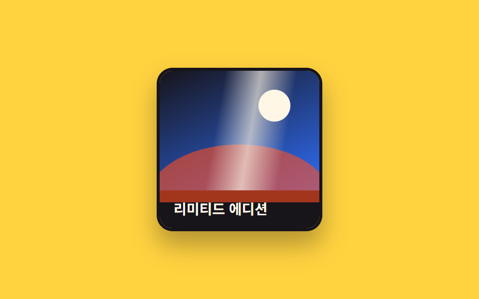
<main class="stage">
  <figure class="photo is-demo" tabindex="0">
    <span class="photo__pic" aria-hidden="true">
      <span class="photo__sun"></span>
      <span class="photo__hill"></span>
      <span class="photo__sweep"></span>
    </span>
    <figcaption class="photo__cap">Phiên bản giới hạn</figcaption>
  </figure>
</main>
@use "../../../../site/static/demo-tokens" as *;
$duration: $dur-enter; // 띠가 한 번 지나가는 시간
$easing: $ease-out;
$color: $subject-ink; // 사진 프레임 색
@include stage($stage-yellow);
.stage { padding: clamp(6px, 2.4vw, 16px); } // 320px 대응: 데모 카드가 작아 여백도 줄인다
.photo {
margin: 0;
width: min(160px, 50vw);
border-radius: $r-card;
overflow: hidden;
box-shadow: $shadow-raised;
border: 3px solid $color;
outline: none;
cursor: pointer;
}
.photo__pic {
display: block;
position: relative;
aspect-ratio: 4 / 3;
background: linear-gradient(155deg, $subject-ink 0%, $subject-blue 100%);
}
.photo__sun {
position: absolute;
top: 16%;
right: 18%;
width: 20%;
aspect-ratio: 1;
border-radius: 50%;
background: $subject-cream;
}
.photo__hill {
position: absolute;
left: -8%;
right: -8%;
bottom: -10%;
height: 48%;
border-radius: 50% 50% 0 0 / 100% 100% 0 0;
background: $stage-orange;
opacity: .6;
}
.photo__sweep {
position: absolute;
inset: 0;
background: linear-gradient(100deg, transparent 30%, rgba($subject-cream, .65) 50%, transparent 70%);
transform: translateX(-120%);
pointer-events: none;
}
.photo:hover .photo__sweep,
.photo:focus-visible .photo__sweep,
.photo:active .photo__sweep {
transform: translateX(120%);
transition: transform $duration $easing;
}
.photo__cap {
word-break: keep-all;
margin: 0;
padding: 10px 14px;
font-weight: 600; font-size: clamp(12px, 3.4vw, 14px); line-height: 1.3; font-family: inherit;
color: $subject-cream;
background: $color;
}
.photo.is-demo .photo__sweep {
animation: sweep-loop $dur-loop $easing infinite;
}
@keyframes sweep-loop {
0%, 15% { transform: translateX(-120%); }
65% { transform: translateX(120%); }
100% { transform: translateX(120%); }
}
@media (hover: none) {
.photo:active .photo__sweep { transform: translateX(120%); transition: transform $duration $easing; }
}
@media (prefers-reduced-motion: reduce) {
.photo__sweep { transition: none; }
.photo.is-demo .photo__sweep { animation: none; transform: translateX(-120%); }
}html, body {
margin: 0;
overflow: hidden;
}
.stage {
box-sizing: border-box;
min-height: 100vh;
display: grid;
place-items: center;
margin: 0;
background: #ffd23f;
font-family: -apple-system, "Segoe UI", "Noto Sans KR", sans-serif;
padding: clamp(8px, 4vw, 24px);
}
.stage {
padding: clamp(6px, 2.4vw, 16px);
}
.photo {
margin: 0;
width: min(160px, 50vw);
border-radius: 16px;
overflow: hidden;
box-shadow: 0 14px 24px rgba(23, 20, 26, 0.32);
border: 3px solid #17141a;
outline: none;
cursor: pointer;
}
.photo__pic {
display: block;
position: relative;
aspect-ratio: 4/3;
background: linear-gradient(155deg, #17141a 0%, #2f6df6 100%);
}
.photo__sun {
position: absolute;
top: 16%;
right: 18%;
width: 20%;
aspect-ratio: 1;
border-radius: 50%;
background: #fff7e6;
}
.photo__hill {
position: absolute;
left: -8%;
right: -8%;
bottom: -10%;
height: 48%;
border-radius: 50% 50% 0 0/100% 100% 0 0;
background: #ff4d1f;
opacity: 0.6;
}
.photo__sweep {
position: absolute;
inset: 0;
background: linear-gradient(100deg, transparent 30%, rgba(255, 247, 230, 0.65) 50%, transparent 70%);
transform: translateX(-120%);
pointer-events: none;
}
.photo:hover .photo__sweep,
.photo:focus-visible .photo__sweep,
.photo:active .photo__sweep {
transform: translateX(120%);
transition: transform 600ms ease-out;
}
.photo__cap {
word-break: keep-all;
margin: 0;
padding: 10px 14px;
font-weight: 600;
font-size: clamp(12px, 3.4vw, 14px);
line-height: 1.3;
font-family: inherit;
color: #fff7e6;
background: #17141a;
}
.photo.is-demo .photo__sweep {
animation: sweep-loop 2s ease-out infinite;
}
@keyframes sweep-loop {
0%, 15% {
transform: translateX(-120%);
}
65% {
transform: translateX(120%);
}
100% {
transform: translateX(120%);
}
}
@media (hover: none) {
.photo:active .photo__sweep {
transform: translateX(120%);
transition: transform 600ms ease-out;
}
}
@media (prefers-reduced-motion: reduce) {
.photo__sweep {
transition: none;
}
.photo.is-demo .photo__sweep {
animation: none;
transform: translateX(-120%);
}
}import type { CSSProperties } from "react";
import styles from "./BrightnessSweepPhoto.module.scss";
export type BrightnessSweepPhotoProps = {
caption: string;
/** 띠가 한 번 지나가는 시간 (기본 600ms) */
duration?: number;
easing?: string;
/** 프레임 색 */
color?: string;
};
type Vars = CSSProperties & { "--duration"?: string; "--easing"?: string; "--color"?: string };
export default function BrightnessSweepPhoto({
caption,
duration = 600,
easing = "ease-out",
color = "#17141a",
}: BrightnessSweepPhotoProps) {
const vars: Vars = { "--duration": `${duration}ms`, "--easing": easing, "--color": color };
return (
<figure className={styles.photo} style={vars} tabIndex={0}>
<span className={styles.pic} aria-hidden="true">
<span className={styles.sun} />
<span className={styles.hill} />
<span className={styles.sweep} />
</span>
<figcaption className={styles.cap}>{caption}</figcaption>
</figure>
);
}06 Quét sáng — Diện tích đo được 12.756% · khung hình chuyển động 8/23Nguyên tác GODRICH · SCSS và React nằm trong tệp zip · 9 CSS Image Hover Effects — dán 1 dòng là chạy
Bài viết chứa demo này
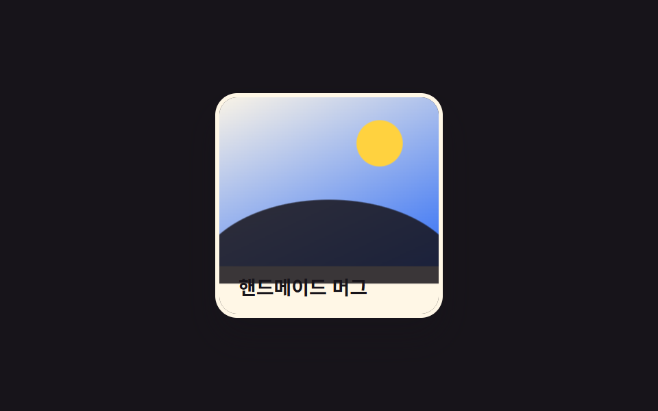 9 CSS Image Hover Effects — dán 1 dòng là chạyCSS image hover effects là các hiệu ứng chỉ chạy bằng CSS khi con trỏ dừng trên một ảnh, không cần JavaScript. Chín kiểu Xem tất cả demo trong bài này