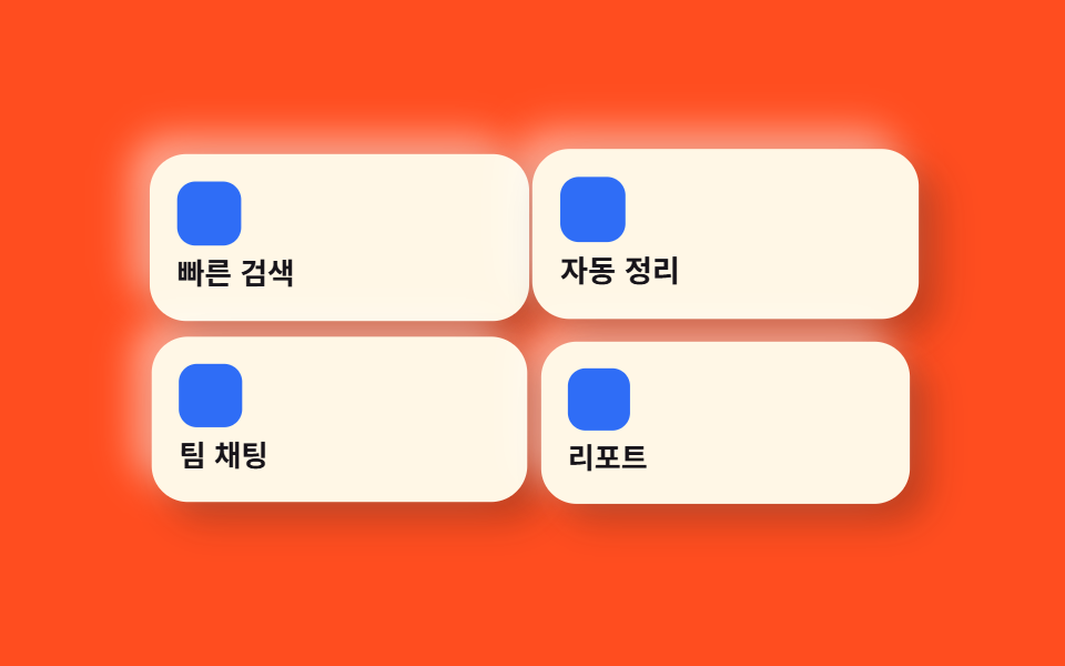
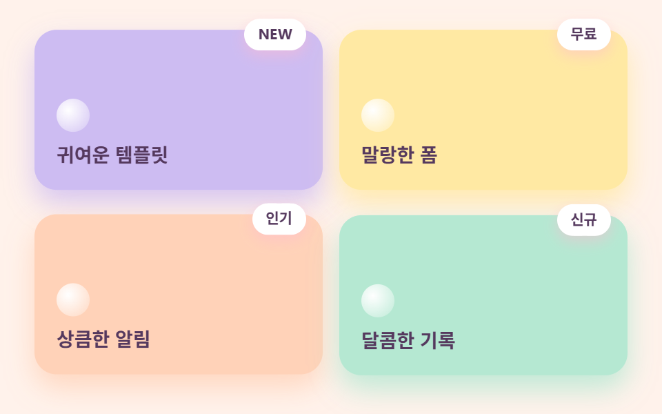
03Core bento card grid
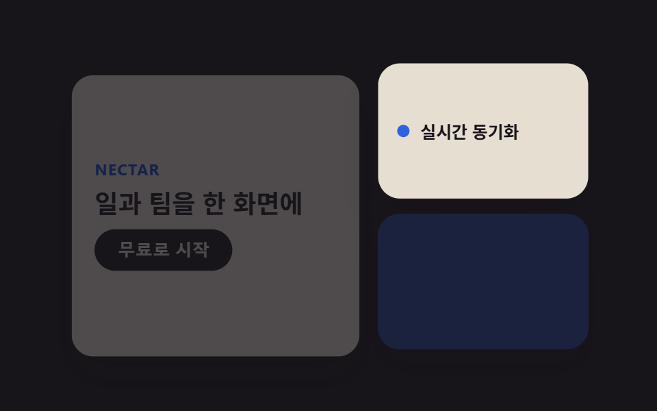
The core of the style — tiles span different column and row widths so the eye lands on the biggest one first.
Best forFeature showcase grids, dashboard summary cards
grid-template-columnsgap 16px2열→1열
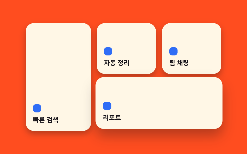
<main class="stage">
  <section class="grid">
    <div class="grid__tile grid__tile--a is-demo">
      <span class="grid__dot" aria-hidden="true"></span>
      <p class="grid__label">Instant search</p>
    </div>
    <div class="grid__tile grid__tile--b is-demo">
      <span class="grid__dot" aria-hidden="true"></span>
      <p class="grid__label">Auto-organize</p>
    </div>
    <div class="grid__tile grid__tile--c is-demo">
      <span class="grid__dot" aria-hidden="true"></span>
      <p class="grid__label">Team chat</p>
    </div>
    <div class="grid__tile grid__tile--d is-demo">
      <span class="grid__dot" aria-hidden="true"></span>
      <p class="grid__label">Reports</p>
    </div>
  </section>
</main>
@use "../../../../site/static/demo-tokens" as *;
$duration: $dur-loop; // 네 칸을 도는 한 주기
$easing: $ease-pop; // 살짝 튀는 곡선
$color: $subject-blue; // 점 강조 색
@include stage($stage-orange);
.grid {
width: clamp(240px, 82vw, 380px);
height: clamp(160px, 46vw, 210px);
display: grid;
grid-template-columns: 1.1fr 1fr 1fr;
grid-template-rows: 1fr 1fr;
gap: clamp(8px, 2.4vw, 12px);
}
.grid__tile {
border-radius: $r-card;
background: $subject-cream;
box-shadow: $shadow-press;
padding: clamp(10px, 3vw, 14px);
display: flex;
flex-direction: column;
justify-content: flex-end;
gap: 6px;
animation: tileWave $duration $easing infinite;
}
.grid__tile--a { grid-row: 1 / 3; animation-delay: 0s; }
.grid__tile--b { grid-column: 2; grid-row: 1; animation-delay: -0.5s; }
.grid__tile--c { grid-column: 3; grid-row: 1; animation-delay: -1s; }
.grid__tile--d { grid-column: 2 / 4; grid-row: 2; animation-delay: -1.5s; }
.grid__dot {
width: 16px;
height: 16px;
border-radius: 6px;
background: $color;
}
.grid__label {
margin: 0;
color: $subject-ink;
font-weight: 600; font-size: clamp(10.5px, 2.6vw, 12.5px); line-height: 1.3;
}
// 데모: 칸마다 살짝 떠올랐다 가라앉는 물결이 시차를 두고 지나간다
@keyframes tileWave {
0% { transform: translateY(0) scale(1); box-shadow: $shadow-press; }
15% { transform: translateY(-5px) scale(1.02); box-shadow: $shadow-raised; }
30% { transform: translateY(0) scale(1); box-shadow: $shadow-press; }
100% { transform: translateY(0) scale(1); box-shadow: $shadow-press; }
}
@media (prefers-reduced-motion: reduce) {
.grid__tile {
animation: none !important;
transform: none;
box-shadow: $shadow-press;
}
}html, body {
margin: 0;
overflow: hidden;
}
.stage {
box-sizing: border-box;
min-height: 100vh;
display: grid;
place-items: center;
margin: 0;
background: #ff4d1f;
font-family: -apple-system, "Segoe UI", "Noto Sans KR", sans-serif;
padding: clamp(8px, 4vw, 24px);
}
.grid {
width: clamp(240px, 82vw, 380px);
height: clamp(160px, 46vw, 210px);
display: grid;
grid-template-columns: 1.1fr 1fr 1fr;
grid-template-rows: 1fr 1fr;
gap: clamp(8px, 2.4vw, 12px);
}
.grid__tile {
border-radius: 16px;
background: #fff7e6;
box-shadow: 0 6px 12px rgba(23, 20, 26, 0.32);
padding: clamp(10px, 3vw, 14px);
display: flex;
flex-direction: column;
justify-content: flex-end;
gap: 6px;
animation: tileWave 2s cubic-bezier(0.2, 1.4, 0.4, 1) infinite;
}
.grid__tile--a {
grid-row: 1/3;
animation-delay: 0s;
}
.grid__tile--b {
grid-column: 2;
grid-row: 1;
animation-delay: -0.5s;
}
.grid__tile--c {
grid-column: 3;
grid-row: 1;
animation-delay: -1s;
}
.grid__tile--d {
grid-column: 2/4;
grid-row: 2;
animation-delay: -1.5s;
}
.grid__dot {
width: 16px;
height: 16px;
border-radius: 6px;
background: #2f6df6;
}
.grid__label {
margin: 0;
color: #17141a;
font-weight: 600;
font-size: clamp(10.5px, 2.6vw, 12.5px);
line-height: 1.3;
}
@keyframes tileWave {
0% {
transform: translateY(0) scale(1);
box-shadow: 0 6px 12px rgba(23, 20, 26, 0.32);
}
15% {
transform: translateY(-5px) scale(1.02);
box-shadow: 0 14px 24px rgba(23, 20, 26, 0.32);
}
30% {
transform: translateY(0) scale(1);
box-shadow: 0 6px 12px rgba(23, 20, 26, 0.32);
}
100% {
transform: translateY(0) scale(1);
box-shadow: 0 6px 12px rgba(23, 20, 26, 0.32);
}
}
@media (prefers-reduced-motion: reduce) {
.grid__tile {
animation: none !important;
transform: none;
box-shadow: 0 6px 12px rgba(23, 20, 26, 0.32);
}
}import type { CSSProperties } from "react";
import styles from "./BentoCardGrid.module.scss";
export type BentoCardGridProps = {
labels?: [string, string, string, string];
duration?: number;
easing?: string;
color?: string;
};
type Vars = CSSProperties & { "--duration"?: string; "--easing"?: string; "--color"?: string };
export default function BentoCardGrid({
labels = ["Instant search", "Auto-organize", "Team chat", "Reports"],
duration = 2000,
easing = "cubic-bezier(.2,1.4,.4,1)",
color = "#2f6df6",
}: BentoCardGridProps) {
const vars: Vars = { "--duration": `${duration}ms`, "--easing": easing, "--color": color };
const cls = [styles.tileA, styles.tileB, styles.tileC, styles.tileD];
return (
<section className={styles.grid} style={vars}>
{labels.map((label, i) => (
<div key={label} className={`${styles.tile} ${cls[i]}`}>
<span className={styles.dot} aria-hidden="true" />
<p className={styles.label}>{label}</p>
</div>
))}
</section>
);
}03 Core bento card grid — Measured area 17.204% · moving frames 20/23Original by GODRICH · SCSS and React ship in the zip · Bento Grid Design: 9 Ready-to-Copy Sections
The post this demo lives in
 Bento Grid Design: 9 Ready-to-Copy SectionsBento grid design arranges a landing page into tiles of uneven sizes inside one grid, the way a bento box holds differen See all demos in this post