04Unfold a letter
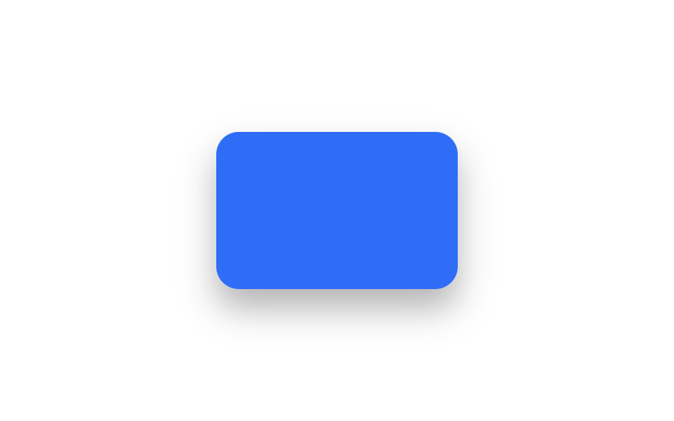
The folded card unfolds panel by panel like opening a letter, staggered so it reads as an envelope being opened.
Best forEvent invitation cards, thank-you message cards
rotateXtransition-delaytransform-origin: top
<main class="stage">
  <div class="ul-scene is-demo">
    <div class="ul-letter">YOU'RE<br>INVITED</div>
    <div class="ul-flap ul-flap--top"></div>
    <div class="ul-flap ul-flap--bottom"></div>
  </div>
</main>
@use "../../../../site/static/demo-tokens" as *;
// ── 변수 3개 ──────────────────────────────────────────
$duration: $dur-enter;
$easing: $ease-spring;
$color: $subject-blue;
@include stage($stage-paper);
.ul-scene {
position: relative;
width: 172px;
height: 112px;
perspective: 900px;
border-radius: $r-card;
box-shadow: $shadow-raised;
}
.ul-letter {
position: absolute;
inset: 0;
display: flex;
align-items: center;
justify-content: center;
text-align: center;
border-radius: $r-card;
background: $subject-cream;
color: $color;
font: 700 13px/1.35 -apple-system, "Segoe UI", sans-serif;
letter-spacing: .04em;
}
.ul-flap {
position: absolute;
left: 0;
width: 100%;
height: 50%;
background: $color;
border-radius: $r-card $r-card 0 0;
transform-style: preserve-3d;
}
.ul-flap--top { top: 0; transform-origin: top center; } // 규칙8: 봉투 플랩 상변 경첩
.ul-flap--bottom { bottom: 0; border-radius: 0 0 $r-card $r-card; transform-origin: bottom center; } // 규칙8: 봉투 플랩 하변 경첩
// 데모 루프: 위 flap 먼저, 아래 flap 이 시차(transition-delay)를 두고 뒤따라 펴진다
@keyframes ul-open-top {
0%, 25% { transform: rotateX(0); }
60%, 100% { transform: rotateX(-172deg); }
}
@keyframes ul-open-bottom {
0%, 40% { transform: rotateX(0); }
75%, 100% { transform: rotateX(172deg); }
}
.ul-scene.is-demo .ul-flap--top { animation: ul-open-top $duration * 2.6 $easing infinite; }
.ul-scene.is-demo .ul-flap--bottom { animation: ul-open-bottom $duration * 2.6 $easing infinite; }
@media (prefers-reduced-motion: reduce) {
.ul-scene.is-demo .ul-flap--top,
.ul-scene.is-demo .ul-flap--bottom { animation: none !important; transform: none !important; }
}html, body {
margin: 0;
overflow: hidden;
}
.stage {
box-sizing: border-box;
min-height: 100vh;
display: grid;
place-items: center;
margin: 0;
background: #ffffff;
font-family: -apple-system, "Segoe UI", "Noto Sans KR", sans-serif;
padding: clamp(8px, 4vw, 24px);
}
.ul-scene {
position: relative;
width: 172px;
height: 112px;
perspective: 900px;
border-radius: 16px;
box-shadow: 0 14px 24px rgba(23, 20, 26, 0.32);
}
.ul-letter {
position: absolute;
inset: 0;
display: flex;
align-items: center;
justify-content: center;
text-align: center;
border-radius: 16px;
background: #fff7e6;
color: #2f6df6;
font: 700 13px/1.35 -apple-system, "Segoe UI", sans-serif;
letter-spacing: 0.04em;
}
.ul-flap {
position: absolute;
left: 0;
width: 100%;
height: 50%;
background: #2f6df6;
border-radius: 16px 16px 0 0;
transform-style: preserve-3d;
}
.ul-flap--top {
top: 0;
transform-origin: top center;
}
.ul-flap--bottom {
bottom: 0;
border-radius: 0 0 16px 16px;
transform-origin: bottom center;
}
@keyframes ul-open-top {
0%, 25% {
transform: rotateX(0);
}
60%, 100% {
transform: rotateX(-172deg);
}
}
@keyframes ul-open-bottom {
0%, 40% {
transform: rotateX(0);
}
75%, 100% {
transform: rotateX(172deg);
}
}
.ul-scene.is-demo .ul-flap--top {
animation: ul-open-top 1560ms cubic-bezier(0.2, 0.8, 0.2, 1) infinite;
}
.ul-scene.is-demo .ul-flap--bottom {
animation: ul-open-bottom 1560ms cubic-bezier(0.2, 0.8, 0.2, 1) infinite;
}
@media (prefers-reduced-motion: reduce) {
.ul-scene.is-demo .ul-flap--top,
.ul-scene.is-demo .ul-flap--bottom {
animation: none !important;
transform: none !important;
}
}import { CSSProperties, useState } from "react";
import styles from "./UnfoldLetter.module.scss";
export interface UnfoldLetterProps {
duration?: string;
easing?: string;
message?: string;
}
export default function UnfoldLetter({
duration = "600ms",
easing = "cubic-bezier(.2, .8, .2, 1)",
message = "YOU'RE INVITED",
}: UnfoldLetterProps) {
const [open, setOpen] = useState(false);
const style = { "--duration": duration, "--easing": easing } as CSSProperties;
return (
<div
className={styles.scene}
style={style}
role="button"
tabIndex={0}
aria-pressed={open}
onClick={() => setOpen((v) => !v)}
onKeyDown={(e: { key: string }) => (e.key === "Enter" || e.key === " ") && setOpen((v) => !v)}
>
<div className={styles.letter}>{message}</div>
<div className={`${styles.flap} ${styles.top} ${open ? styles.openTop : ""}`} />
<div className={`${styles.flap} ${styles.bottom} ${open ? styles.openBottom : ""}`} />
</div>
);
}04 Unfold a letter — Measured area 26.174% · moving frames 11/23Original by GODRICH · SCSS and React ship in the zip · 9 CSS Card Flip Animations (Copy-Paste, 20 Lines)
The post this demo lives in
 9 CSS Card Flip Animations (Copy-Paste, 20 Lines)A CSS card flip animation spins a card around its own center to reveal different content on the back, built with 3D tran See all demos in this post