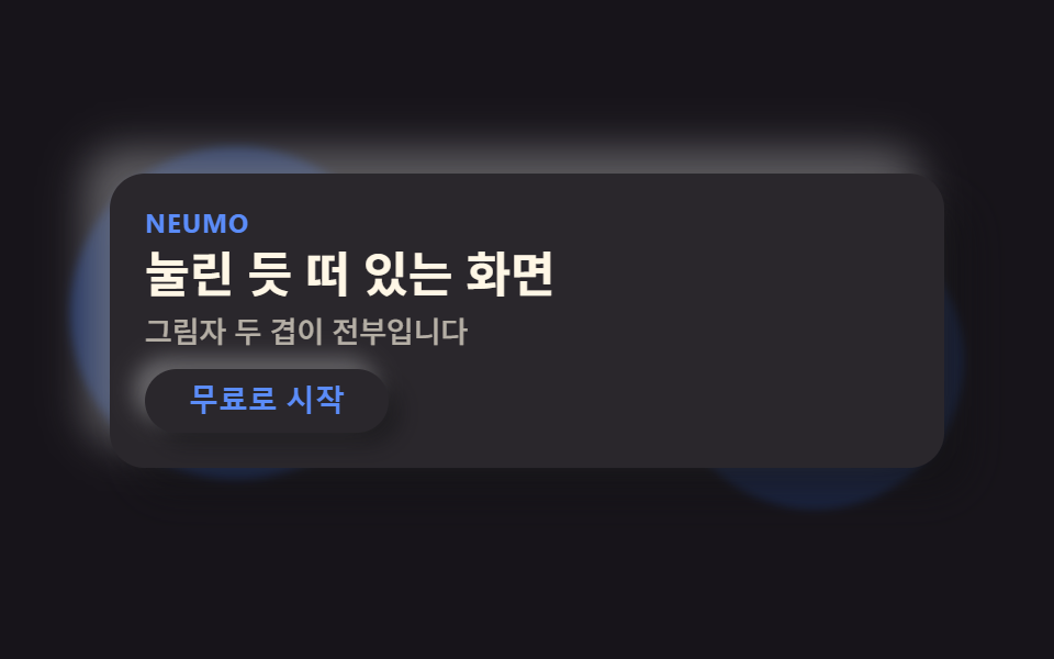
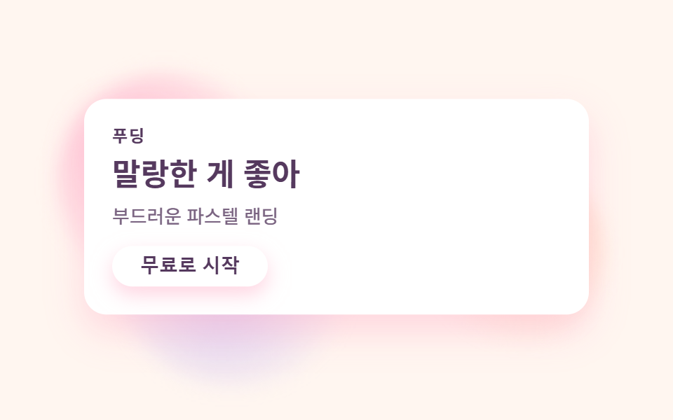
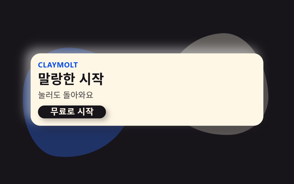
01Clay-shape hero
Two organic blobs drift slowly behind the headline while the hero card sits like pressed clay, lit from inside and shadowed from outside.
Best forSaaS landing first screen, product cover
blob 부유radius 16이중 그림자
<main class="stage">
  <section class="hero">
    <div class="hero__blob hero__blob--a is-demo" aria-hidden="true"></div>
    <div class="hero__blob hero__blob--b is-demo" aria-hidden="true"></div>
    <div class="hero__card is-demo">
      <p class="hero__eyebrow">Claymolt</p>
      <h1 class="hero__title">Soft start</h1>
      <p class="hero__desc">Press it — it springs back</p>
      <button class="hero__cta" type="button">Start for free</button>
    </div>
  </section>
</main>
@use "../../../../site/static/demo-tokens" as *;
$duration: $dur-loop; // 블롭이 한 바퀴 떠도는 시간
$easing: $ease-spring; // 떠오르는 곡선
$color: $subject-blue; // 강조 색
@include stage($stage-ink);
.hero {
position: relative;
width: clamp(240px, 82vw, 380px);
}
.hero__blob {
position: absolute;
width: clamp(110px, 42vw, 170px);
aspect-ratio: 1;
pointer-events: none;
}
.hero__blob--a {
top: -14px;
left: -14px;
background: rgba($color, .35);
border-radius: 42% 58% 63% 37% / 41% 44% 56% 59%;
animation: blobA $duration $easing infinite;
}
.hero__blob--b {
bottom: -16px;
right: -12px;
background: rgba($subject-cream, .3);
border-radius: 58% 42% 39% 61% / 56% 63% 37% 44%;
animation: blobB $duration $easing infinite;
animation-delay: -1s;
}
.hero__card {
position: relative;
box-sizing: border-box;
width: 100%;
display: flex;
flex-direction: column;
align-items: flex-start;
gap: $sp-1;
padding: $sp-3;
border-radius: $r-card;
background: $subject-cream;
box-shadow: 8px 8px 16px rgba($stage-ink, .3), -8px -8px 16px rgba($stage-paper, .5);
animation: cardRise $duration $easing infinite;
}
.hero__eyebrow {
margin: 0;
color: $subject-blue-deep; // 밝은 면 위 파란 글자 — AA 4.5
font-weight: 700; font-size: clamp(10px, 2.6vw, 12px); line-height: 1;
letter-spacing: .04em;
text-transform: uppercase;
}
.hero__title {
margin: 0;
color: $subject-ink;
font-weight: 700; font-size: clamp(18px, 4.6vw, 24px); line-height: 1.2;
}
.hero__desc {
margin: 0;
color: rgba($subject-ink, .7);
font-weight: 500; font-size: clamp(12px, 2.8vw, 14px); line-height: 1.4;
}
.hero__cta {
margin-top: $sp-1;
border: 0;
border-radius: $r-pill;
background: $subject-ink;
color: $subject-cream;
padding: $sp-1 $sp-5;
font-weight: 600; font-size: clamp(12px, 2.8vw, 14px); line-height: 1;
box-shadow: 4px 4px 8px rgba($stage-ink, .3);
}
// 데모: 블롭 두 개가 서로 반대 위상으로 떠돌고, 카드는 살짝 떠올랐다 가라앉는다 (WAAPI 시계가 잡을 수 있게 keyframes)
@keyframes blobA {
0%, 100% { transform: translate(0, 0) rotate(0deg) scale(1); }
50% { transform: translate(4%, 6%) rotate(10deg) scale(1.08); }
}
@keyframes blobB {
0%, 100% { transform: translate(0, 0) rotate(0deg) scale(1); }
50% { transform: translate(-5%, -4%) rotate(-8deg) scale(.93); }
}
@keyframes cardRise {
0%, 100% { transform: translateY(0); }
50% { transform: translateY(-6px); }
}
@media (prefers-reduced-motion: reduce) {
.hero__blob, .hero__card {
animation: none !important;
transform: none;
}
}html, body {
margin: 0;
overflow: hidden;
}
.stage {
box-sizing: border-box;
min-height: 100vh;
display: grid;
place-items: center;
margin: 0;
background: #17141a;
font-family: -apple-system, "Segoe UI", "Noto Sans KR", sans-serif;
padding: clamp(8px, 4vw, 24px);
}
.hero {
position: relative;
width: clamp(240px, 82vw, 380px);
}
.hero__blob {
position: absolute;
width: clamp(110px, 42vw, 170px);
aspect-ratio: 1;
pointer-events: none;
}
.hero__blob--a {
top: -14px;
left: -14px;
background: rgba(47, 109, 246, 0.35);
border-radius: 42% 58% 63% 37%/41% 44% 56% 59%;
animation: blobA 2s cubic-bezier(0.2, 0.8, 0.2, 1) infinite;
}
.hero__blob--b {
bottom: -16px;
right: -12px;
background: rgba(255, 247, 230, 0.3);
border-radius: 58% 42% 39% 61%/56% 63% 37% 44%;
animation: blobB 2s cubic-bezier(0.2, 0.8, 0.2, 1) infinite;
animation-delay: -1s;
}
.hero__card {
position: relative;
box-sizing: border-box;
width: 100%;
display: flex;
flex-direction: column;
align-items: flex-start;
gap: 4px;
padding: 12px;
border-radius: 16px;
background: #fff7e6;
box-shadow: 8px 8px 16px rgba(23, 20, 26, 0.3), -8px -8px 16px rgba(255, 255, 255, 0.5);
animation: cardRise 2s cubic-bezier(0.2, 0.8, 0.2, 1) infinite;
}
.hero__eyebrow {
margin: 0;
color: #0a4fe8;
font-weight: 700;
font-size: clamp(10px, 2.6vw, 12px);
line-height: 1;
letter-spacing: 0.04em;
text-transform: uppercase;
}
.hero__title {
margin: 0;
color: #17141a;
font-weight: 700;
font-size: clamp(18px, 4.6vw, 24px);
line-height: 1.2;
}
.hero__desc {
margin: 0;
color: rgba(23, 20, 26, 0.7);
font-weight: 500;
font-size: clamp(12px, 2.8vw, 14px);
line-height: 1.4;
}
.hero__cta {
margin-top: 4px;
border: 0;
border-radius: 999px;
background: #17141a;
color: #fff7e6;
padding: 4px 20px;
font-weight: 600;
font-size: clamp(12px, 2.8vw, 14px);
line-height: 1;
box-shadow: 4px 4px 8px rgba(23, 20, 26, 0.3);
}
@keyframes blobA {
0%, 100% {
transform: translate(0, 0) rotate(0deg) scale(1);
}
50% {
transform: translate(4%, 6%) rotate(10deg) scale(1.08);
}
}
@keyframes blobB {
0%, 100% {
transform: translate(0, 0) rotate(0deg) scale(1);
}
50% {
transform: translate(-5%, -4%) rotate(-8deg) scale(0.93);
}
}
@keyframes cardRise {
0%, 100% {
transform: translateY(0);
}
50% {
transform: translateY(-6px);
}
}
@media (prefers-reduced-motion: reduce) {
.hero__blob, .hero__card {
animation: none !important;
transform: none;
}
}import type { CSSProperties } from "react";
import styles from "./HeroClay.module.scss";
export type HeroClayProps = {
eyebrow?: string;
title?: string;
desc?: string;
cta?: string;
/** 한 주기(기본 2000ms) */
duration?: number;
easing?: string;
color?: string;
};
type Vars = CSSProperties & { "--duration"?: string; "--easing"?: string; "--color"?: string };
export default function HeroClay({
eyebrow = "Claymolt",
title = "말랑한 시작",
desc = "눌러도 돌아와요",
cta = "무료로 시작",
duration = 2000,
easing = "cubic-bezier(.2,.8,.2,1)",
color = "#2f6df6",
}: HeroClayProps) {
const vars: Vars = { "--duration": `${duration}ms`, "--easing": easing, "--color": color };
return (
<section className={styles.hero} style={vars}>
<div className={`${styles.blob} ${styles.blobA}`} aria-hidden="true" />
<div className={`${styles.blob} ${styles.blobB}`} aria-hidden="true" />
<div className={styles.card}>
<p className={styles.eyebrow}>{eyebrow}</p>
<h1 className={styles.title}>{title}</h1>
<p className={styles.desc}>{desc}</p>
<button type="button" className={styles.cta}>{cta}</button>
</div>
</section>
);
}01 Clay-shape hero — Measured area 16.283% · moving frames 17/23Original by GODRICH · SCSS and React ship in the zip · Claymorphism UI Kit: 9 Puffy Landing Sections
The post this demo lives in
 Claymorphism UI Kit: 9 Puffy Landing SectionsClaymorphism pairs a thick corner radius with one bright highlight and one dark shadow on the same surface, so a card re See all demos in this post