06Round avatar + bubble
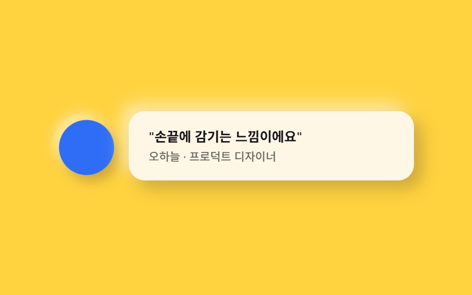
The avatar sits nested in a round capsule frame while the quote bubble puffs up like soft clay beside it.
Best forCustomer testimonials, partner quotes
radius 16아바타 원형꼬리 그림자
<main class="stage">
  <div class="testi is-demo">
    <span class="testi__avatar" aria-hidden="true"></span>
    <div class="testi__bubble">
      <p class="testi__quote">"It feels like it wraps around your fingertip."</p>
      <p class="testi__name">Oh Ha-neul · Product Designer</p>
    </div>
  </div>
</main>
@use "../../../../site/static/demo-tokens" as *;
$duration: $dur-loop; // 아바타 흔들림·말풍선 뜸의 한 주기
$easing: $ease-spring; // 곡선
$color: $subject-ink; // 강조 색 (노랑 무대라 먹색으로 대비)
@include stage($stage-yellow);
.testi {
display: flex;
align-items: center;
gap: $sp-4;
width: clamp(240px, 80vw, 360px);
}
.testi__avatar {
flex: none;
width: 56px;
height: 56px;
border-radius: $r-pill;
background: $subject-blue;
box-shadow: 6px 6px 12px rgba($stage-ink, .22), -6px -6px 12px rgba($stage-paper, .55);
animation: wobble $duration $easing infinite;
}
.testi__bubble {
flex: 1;
box-sizing: border-box;
border-radius: $r-card;
background: $subject-cream;
padding: $sp-4 $sp-5;
box-shadow: 8px 8px 16px rgba($stage-ink, .22), -8px -8px 16px rgba($stage-paper, .55);
animation: bubbleIn $duration $easing infinite;
animation-delay: -0.4s;
}
.testi__quote {
margin: 0 0 $sp-1;
color: $color;
font-weight: 600; font-size: clamp(12px, 2.8vw, 14px); line-height: 1.4;
}
.testi__name {
margin: 0;
color: rgba($color, .65);
font-weight: 500; font-size: clamp(10.5px, 2.4vw, 12px); line-height: 1.3;
}
// 데모: 아바타가 살짝 좌우로 흔들리고, 말풍선은 뜨고 가라앉는다
@keyframes wobble {
0%, 100% { transform: rotate(0deg); }
50% { transform: rotate(6deg); }
}
@keyframes bubbleIn {
0%, 100% { transform: translateY(0) scale(1); }
50% { transform: translateY(-4px) scale(1.015); }
}
@media (prefers-reduced-motion: reduce) {
.testi__avatar, .testi__bubble { animation: none !important; transform: none; }
}html, body {
margin: 0;
overflow: hidden;
}
.stage {
box-sizing: border-box;
min-height: 100vh;
display: grid;
place-items: center;
margin: 0;
background: #ffd23f;
font-family: -apple-system, "Segoe UI", "Noto Sans KR", sans-serif;
padding: clamp(8px, 4vw, 24px);
}
.testi {
display: flex;
align-items: center;
gap: 16px;
width: clamp(240px, 80vw, 360px);
}
.testi__avatar {
flex: none;
width: 56px;
height: 56px;
border-radius: 999px;
background: #2f6df6;
box-shadow: 6px 6px 12px rgba(23, 20, 26, 0.22), -6px -6px 12px rgba(255, 255, 255, 0.55);
animation: wobble 2s cubic-bezier(0.2, 0.8, 0.2, 1) infinite;
}
.testi__bubble {
flex: 1;
box-sizing: border-box;
border-radius: 16px;
background: #fff7e6;
padding: 16px 20px;
box-shadow: 8px 8px 16px rgba(23, 20, 26, 0.22), -8px -8px 16px rgba(255, 255, 255, 0.55);
animation: bubbleIn 2s cubic-bezier(0.2, 0.8, 0.2, 1) infinite;
animation-delay: -0.4s;
}
.testi__quote {
margin: 0 0 4px;
color: #17141a;
font-weight: 600;
font-size: clamp(12px, 2.8vw, 14px);
line-height: 1.4;
}
.testi__name {
margin: 0;
color: rgba(23, 20, 26, 0.65);
font-weight: 500;
font-size: clamp(10.5px, 2.4vw, 12px);
line-height: 1.3;
}
@keyframes wobble {
0%, 100% {
transform: rotate(0deg);
}
50% {
transform: rotate(6deg);
}
}
@keyframes bubbleIn {
0%, 100% {
transform: translateY(0) scale(1);
}
50% {
transform: translateY(-4px) scale(1.015);
}
}
@media (prefers-reduced-motion: reduce) {
.testi__avatar, .testi__bubble {
animation: none !important;
transform: none;
}
}import type { CSSProperties } from "react";
import styles from "./TestimonialClay.module.scss";
export type TestimonialClayProps = {
quote?: string;
name?: string;
duration?: number;
easing?: string;
color?: string;
};
type Vars = CSSProperties & { "--duration"?: string; "--easing"?: string; "--color"?: string };
export default function TestimonialClay({
quote = '"손끝에 감기는 느낌이에요"',
name = "오하늘 · 프로덕트 디자이너",
duration = 2000,
easing = "cubic-bezier(.2,.8,.2,1)",
color = "#17141a",
}: TestimonialClayProps) {
const vars: Vars = { "--duration": `${duration}ms`, "--easing": easing, "--color": color };
return (
<div className={styles.testi} style={vars}>
<span className={styles.avatar} aria-hidden="true" />
<div className={styles.bubble}>
<p className={styles.quote}>{quote}</p>
<p className={styles.name}>{name}</p>
</div>
</div>
);
}06 Round avatar + bubble — Measured area 7.151% · moving frames 18/23Original by GODRICH · SCSS and React ship in the zip · Claymorphism UI Kit: 9 Puffy Landing Sections
The post this demo lives in
 Claymorphism UI Kit: 9 Puffy Landing SectionsClaymorphism pairs a thick corner radius with one bright highlight and one dark shadow on the same surface, so a card re See all demos in this post