01Stacked frame hero
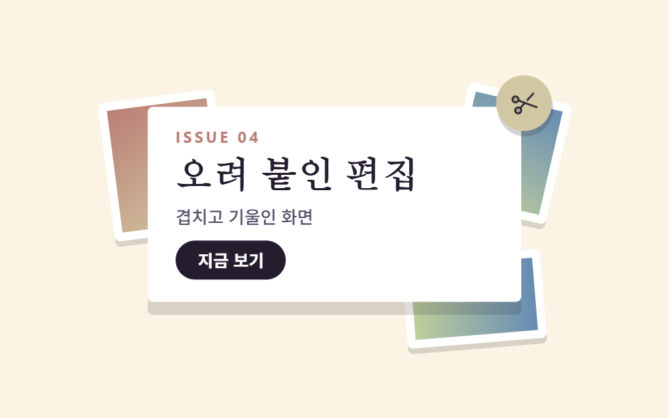
Three tilted photo frames sway against each other while the serif title card pasted on top is the only layer that rises.
Best forFirst screens for magazine, portfolio, and festival landings
z-index 겹침반대 위상radius 4
<main class="stage">
  <section class="hcol">
    <span class="hcol__frame hcol__frame--coral" aria-hidden="true"></span>
    <span class="hcol__frame hcol__frame--sky" aria-hidden="true"></span>
    <span class="hcol__frame hcol__frame--lime" aria-hidden="true"></span>
    <div class="hcol__card">
      <p class="hcol__eyebrow">ISSUE 04</p>
      <h1 class="hcol__title">A cut-and-paste edit</h1>
      <p class="hcol__desc">Screens that overlap and tilt</p>
      <button class="hcol__cta" type="button">See it now</button>
    </div>
    <span class="hcol__stamp" aria-hidden="true">
      <svg xmlns="http://www.w3.org/2000/svg" width="1em" height="1em" viewBox="0 0 256 256" fill="currentColor"><path d="M40.2,95.8a28,28,0,1,1,39.6,0A28,28,0,0,1,40.2,95.8Zm0,64.4a28,28,0,1,0,39.6,0A28,28,0,0,0,40.2,160.2Z" opacity="0.2"/><path d="M157.73,113.13A8,8,0,0,1,159.82,102L227.48,55.7a8,8,0,0,1,9,13.21l-67.67,46.3a7.92,7.92,0,0,1-4.51,1.4A8,8,0,0,1,157.73,113.13Zm80.87,85.09a8,8,0,0,1-11.12,2.08L136,137.7,93.49,166.78a36,36,0,1,1-9-13.19L121.83,128,84.44,102.41a35.86,35.86,0,1,1,9-13.19l143,97.87A8,8,0,0,1,238.6,198.22ZM80,180a20,20,0,1,0-5.86,14.14A19.85,19.85,0,0,0,80,180ZM74.14,90.13a20,20,0,1,0-28.28,0A19.85,19.85,0,0,0,74.14,90.13Z"/></svg>
    </span>
  </section>
</main>
@use "../../../../site/static/demo-tokens" as *;
// 콜라주·맥시멀 팔레트 — 크림 바탕 한 장 위에 오려 붙인 상큼한 다섯 색.
// 대비 실측(WCAG 상대휘도 직접 계산): ink/cream 14.76:1 · slate/cream 6.90:1 · sheet/coral 4.59:1
$cg-cream: #fbf3e4;
$cg-sheet: #ffffff;
$cg-ink: #241d2e;
$cg-slate: #57506a;
$cg-coral: #bb7f74;
$cg-sky: #668cb4;
$cg-lime: #bfce9c;
$cg-lemon: #d1c8a3;
$serif: Georgia, "Nanum Myeongjo", "Times New Roman", serif;
$duration: $dur-loop; // 프레임 한 장이 흔들렸다 돌아오는 한 주기
$easing: $ease-spring; // 종이는 붙어 있으니 끝에서 살짝 눌린다
$color: $cg-coral; // 맨 뒤 프레임의 대표색
@include stage($cg-cream);
.hcol {
position: relative;
width: clamp(196px, 62vw, 268px);
isolation: isolate;
}
// 뒤에 오려 붙인 사진 프레임 — 흰 여백 테두리 + 색면(사진 자리)
.hcol__frame {
position: absolute;
z-index: 0;
border: 6px solid $cg-sheet;
border-radius: $r-xs;
box-shadow: 0 4px 0 rgba($cg-ink, .16);
animation-name: frameSway;
animation-duration: $duration;
animation-timing-function: $easing;
animation-iteration-count: infinite;
}
.hcol__frame--coral {
--rot: -9deg;
left: -30px;
top: -14px;
width: 72px;
height: 88px;
background: linear-gradient(150deg, $cg-coral 0%, $cg-lemon 100%);
}
.hcol__frame--sky {
--rot: 8deg;
right: -28px;
top: -22px;
width: 64px;
height: 76px;
background: linear-gradient(200deg, $cg-sky 0%, $cg-lime 100%);
animation-delay: -.7s;
}
.hcol__frame--lime {
--rot: -5deg;
right: -16px;
bottom: -26px;
width: 88px;
height: 52px;
background: linear-gradient(90deg, $cg-lime 0%, $cg-sky 100%);
animation-delay: -1.4s;
}
// 맨 위에 붙인 제목 카드 — 층이 하나 더 있다는 걸 그림자 폭으로 알린다
.hcol__card {
position: relative;
z-index: 2;
box-sizing: border-box;
display: flex;
flex-direction: column;
align-items: flex-start;
gap: $sp-2;
padding: $sp-4 $sp-5;
border-radius: $r-xs;
background: $cg-sheet;
box-shadow: 0 6px 0 rgba($cg-ink, .18);
animation-name: cardRise;
animation-duration: $duration;
animation-timing-function: $easing;
animation-iteration-count: infinite;
}
.hcol__eyebrow {
margin: 0;
color: $cg-coral;
font-weight: 700;
font-size: clamp(9px, 2.4vw, 11px);
line-height: 1;
letter-spacing: .18em;
}
.hcol__title {
margin: 0;
color: $cg-ink;
font-family: $serif;
font-weight: 700;
font-size: clamp(20px, 5.4vw, 30px);
line-height: 1.1;
}
.hcol__desc {
margin: 0;
color: $cg-slate;
font-weight: 500;
font-size: clamp(11px, 2.6vw, 13px);
line-height: 1.4;
}
.hcol__cta {
border: 0;
border-radius: $r-pill;
background: $cg-ink;
color: $cg-sheet;
padding: $sp-2 $sp-4;
font-family: inherit;
font-weight: 700;
font-size: clamp(11px, 2.6vw, 12px);
line-height: 1;
}
.hcol__cta:focus-visible {
outline: 3px solid $cg-sky;
outline-offset: 2px;
}
// 기울여 붙인 스탬프 — 맨 위 층이라 카드보다 앞
.hcol__stamp {
position: absolute;
z-index: 3;
right: -22px;
top: -26px;
width: 40px;
aspect-ratio: 1;
display: grid;
place-items: center;
border-radius: 50%;
background: $cg-lemon;
color: $cg-ink;
font-size: 20px;
transform: rotate(-14deg);
box-shadow: 0 4px 0 rgba($cg-ink, .2);
}
// 데모: 뒤 프레임 세 장은 서로 다른 위상으로 흔들리고, 앞 카드만 제자리에서 뜬다
@keyframes frameSway {
0%, 100% { transform: translateY(0) rotate(var(--rot)); }
50% { transform: translateY(8px) rotate(calc(var(--rot) + 5deg)); }
}
@keyframes cardRise {
0%, 100% { transform: translateY(0); box-shadow: 0 6px 0 rgba($cg-ink, .18); }
50% { transform: translateY(-10px); box-shadow: 0 16px 0 rgba($cg-ink, .12); }
}
@media (max-width: 360px), (max-height: 230px) {
.hcol { width: 168px; }
.hcol__card { padding: $sp-3; gap: $sp-1; }
.hcol__desc { display: none; }
.hcol__title { font-size: 18px; }
.hcol__frame--coral { width: 48px; height: 60px; left: -20px; top: -10px; }
.hcol__frame--sky { width: 44px; height: 52px; right: -18px; top: -14px; }
.hcol__frame--lime { width: 56px; height: 36px; right: -12px; bottom: -16px; }
.hcol__stamp { width: 28px; font-size: 14px; right: -14px; top: -16px; }
}
@media (prefers-reduced-motion: reduce) {
.hcol__frame, .hcol__card { animation: none !important; }
.hcol__frame--coral { transform: rotate(-9deg); }
.hcol__frame--sky { transform: rotate(8deg); }
.hcol__frame--lime { transform: rotate(-5deg); }
}html, body {
margin: 0;
overflow: hidden;
}
.stage {
box-sizing: border-box;
min-height: 100vh;
display: grid;
place-items: center;
margin: 0;
background: #fbf3e4;
font-family: -apple-system, "Segoe UI", "Noto Sans KR", sans-serif;
padding: clamp(8px, 4vw, 24px);
}
.hcol {
position: relative;
width: clamp(196px, 62vw, 268px);
isolation: isolate;
}
.hcol__frame {
position: absolute;
z-index: 0;
border: 6px solid #ffffff;
border-radius: 4px;
box-shadow: 0 4px 0 rgba(36, 29, 46, 0.16);
animation-name: frameSway;
animation-duration: 2s;
animation-timing-function: cubic-bezier(0.2, 0.8, 0.2, 1);
animation-iteration-count: infinite;
}
.hcol__frame--coral {
--rot: -9deg;
left: -30px;
top: -14px;
width: 72px;
height: 88px;
background: linear-gradient(150deg, #bb7f74 0%, #d1c8a3 100%);
}
.hcol__frame--sky {
--rot: 8deg;
right: -28px;
top: -22px;
width: 64px;
height: 76px;
background: linear-gradient(200deg, #668cb4 0%, #bfce9c 100%);
animation-delay: -0.7s;
}
.hcol__frame--lime {
--rot: -5deg;
right: -16px;
bottom: -26px;
width: 88px;
height: 52px;
background: linear-gradient(90deg, #bfce9c 0%, #668cb4 100%);
animation-delay: -1.4s;
}
.hcol__card {
position: relative;
z-index: 2;
box-sizing: border-box;
display: flex;
flex-direction: column;
align-items: flex-start;
gap: 8px;
padding: 16px 20px;
border-radius: 4px;
background: #ffffff;
box-shadow: 0 6px 0 rgba(36, 29, 46, 0.18);
animation-name: cardRise;
animation-duration: 2s;
animation-timing-function: cubic-bezier(0.2, 0.8, 0.2, 1);
animation-iteration-count: infinite;
}
.hcol__eyebrow {
margin: 0;
color: #bb7f74;
font-weight: 700;
font-size: clamp(9px, 2.4vw, 11px);
line-height: 1;
letter-spacing: 0.18em;
}
.hcol__title {
margin: 0;
color: #241d2e;
font-family: Georgia, "Nanum Myeongjo", "Times New Roman", serif;
font-weight: 700;
font-size: clamp(20px, 5.4vw, 30px);
line-height: 1.1;
}
.hcol__desc {
margin: 0;
color: #57506a;
font-weight: 500;
font-size: clamp(11px, 2.6vw, 13px);
line-height: 1.4;
}
.hcol__cta {
border: 0;
border-radius: 999px;
background: #241d2e;
color: #ffffff;
padding: 8px 16px;
font-family: inherit;
font-weight: 700;
font-size: clamp(11px, 2.6vw, 12px);
line-height: 1;
}
.hcol__cta:focus-visible {
outline: 3px solid #668cb4;
outline-offset: 2px;
}
.hcol__stamp {
position: absolute;
z-index: 3;
right: -22px;
top: -26px;
width: 40px;
aspect-ratio: 1;
display: grid;
place-items: center;
border-radius: 50%;
background: #d1c8a3;
color: #241d2e;
font-size: 20px;
transform: rotate(-14deg);
box-shadow: 0 4px 0 rgba(36, 29, 46, 0.2);
}
@keyframes frameSway {
0%, 100% {
transform: translateY(0) rotate(var(--rot));
}
50% {
transform: translateY(8px) rotate(calc(var(--rot) + 5deg));
}
}
@keyframes cardRise {
0%, 100% {
transform: translateY(0);
box-shadow: 0 6px 0 rgba(36, 29, 46, 0.18);
}
50% {
transform: translateY(-10px);
box-shadow: 0 16px 0 rgba(36, 29, 46, 0.12);
}
}
@media (max-width: 360px), (max-height: 230px) {
.hcol {
width: 168px;
}
.hcol__card {
padding: 12px;
gap: 4px;
}
.hcol__desc {
display: none;
}
.hcol__title {
font-size: 18px;
}
.hcol__frame--coral {
width: 48px;
height: 60px;
left: -20px;
top: -10px;
}
.hcol__frame--sky {
width: 44px;
height: 52px;
right: -18px;
top: -14px;
}
.hcol__frame--lime {
width: 56px;
height: 36px;
right: -12px;
bottom: -16px;
}
.hcol__stamp {
width: 28px;
font-size: 14px;
right: -14px;
top: -16px;
}
}
@media (prefers-reduced-motion: reduce) {
.hcol__frame, .hcol__card {
animation: none !important;
}
.hcol__frame--coral {
transform: rotate(-9deg);
}
.hcol__frame--sky {
transform: rotate(8deg);
}
.hcol__frame--lime {
transform: rotate(-5deg);
}
}import type { CSSProperties } from "react";
import styles from "./HeroCollage.module.scss";
export type HeroCollageProps = {
eyebrow?: string;
title?: string;
desc?: string;
cta?: string;
/** 한 주기(기본 2000ms) */
duration?: number;
easing?: string;
color?: string;
};
type Vars = CSSProperties & { "--duration"?: string; "--easing"?: string; "--color"?: string };
export default function HeroCollage({
eyebrow = "ISSUE 04",
title = "오려 붙인 편집",
desc = "겹치고 기울인 화면",
cta = "지금 보기",
duration = 2000,
easing = "cubic-bezier(.2, .8, .2, 1)",
color = "#d93a1e",
}: HeroCollageProps) {
const vars: Vars = { "--duration": `${duration}ms`, "--easing": easing, "--color": color };
return (
<section className={styles.hcol} style={vars}>
<span className={`${styles.frame} ${styles.frameCoral}`} aria-hidden="true" />
<span className={`${styles.frame} ${styles.frameSky}`} aria-hidden="true" />
<span className={`${styles.frame} ${styles.frameLime}`} aria-hidden="true" />
<div className={styles.card}>
<p className={styles.eyebrow}>{eyebrow}</p>
<h1 className={styles.title}>{title}</h1>
<p className={styles.desc}>{desc}</p>
<button type="button" className={styles.cta}>{cta}</button>
</div>
<span className={styles.stamp} aria-hidden="true">
<svg xmlns="http://www.w3.org/2000/svg" width="1em" height="1em" viewBox="0 0 256 256" fill="currentColor"><path d="M40.2,95.8a28,28,0,1,1,39.6,0A28,28,0,0,1,40.2,95.8Zm0,64.4a28,28,0,1,0,39.6,0A28,28,0,0,0,40.2,160.2Z" opacity="0.2"/><path d="M157.73,113.13A8,8,0,0,1,159.82,102L227.48,55.7a8,8,0,0,1,9,13.21l-67.67,46.3a7.92,7.92,0,0,1-4.51,1.4A8,8,0,0,1,157.73,113.13Zm80.87,85.09a8,8,0,0,1-11.12,2.08L136,137.7,93.49,166.78a36,36,0,1,1-9-13.19L121.83,128,84.44,102.41a35.86,35.86,0,1,1,9-13.19l143,97.87A8,8,0,0,1,238.6,198.22ZM80,180a20,20,0,1,0-5.86,14.14A19.85,19.85,0,0,0,80,180ZM74.14,90.13a20,20,0,1,0-28.28,0A19.85,19.85,0,0,0,74.14,90.13Z"/></svg>
</span>
</section>
);
}01 Stacked frame hero — Measured area 13.358% · moving frames 23/23Original by GODRICH · SCSS and React ship in the zip · Maximalist Web Design: 9 Collage Landing Sections
The post this demo lives in
 Maximalist Web Design: 9 Collage Landing SectionsMaximalist web design fills the screen instead of emptying it, stacking color fields, oversized type, and stickers until See all demos in this post