03Manage-consent modal reopen
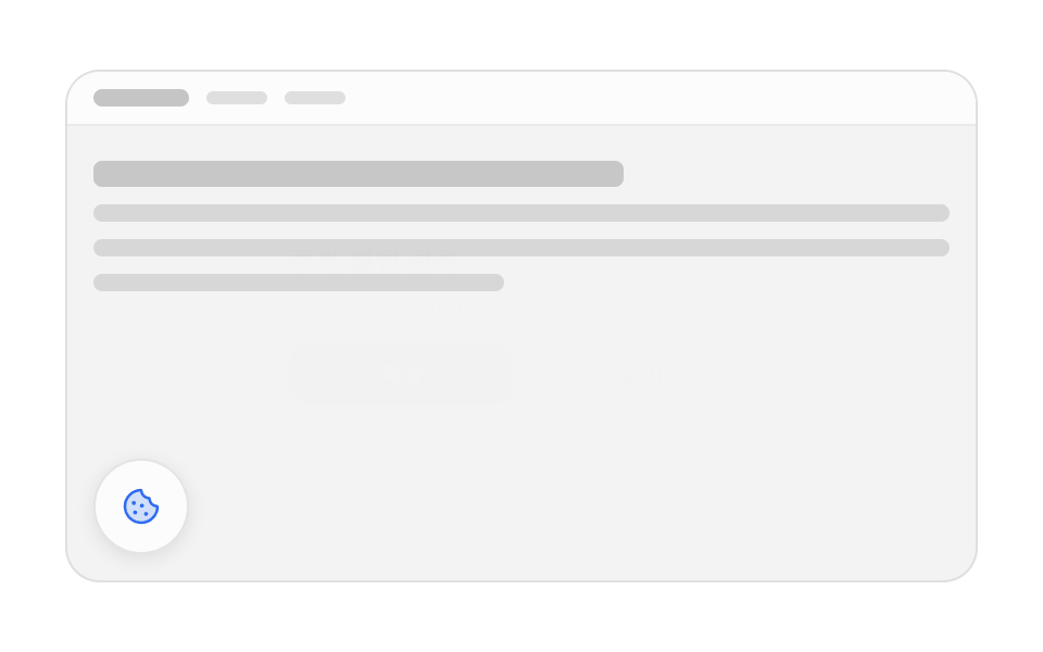
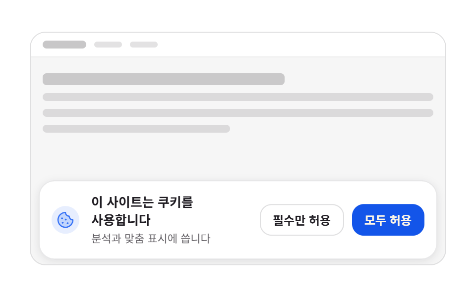
A small cookie button at the bottom left breathes once, and pressing it darkens the page behind while the manage modal scales from 0.92 to 1.
Best forA permanent button that reopens consent after it was dismissed, and cookie settings links in the footer
scale .92→1백드롭 opacityradius 16
<main class="stage">
  <div class="mo is-demo">
    <div class="mo__page" aria-hidden="true">
      <div class="mo__topbar">
        <span class="mo__brand"></span>
        <span class="mo__nav"></span>
        <span class="mo__nav"></span>
      </div>
      <div class="mo__lines">
        <span class="mo__line mo__line--head"></span>
        <span class="mo__line"></span>
        <span class="mo__line"></span>
        <span class="mo__line mo__line--short"></span>
      </div>
    </div>

    <button class="mo__reopen" type="button" aria-label="Open cookie settings"><svg viewBox="0 0 256 256" width="20" height="20"><g fill="currentColor"><path d="M224 128a96 96 0 1 1-96-96a48 48 0 0 0 48 48a48 48 0 0 0 48 48" opacity=".2"/><path d="M164.49 163.51a12 12 0 1 1-17 0a12 12 0 0 1 17 0m-81-8a12 12 0 1 0 17 0a12 12 0 0 0-16.98 0Zm9-39a12 12 0 1 0-17 0a12 12 0 0 0 17-.02Zm48-1a12 12 0 1 0 0 17a12 12 0 0 0 0-17M232 128A104 104 0 1 1 128 24a8 8 0 0 1 8 8a40 40 0 0 0 40 40a8 8 0 0 1 8 8a40 40 0 0 0 40 40a8 8 0 0 1 8 8m-16.31 7.39A56.13 56.13 0 0 1 168.5 87.5a56.13 56.13 0 0 1-47.89-47.19a88 88 0 1 0 95.08 95.08"/></g></svg></button>

    <div class="mo__backdrop"></div>

    <div class="mo__wrap">
      <div class="mo__modal" role="dialog" aria-modal="true" aria-label="Manage cookie settings">
        <button class="mo__x" type="button" data-a="close" aria-label="Close"><svg viewBox="0 0 256 256" width="14" height="14"><g fill="currentColor"><path d="M216 56v144a16 16 0 0 1-16 16H56a16 16 0 0 1-16-16V56a16 16 0 0 1 16-16h144a16 16 0 0 1 16 16" opacity=".2"/><path d="M205.66 194.34a8 8 0 0 1-11.32 11.32L128 139.31l-66.34 66.35a8 8 0 0 1-11.32-11.32L116.69 128L50.34 61.66a8 8 0 0 1 11.32-11.32L128 116.69l66.34-66.35a8 8 0 0 1 11.32 11.32L139.31 128Z"/></g></svg></button>
        <h2 class="mo__title">Manage cookie settings</h2>
        <p class="mo__desc">You can reopen this any time to change it.</p>
        <div class="mo__acts">
          <button class="mo__btn mo__btn--ok" type="button" data-a="save">Save</button>
          <button class="mo__btn" type="button" data-a="close">Close</button>
        </div>
      </div>
    </div>
  </div>
</main>@use "../../../../site/static/demo-tokens" as *;
$duration: $dur-base;
$easing: $ease-spring;
$color: $subject-blue;
@include stage($stage-paper);
// ── 무대: 움직이지 않는 가짜 페이지. 움직이는 건 모달과 재열기 버튼뿐이다 ──
.mo {
position: relative;
box-sizing: border-box;
width: min(100%, 420px);
height: clamp(156px, 52vw, 236px);
overflow: hidden;
border: 1px solid rgba(23, 20, 26, .10);
border-radius: $r-card;
background: rgba(23, 20, 26, .04);
color: $subject-ink;
font-family: -apple-system, "Segoe UI", "Noto Sans KR", sans-serif;
}
.mo__page { position: absolute; inset: 0; }
.mo__topbar {
display: flex;
align-items: center;
gap: $sp-2;
padding: $sp-2 $sp-3;
background: $stage-paper;
border-bottom: 1px solid rgba(23, 20, 26, .08);
}
.mo__brand { width: 44px; height: 8px; border-radius: $r-xs; background: rgba(23, 20, 26, .24); }
.mo__nav { width: 28px; height: 6px; border-radius: $r-xs; background: rgba(23, 20, 26, .12); }
.mo__nav:first-of-type { margin-left: auto; }
.mo__lines { display: grid; gap: $sp-2; padding: $sp-4 $sp-3; }
.mo__line { height: 8px; border-radius: $r-xs; background: rgba(23, 20, 26, .12); }
.mo__line--head { height: 12px; width: 62%; background: rgba(23, 20, 26, .20); }
.mo__line--short { width: 48%; }
// ── 왼쪽 아래 재열기 버튼 ──
.mo__reopen {
position: absolute;
left: $sp-3;
bottom: $sp-3;
z-index: 2;
display: inline-flex;
align-items: center;
justify-content: center;
width: 44px;
height: 44px;
margin: 0;
padding: 0;
border: 1px solid rgba(23, 20, 26, .10);
border-radius: $r-pill;
background: $stage-paper;
box-shadow: 0 2px 8px rgba(23, 20, 26, .10);
color: $color;
cursor: pointer;
transform: scale(1);
transition: transform $dur-quick $easing, background $dur-quick $ease-out;
}
.mo__reopen:hover, .mo__reopen:focus-visible { background: rgba(47, 109, 246, .08); }
// ── 백드롭 + 모달 ──
.mo__backdrop {
position: absolute;
inset: 0;
z-index: 3;
background: rgba(23, 20, 26, .44);
opacity: 0;
pointer-events: none;
transition: opacity $duration $ease-out;
}
.mo.is-open .mo__backdrop { opacity: 1; pointer-events: auto; }
.mo__wrap {
position: absolute;
inset: 0;
z-index: 4;
display: grid;
place-items: center;
padding: $sp-3;
pointer-events: none;
}
.mo__modal {
position: relative;
box-sizing: border-box;
width: min(100%, 264px);
display: grid;
gap: $sp-2;
padding: $sp-4;
border-radius: $r-card;
background: $stage-paper;
box-shadow: $shadow-raised;
opacity: 0;
transform: scale(.92);
pointer-events: none;
transition: transform $duration $easing, opacity $duration $ease-out;
}
.mo.is-open .mo__modal { opacity: 1; transform: scale(1); pointer-events: auto; }
.mo__x {
position: absolute;
top: $sp-2;
right: $sp-2;
display: inline-flex;
align-items: center;
justify-content: center;
width: 24px;
height: 24px;
margin: 0;
padding: 0;
border: 0;
border-radius: $r-pill;
background: none;
color: rgba(23, 20, 26, .40);
cursor: pointer;
transition: background $dur-quick $ease-out;
}
.mo__x:hover, .mo__x:focus-visible { background: rgba(23, 20, 26, .06); }
.mo__title {
margin: 0;
padding-right: $sp-6;
font-size: clamp(12px, 3.2vw, 14px);
font-weight: 700;
line-height: 1.25;
}
.mo__desc {
margin: 0;
color: rgba($stage-ink, .72);
font-size: clamp(9px, 2.6vw, 11px);
line-height: 1.4;
}
.mo__acts { display: flex; gap: $sp-2; }
.mo__btn {
flex: 1 1 auto;
border: 1px solid rgba(23, 20, 26, .14);
border-radius: $r-control;
background: $stage-paper;
color: $subject-ink;
font-family: inherit;
font-size: clamp(10px, 2.8vw, 12px);
font-weight: 700;
line-height: 1.2;
white-space: nowrap;
padding: $sp-2 $sp-3;
cursor: pointer;
transition: background $dur-quick $ease-out;
}
.mo__btn--ok { border-color: transparent; background: $subject-blue-deep; color: $subject-cream; }
.mo__btn:hover, .mo__btn:focus-visible { background: rgba(23, 20, 26, .06); }
.mo__btn--ok:hover, .mo__btn--ok:focus-visible { background: rgba(47, 109, 246, .84); }
// ── 자동 루프: 버튼이 한 번 숨쉬고 → 모달이 열리고 → 닫힌다. 0% 와 100% 가 같다 ──
.mo.is-demo .mo__reopen { animation: mo-pulse $dur-loop $easing infinite; }
.mo.is-demo .mo__backdrop { animation: mo-veil $dur-loop $ease-out infinite; }
.mo.is-demo .mo__modal { animation: mo-pop $dur-loop $easing infinite; }
@keyframes mo-pulse {
0% { transform: scale(1); }
7% { transform: scale(1.08); }
15%, 100% { transform: scale(1); }
}
@keyframes mo-veil {
0%, 22% { opacity: 0; }
32%, 72% { opacity: 1; }
85%, 100% { opacity: 0; }
}
@keyframes mo-pop {
0%, 22% { opacity: 0; transform: scale(.92); }
32%, 72% { opacity: 1; transform: scale(1); }
85%, 100% { opacity: 0; transform: scale(.92); }
}
@media (max-width: 340px) {
.mo__lines { padding: $sp-3; gap: $sp-1; }
.mo__reopen { left: $sp-2; bottom: $sp-2; width: 40px; height: 40px; }
.mo__wrap { padding: $sp-2; }
.mo__modal { padding: $sp-3; gap: $sp-1; }
.mo__title { padding-right: $sp-5; }
.mo__btn { padding: $sp-1 $sp-2; }
}
@media (prefers-reduced-motion: reduce) {
// 루프는 끄되 결과(열린 모달)는 남긴다
.mo.is-demo .mo__reopen,
.mo.is-demo .mo__backdrop,
.mo.is-demo .mo__modal { animation: none !important; }
.mo.is-demo .mo__backdrop { opacity: 1; }
.mo.is-demo .mo__modal { opacity: 1; transform: scale(1); }
.mo__reopen, .mo__backdrop, .mo__modal, .mo__btn, .mo__x { transition: none; }
}html, body {
margin: 0;
overflow: hidden;
}
.stage {
box-sizing: border-box;
min-height: 100vh;
display: grid;
place-items: center;
margin: 0;
background: #ffffff;
font-family: -apple-system, "Segoe UI", "Noto Sans KR", sans-serif;
padding: clamp(8px, 4vw, 24px);
}
.mo {
position: relative;
box-sizing: border-box;
width: min(100%, 420px);
height: clamp(156px, 52vw, 236px);
overflow: hidden;
border: 1px solid rgba(23, 20, 26, 0.1);
border-radius: 16px;
background: rgba(23, 20, 26, 0.04);
color: #17141a;
font-family: -apple-system, "Segoe UI", "Noto Sans KR", sans-serif;
}
.mo__page {
position: absolute;
inset: 0;
}
.mo__topbar {
display: flex;
align-items: center;
gap: 8px;
padding: 8px 12px;
background: #ffffff;
border-bottom: 1px solid rgba(23, 20, 26, 0.08);
}
.mo__brand {
width: 44px;
height: 8px;
border-radius: 4px;
background: rgba(23, 20, 26, 0.24);
}
.mo__nav {
width: 28px;
height: 6px;
border-radius: 4px;
background: rgba(23, 20, 26, 0.12);
}
.mo__nav:first-of-type {
margin-left: auto;
}
.mo__lines {
display: grid;
gap: 8px;
padding: 16px 12px;
}
.mo__line {
height: 8px;
border-radius: 4px;
background: rgba(23, 20, 26, 0.12);
}
.mo__line--head {
height: 12px;
width: 62%;
background: rgba(23, 20, 26, 0.2);
}
.mo__line--short {
width: 48%;
}
.mo__reopen {
position: absolute;
left: 12px;
bottom: 12px;
z-index: 2;
display: inline-flex;
align-items: center;
justify-content: center;
width: 44px;
height: 44px;
margin: 0;
padding: 0;
border: 1px solid rgba(23, 20, 26, 0.1);
border-radius: 999px;
background: #ffffff;
box-shadow: 0 2px 8px rgba(23, 20, 26, 0.1);
color: #2f6df6;
cursor: pointer;
transform: scale(1);
transition: transform 220ms cubic-bezier(0.2, 0.8, 0.2, 1), background 220ms ease-out;
}
.mo__reopen:hover, .mo__reopen:focus-visible {
background: rgba(47, 109, 246, 0.08);
}
.mo__backdrop {
position: absolute;
inset: 0;
z-index: 3;
background: rgba(23, 20, 26, 0.44);
opacity: 0;
pointer-events: none;
transition: opacity 300ms ease-out;
}
.mo.is-open .mo__backdrop {
opacity: 1;
pointer-events: auto;
}
.mo__wrap {
position: absolute;
inset: 0;
z-index: 4;
display: grid;
place-items: center;
padding: 12px;
pointer-events: none;
}
.mo__modal {
position: relative;
box-sizing: border-box;
width: min(100%, 264px);
display: grid;
gap: 8px;
padding: 16px;
border-radius: 16px;
background: #ffffff;
box-shadow: 0 14px 24px rgba(23, 20, 26, 0.32);
opacity: 0;
transform: scale(0.92);
pointer-events: none;
transition: transform 300ms cubic-bezier(0.2, 0.8, 0.2, 1), opacity 300ms ease-out;
}
.mo.is-open .mo__modal {
opacity: 1;
transform: scale(1);
pointer-events: auto;
}
.mo__x {
position: absolute;
top: 8px;
right: 8px;
display: inline-flex;
align-items: center;
justify-content: center;
width: 24px;
height: 24px;
margin: 0;
padding: 0;
border: 0;
border-radius: 999px;
background: none;
color: rgba(23, 20, 26, 0.4);
cursor: pointer;
transition: background 220ms ease-out;
}
.mo__x:hover, .mo__x:focus-visible {
background: rgba(23, 20, 26, 0.06);
}
.mo__title {
margin: 0;
padding-right: 24px;
font-size: clamp(12px, 3.2vw, 14px);
font-weight: 700;
line-height: 1.25;
}
.mo__desc {
margin: 0;
color: rgba(23, 20, 26, 0.72);
font-size: clamp(9px, 2.6vw, 11px);
line-height: 1.4;
}
.mo__acts {
display: flex;
gap: 8px;
}
.mo__btn {
flex: 1 1 auto;
border: 1px solid rgba(23, 20, 26, 0.14);
border-radius: 12px;
background: #ffffff;
color: #17141a;
font-family: inherit;
font-size: clamp(10px, 2.8vw, 12px);
font-weight: 700;
line-height: 1.2;
white-space: nowrap;
padding: 8px 12px;
cursor: pointer;
transition: background 220ms ease-out;
}
.mo__btn--ok {
border-color: transparent;
background: #0a4fe8;
color: #fff7e6;
}
.mo__btn:hover, .mo__btn:focus-visible {
background: rgba(23, 20, 26, 0.06);
}
.mo__btn--ok:hover, .mo__btn--ok:focus-visible {
background: rgba(47, 109, 246, 0.84);
}
.mo.is-demo .mo__reopen {
animation: mo-pulse 2s cubic-bezier(0.2, 0.8, 0.2, 1) infinite;
}
.mo.is-demo .mo__backdrop {
animation: mo-veil 2s ease-out infinite;
}
.mo.is-demo .mo__modal {
animation: mo-pop 2s cubic-bezier(0.2, 0.8, 0.2, 1) infinite;
}
@keyframes mo-pulse {
0% {
transform: scale(1);
}
7% {
transform: scale(1.08);
}
15%, 100% {
transform: scale(1);
}
}
@keyframes mo-veil {
0%, 22% {
opacity: 0;
}
32%, 72% {
opacity: 1;
}
85%, 100% {
opacity: 0;
}
}
@keyframes mo-pop {
0%, 22% {
opacity: 0;
transform: scale(0.92);
}
32%, 72% {
opacity: 1;
transform: scale(1);
}
85%, 100% {
opacity: 0;
transform: scale(0.92);
}
}
@media (max-width: 340px) {
.mo__lines {
padding: 12px;
gap: 4px;
}
.mo__reopen {
left: 8px;
bottom: 8px;
width: 40px;
height: 40px;
}
.mo__wrap {
padding: 8px;
}
.mo__modal {
padding: 12px;
gap: 4px;
}
.mo__title {
padding-right: 20px;
}
.mo__btn {
padding: 4px 8px;
}
}
@media (prefers-reduced-motion: reduce) {
.mo.is-demo .mo__reopen,
.mo.is-demo .mo__backdrop,
.mo.is-demo .mo__modal {
animation: none !important;
}
.mo.is-demo .mo__backdrop {
opacity: 1;
}
.mo.is-demo .mo__modal {
opacity: 1;
transform: scale(1);
}
.mo__reopen, .mo__backdrop, .mo__modal, .mo__btn, .mo__x {
transition: none;
}
}// 실제 동작: 재열기 버튼으로 모달을 열고, x·Close·백드롭·Esc 로 닫는다.
// 열 때는 모달 안 첫 버튼으로, 닫을 때는 재열기 버튼으로 포커스를 돌려준다.
var mo = document.querySelector('.mo');
var modal = mo.querySelector('.mo__modal');
var reopen = mo.querySelector('.mo__reopen');
var KEY = 'gd-consent-03';
function stop() { mo.classList.remove('is-demo'); }
function show() {
stop();
mo.classList.add('is-open');
var first = modal.querySelector('button');
if (first) first.focus({ preventScroll: true });
}
function hide() {
stop();
mo.classList.remove('is-open');
reopen.focus({ preventScroll: true });
}
function keep() {
try { localStorage.setItem(KEY, new Date().toISOString()); } catch (e) {}
hide();
}
reopen.addEventListener('click', show);
mo.querySelector('.mo__backdrop').addEventListener('click', hide);
var acts = mo.querySelectorAll('[data-a]');
for (var i = 0; i < acts.length; i++) {
acts[i].addEventListener('click', function (e) {
if (e.currentTarget.getAttribute('data-a') === 'save') { keep(); } else { hide(); }
});
}
document.addEventListener('keydown', function (e) {
if (e.key === 'Escape' && mo.classList.contains('is-open')) hide();
});import { useEffect, useRef, useState } from "react";
import type { CSSProperties } from "react";
import styles from "./ManageModalReopen.module.scss";
export type ManageModalReopenProps = {
duration?: number;
easing?: string;
color?: string;
};
type Vars = CSSProperties & {
"--duration"?: string;
"--easing"?: string;
"--color"?: string;
};
const KEY = "gd-consent-03";
export default function ManageModalReopen({
duration = 300,
easing = "cubic-bezier(.2,.8,.2,1)",
color = "#2f6df6",
}: ManageModalReopenProps) {
const [open, setOpen] = useState<boolean>(false);
const [live, setLive] = useState<boolean>(true);
const reopenRef = useRef<HTMLButtonElement>(null);
const firstRef = useRef<HTMLButtonElement>(null);
// 열 때는 모달 안 첫 버튼으로, 닫을 때는 재열기 버튼으로 포커스를 돌려준다
useEffect(() => {
const el = open ? firstRef.current : reopenRef.current;
if (el && !live) el.focus({ preventScroll: true });
}, [open, live]);
useEffect(() => {
function onKey(e: KeyboardEvent): void {
if (e.key === "Escape") setOpen(false);
}
document.addEventListener("keydown", onKey);
return () => document.removeEventListener("keydown", onKey);
}, []);
function show(): void {
setLive(false);
setOpen(true);
}
function hide(): void {
setLive(false);
setOpen(false);
}
function keep(): void {
try {
localStorage.setItem(KEY, new Date().toISOString());
} catch (e) {
/* 샌드박스에서 던진다 */
}
hide();
}
const vars: Vars = {
"--duration": `${duration}ms`,
"--easing": easing,
"--color": color,
};
return (
<div
className={`${styles.mo} ${live ? styles.isDemo : ""} ${open ? styles.isOpen : ""}`}
style={vars}
>
<div className={styles.page} aria-hidden="true">
<div className={styles.topbar}>
<span className={styles.brand} />
<span className={styles.nav} />
<span className={styles.nav} />
</div>
<div className={styles.lines}>
<span className={`${styles.line} ${styles.lineHead}`} />
<span className={styles.line} />
<span className={styles.line} />
<span className={`${styles.line} ${styles.lineShort}`} />
</div>
</div>
<button
ref={reopenRef}
className={styles.reopen}
type="button"
aria-label="Open cookie settings"
onClick={show}
>
<svg viewBox="0 0 256 256" width="20" height="20">
<g fill="currentColor">
<path
d="M224 128a96 96 0 1 1-96-96a48 48 0 0 0 48 48a48 48 0 0 0 48 48"
opacity=".2"
/>
<path d="M164.49 163.51a12 12 0 1 1-17 0a12 12 0 0 1 17 0m-81-8a12 12 0 1 0 17 0a12 12 0 0 0-16.98 0Zm9-39a12 12 0 1 0-17 0a12 12 0 0 0 17-.02Zm48-1a12 12 0 1 0 0 17a12 12 0 0 0 0-17M232 128A104 104 0 1 1 128 24a8 8 0 0 1 8 8a40 40 0 0 0 40 40a8 8 0 0 1 8 8a40 40 0 0 0 40 40a8 8 0 0 1 8 8m-16.31 7.39A56.13 56.13 0 0 1 168.5 87.5a56.13 56.13 0 0 1-47.89-47.19a88 88 0 1 0 95.08 95.08" />
</g>
</svg>
</button>
<div className={styles.backdrop} onClick={hide} />
<div className={styles.wrap}>
<div
className={styles.modal}
role="dialog"
aria-modal="true"
aria-label="Manage cookie settings"
>
<button
ref={firstRef}
className={styles.x}
type="button"
aria-label="Close"
onClick={hide}
>
<svg viewBox="0 0 256 256" width="14" height="14">
<g fill="currentColor">
<path
d="M216 56v144a16 16 0 0 1-16 16H56a16 16 0 0 1-16-16V56a16 16 0 0 1 16-16h144a16 16 0 0 1 16 16"
opacity=".2"
/>
<path d="M205.66 194.34a8 8 0 0 1-11.32 11.32L128 139.31l-66.34 66.35a8 8 0 0 1-11.32-11.32L116.69 128L50.34 61.66a8 8 0 0 1 11.32-11.32L128 116.69l66.34-66.35a8 8 0 0 1 11.32 11.32L139.31 128Z" />
</g>
</svg>
</button>
<h2 className={styles.title}>Manage cookie settings</h2>
<p className={styles.desc}>You can reopen this any time to change it.</p>
<div className={styles.acts}>
<button className={`${styles.btn} ${styles.btnOk}`} type="button" onClick={keep}>
Save
</button>
<button className={styles.btn} type="button" onClick={hide}>
Close
</button>
</div>
</div>
</div>
</div>
);
}03 Manage-consent modal reopen — Measured area 67.808% · moving frames 9/23Original by GODRICH · SCSS and React ship in the zip · Cookie Consent Banner UI — 9 Patterns to Paste In
The post this demo lives in
 Cookie Consent Banner UI — 9 Patterns to Paste InA cookie consent banner ui is the strip or card that tells visitors a site stores cookies and records their choice. Thes See all demos in this post