093D room scroll
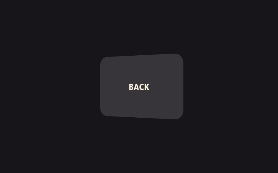
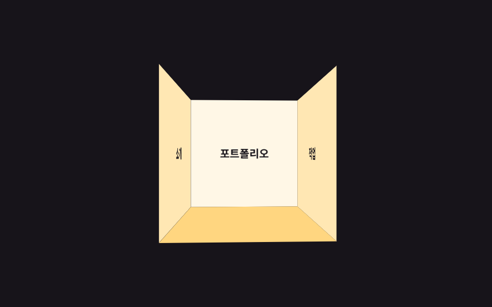
A room with no front wall — three walls plus a floor — rotates once every nine seconds under a short perspective, so the camera feels like it's standing inside looking around. Unlike the closed six-sided cube in item 01, this is an open structure viewed from the inside.
Best for3D portfolio navigation, interactive about sections
짧은 perspectivetransform-style: preserve-3dbackface-visibility
<main class="stage">
  <div class="room-scene">
    <div class="room is-demo">
      <div class="room__wall room__wall--back">Portfolio</div>
      <div class="room__wall room__wall--left">About</div>
      <div class="room__wall room__wall--right">Work</div>
      <div class="room__floor" aria-hidden="true"></div>
    </div>
  </div>
</main>
@use "../../../../site/static/demo-tokens" as *;
// ── 변수 3개 ──────────────────────────────
$duration: 9s; // 방을 한 바퀴 둘러보는 시간 — 큐브(01)보다 느리게 돈다
$easing: linear;
$color: $subject-cream; // 벽 색
@include stage($stage-ink);
$half: 65px;
// perspective 를 짧게 잡아 카메라가 방 '안'에 들어와 있는 것처럼 벽이 시야 가득 보이게 한다
.room-scene { perspective: 260px; }
.room {
position: relative;
width: $half * 2;
height: $half * 2;
transform-style: preserve-3d;
animation: look-around $duration $easing infinite;
}
.room__wall {
position: absolute;
inset: 0;
display: grid;
place-items: center;
color: $subject-ink;
font-weight: 700;
font-size: 13px;
line-height: 1.3;
font-family: inherit;
background: $color;
backface-visibility: hidden; // 등진 벽이 뒤집혀 비치지 않게
}
// 정면 벽 하나를 없애 '문 없는 방' 구조로 만든다 — 큐브(01)처럼 닫힌 6면이 아니라 세 벽 + 바닥
.room__wall--back { transform: translateZ(-$half); }
.room__wall--left { transform: rotateY(90deg) translateZ(-$half); background: darken($color, 10%); }
.room__wall--right { transform: rotateY(-90deg) translateZ(-$half); background: darken($color, 10%); }
.room__floor {
position: absolute;
inset: 0;
background: darken($color, 20%);
transform: rotateX(90deg) translateZ(-$half);
}
@keyframes look-around {
from { transform: rotateY(-35deg); }
to { transform: rotateY(325deg); }
}
// ── 접근성: 움직임 줄이기 설정이면 정면을 바라본 채로 고정 ────────────
@media (prefers-reduced-motion: reduce) {
.room { animation: none; transform: rotateY(-15deg); }
}html, body {
margin: 0;
overflow: hidden;
}
.stage {
box-sizing: border-box;
min-height: 100vh;
display: grid;
place-items: center;
margin: 0;
background: #17141a;
font-family: -apple-system, "Segoe UI", "Noto Sans KR", sans-serif;
padding: clamp(8px, 4vw, 24px);
}
.room-scene {
perspective: 260px;
}
.room {
position: relative;
width: 130px;
height: 130px;
transform-style: preserve-3d;
animation: look-around 9s linear infinite;
}
.room__wall {
position: absolute;
inset: 0;
display: grid;
place-items: center;
color: #17141a;
font-weight: 700;
font-size: 13px;
line-height: 1.3;
font-family: inherit;
background: #fff7e6;
backface-visibility: hidden;
}
.room__wall--back {
transform: translateZ(-65px);
}
.room__wall--left {
transform: rotateY(90deg) translateZ(-65px);
background: rgb(100%, 90.462745098%, 70.1960784314%);
}
.room__wall--right {
transform: rotateY(-90deg) translateZ(-65px);
background: rgb(100%, 90.462745098%, 70.1960784314%);
}
.room__floor {
position: absolute;
inset: 0;
background: rgb(100%, 84.062745098%, 50.1960784314%);
transform: rotateX(90deg) translateZ(-65px);
}
@keyframes look-around {
from {
transform: rotateY(-35deg);
}
to {
transform: rotateY(325deg);
}
}
@media (prefers-reduced-motion: reduce) {
.room {
animation: none;
transform: rotateY(-15deg);
}
}import type { CSSProperties } from "react";
import styles from "./RoomScroll.module.scss";
export type RoomScrollProps = {
/** 방을 한 바퀴 둘러보는 시간 (기본 9000ms) — 큐브 회전보다 느리게 */
duration?: number;
easing?: string;
/** 벽 색 */
color?: string;
walls?: [string, string, string];
};
type Vars = CSSProperties & { "--duration"?: string; "--easing"?: string; "--color"?: string };
export default function RoomScroll({
duration = 9000,
easing = "linear",
color = "#fff7e6",
walls = ["포트폴리오", "소개", "작업"],
}: RoomScrollProps) {
const vars: Vars = { "--duration": `${duration}ms`, "--easing": easing, "--color": color };
return (
<div className={styles.scene}>
<div className={styles.room} style={vars}>
<div className={`${styles.wall} ${styles.back}`}>{walls[0]}</div>
<div className={`${styles.wall} ${styles.left}`}>{walls[1]}</div>
<div className={`${styles.wall} ${styles.right}`}>{walls[2]}</div>
<div className={styles.floor} aria-hidden="true" />
</div>
</div>
);
}09 3D room scroll — Measured area 18.625% · moving frames 23/23Original by GODRICH · SCSS and React ship in the zip · 9 CSS 3D Cube Effects — One Line, Copy-Paste
The post this demo lives in
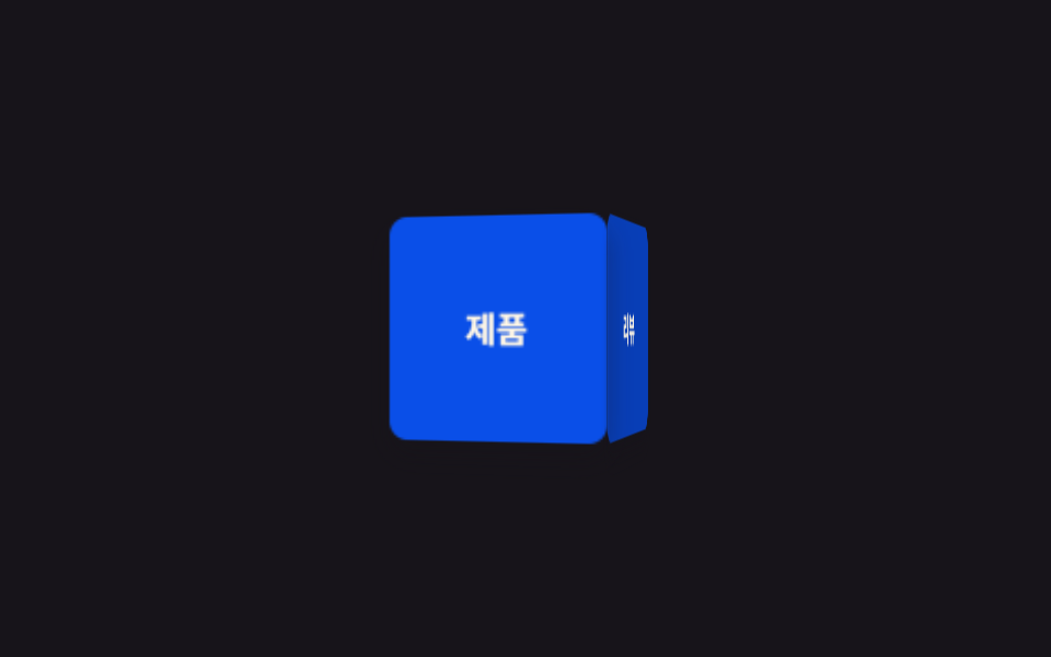 9 CSS 3D Cube Effects — One Line, Copy-PasteA css 3d cube spins its four labeled faces inside a perspective wrapper — one of nine such effects below, each one line, See all demos in this post