05Blob morph
Two or three differently shaped blobs are stacked and cross-faded using only opacity and transform (scale, rotate), so the mass appears to keep changing shape without ever recalculating border-radius per frame.
Best forAbout-page decorative backgrounds, empty-state illustration backgrounds
레이어 크로스페이드transform: scale·rotateopacity
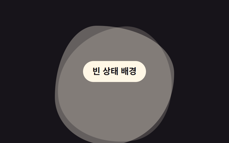
<main class="stage">
  <span class="blob m1" aria-hidden="true"></span>
  <span class="blob m2" aria-hidden="true"></span>
  <span class="blob m3" aria-hidden="true"></span>
  <p class="hint">Empty state</p>
</main>
@use "../../../../site/static/demo-tokens" as *;
// ── 변수 3개 ──────────────────────────────────────────
$duration: $dur-loop; // 세 블롭이 한 바퀴 교차하는 시간
$easing: $ease-spring;
$color: $subject-cream; // 블롭 색
// ── 데모 무대 ──────────────────────────────────────────
@include stage($stage-ink);
.stage {
position: relative;
overflow: hidden;
}
// border-radius 는 세 블롭마다 고정값. opacity·transform 만 움직여 border-radius 를 매 프레임 다시 계산하지 않는다
.blob {
position: absolute;
width: 52%;
aspect-ratio: 1;
left: 24%;
top: 18%;
background: $color;
}
.m1 { border-radius: 42% 58% 63% 37% / 41% 44% 56% 59%; animation: morph1 $duration $easing infinite; }
.m2 { border-radius: 63% 37% 41% 59% / 55% 48% 52% 45%; opacity: 0; animation: morph2 $duration $easing infinite; }
.m3 { border-radius: 35% 65% 55% 45% / 60% 40% 60% 40%; opacity: 0; animation: morph3 $duration $easing infinite; }
@keyframes morph1 {
0% { opacity: 1; transform: scale(1) rotate(0deg); }
28% { opacity: 1; transform: scale(1.05) rotate(4deg); }
38% { opacity: 0; transform: scale(.94) rotate(8deg); }
92% { opacity: 0; }
100% { opacity: 1; transform: scale(1) rotate(0deg); }
}
@keyframes morph2 {
0%, 30% { opacity: 0; }
40% { opacity: 1; transform: scale(1) rotate(0deg); }
68% { opacity: 1; transform: scale(1.05) rotate(-4deg); }
78% { opacity: 0; transform: scale(.94) rotate(-8deg); }
100% { opacity: 0; }
}
@keyframes morph3 {
0%, 70% { opacity: 0; }
80% { opacity: 1; transform: scale(1) rotate(0deg); }
96% { opacity: 1; transform: scale(1.05) rotate(4deg); }
100% { opacity: 0; }
}
.hint {
position: relative;
margin: 0;
padding: 10px 20px;
border-radius: $r-pill;
background: $subject-cream;
color: $subject-ink;
font: 700 clamp(14px, 4vw, 18px)/1.3 -apple-system, "Segoe UI", "Noto Sans KR", sans-serif;
}
@media (prefers-reduced-motion: reduce) {
.blob { animation: none; }
.m1 { opacity: 1; }
.m2, .m3 { opacity: 0; }
}html, body {
margin: 0;
overflow: hidden;
}
.stage {
box-sizing: border-box;
min-height: 100vh;
display: grid;
place-items: center;
margin: 0;
background: #17141a;
font-family: -apple-system, "Segoe UI", "Noto Sans KR", sans-serif;
padding: clamp(8px, 4vw, 24px);
}
.stage {
position: relative;
overflow: hidden;
}
.blob {
position: absolute;
width: 52%;
aspect-ratio: 1;
left: 24%;
top: 18%;
background: #fff7e6;
}
.m1 {
border-radius: 42% 58% 63% 37%/41% 44% 56% 59%;
animation: morph1 2s cubic-bezier(0.2, 0.8, 0.2, 1) infinite;
}
.m2 {
border-radius: 63% 37% 41% 59%/55% 48% 52% 45%;
opacity: 0;
animation: morph2 2s cubic-bezier(0.2, 0.8, 0.2, 1) infinite;
}
.m3 {
border-radius: 35% 65% 55% 45%/60% 40% 60% 40%;
opacity: 0;
animation: morph3 2s cubic-bezier(0.2, 0.8, 0.2, 1) infinite;
}
@keyframes morph1 {
0% {
opacity: 1;
transform: scale(1) rotate(0deg);
}
28% {
opacity: 1;
transform: scale(1.05) rotate(4deg);
}
38% {
opacity: 0;
transform: scale(0.94) rotate(8deg);
}
92% {
opacity: 0;
}
100% {
opacity: 1;
transform: scale(1) rotate(0deg);
}
}
@keyframes morph2 {
0%, 30% {
opacity: 0;
}
40% {
opacity: 1;
transform: scale(1) rotate(0deg);
}
68% {
opacity: 1;
transform: scale(1.05) rotate(-4deg);
}
78% {
opacity: 0;
transform: scale(0.94) rotate(-8deg);
}
100% {
opacity: 0;
}
}
@keyframes morph3 {
0%, 70% {
opacity: 0;
}
80% {
opacity: 1;
transform: scale(1) rotate(0deg);
}
96% {
opacity: 1;
transform: scale(1.05) rotate(4deg);
}
100% {
opacity: 0;
}
}
.hint {
position: relative;
margin: 0;
padding: 10px 20px;
border-radius: 999px;
background: #fff7e6;
color: #17141a;
font: 700 clamp(14px, 4vw, 18px)/1.3 -apple-system, "Segoe UI", "Noto Sans KR", sans-serif;
}
@media (prefers-reduced-motion: reduce) {
.blob {
animation: none;
}
.m1 {
opacity: 1;
}
.m2, .m3 {
opacity: 0;
}
}import type { CSSProperties, ReactNode } from "react";
import styles from "./BlobMorphBg.module.scss";
export type BlobMorphBgProps = {
children?: ReactNode;
/** 세 블롭이 한 바퀴 교차하는 시간 (기본 2000ms) */
duration?: number;
easing?: string;
/** 블롭 색 */
color?: string;
className?: string;
};
type Vars = CSSProperties & { "--duration"?: string; "--easing"?: string; "--color"?: string };
export default function BlobMorphBg({
children,
duration = 2000,
easing = "cubic-bezier(.2,.8,.2,1)",
color = "#fff7e6",
className = "",
}: BlobMorphBgProps) {
const vars: Vars = { "--duration": `${duration}ms`, "--easing": easing, "--color": color };
return (
<div className={`${styles.stage} ${className}`} style={vars}>
<span className={`${styles.blob} ${styles.m1}`} aria-hidden="true" />
<span className={`${styles.blob} ${styles.m2}`} aria-hidden="true" />
<span className={`${styles.blob} ${styles.m3}`} aria-hidden="true" />
{children}
</div>
);
}05 Blob morph — Measured area 36.54% · moving frames 22/23Original by GODRICH · SCSS and React ship in the zip · 9 CSS Background Animation — One Line, Copy-Paste
The post this demo lives in
 9 CSS Background Animation — One Line, Copy-PasteA css background animation is a decorative layer — a shifting gradient, a drifting grid, blurred shapes — that loops beh See all demos in this post