07Trending flame badge
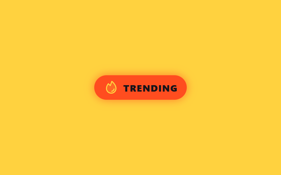
A flame-shaped SVG gets filter: hue-rotate and brightness nudged unevenly frame to frame, while a layered box-shadow behind it wobbles in sync, so the flicker never looks metronomic like real fire.
Best forTrending-product or trending-post markers, highlighting a top-ranked item in a list
filter: hue-rotate·brightness다중 box-shadow 플리커@keyframes
<main class="stage is-demo">
  <span class="badge" aria-label="trending">
    <svg class="flame" viewBox="0 0 256 256" width="26" height="26" aria-hidden="true">
      <g fill="currentColor"><path d="M208 144a80 80 0 0 1-160 0c0-30.57 14.42-58.26 31-80l33 32l26.27-72C159.86 41.92 208 88.15 208 144" opacity=".2"/><path d="M183.89 153.34a57.6 57.6 0 0 1-46.56 46.55a9 9 0 0 1-1.33.11a8 8 0 0 1-1.32-15.89c16.57-2.79 30.63-16.85 33.44-33.45a8 8 0 0 1 15.78 2.68ZM216 144a88 88 0 0 1-176 0c0-27.92 11-56.47 32.66-84.85a8 8 0 0 1 11.93-.89l24.12 23.41l22-60.41a8 8 0 0 1 12.63-3.41C165.21 36 216 84.55 216 144m-16 0c0-46.09-35.79-85.92-58.21-106.33l-22.27 61.07a8 8 0 0 1-13.09 3L80.06 76.16C64.09 99.21 56 122 56 144a72 72 0 0 0 144 0"/></g>
    </svg>
    TRENDING
  </span>
</main>
@use "../../../../site/static/demo-tokens" as *;
// ── 변수 3개 ──────────────────────────────────────────
$duration: 900ms; // 불꽃 한 번 일렁임 — 깜빡임은 빨라야 산다
$easing: $ease-out;
$color: $stage-orange;
@include stage($stage-yellow);
.badge {
display: inline-flex; align-items: center; gap: $sp-2;
padding: $sp-2 $sp-4;
border-radius: $r-pill;
background: $stage-orange;
color: $subject-ink;
font-family: -apple-system, "Segoe UI", "Noto Sans KR", sans-serif;
font-weight: 800;
font-size: 16px;
letter-spacing: .06em;
box-shadow: 0 0 $sp-2 rgba($color, .5);
}
.flame {
color: $stage-yellow; // Phosphor duotone: g fill="currentColor" 가 이 값을 물려받는다
filter: brightness(1) hue-rotate(0deg);
}
.stage.is-demo .flame {
animation: flicker $duration $easing infinite alternate;
}
.stage.is-demo .badge {
animation: glow-pulse #{$duration * 2} $easing infinite;
}
// 프레임마다 어긋나는 정지 구간 — 규칙적인 깜빡임이 아니라 진짜 불처럼
@keyframes flicker {
0% { filter: brightness(1) hue-rotate(0deg); transform: scale(1) skewX(0deg); }
18% { filter: brightness(1.25) hue-rotate(-6deg); transform: scale(1.05) skewX(-2deg); }
40% { filter: brightness(.92) hue-rotate(4deg); transform: scale(.97) skewX(1deg); }
63% { filter: brightness(1.15) hue-rotate(-3deg); transform: scale(1.03) skewX(-1deg); }
81% { filter: brightness(.97) hue-rotate(2deg); transform: scale(1) skewX(1deg); }
100% { filter: brightness(1.2) hue-rotate(-5deg); transform: scale(1.04) skewX(-2deg); }
}
@keyframes glow-pulse {
0%, 100% { box-shadow: 0 0 $sp-2 rgba($color, .5); }
50% { box-shadow: 0 0 $sp-6 rgba($color, .85), 0 0 $sp-2 rgba($stage-yellow, .5); }
}
@media (prefers-reduced-motion: reduce) {
.stage.is-demo .flame { animation: none; }
.stage.is-demo .badge { animation: none; }
}html, body {
margin: 0;
overflow: hidden;
}
.stage {
box-sizing: border-box;
min-height: 100vh;
display: grid;
place-items: center;
margin: 0;
background: #ffd23f;
font-family: -apple-system, "Segoe UI", "Noto Sans KR", sans-serif;
padding: clamp(8px, 4vw, 24px);
}
.badge {
display: inline-flex;
align-items: center;
gap: 8px;
padding: 8px 16px;
border-radius: 999px;
background: #ff4d1f;
color: #17141a;
font-family: -apple-system, "Segoe UI", "Noto Sans KR", sans-serif;
font-weight: 800;
font-size: 16px;
letter-spacing: 0.06em;
box-shadow: 0 0 8px rgba(255, 77, 31, 0.5);
}
.flame {
color: #ffd23f;
filter: brightness(1) hue-rotate(0deg);
}
.stage.is-demo .flame {
animation: flicker 900ms ease-out infinite alternate;
}
.stage.is-demo .badge {
animation: glow-pulse 1800ms ease-out infinite;
}
@keyframes flicker {
0% {
filter: brightness(1) hue-rotate(0deg);
transform: scale(1) skewX(0deg);
}
18% {
filter: brightness(1.25) hue-rotate(-6deg);
transform: scale(1.05) skewX(-2deg);
}
40% {
filter: brightness(0.92) hue-rotate(4deg);
transform: scale(0.97) skewX(1deg);
}
63% {
filter: brightness(1.15) hue-rotate(-3deg);
transform: scale(1.03) skewX(-1deg);
}
81% {
filter: brightness(0.97) hue-rotate(2deg);
transform: scale(1) skewX(1deg);
}
100% {
filter: brightness(1.2) hue-rotate(-5deg);
transform: scale(1.04) skewX(-2deg);
}
}
@keyframes glow-pulse {
0%, 100% {
box-shadow: 0 0 8px rgba(255, 77, 31, 0.5);
}
50% {
box-shadow: 0 0 24px rgba(255, 77, 31, 0.85), 0 0 8px rgba(255, 210, 63, 0.5);
}
}
@media (prefers-reduced-motion: reduce) {
.stage.is-demo .flame {
animation: none;
}
.stage.is-demo .badge {
animation: none;
}
}import type { CSSProperties } from "react";
import styles from "./BadgeTrendingFlame.module.scss";
export type BadgeTrendingFlameProps = {
duration?: number;
easing?: string;
color?: string;
label?: string;
};
export default function BadgeTrendingFlame({
duration = 900,
easing = "ease-out",
color = "#ff4d1f",
label = "TRENDING",
}: BadgeTrendingFlameProps) {
const vars: CSSProperties = { "--duration": `${duration}ms`, "--easing": easing, "--color": color } as CSSProperties;
return (
<span className={styles.badge} style={vars} aria-label="trending">
<svg className={styles.flame} viewBox="0 0 256 256" width={26} height={26} aria-hidden="true">
<g fill="currentColor"><path d="M208 144a80 80 0 0 1-160 0c0-30.57 14.42-58.26 31-80l33 32l26.27-72C159.86 41.92 208 88.15 208 144" opacity=".2" /><path d="M183.89 153.34a57.6 57.6 0 0 1-46.56 46.55a9 9 0 0 1-1.33.11a8 8 0 0 1-1.32-15.89c16.57-2.79 30.63-16.85 33.44-33.45a8 8 0 0 1 15.78 2.68ZM216 144a88 88 0 0 1-176 0c0-27.92 11-56.47 32.66-84.85a8 8 0 0 1 11.93-.89l24.12 23.41l22-60.41a8 8 0 0 1 12.63-3.41C165.21 36 216 84.55 216 144m-16 0c0-46.09-35.79-85.92-58.21-106.33l-22.27 61.07a8 8 0 0 1-13.09 3L80.06 76.16C64.09 99.21 56 122 56 144a72 72 0 0 0 144 0" /></g>
</svg>
{label}
</span>
);
}07 Trending flame badge — Measured area 3.995% · moving frames 22/23Original by GODRICH · SCSS and React ship in the zip · 9 CSS Badge Design Ideas — New, Sale, Verified
The post this demo lives in
 9 CSS Badge Design Ideas — New, Sale, VerifiedA badge is the small label on a thumbnail or name that shows status at a glance — new, sale, verified, sold out. Good CS See all demos in this post