05Gradient reveal tile
A photo-only tile reveals a layered gradient via opacity on hover while its title text slides up slightly with translateY.
Best forMagazine-style tiles with titles over images, category cover cards
opacitytranslateY350ms
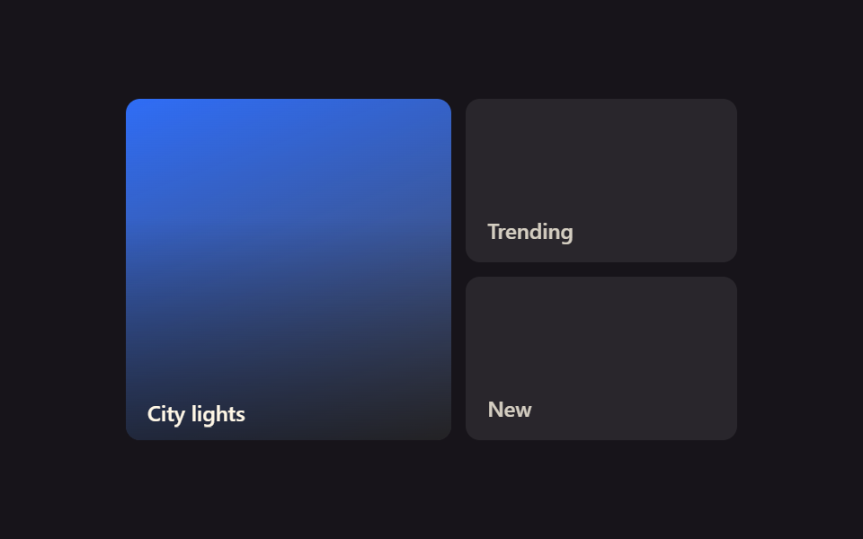
<main class="stage">
  <div class="gr-grid is-demo">
    <div class="gr-tile gr-tile--a gr-focal">
      <span class="gr-tile__scrim"></span>
      <span class="gr-tile__label">City lights</span>
    </div>
    <div class="gr-tile gr-tile--b">
      <span class="gr-tile__tag">Trending</span>
    </div>
    <div class="gr-tile gr-tile--c">
      <span class="gr-tile__tag">New</span>
    </div>
  </div>
</main>
@use "../../../../site/static/demo-tokens" as *;
// ── 변수 3개 ──────────────────────────────────────────
$duration: 350ms;
$easing: $ease-out;
$color: $subject-blue;
@include stage($stage-ink);
.gr-grid {
width: min(340px, 90vw);
aspect-ratio: 340 / 190;
display: grid;
grid-template-columns: 1.2fr 1fr;
grid-template-rows: 1fr 1fr;
gap: $sp-2;
}
.gr-tile {
border-radius: $r-sm;
display: flex;
flex-direction: column;
justify-content: flex-end;
padding: $sp-3;
box-sizing: border-box;
color: $subject-cream;
font: 600 12px/1 -apple-system, "Segoe UI", sans-serif;
position: relative;
overflow: hidden;
}
.gr-tile--a { grid-row: 1 / 3; background: linear-gradient(160deg, $color, rgba(255, 255, 255, .2)); }
.gr-tile--b, .gr-tile--c { background: rgba(255, 255, 255, .08); }
.gr-tile__tag { opacity: .8; }
// 평소엔 사진만: 스크림은 opacity 0, 제목은 아래로 8px 밀려 있다
.gr-tile__scrim {
position: absolute;
inset: 0;
background: linear-gradient(to top, rgba(0, 0, 0, .75), transparent 65%);
opacity: 0;
transition: opacity $duration $easing;
}
.gr-tile__label {
position: relative;
z-index: 1;
transform: translateY($sp-2);
transition: transform $duration $easing;
}
// 실사용: 진짜 마우스 호버
.gr-focal:hover .gr-tile__scrim { opacity: 1; }
.gr-focal:hover .gr-tile__label { transform: translateY(0); }
// 데모 루프: is-demo 는 같은 등장을 keyframes 로 무한 재생 (캡처용)
@keyframes gr-scrim-in { 0%, 100% { opacity: 0; } 50% { opacity: 1; } }
@keyframes gr-label-up { 0%, 100% { transform: translateY($sp-2); } 50% { transform: translateY(0); } }
.gr-grid.is-demo .gr-focal .gr-tile__scrim { animation: gr-scrim-in $duration $easing infinite; }
.gr-grid.is-demo .gr-focal .gr-tile__label { animation: gr-label-up $duration $easing infinite; }
@media (prefers-reduced-motion: reduce) {
.gr-focal:hover .gr-tile__scrim, .gr-focal:hover .gr-tile__label,
.gr-grid.is-demo .gr-focal .gr-tile__scrim, .gr-grid.is-demo .gr-focal .gr-tile__label {
animation: none !important; transition: none !important;
}
}html, body {
margin: 0;
overflow: hidden;
}
.stage {
box-sizing: border-box;
min-height: 100vh;
display: grid;
place-items: center;
margin: 0;
background: #17141a;
font-family: -apple-system, "Segoe UI", "Noto Sans KR", sans-serif;
padding: clamp(8px, 4vw, 24px);
}
.gr-grid {
width: min(340px, 90vw);
aspect-ratio: 340/190;
display: grid;
grid-template-columns: 1.2fr 1fr;
grid-template-rows: 1fr 1fr;
gap: 8px;
}
.gr-tile {
border-radius: 8px;
display: flex;
flex-direction: column;
justify-content: flex-end;
padding: 12px;
box-sizing: border-box;
color: #fff7e6;
font: 600 12px/1 -apple-system, "Segoe UI", sans-serif;
position: relative;
overflow: hidden;
}
.gr-tile--a {
grid-row: 1/3;
background: linear-gradient(160deg, #2f6df6, rgba(255, 255, 255, 0.2));
}
.gr-tile--b, .gr-tile--c {
background: rgba(255, 255, 255, 0.08);
}
.gr-tile__tag {
opacity: 0.8;
}
.gr-tile__scrim {
position: absolute;
inset: 0;
background: linear-gradient(to top, rgba(0, 0, 0, 0.75), transparent 65%);
opacity: 0;
transition: opacity 350ms ease-out;
}
.gr-tile__label {
position: relative;
z-index: 1;
transform: translateY(8px);
transition: transform 350ms ease-out;
}
.gr-focal:hover .gr-tile__scrim {
opacity: 1;
}
.gr-focal:hover .gr-tile__label {
transform: translateY(0);
}
@keyframes gr-scrim-in {
0%, 100% {
opacity: 0;
}
50% {
opacity: 1;
}
}
@keyframes gr-label-up {
0%, 100% {
transform: translateY(8px);
}
50% {
transform: translateY(0);
}
}
.gr-grid.is-demo .gr-focal .gr-tile__scrim {
animation: gr-scrim-in 350ms ease-out infinite;
}
.gr-grid.is-demo .gr-focal .gr-tile__label {
animation: gr-label-up 350ms ease-out infinite;
}
@media (prefers-reduced-motion: reduce) {
.gr-focal:hover .gr-tile__scrim, .gr-focal:hover .gr-tile__label,
.gr-grid.is-demo .gr-focal .gr-tile__scrim, .gr-grid.is-demo .gr-focal .gr-tile__label {
animation: none !important;
transition: none !important;
}
}import { CSSProperties } from "react";
import styles from "./GradientRevealTile.module.scss";
type Vars = CSSProperties & {
"--duration"?: string;
"--easing"?: string;
"--color"?: string;
};
export interface GradientRevealTileProps {
duration?: string;
easing?: string;
color?: string;
}
export default function GradientRevealTile({
duration = "350ms",
easing = "ease-out",
color = "#2f6df6",
}: GradientRevealTileProps) {
const style: Vars = {
"--duration": duration,
"--easing": easing,
"--color": color,
};
return (
<div className={styles.grid} style={style}>
<div className={`${styles.tile} ${styles.tileA} ${styles.focal}`}>
<span className={styles.scrim} />
<span className={styles.label}>City lights</span>
</div>
<div className={`${styles.tile} ${styles.tileB}`}>
<span className={styles.tag}>Trending</span>
</div>
<div className={`${styles.tile} ${styles.tileC}`}>
<span className={styles.tag}>New</span>
</div>
</div>
);
}05 Gradient reveal tile — Measured area 13.982% · moving frames 23/23Original by GODRICH · SCSS and React ship in the zip · 9 CSS Bento Grid Hover Animations to Copy-Paste
The post this demo lives in
 9 CSS Bento Grid Hover Animations to Copy-PasteA bento grid is a layout built from big and small boxes fitted together like a photo collage, the shape you see on portf See all demos in this post