05List row tap highlight
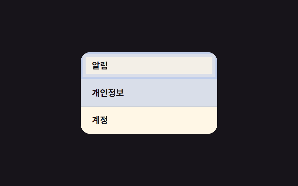
With -webkit-tap-highlight-color turned transparent, tapping a list row flashes a custom background color that fades out after 0.2s, confirming which row was pressed.
Best forSettings menus, chat room lists — any row-by-row tappable list
-webkit-tap-highlight-color:active0.2초
<main class="stage">
  <ul class="list">
    <li class="is-demo" tabindex="0">Notifications</li>
    <li class="is-demo" tabindex="0">Privacy</li>
    <li class="is-demo" tabindex="0">Account</li>
  </ul>
</main>
@use "../../../../site/static/demo-tokens" as *;
$duration: $dur-quick; // 하이라이트가 사라지는 시간
$easing: $ease-out;
$color: $subject-blue; // 하이라이트 색
@include stage($stage-ink);
.list {
width: min(220px, 70vw);
background: $subject-cream;
border-radius: $r-card;
overflow: hidden;
list-style: none;
margin: 0;
padding: 0;
}
.list li {
position: relative;
min-height: 44px; // 터치 목표 44px (WCAG 2.5.8 / Apple HIG)
box-sizing: border-box;
display: flex;
align-items: center;
padding: 14px 18px;
font-weight: 600; font-size: 14px; line-height: 1; font-family: inherit;
color: $stage-ink;
background: $subject-cream;
border-bottom: 1px solid rgba($stage-ink, .08);
-webkit-tap-highlight-color: transparent;
cursor: pointer;
transition: background $duration $easing;
overflow: hidden;
// 규칙8 한 겹: 배경 플래시와 함께 행 안쪽 가장자리로 두 겹 링이 불규칙하게 번지다 감쇠
&::after {
content: "";
position: absolute;
inset: 0;
border-radius: inherit;
box-shadow: inset 0 0 0 0 rgba($color, .4), inset 0 0 0 0 rgba($color, .22);
opacity: 0;
pointer-events: none;
}
}
.list li:last-child { border-bottom: 0; }
.list li:active {
background: rgba($color, .18);
transition: background 0s; // 눌리는 순간은 지연 없이 즉시
}
.list li:active::after {
animation: ripple-wave $dur-enter $easing;
}
.list li.is-demo { animation: row-flash $dur-loop $easing infinite; }
.list li.is-demo::after { animation: ripple-loop $dur-loop $easing infinite; }
.list li:nth-child(2).is-demo,
.list li:nth-child(2).is-demo::after { animation-delay: .4s; }
.list li:nth-child(3).is-demo,
.list li:nth-child(3).is-demo::after { animation-delay: .8s; }
@keyframes row-flash {
0%, 8% { background: rgba($color, .18); }
35% { background: $subject-cream; }
100% { background: $subject-cream; }
}
@keyframes ripple-wave {
0% { box-shadow: inset 0 0 0 0 rgba($color, .4), inset 0 0 0 0 rgba($color, .22); opacity: 1; }
38% { box-shadow: inset 0 0 0 8px rgba($color, .18), inset 0 0 0 3px rgba($color, .22); opacity: .7; }
66% { box-shadow: inset 0 0 0 14px rgba($color, .08), inset 0 0 0 9px rgba($color, .12); opacity: .3; }
100% { box-shadow: inset 0 0 0 20px rgba($color, 0), inset 0 0 0 16px rgba($color, 0); opacity: 0; }
}
@keyframes ripple-loop {
0%, 8% { box-shadow: inset 0 0 0 0 rgba($color, .4), inset 0 0 0 0 rgba($color, .22); opacity: 1; }
22% { box-shadow: inset 0 0 0 8px rgba($color, .18), inset 0 0 0 3px rgba($color, .22); opacity: .7; }
35% { box-shadow: inset 0 0 0 14px rgba($color, .08), inset 0 0 0 9px rgba($color, .12); opacity: .3; }
50%, 100% { box-shadow: inset 0 0 0 20px rgba($color, 0), inset 0 0 0 16px rgba($color, 0); opacity: 0; }
}
@media (prefers-reduced-motion: reduce) {
.list li { transition: none; }
.list li::after { animation: none !important; opacity: 0; }
.list li.is-demo { animation: none; }
}html, body {
margin: 0;
overflow: hidden;
}
.stage {
box-sizing: border-box;
min-height: 100vh;
display: grid;
place-items: center;
margin: 0;
background: #17141a;
font-family: -apple-system, "Segoe UI", "Noto Sans KR", sans-serif;
padding: clamp(8px, 4vw, 24px);
}
.list {
width: min(220px, 70vw);
background: #fff7e6;
border-radius: 16px;
overflow: hidden;
list-style: none;
margin: 0;
padding: 0;
}
.list li {
position: relative;
min-height: 44px;
box-sizing: border-box;
display: flex;
align-items: center;
padding: 14px 18px;
font-weight: 600;
font-size: 14px;
line-height: 1;
font-family: inherit;
color: #17141a;
background: #fff7e6;
border-bottom: 1px solid rgba(23, 20, 26, 0.08);
-webkit-tap-highlight-color: transparent;
cursor: pointer;
transition: background 220ms ease-out;
overflow: hidden;
}
.list li::after {
content: "";
position: absolute;
inset: 0;
border-radius: inherit;
box-shadow: inset 0 0 0 0 rgba(47, 109, 246, 0.4), inset 0 0 0 0 rgba(47, 109, 246, 0.22);
opacity: 0;
pointer-events: none;
}
.list li:last-child {
border-bottom: 0;
}
.list li:active {
background: rgba(47, 109, 246, 0.18);
transition: background 0s;
}
.list li:active::after {
animation: ripple-wave 600ms ease-out;
}
.list li.is-demo {
animation: row-flash 2s ease-out infinite;
}
.list li.is-demo::after {
animation: ripple-loop 2s ease-out infinite;
}
.list li:nth-child(2).is-demo,
.list li:nth-child(2).is-demo::after {
animation-delay: 0.4s;
}
.list li:nth-child(3).is-demo,
.list li:nth-child(3).is-demo::after {
animation-delay: 0.8s;
}
@keyframes row-flash {
0%, 8% {
background: rgba(47, 109, 246, 0.18);
}
35% {
background: #fff7e6;
}
100% {
background: #fff7e6;
}
}
@keyframes ripple-wave {
0% {
box-shadow: inset 0 0 0 0 rgba(47, 109, 246, 0.4), inset 0 0 0 0 rgba(47, 109, 246, 0.22);
opacity: 1;
}
38% {
box-shadow: inset 0 0 0 8px rgba(47, 109, 246, 0.18), inset 0 0 0 3px rgba(47, 109, 246, 0.22);
opacity: 0.7;
}
66% {
box-shadow: inset 0 0 0 14px rgba(47, 109, 246, 0.08), inset 0 0 0 9px rgba(47, 109, 246, 0.12);
opacity: 0.3;
}
100% {
box-shadow: inset 0 0 0 20px rgba(47, 109, 246, 0), inset 0 0 0 16px rgba(47, 109, 246, 0);
opacity: 0;
}
}
@keyframes ripple-loop {
0%, 8% {
box-shadow: inset 0 0 0 0 rgba(47, 109, 246, 0.4), inset 0 0 0 0 rgba(47, 109, 246, 0.22);
opacity: 1;
}
22% {
box-shadow: inset 0 0 0 8px rgba(47, 109, 246, 0.18), inset 0 0 0 3px rgba(47, 109, 246, 0.22);
opacity: 0.7;
}
35% {
box-shadow: inset 0 0 0 14px rgba(47, 109, 246, 0.08), inset 0 0 0 9px rgba(47, 109, 246, 0.12);
opacity: 0.3;
}
50%, 100% {
box-shadow: inset 0 0 0 20px rgba(47, 109, 246, 0), inset 0 0 0 16px rgba(47, 109, 246, 0);
opacity: 0;
}
}
@media (prefers-reduced-motion: reduce) {
.list li {
transition: none;
}
.list li::after {
animation: none !important;
opacity: 0;
}
.list li.is-demo {
animation: none;
}
}import type { CSSProperties } from "react";
import styles from "./TapHighlightList.module.scss";
export type TapHighlightListProps = {
items: string[];
duration?: number;
easing?: string;
color?: string;
};
type Vars = CSSProperties & { "--duration"?: string; "--easing"?: string; "--color"?: string };
export default function TapHighlightList({
items,
duration = 220,
easing = "ease-out",
color = "#2f6df6",
}: TapHighlightListProps) {
const vars: Vars = { "--duration": `${duration}ms`, "--easing": easing, "--color": color };
return (
<ul className={styles.list} style={vars}>
{items.map((label) => (
<li key={label}>{label}</li>
))}
</ul>
);
}05 List row tap highlight — Measured area 19.752% · moving frames 16/23Original by GODRICH · SCSS and React ship in the zip · 9 CSS Button Click Feedback Effects, Copy-Paste
The post this demo lives in
 9 CSS Button Click Feedback Effects, Copy-PasteCSS button click feedback is the flash, scale, or color shift a button shows the instant it's pressed, confirming a tap See all demos in this post