02Confetti rain
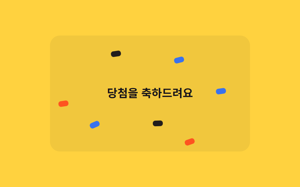
Confetti pieces of varying sizes keep falling over a celebration banner, each with its own delay, filling the scene like rain using only translateY and rotate.
Best forGiveaway-winner banners, goal-achieved celebration screens
@for 루프translateY2.4s
<main class="stage">
  <div class="cr-wrap is-demo">
    <span class="cr-banner">Congrats on your prize</span>
    <span class="cr-piece"></span><span class="cr-piece"></span><span class="cr-piece"></span>
    <span class="cr-piece"></span><span class="cr-piece"></span><span class="cr-piece"></span>
    <span class="cr-piece"></span><span class="cr-piece"></span><span class="cr-piece"></span>
    <span class="cr-piece"></span><span class="cr-piece"></span><span class="cr-piece"></span>
    <span class="cr-piece"></span><span class="cr-piece"></span><span class="cr-piece"></span>
    <span class="cr-piece"></span><span class="cr-piece"></span><span class="cr-piece"></span>
  </div>
</main>
@use "../../../../site/static/demo-tokens" as *;
// ── 변수 3개 ──────────────────────────────────────────
$duration: 2s;
$easing: linear;
$color: $subject-blue;
@include stage($stage-yellow);
$piece-colors: $color, $stage-orange, $subject-ink, $subject-cream;
.cr-wrap {
position: relative;
width: min(320px, 88vw);
height: min(220px, 62vh);
overflow: hidden;
border-radius: $r-card;
background: rgba(23, 20, 26, .06);
}
.cr-banner {
position: absolute;
inset: 0;
display: grid;
place-items: center;
padding: $sp-4;
box-sizing: border-box;
text-align: center;
color: $subject-ink;
font: 700 18px/1.3 -apple-system, "Segoe UI", "Noto Sans KR", sans-serif;
}
.cr-piece {
position: absolute;
top: -220px;
width: 9px;
height: 16px;
border-radius: $r-xs;
opacity: .95;
animation-duration: $duration;
}
// 조각 18개가 카드 높이 전체에 걸쳐 서로 다른 top 시작값을 갖는다 — delay 만 다르면 전부 위쪽에서
// 한 줄로 뭉쳐 같이 출발해 버린다 (실측). top 순서를 왼쪽 순서(left%)와 다르게 섞어야 대각선 한 줄이
// 아니라 흩뿌린 비처럼 보인다 (실측: left·top 을 같은 $i 로 선형 배치하면 완벽한 대각선이 된다)
$tops: -40px, 160px, -180px, 20px, 100px, -120px, 60px, -200px, 140px, -20px, 180px, -100px, 40px, -160px, 120px, -60px, 200px, -140px;
@for $i from 1 through 18 {
.cr-piece:nth-child(#{$i + 1}) {
left: percentage($i / 19);
top: nth($tops, $i);
background: nth($piece-colors, $i % 4 + 1);
animation-duration: #{1700ms + ($i % 5) * 140ms};
}
}
@keyframes cr-fall {
0% { transform: translateY(0) rotate(0deg); }
100% { transform: translateY(520px) rotate(300deg); }
}
// duration 은 shorthand 로 주지 않는다 — 그러면 specificity 가 더 높아 항목마다 다른 animation-duration(위) 을
// 덮어써 18개가 전부 같은 박자로 떨어져 버린다 (실측). name·timing·iteration 만 여기서, duration 은 조각마다
.cr-wrap.is-demo .cr-piece { animation-name: cr-fall; animation-timing-function: $easing; animation-iteration-count: infinite; }
@media (prefers-reduced-motion: reduce) {
.cr-wrap.is-demo .cr-piece { animation: none !important; opacity: 0 !important; }
}html, body {
margin: 0;
overflow: hidden;
}
.stage {
box-sizing: border-box;
min-height: 100vh;
display: grid;
place-items: center;
margin: 0;
background: #ffd23f;
font-family: -apple-system, "Segoe UI", "Noto Sans KR", sans-serif;
padding: clamp(8px, 4vw, 24px);
}
.cr-wrap {
position: relative;
width: min(320px, 88vw);
height: min(220px, 62vh);
overflow: hidden;
border-radius: 16px;
background: rgba(23, 20, 26, 0.06);
}
.cr-banner {
position: absolute;
inset: 0;
display: grid;
place-items: center;
padding: 16px;
box-sizing: border-box;
text-align: center;
color: #17141a;
font: 700 18px/1.3 -apple-system, "Segoe UI", "Noto Sans KR", sans-serif;
}
.cr-piece {
position: absolute;
top: -220px;
width: 9px;
height: 16px;
border-radius: 4px;
opacity: 0.95;
animation-duration: 2s;
}
.cr-piece:nth-child(2) {
left: 5.2631578947%;
top: -40px;
background: #ff4d1f;
animation-duration: 1840ms;
}
.cr-piece:nth-child(3) {
left: 10.5263157895%;
top: 160px;
background: #17141a;
animation-duration: 1980ms;
}
.cr-piece:nth-child(4) {
left: 15.7894736842%;
top: -180px;
background: #fff7e6;
animation-duration: 2120ms;
}
.cr-piece:nth-child(5) {
left: 21.0526315789%;
top: 20px;
background: #2f6df6;
animation-duration: 2260ms;
}
.cr-piece:nth-child(6) {
left: 26.3157894737%;
top: 100px;
background: #ff4d1f;
animation-duration: 1700ms;
}
.cr-piece:nth-child(7) {
left: 31.5789473684%;
top: -120px;
background: #17141a;
animation-duration: 1840ms;
}
.cr-piece:nth-child(8) {
left: 36.8421052632%;
top: 60px;
background: #fff7e6;
animation-duration: 1980ms;
}
.cr-piece:nth-child(9) {
left: 42.1052631579%;
top: -200px;
background: #2f6df6;
animation-duration: 2120ms;
}
.cr-piece:nth-child(10) {
left: 47.3684210526%;
top: 140px;
background: #ff4d1f;
animation-duration: 2260ms;
}
.cr-piece:nth-child(11) {
left: 52.6315789474%;
top: -20px;
background: #17141a;
animation-duration: 1700ms;
}
.cr-piece:nth-child(12) {
left: 57.8947368421%;
top: 180px;
background: #fff7e6;
animation-duration: 1840ms;
}
.cr-piece:nth-child(13) {
left: 63.1578947368%;
top: -100px;
background: #2f6df6;
animation-duration: 1980ms;
}
.cr-piece:nth-child(14) {
left: 68.4210526316%;
top: 40px;
background: #ff4d1f;
animation-duration: 2120ms;
}
.cr-piece:nth-child(15) {
left: 73.6842105263%;
top: -160px;
background: #17141a;
animation-duration: 2260ms;
}
.cr-piece:nth-child(16) {
left: 78.9473684211%;
top: 120px;
background: #fff7e6;
animation-duration: 1700ms;
}
.cr-piece:nth-child(17) {
left: 84.2105263158%;
top: -60px;
background: #2f6df6;
animation-duration: 1840ms;
}
.cr-piece:nth-child(18) {
left: 89.4736842105%;
top: 200px;
background: #ff4d1f;
animation-duration: 1980ms;
}
.cr-piece:nth-child(19) {
left: 94.7368421053%;
top: -140px;
background: #17141a;
animation-duration: 2120ms;
}
@keyframes cr-fall {
0% {
transform: translateY(0) rotate(0deg);
}
100% {
transform: translateY(520px) rotate(300deg);
}
}
.cr-wrap.is-demo .cr-piece {
animation-name: cr-fall;
animation-timing-function: linear;
animation-iteration-count: infinite;
}
@media (prefers-reduced-motion: reduce) {
.cr-wrap.is-demo .cr-piece {
animation: none !important;
opacity: 0 !important;
}
}import { CSSProperties } from "react";
import styles from "./ConfettiRain.module.scss";
type Vars = CSSProperties & Record<string, string>;
export interface ConfettiRainProps {
duration?: string;
easing?: string;
color?: string;
}
const COLORS = ["var(--color)", "#ff4d1f", "#17141a", "#fff7e6"];
// top 을 left% 순서와 다르게 섞는다 — 둘을 같은 인덱스로 선형 배치하면 낙하가 아니라 대각선 한 줄로 보인다
const TOPS = [-40, 160, -180, 20, 100, -120, 60, -200, 140, -20, 180, -100, 40, -160, 120, -60, 200, -140];
export default function ConfettiRain({
duration = "2s",
easing = "linear",
color = "#2f6df6",
}: ConfettiRainProps) {
const style: Vars = { "--duration": duration, "--easing": easing, "--color": color };
return (
<div className={styles.wrap} style={style}>
<span className={styles.banner}>당첨을 축하드려요</span>
{TOPS.map((top, i) => {
const pieceStyle: Vars = {
left: `${((i + 1) / (TOPS.length + 1)) * 100}%`,
top: `${top}px`,
background: COLORS[i % COLORS.length],
animationDuration: `${1700 + (i % 5) * 140}ms`,
};
return <span key={i} className={styles.piece} style={pieceStyle} />;
})}
</div>
);
}02 Confetti rain — Measured area 12.233% · moving frames 22/23Original by GODRICH · SCSS and React ship in the zip · 9 CSS Confetti Animation & Sparkle Effects
The post this demo lives in
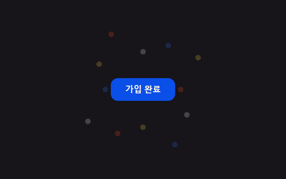 9 CSS Confetti Animation & Sparkle EffectsA confetti animation is the small colored burst a screen fires when something succeeds — a finished signup, a completed See all demos in this post