09Side-by-side easing compare
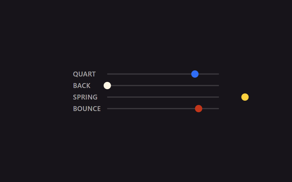
Running quart, back, spring, and bounce over the same 2-second, same-distance track side by side makes the shape of each deceleration instantly visible.
Best forComparing a shortlist of easing candidates on one screen before picking one
cubic-bezierlinear()비교
<main class="stage is-demo">
  <div class="compare">
    <div class="lane">
      <span class="label">quart</span>
      <div class="track"><div class="puck puck--quart"></div></div>
    </div>
    <div class="lane">
      <span class="label">back</span>
      <div class="track"><div class="puck puck--back"></div></div>
    </div>
    <div class="lane">
      <span class="label">spring</span>
      <div class="track"><div class="puck puck--spring"></div></div>
    </div>
    <div class="lane">
      <span class="label">bounce</span>
      <div class="track"><div class="puck puck--bounce"></div></div>
    </div>
  </div>
</main>
@use "../../../../site/static/demo-tokens" as *;
// ── 변수 3개 ──────────────────────────────────────────
$duration: $dur-loop; // 2s — 네 레인 전부 같은 길이라야 곡선 모양만으로 비교가 된다
$easing: cubic-bezier(.25, 1, .5, 1); // 대표값(quart). 레인마다 실제 값은 아래 참고
$color: $subject-blue;
@include stage($stage-ink);
$track-w: 184px;
$puck-w: $sp-3;
$travel: $track-w - $puck-w;
.compare {
display: flex;
flex-direction: column;
gap: $sp-2;
width: $track-w + $sp-12 + $sp-2; // 라벨 폭 + 간격 + 트랙 폭
}
.lane {
display: flex;
align-items: center;
gap: $sp-2;
}
.label {
width: $sp-12;
flex: 0 0 auto;
font: 600 11px/1 -apple-system, "Segoe UI", "Noto Sans KR", sans-serif;
color: rgba(255, 255, 255, .6);
text-transform: uppercase;
letter-spacing: .03em;
}
.track {
position: relative;
flex: 1 1 auto;
width: $track-w;
height: 2px;
background: rgba(255, 255, 255, .15);
border-radius: $r-xs;
}
.puck {
position: absolute;
top: 50%;
left: 0;
width: $puck-w;
height: $puck-w;
border-radius: $r-pill;
transform: translate(0, -50%);
}
.puck--quart { background: $subject-blue; }
.puck--back { background: $subject-cream; }
.puck--spring { background: $stage-yellow; }
.puck--bounce { background: $error; }
.stage.is-demo .puck--quart {
// ease-out-quart — 01번과 같은 값
animation: move $duration cubic-bezier(.25, 1, .5, 1) infinite alternate;
}
.stage.is-demo .puck--back {
// ease-in-out-back — 02번과 같은 값. 출발 전 뒤로 당겼다가 도착 뒤 넘어간다
animation: move $duration cubic-bezier(.68, -.6, .32, 1.6) infinite alternate;
}
.stage.is-demo .puck--spring {
// spring-snappy — 06번과 같은 값. 오버슈트 뒤 여러 번 오간다
animation: move $duration linear(0, .055, .197, .394, .612, .824, 1.009, 1.153, 1.25, 1.3, 1.307, 1.281, 1.231, 1.167, 1.099, 1.035, .982, .942, .916, .905, .907, .917, .935, .955, .976, .995, 1) infinite alternate;
}
.stage.is-demo .puck--bounce {
// bounce-linear — 04번과 같은 값. 방향을 안 바꾸고 매 루프 제자리로 순간 복귀한다
animation: move-once $duration linear(0, .013, .053, .118, .21, .328, .473, .643, .84, .97, .875, .807, .766, .75, .761, .798, .861, .951, .973, .943, .939, .962, .995, .984, 1) infinite;
}
@keyframes move {
from { transform: translate(0, -50%); }
to { transform: translate($travel, -50%); }
}
@keyframes move-once {
from { transform: translate(0, -50%); }
to { transform: translate($travel, -50%); }
}
@media (prefers-reduced-motion: reduce) {
.stage.is-demo .puck { animation: none; transform: translate($travel, -50%); }
}html, body {
margin: 0;
overflow: hidden;
}
.stage {
box-sizing: border-box;
min-height: 100vh;
display: grid;
place-items: center;
margin: 0;
background: #17141a;
font-family: -apple-system, "Segoe UI", "Noto Sans KR", sans-serif;
padding: clamp(8px, 4vw, 24px);
}
.compare {
display: flex;
flex-direction: column;
gap: 8px;
width: 240px;
}
.lane {
display: flex;
align-items: center;
gap: 8px;
}
.label {
width: 48px;
flex: 0 0 auto;
font: 600 11px/1 -apple-system, "Segoe UI", "Noto Sans KR", sans-serif;
color: rgba(255, 255, 255, 0.6);
text-transform: uppercase;
letter-spacing: 0.03em;
}
.track {
position: relative;
flex: 1 1 auto;
width: 184px;
height: 2px;
background: rgba(255, 255, 255, 0.15);
border-radius: 4px;
}
.puck {
position: absolute;
top: 50%;
left: 0;
width: 12px;
height: 12px;
border-radius: 999px;
transform: translate(0, -50%);
}
.puck--quart {
background: #2f6df6;
}
.puck--back {
background: #fff7e6;
}
.puck--spring {
background: #ffd23f;
}
.puck--bounce {
background: #c2361a;
}
.stage.is-demo .puck--quart {
animation: move 2s cubic-bezier(0.25, 1, 0.5, 1) infinite alternate;
}
.stage.is-demo .puck--back {
animation: move 2s cubic-bezier(0.68, -0.6, 0.32, 1.6) infinite alternate;
}
.stage.is-demo .puck--spring {
animation: move 2s linear(0, 0.055, 0.197, 0.394, 0.612, 0.824, 1.009, 1.153, 1.25, 1.3, 1.307, 1.281, 1.231, 1.167, 1.099, 1.035, 0.982, 0.942, 0.916, 0.905, 0.907, 0.917, 0.935, 0.955, 0.976, 0.995, 1) infinite alternate;
}
.stage.is-demo .puck--bounce {
animation: move-once 2s linear(0, 0.013, 0.053, 0.118, 0.21, 0.328, 0.473, 0.643, 0.84, 0.97, 0.875, 0.807, 0.766, 0.75, 0.761, 0.798, 0.861, 0.951, 0.973, 0.943, 0.939, 0.962, 0.995, 0.984, 1) infinite;
}
@keyframes move {
from {
transform: translate(0, -50%);
}
to {
transform: translate(172px, -50%);
}
}
@keyframes move-once {
from {
transform: translate(0, -50%);
}
to {
transform: translate(172px, -50%);
}
}
@media (prefers-reduced-motion: reduce) {
.stage.is-demo .puck {
animation: none;
transform: translate(172px, -50%);
}
}import type { CSSProperties } from "react";
import styles from "./EasingCompare.module.scss";
export type EasingCompareProps = {
/** 네 레인 공통 주기 (기본 2000ms) — 같은 길이라야 곡선 모양만으로 비교가 된다 */
duration?: number;
};
const LANES = [
{ key: "quart", label: "QUART", cls: styles.puckQuart },
{ key: "back", label: "BACK", cls: styles.puckBack },
{ key: "spring", label: "SPRING", cls: styles.puckSpring },
{ key: "bounce", label: "BOUNCE", cls: styles.puckBounce },
] as const;
export default function EasingCompare({ duration = 2000 }: EasingCompareProps) {
return (
<div className={styles.stage} style={{ "--duration": `${duration}ms` } as CSSProperties}>
<div className={styles.compare}>
{LANES.map((lane) => (
<div className={styles.lane} key={lane.key}>
<span className={styles.label}>{lane.label}</span>
<div className={styles.track}>
<div className={`${styles.puck} ${lane.cls}`} />
</div>
</div>
))}
</div>
</div>
);
}09 Side-by-side easing compare — Measured area 4.24% · moving frames 23/23Original by GODRICH · SCSS and React ship in the zip · 9 CSS Easing Curves You Can Copy-Paste
The post this demo lives in
 9 CSS Easing Curves You Can Copy-PasteA CSS animation moving at one constant speed looks robotic; ease it down at the end, or spring past the target and settl See all demos in this post