01Neon text flicker
Multiple layered text-shadow glows brighten and dim like a loose neon tube, and the @keyframes stops are deliberately uneven so the flicker never feels metronomic.
Best forLanding-page hero titles, sale or event badge copy
text-shadow@keyframes flicker다중 그림자
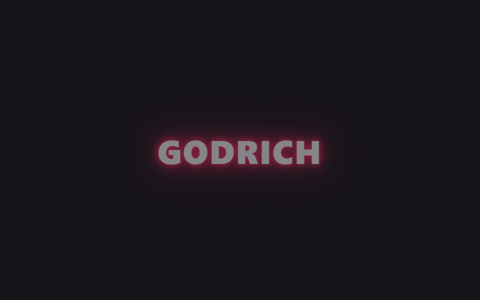
<main class="stage is-demo">
  <h1 class="neon">GODRICH</h1>
</main>
@use "../../../../site/static/demo-tokens" as *;
// ── 변수 3개 ──────────────────────────────────────────
$duration: $dur-loop; // 2s — 깜빡임 한 주기
$easing: linear;
$color: #ff2e63; // 네온 핑크
@include stage($stage-ink);
.neon {
margin: 0;
font: 800 clamp(30px, 11vmin, 56px)/1 "Segoe UI", -apple-system, "Noto Sans KR", sans-serif;
letter-spacing: .04em;
color: $stage-paper;
text-shadow:
0 0 $sp-1 $color,
0 0 $sp-2 $color,
0 0 $sp-4 rgba($color, .8),
0 0 $sp-8 rgba($color, .6),
0 0 $sp-12 rgba($color, .35);
}
// opacity 하나만 흔들어도 색+text-shadow 전체가 같이 어두워진다 — transform·opacity 원칙 유지
.stage.is-demo .neon {
animation: flicker $duration $easing infinite;
}
@keyframes flicker {
0% { opacity: 1; }
6% { opacity: .3; }
14% { opacity: 1; }
20% { opacity: 1; }
26% { opacity: .4; }
34% { opacity: 1; }
50% { opacity: 1; }
56% { opacity: .25; }
64% { opacity: 1; }
80% { opacity: 1; }
86% { opacity: .35; }
94% { opacity: 1; }
100% { opacity: 1; }
}
@media (prefers-reduced-motion: reduce) {
.stage.is-demo .neon { animation: none; opacity: 1; }
}html, body {
margin: 0;
overflow: hidden;
}
.stage {
box-sizing: border-box;
min-height: 100vh;
display: grid;
place-items: center;
margin: 0;
background: #17141a;
font-family: -apple-system, "Segoe UI", "Noto Sans KR", sans-serif;
padding: clamp(8px, 4vw, 24px);
}
.neon {
margin: 0;
font: 800 clamp(30px, 11vmin, 56px)/1 "Segoe UI", -apple-system, "Noto Sans KR", sans-serif;
letter-spacing: 0.04em;
color: #ffffff;
text-shadow: 0 0 4px #ff2e63, 0 0 8px #ff2e63, 0 0 16px rgba(255, 46, 99, 0.8), 0 0 32px rgba(255, 46, 99, 0.6), 0 0 48px rgba(255, 46, 99, 0.35);
}
.stage.is-demo .neon {
animation: flicker 2s linear infinite;
}
@keyframes flicker {
0% {
opacity: 1;
}
6% {
opacity: 0.3;
}
14% {
opacity: 1;
}
20% {
opacity: 1;
}
26% {
opacity: 0.4;
}
34% {
opacity: 1;
}
50% {
opacity: 1;
}
56% {
opacity: 0.25;
}
64% {
opacity: 1;
}
80% {
opacity: 1;
}
86% {
opacity: 0.35;
}
94% {
opacity: 1;
}
100% {
opacity: 1;
}
}
@media (prefers-reduced-motion: reduce) {
.stage.is-demo .neon {
animation: none;
opacity: 1;
}
}import type { CSSProperties } from "react";
import styles from "./NeonTextFlicker.module.scss";
export type NeonTextFlickerProps = {
/** 화면에 뜨는 글자 (기본 "GODRICH") */
text?: string;
/** 깜빡임 한 주기 (기본 2000ms) */
duration?: number;
color?: string;
};
export default function NeonTextFlicker({
text = "GODRICH",
duration = 2000,
color = "#ff2e63",
}: NeonTextFlickerProps) {
const vars: CSSProperties = { "--duration": `${duration}ms`, "--color": color } as CSSProperties;
return (
<div className={styles.stage} style={vars}>
<h1 className={styles.neon}>{text}</h1>
</div>
);
}01 Neon text flicker — Measured area 6.513% · moving frames 14/23Original by GODRICH · SCSS and React ship in the zip · 9 CSS Glow Effect Animations — Neon, Copy-Paste
The post this demo lives in
 9 CSS Glow Effect Animations — Neon, Copy-PasteA glowing button or headline looks lit from the inside like a neon sign, the trick gaming sites, streamers, and portfoli See all demos in this post