06Clap count
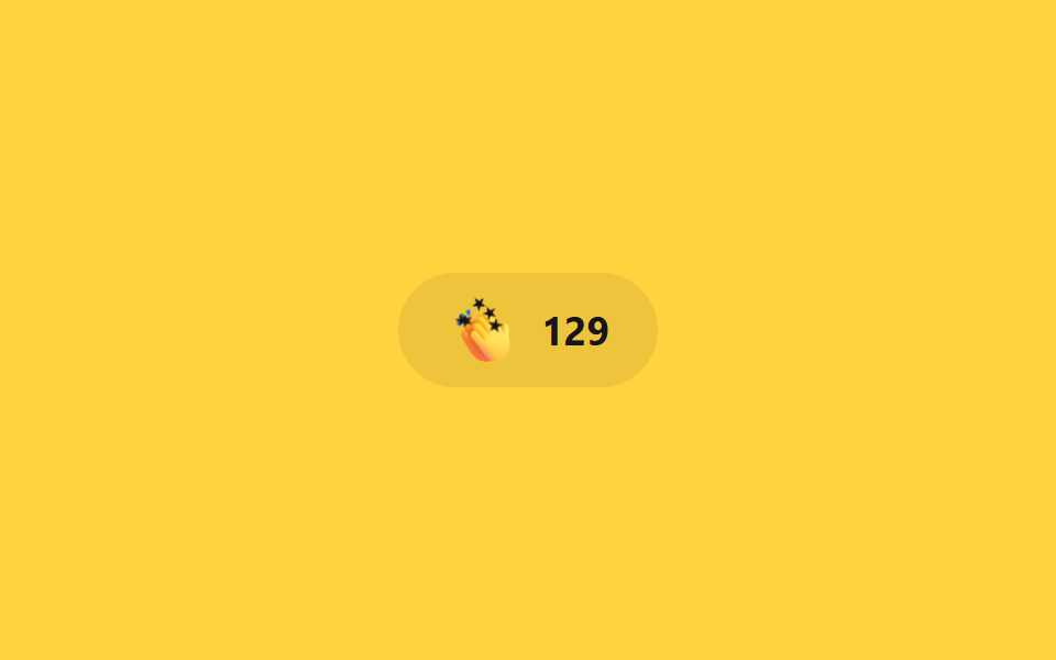
A button whose count climbs with every click — each tap gives the icon a quick scale bounce while a "+1" label drifts up via translateY and fades via opacity.
Best forMedium-style clap buttons, feedback widgets
반복 클릭translateY+opacityJS 카운트
<main class="stage">
  <button class="clap is-demo" type="button" aria-label="Clap">
    <span class="clap__icon" aria-hidden="true">👏</span>
    <span class="clap__plus" aria-hidden="true">+1</span>
    <span class="clap__count"><span aria-live="polite">128</span></span>
    <span class="clap__fx" aria-hidden="true"><span class="clap__spark"></span><span class="clap__spark"></span><span class="clap__spark"></span><span class="clap__spark"></span><span class="clap__spark"></span></span>
  </button>
</main>
@use "../../../../site/static/demo-tokens" as *;
// ── 변수 3개 ──────────────────────────────────────────
$duration: $dur-quick; // 아이콘이 튀는 시간
$easing: $ease-pop; // 튕기는 이징
$color: $subject-ink; // 숫자 강조색 (노랑 무대)
// ── 데모 무대 ──────────────────────────────────────────
@include stage($stage-yellow);
.clap {
position: relative;
display: inline-flex;
align-items: center;
gap: clamp(8px, 2.6vw, 10px);
border: 0;
border-radius: $r-pill;
padding: clamp(10px, 3.6vw, 14px) clamp(18px, 5.4vw, 22px);
font-weight: 700; font-size: clamp(15px, 4.2vw, 18px); line-height: 1; font-family: inherit;
color: $color;
background: rgba(23, 20, 26, .08);
cursor: pointer;
-webkit-tap-highlight-color: transparent;
&__icon { font-size: clamp(20px, 5.6vw, 24px); display: inline-block; transform: scale(1) rotate(0deg); }
&__plus {
position: absolute; top: -2px; left: 34px;
font-weight: 700; font-size: 13px; line-height: 1; font-family: inherit; color: $color;
opacity: 0; transform: translateY(0);
pointer-events: none;
}
&__count { font-variant-numeric: tabular-nums; }
// 한 겹: 물리 스파크 파티클(미니 별) — fire 직전 JS 가 아이콘 중심으로 원점을 옮긴다. 좌표·페이드는 JS 가 계산한다.
&__fx { position: absolute; top: 50%; left: 0; pointer-events: none; }
&__spark {
position: absolute; top: 50%; left: 50%;
width: 10px; height: 10px; margin: -5px 0 0 -5px;
background: $color;
clip-path: polygon(50% 0%, 61% 35%, 98% 35%, 68% 57%, 79% 91%, 50% 70%, 21% 91%, 32% 57%, 2% 35%, 39% 35%);
opacity: 0;
pointer-events: none;
will-change: transform, opacity;
}
&.is-clap &__icon { animation: clap-bounce $duration $easing; }
&.is-clap &__plus { animation: clap-plus $duration $easing; }
&.is-demo &__icon { animation: clap-bounce-loop $dur-loop $easing infinite; }
&.is-demo &__plus { animation: clap-plus-loop $dur-loop $easing infinite; }
}
@keyframes clap-bounce {
0% { transform: scale(1) rotate(0deg); }
40% { transform: scale(1.3) rotate(-12deg); }
100% { transform: scale(1) rotate(0deg); }
}
@keyframes clap-plus {
0% { opacity: 1; transform: translateY(0); }
100% { opacity: 0; transform: translateY(-16px); }
}
@keyframes clap-bounce-loop {
0%, 60% { transform: scale(1) rotate(0deg); }
75% { transform: scale(1.3) rotate(-12deg); }
100% { transform: scale(1) rotate(0deg); }
}
@keyframes clap-plus-loop {
0%, 60% { opacity: 0; transform: translateY(0); }
70% { opacity: 1; transform: translateY(0); }
100% { opacity: 0; transform: translateY(-16px); }
}
// ── 접근성 ──────────────────────────────────────────
@media (prefers-reduced-motion: reduce) {
.clap.is-clap .clap__icon,
.clap.is-clap .clap__plus,
.clap.is-demo .clap__icon,
.clap.is-demo .clap__plus { animation: none !important; opacity: 0; transform: none; }
.clap__spark { display: none; } // 물리 파티클도 함께 숨긴다
}html, body {
margin: 0;
overflow: hidden;
}
.stage {
box-sizing: border-box;
min-height: 100vh;
display: grid;
place-items: center;
margin: 0;
background: #ffd23f;
font-family: -apple-system, "Segoe UI", "Noto Sans KR", sans-serif;
padding: clamp(8px, 4vw, 24px);
}
.clap {
position: relative;
display: inline-flex;
align-items: center;
gap: clamp(8px, 2.6vw, 10px);
border: 0;
border-radius: 999px;
padding: clamp(10px, 3.6vw, 14px) clamp(18px, 5.4vw, 22px);
font-weight: 700;
font-size: clamp(15px, 4.2vw, 18px);
line-height: 1;
font-family: inherit;
color: #17141a;
background: rgba(23, 20, 26, 0.08);
cursor: pointer;
-webkit-tap-highlight-color: transparent;
}
.clap__icon {
font-size: clamp(20px, 5.6vw, 24px);
display: inline-block;
transform: scale(1) rotate(0deg);
}
.clap__plus {
position: absolute;
top: -2px;
left: 34px;
font-weight: 700;
font-size: 13px;
line-height: 1;
font-family: inherit;
color: #17141a;
opacity: 0;
transform: translateY(0);
pointer-events: none;
}
.clap__count {
font-variant-numeric: tabular-nums;
}
.clap__fx {
position: absolute;
top: 50%;
left: 0;
pointer-events: none;
}
.clap__spark {
position: absolute;
top: 50%;
left: 50%;
width: 10px;
height: 10px;
margin: -5px 0 0 -5px;
background: #17141a;
clip-path: polygon(50% 0%, 61% 35%, 98% 35%, 68% 57%, 79% 91%, 50% 70%, 21% 91%, 32% 57%, 2% 35%, 39% 35%);
opacity: 0;
pointer-events: none;
will-change: transform, opacity;
}
.clap.is-clap .clap__icon {
animation: clap-bounce 220ms cubic-bezier(0.2, 1.4, 0.4, 1);
}
.clap.is-clap .clap__plus {
animation: clap-plus 220ms cubic-bezier(0.2, 1.4, 0.4, 1);
}
.clap.is-demo .clap__icon {
animation: clap-bounce-loop 2s cubic-bezier(0.2, 1.4, 0.4, 1) infinite;
}
.clap.is-demo .clap__plus {
animation: clap-plus-loop 2s cubic-bezier(0.2, 1.4, 0.4, 1) infinite;
}
@keyframes clap-bounce {
0% {
transform: scale(1) rotate(0deg);
}
40% {
transform: scale(1.3) rotate(-12deg);
}
100% {
transform: scale(1) rotate(0deg);
}
}
@keyframes clap-plus {
0% {
opacity: 1;
transform: translateY(0);
}
100% {
opacity: 0;
transform: translateY(-16px);
}
}
@keyframes clap-bounce-loop {
0%, 60% {
transform: scale(1) rotate(0deg);
}
75% {
transform: scale(1.3) rotate(-12deg);
}
100% {
transform: scale(1) rotate(0deg);
}
}
@keyframes clap-plus-loop {
0%, 60% {
opacity: 0;
transform: translateY(0);
}
70% {
opacity: 1;
transform: translateY(0);
}
100% {
opacity: 0;
transform: translateY(-16px);
}
}
@media (prefers-reduced-motion: reduce) {
.clap.is-clap .clap__icon,
.clap.is-clap .clap__plus,
.clap.is-demo .clap__icon,
.clap.is-demo .clap__plus {
animation: none !important;
opacity: 0;
transform: none;
}
.clap__spark {
display: none;
}
}// 누를 때마다 카운트가 1 오르고 아이콘이 튄다. .is-demo 인 동안은 타이머가 대신 누른다.
// 한 겹: 박수마다 질량-감쇠 물리 스파크 버스트 — 미니 별이 아이콘 중심에서 흩어진다 (Clap 리듬에 맞춰 빠르고 짧게).
// 각 파티클은 초기 속도(위쪽 좁은 부채꼴·크기 랜덤)와 개별 질량을 갖고, 매 프레임 준암시 오일러 적분으로
// 감쇠(-k/m·v — 질량이 클수록 덜 감속)와 중력(질량 무관)을 받아 흩어졌다 멈춘다 (keyframes 아님).
var b = document.querySelector(".clap"), n = b.querySelector(".clap__count span");
var fx = b.querySelector(".clap__fx"), icon = b.querySelector(".clap__icon");
var sparks = [].slice.call(fx.querySelectorAll(".clap__spark"));
var reduce = matchMedia('(prefers-reduced-motion: reduce)').matches;
var alive = false, raf = 0, last = 0;
function fire() {
if (reduce || !sparks.length) return;
fx.style.left = (icon.offsetLeft + icon.offsetWidth / 2) + "px"; // 아이콘 중심으로 발사 원점 이동
var now = performance.now();
for (var i = 0; i < sparks.length; i++) {
var m = .6 + Math.random() * .6; // 개별 질량 0.6~1.2
var ang = -Math.PI / 2 + (Math.random() - .5) * 2.4; // 위쪽 좁은 부채꼴 ±69°
var v0 = (100 + Math.random() * 70) * (1.15 - m * .2); // 무거울수록 느게 출발
sparks[i]._p = { x: 0, y: 0, vx: Math.cos(ang) * v0, vy: Math.sin(ang) * v0,
m: m, k: 3.8, g: 320, rot: (Math.random() - .5) * 40, spin: (Math.random() - .5) * 840,
s: .4 + m * .3, born: now + i * 18, life: 550 + Math.random() * 300 };
}
if (!alive) { alive = true; last = now; raf = requestAnimationFrame(step); }
}
function step(t) {
var dt = Math.min((t - last) / 1000, .05); last = t; // 탭 복귀 시 폭주 방지 클램프
var any = false;
for (var i = 0; i < sparks.length; i++) {
var el = sparks[i], p = el._p; if (!p) continue;
var age = t - p.born;
if (age < 0) { any = true; continue; } // 방출 전 지연(순차 분사)
if (age >= p.life) { el.style.opacity = '0'; el._p = null; continue; } // 수명 끝 → 정지
p.vx += (-p.k / p.m * p.vx) * dt; // 감쇠 가속도 = -k/m·v
p.vy += (p.g - p.k / p.m * p.vy) * dt; // 중력 가속도 = g (질량 무관)
p.x += p.vx * dt; p.y += p.vy * dt; p.rot += p.spin * dt;
var o = age / p.life; // 수명 후반 45%에서 페이드아웃
el.style.opacity = o < .55 ? '1' : (1 - (o - .55) / .45).toFixed(3);
el.style.transform = 'translate(' + p.x.toFixed(1) + 'px,' + p.y.toFixed(1) + 'px) rotate(' + p.rot.toFixed(1) + 'deg) scale(' + p.s.toFixed(3) + ')';
any = true;
}
if (any) raf = requestAnimationFrame(step); else alive = false; // 전부 정지하면 루프 종료
}
function clap() {
n.textContent = String(Number(n.textContent) + 1);
b.classList.remove("is-clap"); void b.offsetWidth; b.classList.add("is-clap");
fire(); // 실제 클릭·데모 루프 둘 다 박수마다 발사
}
b.addEventListener("pointerdown", function () { b.classList.remove("is-demo"); clap(); });
var demoClap = function () { if (!b.classList.contains("is-demo")) return; clap(); };
setInterval(demoClap, 900);
setTimeout(demoClap, 100); // 첫 사이클부터 녹화 창 안에 잡힌다import { useEffect, useRef, useState } from "react";
import type { CSSProperties } from "react";
import styles from "./ClapCount.module.scss";
export type ClapCountProps = {
duration?: number;
easing?: string;
color?: string;
baseCount?: number;
};
type Vars = CSSProperties & { "--duration"?: string; "--easing"?: string; "--color"?: string };
/** 파티클 1개의 물성 — 질량·감쇠·중력으로 흩어졌다 멈춘다 */
type Particle = {
x: number; y: number; vx: number; vy: number;
m: number; k: number; g: number; s: number;
rot: number; spin: number;
born: number; life: number;
};
const SPARKS = [0, 1, 2, 3, 4];
/** 질량-감쇠 물리 초기 상태. 감쇠 가속도 = -k/m·v (무거울수록 덜 감속), 중력 = g (질량 무관). 박수 리듬에 맞춰 빠르고 짧게. */
function spawn(now: number, i: number): Particle {
const m = 0.6 + Math.random() * 0.6; // 개별 질량 0.6~1.2
const ang = -Math.PI / 2 + (Math.random() - 0.5) * 2.4; // 위쪽 좁은 부채꼴 ±69°
const v0 = (100 + Math.random() * 70) * (1.15 - m * 0.2); // 무거울수록 느게 출발
return {
x: 0, y: 0,
vx: Math.cos(ang) * v0, vy: Math.sin(ang) * v0,
m, k: 3.8, g: 320, s: 0.4 + m * 0.3,
rot: (Math.random() - 0.5) * 40, spin: (Math.random() - 0.5) * 840,
born: now + i * 18, life: 550 + Math.random() * 300, // 순차 분사 + 수명 랜덤
};
}
export default function ClapCount({ duration = 220, easing = "cubic-bezier(.2,1.4,.4,1)", color = "#17141a", baseCount = 128 }: ClapCountProps) {
const [count, setCount] = useState(baseCount);
const [claps, setClaps] = useState(0); // 카운트 증가 펄스이자 파티클 burstKey 를 겸한다
const btnRef = useRef<HTMLButtonElement>(null);
const vars: Vars = { "--duration": `${duration}ms`, "--easing": easing, "--color": color };
const clap = () => { setCount((c) => c + 1); setClaps((k) => k + 1); };
// 준암시 오일러 적분 루프 — rAF 안에서 좌표를 계산해 transform 에 쓴다 (keyframes 하드코딩 아님)
useEffect(() => {
if (!claps) return;
if (window.matchMedia("(prefers-reduced-motion: reduce)").matches) return;
const btn = btnRef.current;
if (!btn) return;
const icon = btn.querySelector<HTMLElement>(`.${styles.icon}`);
const fx = btn.querySelector<HTMLElement>(`.${styles.fx}`);
if (!icon || !fx) return;
fx.style.left = `${icon.offsetLeft + icon.offsetWidth / 2}px`; // 아이콘 중심으로 발사 원점 이동
const els = Array.from(fx.querySelectorAll<HTMLElement>(`.${styles.spark}`));
if (!els.length) return;
const now = performance.now();
const ps: (Particle | null)[] = els.map((_, i) => spawn(now, i));
let raf = 0, last = now;
const step = (t: number) => {
const dt = Math.min((t - last) / 1000, 0.05); // 탭 복귀 시 폭주 방지 클램프
last = t;
let any = false;
for (let i = 0; i < els.length; i++) {
const el = els[i], p = ps[i]; if (!p) continue;
const age = t - p.born;
if (age < 0) { any = true; continue; } // 방출 전 지연
if (age >= p.life) { el.style.opacity = "0"; ps[i] = null; continue; } // 수명 끝 → 정지
p.vx += (-p.k / p.m * p.vx) * dt; // 감쇠 = -k/m·v
p.vy += (p.g - p.k / p.m * p.vy) * dt; // 중력 + 감쇠
p.x += p.vx * dt; p.y += p.vy * dt; p.rot += p.spin * dt;
const o = age / p.life;
el.style.opacity = o < 0.55 ? "1" : (1 - (o - 0.55) / 0.45).toFixed(3);
el.style.transform = `translate(${p.x.toFixed(1)}px,${p.y.toFixed(1)}px) rotate(${p.rot.toFixed(1)}deg) scale(${p.s.toFixed(3)})`;
any = true;
}
if (any) raf = requestAnimationFrame(step); // 전부 정지하면 루프 종료
};
raf = requestAnimationFrame(step);
return () => cancelAnimationFrame(raf);
}, [claps]);
return (
<button type="button" className={styles.clap} style={vars} onClick={clap} aria-label="박수" ref={btnRef}>
<span key={claps} className={styles.icon} aria-hidden="true">👏</span>
{claps > 0 && <span key={`plus-${claps}`} className={styles.plus} aria-hidden="true">+1</span>}
<span className={styles.count}>{count}</span>
{claps > 0 && (
<span key={`fx-${claps}`} className={styles.fx} aria-hidden="true">
{SPARKS.map((i) => (
<span key={`${claps}-${i}`} className={styles.spark} />
))}
</span>
)}
</button>
);
}06 Clap count — Measured area 0.886% · moving frames 23/23Original by GODRICH · SCSS and React ship in the zip · 9 CSS Heart Animations — One Line, Copy-Paste
The post this demo lives in
 9 CSS Heart Animations — One Line, Copy-PasteThese nine css heart animations turn a checkbox or a radio input into a like button, a star rating, or a reaction picker See all demos in this post