02Gradient background drift
An oversized conic-gradient layer sits on ::before, contained by overflow:hidden, and slowly translates and rotates so the background drifts without ever touching background-position.
Best forDark SaaS landing hero sections, product-launch page backgrounds
::beforeconic-gradienttranslate · rotate
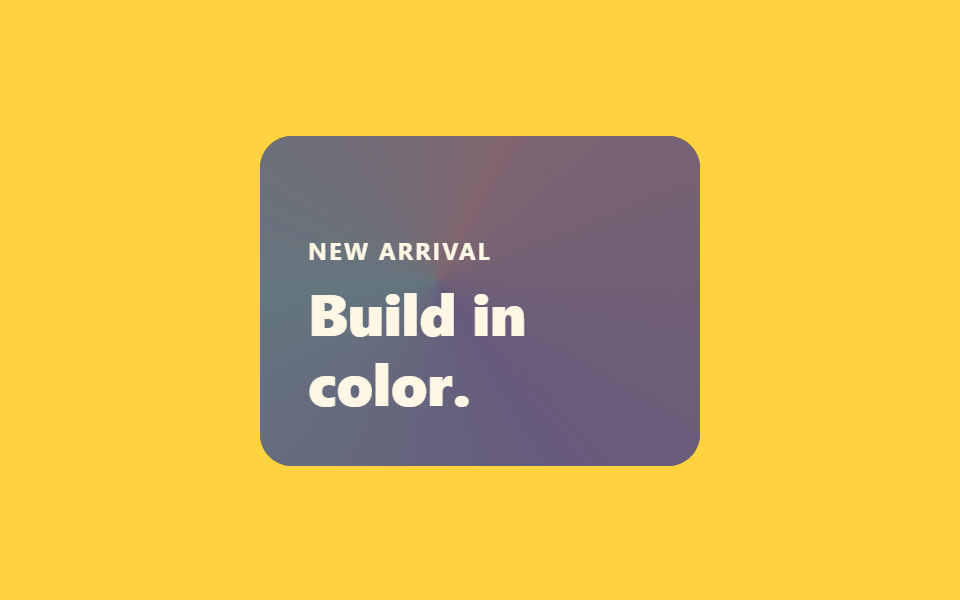
<main class="stage is-demo">
  <section class="hero">
    <p class="hero__eyebrow">New arrival</p>
    <h1 class="hero__title">Build in color.</h1>
  </section>
</main>
@use "../../../../site/static/demo-tokens" as *;
// ── 변수 3개 ──────────────────────────────────────────
$duration: $dur-loop; // 2s — 그라디언트 한 바퀴 드리프트
$easing: $ease-out;
$color: $subject-ink;
@include stage($stage-yellow);
.hero {
position: relative;
overflow: hidden;
box-sizing: border-box;
width: clamp(220px, 62vmin, 300px);
aspect-ratio: 4 / 3;
border-radius: $r-card;
background: $color;
padding: $sp-6;
display: flex;
flex-direction: column;
justify-content: flex-end;
gap: $sp-2;
}
// 카드보다 훨씬 큰(180% 오버사이즈) conic-gradient 층 — overflow:hidden 이 가둔다
.hero::before {
content: '';
position: absolute;
inset: -60% -60%;
background: conic-gradient(from 0deg, #d5a9b6, #a994ca, #a3c6d1, #d5a9b6);
opacity: .55;
pointer-events: none;
}
.hero__eyebrow, .hero__title { position: relative; z-index: 1; margin: 0; color: $subject-cream; }
.hero__eyebrow { font-weight: 700; font-size: clamp(11px, 3vw, 12px); line-height: 1; font-family: inherit; letter-spacing: .08em; text-transform: uppercase; }
.hero__title { font-weight: 800; font-size: clamp(22px, 6vw, 30px); line-height: 1.2; font-family: inherit; }
// translate·rotate 만 — background-position 은 쓰지 않는다
.stage.is-demo .hero::before { animation: drift $duration $easing infinite; }
@keyframes drift {
0% { transform: translate(-6%, -4%) rotate(0deg); }
50% { transform: translate(6%, 5%) rotate(180deg); }
100% { transform: translate(-6%, -4%) rotate(360deg); }
}
@media (prefers-reduced-motion: reduce) {
.stage.is-demo .hero::before { animation: none; transform: none; }
}html, body {
margin: 0;
overflow: hidden;
}
.stage {
box-sizing: border-box;
min-height: 100vh;
display: grid;
place-items: center;
margin: 0;
background: #ffd23f;
font-family: -apple-system, "Segoe UI", "Noto Sans KR", sans-serif;
padding: clamp(8px, 4vw, 24px);
}
.hero {
position: relative;
overflow: hidden;
box-sizing: border-box;
width: clamp(220px, 62vmin, 300px);
aspect-ratio: 4/3;
border-radius: 16px;
background: #17141a;
padding: 24px;
display: flex;
flex-direction: column;
justify-content: flex-end;
gap: 8px;
}
.hero::before {
content: "";
position: absolute;
inset: -60% -60%;
background: conic-gradient(from 0deg, #d5a9b6, #a994ca, #a3c6d1, #d5a9b6);
opacity: 0.55;
pointer-events: none;
}
.hero__eyebrow, .hero__title {
position: relative;
z-index: 1;
margin: 0;
color: #fff7e6;
}
.hero__eyebrow {
font-weight: 700;
font-size: clamp(11px, 3vw, 12px);
line-height: 1;
font-family: inherit;
letter-spacing: 0.08em;
text-transform: uppercase;
}
.hero__title {
font-weight: 800;
font-size: clamp(22px, 6vw, 30px);
line-height: 1.2;
font-family: inherit;
}
.stage.is-demo .hero::before {
animation: drift 2s ease-out infinite;
}
@keyframes drift {
0% {
transform: translate(-6%, -4%) rotate(0deg);
}
50% {
transform: translate(6%, 5%) rotate(180deg);
}
100% {
transform: translate(-6%, -4%) rotate(360deg);
}
}
@media (prefers-reduced-motion: reduce) {
.stage.is-demo .hero::before {
animation: none;
transform: none;
}
}import type { CSSProperties } from "react";
import styles from "./GradientBgDrift.module.scss";
export type GradientBgDriftProps = {
eyebrow?: string;
title?: string;
duration?: number;
easing?: string;
color?: string;
};
type Vars = CSSProperties & { "--duration"?: string; "--easing"?: string; "--color"?: string };
export default function GradientBgDrift({
eyebrow = "New arrival",
title = "Build in color.",
duration = 2000,
easing = "ease-out",
color = "#17141a",
}: GradientBgDriftProps) {
const vars: Vars = { "--duration": `${duration}ms`, "--easing": easing, "--color": color };
return (
<section className={styles.hero} style={vars}>
<p className={styles.eyebrow}>{eyebrow}</p>
<h1 className={styles.title}>{title}</h1>
</section>
);
}02 Gradient background drift — Measured area 23.185% · moving frames 21/23Original by GODRICH · SCSS and React ship in the zip · 9 CSS Hero Section Animations You Can Copy-Paste
The post this demo lives in
 9 CSS Hero Section Animations You Can Copy-PasteA hero section is the big banner filling a landing page's first screen — headline, text, button. This set holds nine CSS See all demos in this post